Kolkata Call Girl Airport Kolkata 👉 8250192130 ❣️💯 Available With Room 24×7
Front Cover Essay
1. Amy Walker
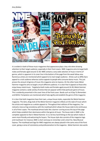
It is evident in both of these music magazines that appearance plays a key role when drawing
attention to their target audience, especially in their front covers. NME magazine aims to target both
males and females aged around 15-30. NME contains a very wide selection of music in terms of
genres, which is apparent in its cover line in the bottom of the page from the weak fallow area.
Numerous artists are mentioned which appeal to its main target audience. Artists such as Biffy Clyro
appeal to a rock audience whereas Justice appeals to people who consume dance music. This just
proves the amount of genres of music this magazine aims to impress. On the other hand, Metal
Hammer magazine aims to target a much different audience. It is clear that it appeals to those who
enjoy heavy metal music. Targeted at both males and females aged around 14-30, Metal Hammer
magazine contains a wide variety of artists that are popular within that particular genre of music.
This is evidently presented in the cover lines of the front cover. Bands such as A Day To Remember
and Within Temptation are mentioned which help signify and establish the genre of the magazine.
It is clear that both magazines have their own, unique house styles, especially the Metal Hammer
magazine. The dark, dingy look of the Metal Hammer magazine reflects on the style of music which
the article and magazine as a whole appeals to. Throughout their editions of the magazine, I’ve
noticed a reoccurring consistency with the masthead which allows the house style to be continuous
in all of their copies. The masthead almost looks like a banner running across the top of the page
which helps establish their dominance within that genre of music. The house style in NME is the
complete opposite to that in Metal Hammer. It is a lot less hard hitting on the eye which makes it
seem more friendly and welcoming for buyers. The house style also consists of the magazine logo
and masthead. For instance, NME is short and easy to remember and is short for, New Musical
Express. The masthead and logo for NME magazines are always placed in the same area of the front
cover, giving a sense of consistency and professionalism to the magazine. Metal Hammer also works
2. Amy Walker
in a similar way to NME. It is always positioned in the same area on the magazine, in this case, a
banner style block of text running along the top of the page.
Both magazines have a main focal point which again, links back to the house style of the two. Both of
the magazines have one, main protagonist placed directly in the centre of the front cover which
immediately attracts viewers and consumers to the magazines. This also links back to the
Guttenberg Design Principle where it is implied that people are assumed to read the content top to
bottom and left to right. This will then help you to split the page into four, key quadrants. The
primary optical is in the top left hand corner of the page, the strong fallow area in the top right hand
corner, the weak fallow area in the bottom left corner and the terminal area situated in the bottom
right hand corner of the page. When this is applied to my chosen magazine covers, it gives a similar
effect to that stated above. In NME magazine, my eyes are immediately drawn to the front cover’s
masthead; it straight away gives an idea and clue as to what the magazine’s going to be about. My
eyes are then distracted onto the large image of Lana Del Rey; this is done intentionally as she is an
up and coming artist and is the main, independent selling point this unique front cover. Other
related stories are then posted and positioned in the strong and weak fallow areas of the article. This
is done as these are the final things which the viewer will spot on the initial front page. In this
instance, the fact that the consumer buys the magazine, they are receiving a free gift; free posters
such as, Nirvana, Sex Pistols and Bob Marley. This again, highlights the fact that NME deals with
many genres. This same principal applies to the Metal Hammer magazine. My eyes are automatically
drawn to the front cover’s masthead, again, it straight away gives an idea as to what’s going to be
inside the edition as well as what it’s going to be about. Similar to NME, my eyes are then side
tracked by the main, selling point of the magazine, the lead singer of the metal band Bring Me The
Horizon, Ollie Sykes. Like NME, many related cover lines are placed in the strong and weak fallow
areas of the cover. In this case, ‘WIN’ is placed directly wear our eyes naturally go.
Both main images in each magazine are the complete opposite from one another. This relates to the
magazines target audience. NME is aimed at a young audience who are mainly interested in more
indie and a wide selection of genres. In most articles of NME, they have one independent
protagonist placed in the centre of the magazine. In this case, it’s Lana Del Rey. A medium shot is
given of the artist in a casual and a rebellious like stance. This suggests her importance and gives the
impression that she’s going to have a double page spread in the content.