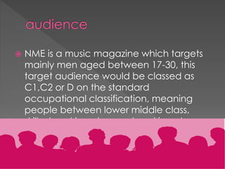
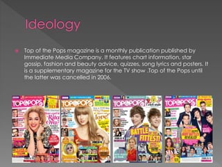
LIIAR analysis-front covers
Ella Duncan
Media A-level
Hook-

The hook is placed at the top right
corner of the magazine which attracts
readers and it stands out as it is in black
box with white writing on a white
background.

Masthead

The font is quite big and written
in blue which stands out from
the plain white background
making it eye-catching for the
reader. The masthead goes
behind the main spread which
makes it hard to read the full
name of the magazine which
could be negative. However,
the font is individual and
matches the main red, blue
and white theme that runs
through the cover.

Main cover line

The main cover line tells the reader
what
Amy Winehouse will be discussing in
the magazine which could attract
readers as they will want to see the
whole interview with Amy Winehouse.
The font is also slightly bigger than
some of the other pieces of text on
the page making it even more eye
catching.

Pull-cover lines

There are other stories that are
shown to be mentioned inside
of the magazine however they
are not the main story inside of
the magazine. Therefore, the
font is a lot smaller and is in
black which does not stand out
as much compared the red,
larger font of what the Amy
Wine house section is about.

Spread

Bar Code

This magazine cover
follows the codes and
conventions as a barcode
is shown as is the Date of
release and the price.

The picture relates to the main
story of the magazine letting
the reader know what is
included in the magazine.
• Rolling Stone is published by Jann Wenner (Wenner Media,
LLC)
• Based in New York City
• The first issue was November 9th 1967
• Sold every other week


Rolling Stone is a music magazine that focuses on politics and
popular culture and is known for its musical coverage and
political reporting by the enigmatic and controversial
journalist Hunter S. Thompson.



In recent years, the magazine has resumed its traditional mix
of content, including in-depth political stories. It also has
expanded content to include coverage of financial and
banking issues.


The target audience for the Rolling Stone magazine is adults
between 18-30.



60% male and 40% female



The magazine is popular in the USA


The picture of Amy Winehouse shows her with a straight face and just a black
vest top on which allows the readers to see all of her tattoos showing a
representation of her



The picture of very posed, with her hair and make clearly having been done
previously before the shoot for the magazine cover.



A mid shot is clearly shown which makes it clear to the audience the
emotions she is feeling and gives the reader an insight to her personality due
to the way she is portraying herself
Masthead-

The Masthead is clear,
bold and stands out as it
is a large, white font on
a red hair coloured
background which
grabs the readers
attention. It follows the
conventions as it is
placed at the top left of
the magazine

Spelling line-

The line “New Musical
Express” makes the reader
aware of what the
magazine is about which
attracts audience and
readers.

Plug-

The plug stand out and allows the
reader to see specific things that
may interest them about the
specific edition of the magazine,
attracting attention

Main cover line-

The main cover line is a quote from
Florence which clearly relates to
what is included inside of the
magazine

Main picture-

The main picture on the cover is
big and takes up the whole of
the cover which is effective
because it is clear what is
included ad could attract
readers attention

Barcode-

The cover follows the conventions as the
barcode is visible and shows the price
and release date of the magazine
• NME is published by IPC Media Ltd (formerly International
Publishing Corporation
• The magazine is published weekly
• UK weekly pop/rock music journalism publication

• IPC media was founded in 1968


It started as a music newspaper, and gradually moved
toward a magazine format during the 1980s and 90s,
changing from newsprint in 1998. It was the first British paper
to include a singles chart, in 14 November 1952 edition. In the
1970s it became the best-selling British music newspaper.
During the period 1972 to 1976, it was particularly associated
with gonzo journalism (self-involved reporting)


NME is a music magazine which targets
mainly men aged between 17-30, this
target audience would be classed as
C1,C2 or D on the standard
occupational classification, meaning
people between lower middle class,
skilled working class and working class
are all targets of this specific magazine
publication.


The picture of Florence is very posed and a close up photo, this lets
the audience understand what is included in the magazine which
could attract the readers and fans of Florence and the Machine



The shot used is a clear close-up shot which lets the reader see the
artists features and the emotions she is trying to portray
Masthead

The main font is in a pink
box which makes it stand
out on the white
background which
attracts audiences eyes
and makes them aware of
the name of the
magazine. The font is large
and yellow making it
stand out well

Buzz word

This attracts more readers as
the word “FREE” stands out,
it is a different front
compared to the other
fonts on the page, making
the magazine eye-catching
and appealing to the
target audience

Main image

The main picture of Justin
Bieber takes up all of the
front page and is zoomed
in which attracts the target
audience and readers

Barcode

The barcode shows the
price and the issue number
of the magazine.

Lure

The lure font is clear but is not as
big as the main story which
makes the banner stand out
even more. The lure can be
read and tells the reader small
pieces of information about
some of the stories included


Immediate Media Company



Immediate Media Company Limited (styled as Immediate Media
Co) is a combined publishing house, combining the former assets of
Origin of Publishing, Magicalia and BBC Magazines. It was created in
late 2011 following the clearance by the Office of Fair Trading of
the purchase of BBC magazines from BBC Worldwide by Exponent
Private Equity.



Sold monthly



First issue in 1995


Top of the Pops magazine is a monthly publication published by
Immediate Media Company. It features chart information, star
gossip, fashion and beauty advice, quizzes, song lyrics and posters. It
is a supplementary magazine for the TV show .Top of the Pops until
the latter was cancelled in 2006.


The target audience for this magazine are teenage girls/preteens who are interested in pop, fashion, music and boy
bands. The magazine includes photos and interviews with
various artists and boy bands which is why it is aimed at
teenage girls


The photos are very posed, implying they were taken at a photo-shoot



The main image is a close up of Justin Bieber where he is smirking which
attracts the target audiences and with other pictures included on the front
cover, it lets the audience know that magazine is mostly about Justin Bieber.



The shot is a mid-shot letting the reader see the clothes the artist is wearing
which tells the audience a bit about his personality and the emotions and
feelings he is portraying.

LIIAR annalysis

  • 1.
  • 2.
    Hook- The hook isplaced at the top right corner of the magazine which attracts readers and it stands out as it is in black box with white writing on a white background. Masthead The font is quite big and written in blue which stands out from the plain white background making it eye-catching for the reader. The masthead goes behind the main spread which makes it hard to read the full name of the magazine which could be negative. However, the font is individual and matches the main red, blue and white theme that runs through the cover. Main cover line The main cover line tells the reader what Amy Winehouse will be discussing in the magazine which could attract readers as they will want to see the whole interview with Amy Winehouse. The font is also slightly bigger than some of the other pieces of text on the page making it even more eye catching. Pull-cover lines There are other stories that are shown to be mentioned inside of the magazine however they are not the main story inside of the magazine. Therefore, the font is a lot smaller and is in black which does not stand out as much compared the red, larger font of what the Amy Wine house section is about. Spread Bar Code This magazine cover follows the codes and conventions as a barcode is shown as is the Date of release and the price. The picture relates to the main story of the magazine letting the reader know what is included in the magazine.
  • 3.
    • Rolling Stoneis published by Jann Wenner (Wenner Media, LLC) • Based in New York City • The first issue was November 9th 1967 • Sold every other week
  • 4.
     Rolling Stone isa music magazine that focuses on politics and popular culture and is known for its musical coverage and political reporting by the enigmatic and controversial journalist Hunter S. Thompson.  In recent years, the magazine has resumed its traditional mix of content, including in-depth political stories. It also has expanded content to include coverage of financial and banking issues.
  • 5.
     The target audiencefor the Rolling Stone magazine is adults between 18-30.  60% male and 40% female  The magazine is popular in the USA
  • 6.
     The picture ofAmy Winehouse shows her with a straight face and just a black vest top on which allows the readers to see all of her tattoos showing a representation of her  The picture of very posed, with her hair and make clearly having been done previously before the shoot for the magazine cover.  A mid shot is clearly shown which makes it clear to the audience the emotions she is feeling and gives the reader an insight to her personality due to the way she is portraying herself
  • 7.
    Masthead- The Masthead isclear, bold and stands out as it is a large, white font on a red hair coloured background which grabs the readers attention. It follows the conventions as it is placed at the top left of the magazine Spelling line- The line “New Musical Express” makes the reader aware of what the magazine is about which attracts audience and readers. Plug- The plug stand out and allows the reader to see specific things that may interest them about the specific edition of the magazine, attracting attention Main cover line- The main cover line is a quote from Florence which clearly relates to what is included inside of the magazine Main picture- The main picture on the cover is big and takes up the whole of the cover which is effective because it is clear what is included ad could attract readers attention Barcode- The cover follows the conventions as the barcode is visible and shows the price and release date of the magazine
  • 8.
    • NME ispublished by IPC Media Ltd (formerly International Publishing Corporation • The magazine is published weekly • UK weekly pop/rock music journalism publication • IPC media was founded in 1968
  • 9.
     It started asa music newspaper, and gradually moved toward a magazine format during the 1980s and 90s, changing from newsprint in 1998. It was the first British paper to include a singles chart, in 14 November 1952 edition. In the 1970s it became the best-selling British music newspaper. During the period 1972 to 1976, it was particularly associated with gonzo journalism (self-involved reporting)
  • 10.
     NME is amusic magazine which targets mainly men aged between 17-30, this target audience would be classed as C1,C2 or D on the standard occupational classification, meaning people between lower middle class, skilled working class and working class are all targets of this specific magazine publication.
  • 11.
     The picture ofFlorence is very posed and a close up photo, this lets the audience understand what is included in the magazine which could attract the readers and fans of Florence and the Machine  The shot used is a clear close-up shot which lets the reader see the artists features and the emotions she is trying to portray
  • 12.
    Masthead The main fontis in a pink box which makes it stand out on the white background which attracts audiences eyes and makes them aware of the name of the magazine. The font is large and yellow making it stand out well Buzz word This attracts more readers as the word “FREE” stands out, it is a different front compared to the other fonts on the page, making the magazine eye-catching and appealing to the target audience Main image The main picture of Justin Bieber takes up all of the front page and is zoomed in which attracts the target audience and readers Barcode The barcode shows the price and the issue number of the magazine. Lure The lure font is clear but is not as big as the main story which makes the banner stand out even more. The lure can be read and tells the reader small pieces of information about some of the stories included
  • 13.
     Immediate Media Company  ImmediateMedia Company Limited (styled as Immediate Media Co) is a combined publishing house, combining the former assets of Origin of Publishing, Magicalia and BBC Magazines. It was created in late 2011 following the clearance by the Office of Fair Trading of the purchase of BBC magazines from BBC Worldwide by Exponent Private Equity.  Sold monthly  First issue in 1995
  • 14.
     Top of thePops magazine is a monthly publication published by Immediate Media Company. It features chart information, star gossip, fashion and beauty advice, quizzes, song lyrics and posters. It is a supplementary magazine for the TV show .Top of the Pops until the latter was cancelled in 2006.
  • 15.
     The target audiencefor this magazine are teenage girls/preteens who are interested in pop, fashion, music and boy bands. The magazine includes photos and interviews with various artists and boy bands which is why it is aimed at teenage girls
  • 16.
     The photos arevery posed, implying they were taken at a photo-shoot  The main image is a close up of Justin Bieber where he is smirking which attracts the target audiences and with other pictures included on the front cover, it lets the audience know that magazine is mostly about Justin Bieber.  The shot is a mid-shot letting the reader see the clothes the artist is wearing which tells the audience a bit about his personality and the emotions and feelings he is portraying.