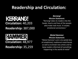
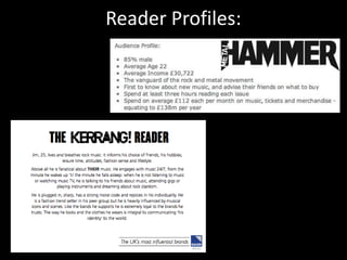
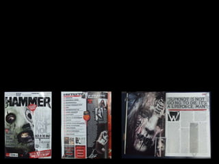
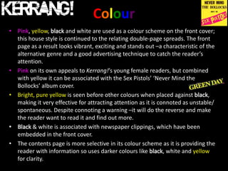
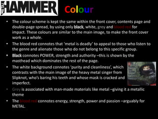
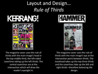
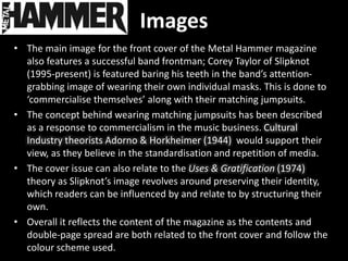
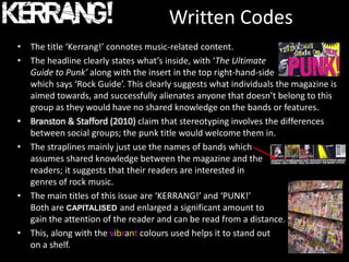
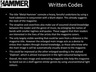
The document analyzes Kerrang! and Metal Hammer magazines due to their coverage of punk music genres relevant to the author's own magazine. Kerrang! has a circulation of 40,203 and readership of 387,000, focusing on emotional connections to rock music. Metal Hammer has a circulation of 48,977 and readership of 35,259, aiming to satisfy established metal fans and break new artists. Both magazines are published by large multimedia companies and target male audiences through their coverage of concerts and albums.