This magazine cover breaks conventions in its layout. It places the large masthead in front of the main image rather than behind it. There are many small additional images throughout the cover rather than just focusing on one main image. This spreads the message in a more modern, rule-breaking way to attract younger readers. The informal, casual language and styles used also appeal to younger audiences. Overall the unconventional design is bold, eye-catching and tailored to engage its target demographic.
UX@AddThis
At AddThis we design products that are used on over 15 million websites, loaded over 1.1 trillion times annually and reaching 1.9 billion people monthly in 70 languages all over the world. As a small company, we’ve had to get creative to scale product design that evolves quickly with customer needs and a rapidly changing technology landscape.
In this session you’ll learn how we’ve taken ideas from agile development, lean UX methodologies, and organizational design strategies to come up with our own flavor of rapid design and product development.
In this talk Jim will touch on team structure, project process, designing for scale, putting data to work, iterating on process design, and tools, tips and tricks for making things work smoothly.
About Jim
Jim is Vice President of User Experience at AddThis. He founded NoVA UX in 2012 to provide learning and networking opportunities for UX students and professionals in the Northern Virginia/DC metro area.
NoVA UX Meetup: Product Testing and Data-informed DesignJim Lane
These are the slides for the January 2013 NoVA UX Meetup in Vienna, VA. VP of UX Jim Lane shared tips, tools, and research strategies that the AddThis has used to develop publisher products used on over 14 million websites.
Slides from Chrissy Ching's presentation on how to land a job in UX, which she presented at the October NoVA UX Meetup.
Chrissy can be reached by email at CChing at HireStrategy.com.
Join us at an upcoming meetup: http://meetup.com/nova-ux
Follow us on Twitter: http://twitter.com/novauxmeetup
This is a five minute lightning talk presented by Jim Lane, Director of User Experience for Clearspring Technologies, at the Web Intents Design Push on February 25th, 2012 in Brighton UK. Jim described the AddThis platform, how it works, what publishers look for in sharing tools, and design strategies to meet those needs. The goal of the presentation was to help inform exploratory Web Intents design sessions later that day.
NoVA UX User Testing Workshop July 2015 - Will KingJim Lane
Summary
User testing is something we all know we should do with our products or websites, but we seldom do because of perceptions of expensive time/financial commitments or that it is difficult to do. The reality couldn't be further from the truth! Join us for our testing workshop and learn user testing best practices and get hands on experience testing your own/your company's website, app, product. We encourage you to have a website or app you want to test ready when you arrive. We'll be pairing into small groups and giving everyone chances to moderate and test.
About Will King
Will works as a product manager and user researcher for AddThis and he also co-organizes NoVA UX. He's conducted user research for Fortune 500 companies, start-ups, government agencies, and most proudly, for AddThis. His educational background is in cognitive psychology, so watch out, he might psycho-analyze you if you're not careful ;). Will enjoys watching/reading sci-fi, bushwhacking, and the occasional RPG.
An attempt to know, how Fiat is doing great in Brazil and not at all good in India. Further, there are ways mentioned in the document through which Fiat can gain some substantial market share.
It is a basic document created for knowledge sharing purpose about Viral Marketing or Viral Advertising for beginners or even marketers to know about the basics of Viral Marketing.
I was asked to make a digital strategy presentation for Hyundai Creta launch. Here it is that for the world to see.
Though the interviewer never called back even to criticise my effort at least. I am very happy that I worked those grey cells a bit more.
I had kept the strategy very basic and so you may find room of improvement in terms of fleshing out the strategy... but you know that was the idea for me (to have the interviewer at least call and discuss the effort in detail.)
Feel free to pour your feedback.
PS: obviously this is a toned down version in terms of aesthetics for slideshare compatibility. Get in touch for the actual document in case you need.
UI Testing Automation - Alex Kalinovsky - CreamTec LLCJim Lane
Presentation by CreamTec CEO Alex Kalinovsky at the March NoVA UX meetup at AddThis. Alex talks about the importance of visual interface testing, current tools and methodologies, and introduces his company's solution called Screenster.
हम आग्रह करते हैं कि जो भी सत्ता में आए, वह संविधान का पालन करे, उसकी रक्षा करे और उसे बनाए रखे।" प्रस्ताव में कुल तीन प्रमुख हस्तक्षेप और उनके तंत्र भी प्रस्तुत किए गए। पहला हस्तक्षेप स्वतंत्र मीडिया को प्रोत्साहित करके, वास्तविकता पर आधारित काउंटर नैरेटिव का निर्माण करके और सत्तारूढ़ सरकार द्वारा नियोजित मनोवैज्ञानिक हेरफेर की रणनीति का मुकाबला करके लोगों द्वारा निर्धारित कथा को बनाए रखना और उस पर कार्यकरना था।
03062024_First India Newspaper Jaipur.pdfFIRST INDIA
Find Latest India News and Breaking News these days from India on Politics, Business, Entertainment, Technology, Sports, Lifestyle and Coronavirus News in India and the world over that you can't miss. For real time update Visit our social media handle. Read First India NewsPaper in your morning replace. Visit First India.
CLICK:- https://firstindia.co.in/
#First_India_NewsPaper
31052024_First India Newspaper Jaipur.pdfFIRST INDIA
Find Latest India News and Breaking News these days from India on Politics, Business, Entertainment, Technology, Sports, Lifestyle and Coronavirus News in India and the world over that you can't miss. For real time update Visit our social media handle. Read First India NewsPaper in your morning replace. Visit First India.
CLICK:- https://firstindia.co.in/
#First_India_NewsPaper
role of women and girls in various terror groupssadiakorobi2
Women have three distinct types of involvement: direct involvement in terrorist acts; enabling of others to commit such acts; and facilitating the disengagement of others from violent or extremist groups.
‘वोटर्स विल मस्ट प्रीवेल’ (मतदाताओं को जीतना होगा) अभियान द्वारा जारी हेल्पलाइन नंबर, 4 जून को सुबह 7 बजे से दोपहर 12 बजे तक मतगणना प्रक्रिया में कहीं भी किसी भी तरह के उल्लंघन की रिपोर्ट करने के लिए खुला रहेगा।
01062024_First India Newspaper Jaipur.pdfFIRST INDIA
Find Latest India News and Breaking News these days from India on Politics, Business, Entertainment, Technology, Sports, Lifestyle and Coronavirus News in India and the world over that you can't miss. For real time update Visit our social media handle. Read First India NewsPaper in your morning replace. Visit First India.
CLICK:- https://firstindia.co.in/
#First_India_NewsPaper
In a May 9, 2024 paper, Juri Opitz from the University of Zurich, along with Shira Wein and Nathan Schneider form Georgetown University, discussed the importance of linguistic expertise in natural language processing (NLP) in an era dominated by large language models (LLMs).
The authors explained that while machine translation (MT) previously relied heavily on linguists, the landscape has shifted. “Linguistics is no longer front and center in the way we build NLP systems,” they said. With the emergence of LLMs, which can generate fluent text without the need for specialized modules to handle grammar or semantic coherence, the need for linguistic expertise in NLP is being questioned.
Do Linguistics Still Matter in the Age of Large Language Models.pptx
Magazine Cover Analysis 2
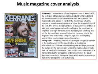
1. Music magazine cover analysis Masthead- The masthead of this magazine cover is ‘KERRANG!’, the text is on a black banner making the bold white text stand out even more as it contrasts with the dark background. The masthead is also placed in front of the main image which is unusual as usually magazines tend to place the image in front of the text. This breaks the conventions of a usual layout and has a take on a more bolder and modern effect as the masthead is amplified to a high standard and is incredibly eye catching. It is key for the masthead to stand out as it is the main title of the magazine and is also the a company logo that is competing against other music magazines on the market. Selling Line- The selling line would usually be the yellow banner at the top however, in this case the line at the top is a information on a feature and the selling line would probably be the button on the bottom right under the masthead as it reads ‘THE UK’S BIGGEST GIG GUIDE’. This breaks the conventions of a standard layout for a magazine and instead makes the cover layout more modern, young and fresh which would be the target market for a magazine such as Kerrang.
2. Music magazine cover analysis Main Image- The main image is of the lead singer of Foo Fighters. The shot is a semi-close up shot with the model facing slightly to the right. The angle of the photo gives a more casual feel to the main image as the model is not in any special or professional looking pose and looks casual which suits the general genre of the magazine and is also a more appealing approach to a younger generation of audience. The lighting of the photograph is mid tone giving the older aged model a soft lighting on the face and also adding to the casual theme of the front cover. The model is dressed in all black making the text stand out. Other Images- There are a lot of small images placed on the front cover. This is unusual as not many music magazines tend to place extra images on the front cover as there is a potential risk of drawing attention away from the main image. This layout breaks conventions again and spreads a wider message of being rule breaking, young, modern and bold. The images allow the readers to have more insight to what will be inside the content of the magazine and also draws in more visual attention as a young audience is more likely to be attracted by images rather than a lot of text. Having the extra images allows the cover to advertise and sell the magazine as it reveals the famous faces that will be included in the issue and will instantly catch the audience’s attention.
3. Music magazine cover analysis Colour Scheme- The colour scheme of the magazine is red, yellow, white and black. The white and black come from the main image and background as the model is dressed in all black and the background is a plain white. Any black and white used in the text will also compliment the masthead. There is no red or white apparent in the main image, however there are hints of these colours in the other images. The badges on the hat of the male artist on the left has red and yellow on it and the male singer on the right also has bright, yellow toned hair, accompanying the colour scheme of the magazine; or the text accompanying the images. Button- There are two buttons on the front cover; the first is the selling line in a button on the right under the masthead. The button almost looks like a stamp as it is stylised in this form, a stamp style almost gives an impression of being official or authorised which is appropriate for the text inside it as it shows the quality of the magazine is also a title being ‘THE UK’S BIGGEST GIG GUIDE’. The second button is for a prize as it says in bold letters ‘WIN!’ with brief details of the prizes. A star shaped button is usually used as sale marks or winning products and so this is familiar and readers will instantly know what it is all about. Having a button for this particular information also makes the text stand out.
4. Music magazine cover analysis Kicker- In this front cover, the kickers are mainly names of artists that are being featured and the extra images also work as a form of a kicker. The main kicker is the name of the main feature, ‘DAVE GROHL’ (lead singer of Foo Fighters). The font of the kicker is largest out of all kickers as it is important for this kicker to be the main feature as Dave Grohl is the front cover and main attribute to the magazine. Explanatory- The explanatory text consists of quotes from interviews and catchy phrases. Quotes will allow the reader to instantly know that there are interviews inside the magazine and also allows the reader to feel connected to the interviewee. There are also direct pieces of text such as ‘we make a great band’ this allows the readers to become engaged and draws more attention as the audience is made to feel exclusive and personal. Font- On this front cover, there are at least 7 types of font which is unusual for a front cover as usually, magazines tend to stick to 3 types; keeping a thematic, proffesional and neat look. This magazine cover breaks conventions in various ways to create a different, new and edgy twist to the cover.