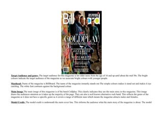
1. Target Audience and genre- The target audience for this magazine is for older teens from the age of 16 and up until about the mid 30s. The bright
colours indicate the target audience of the magazine as we associate bright colours with younger people.
Masthead- Name of the magazine is BillBoard. The name of the magazine instantly stands out The simple colours makes it stand out and makes it eye
catching. The white font contrasts against the background colour.
Main Image The main image of this magazine is of the band Coldplay. This clearly indicates they are the main story in this magazine. This image
draws the audiences attention as it takes up the majority of the page. They are also a well known alternative rock band. This reflects the genre of the
magazine as it does not have a specific genre as it covers a range of different stars which means the magazine attracts males and females.
Model Credit- The model credit is underneath the main cover line. This informs the audience what the main story of the magazine is about. The model
2. credit is directly underneath the main cover line to emphasis its importance and to catch the readers attention more than the other cover lines.
Main Cover Line Coldplay- The name of the band is big and bold and it contrasts against the image of the band and it catches the reader's attention
first which emphasises they are the main story in the magazine.
Banners/ Flashes/ badges- Barcode- essential for every magazine cover . It tells the date and the price of the magazine. It does not have to match the
rest of the covet.
Cover Lines The other cover lines are in white and bold as well as the model credit to make them stand out but the are not as eye catching as the model
credit or the main cover line which means they are not as important and does not immediately catch the reader's attention.
Colours/ Typefaces/ House Style- In every BillBoard magazine the name of the magazine is always in white with the colour blue in the 'a' and the
yellow in the 'd'. The same colours are always used which is the house style of the magazine. The white bold magazine name stands out against the
background which is done to catch the reader's attention. The yellow and blue in the magazine name indicate the target audience as young magazines
are associated with bright colours.
The Gutenberg Design Principle- Immediately the reader's attention goes to the name of the magazine in the top left hand corner which is known as
the primary optical area. This is done on purpose to inform the reader what type of magazine it is. The next place to look is the bottom right which is
known as the terminal area where the smaller less important information is. Next area to look is the top right corner which is known as the strong
fallow area. Then last is the bottom right corner which is known as the weak fallow area.