1. Target Audience and genre- Target Audience
isfor an olderaudience of 25+ as it looks
more sophisticatedthanayoungeraudience
magazine.The calmcoloursindicate the
olderaudience aswe associate younger
magazineswithvibrantcolours.
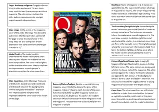
Main Image- In the centre of the magazine
coverof the Arctic Monkeys.Thisdrawsthe
audience’sattentionasittakesupmost of
the page toshowthe importance of the
story. Theyare alsoa verywell-known
alternative rockbandcommonlyof the type
featuredin“Q”.
Main CoverLine-ArcticMonkeys.The name
of the bandis bigand boldandit contrasts
withthe dark colourof the backgroundto
immediatelycatchthe reader’sattention.
Thisemphasisesthe storyhasmore
importance thanthe othercoverlinesshown
on the page.
Model Credit—The model creditis
underneaththe model creditof the Arctic
Monkeysthisinformsthe readerwhatthe
mainstory isabout.The coverline isslightly
bolderthanthe othercover linestoemphasis
the importantand to catch people’s
attentionmore thanthe othercoverlines.
Colours/Typefaces/House style- IneveryQ
Magazine the logo(Masthead) isalwaysinthe top
lefthandcorner.The same coloursare alwaysused
whichisthe house style of the magazine.The white
contrast againstthe redand the mastheadstands
out againstthe dark coloursof the background
whichisdone to catch the reader’sattention.The
coloursalsoindicate the targetaudience asyoung
magazinesare associatedwithbrightcolours.
Masthead- Name of magazine isQ.it standsout
againstthe red.The logoinstantlyshowswhattype
of magazine itis(Music).The simple magazinetitle
makesitstand outand makesit eye catching.The q
couldalsomeana musical Qwhichadds to the type
of magazine itis.
The GutenbergDesignPrinciple- Immediatelythe
reader’sattentiongoestothe Q whichisknownas
primaryoptical area.This is done onpurpose to
informthe readerwhattype of magazine itis. The
nextplace tolookis the bottomright (terminal
area) where the smaller,lessimportantcoverlines
are.Nextisthe top right corner(Strongfallowarea)
where the lessimportantinformationisheld.Then
lastis the bottomright(weakfallowarea) where
the model creditiswhichcatchesthe reader’s
attentionasit standsout.
Cover lines- The othercoverlinesare still inbold
and white tomake themstandout but theyaren’t
as eye catchingas the model creditor the main
coverline whichmeanstheyare lessimportantand
doesn’timmediatelycatchthe reader’sattention.
Banners/Flashes/badges- Barcode- essential forevery
magazine cover.Ittellsthe date andthe price of the
magazine.Itdoesn’thave tomatch the restof the cover.
Advertisementatthe top pf the magazine standsout
colourwise asit is brightblue thiscatchesthe reader’s
attentionwhich alsomakesthemmore intriguedtoread
the magazine.The advertisementisusedtohelpsell the
magazine topeople