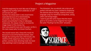
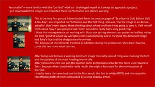
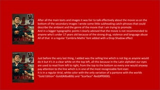
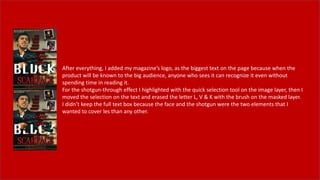
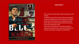
This document describes a proposed magazine cover design project for Scarface, which is celebrating its 35th anniversary. The designer chose Scarface as it has had a powerful visual impact over the years. Secondary images and quotes from positive movie reviews are included. Text boxes advertise the anniversary, describe the movie's genre, and warn about mature content. The final design is presented, incorporating the main character's face, weapon, title text, and the designer's magazine logo. Feedback has been positive, attracting interest in the movie from those unfamiliar with it.
2137ad Merindol Colony Interiors where refugee try to build a seemengly norm...luforfor
This are the interiors of the Merindol Colony in 2137ad after the Climate Change Collapse and the Apocalipse Wars. Merindol is a small Colony in the Italian Alps where there are around 4000 humans. The Colony values mainly around meritocracy and selection by effort.
Hadj Ounis's most notable work is his sculpture titled "Metamorphosis." This piece showcases Ounis's mastery of form and texture, as he seamlessly combines metal and wood to create a dynamic and visually striking composition. The juxtaposition of the two materials creates a sense of tension and harmony, inviting viewers to contemplate the relationship between nature and industry.
Explore the multifaceted world of Muntadher Saleh, an Iraqi polymath renowned for his expertise in visual art, writing, design, and pharmacy. This SlideShare delves into his innovative contributions across various disciplines, showcasing his unique ability to blend traditional themes with modern aesthetics. Learn about his impactful artworks, thought-provoking literary pieces, and his vision as a Neo-Pop artist dedicated to raising awareness about Iraq's cultural heritage. Discover why Muntadher Saleh is celebrated as "The Last Polymath" and how his multidisciplinary talents continue to inspire and influence.
2137ad - Characters that live in Merindol and are at the center of main storiesluforfor
Kurgan is a russian expatriate that is secretly in love with Sonia Contado. Henry is a british soldier that took refuge in Merindol Colony in 2137ad. He is the lover of Sonia Contado.
Fed by curiosity and beauty - Remembering Myrsine Zorba
Unit 14: Digital Magazine-pt.1
1. Project a Magazine
From the beginning my main idea was to design a
magazine for Scarface which celebrates its 35th
anniversary this year.
Scarface has always been a very visual movie
especially because of its merchandising,
personally I’ve seen lots of Scarface’s
posters around barber’s shop or takeaways
restaurants, this always meant to me that the
image impact of this movies has
been very powerful even over the years, so this is
the main reason why I’ve chosen Scarface.
The second reason why I chose this movie it’s
because it is one of my favorite movies, even
though the running time lasts 170 minutes, the
rhythms of the sequences of the movie are
perfect, and the clean directing made me never
stop watching it and it never got me bored.
The characters, the soundtrack, the script are all
perfect and with my cover I wanted to emphasize
the extreme abuse of drugs, violence and strong
language using me myself too strong fonts, strong
colors and strong images.
I want to give the same impact that the movie
gave to me at first, so my magazine has to give
the same ”Pushing it to the Limit” sensation.
2. Market Research
First I searched for some trending movies magazines cover, just for have a look
about what works in the market and what people usually buy and what the
audience is ok with.
Then because Scarface was my first choice from the beginning, I searched for
some gangster movies magazine covers where it’s obvious the clear visibility of
the face and the weapon(where there is) of the main character.
3. ”Blvck Mag” is the name of my magazine, which will be digital on its own website linked
with a main Instagram page.
The target of the magazine has a 17 to 25 years old audience, this because the magazine
genre will be a mix of teen movie and music kind.
Blvck it’s pronounced Black, this because in the trap music for slang the letter A is
usually written as a v, that explains immediately which type of communication will be
used.
The name ‘blvck’, the thematic and the language used it’s really close to the Afro-
American culture, all the music articles will be pointed on the Hip Hop, RnB, Blues and
Soul kind and all the movies will be related to Gangster, Mafia and Ghetto imaginary or
will the ‘Big Pieces’ in the Afro-American Hollywood industry; For Example: Denzel
Washington, Samuel L. Jackson, O’Shea Jackson, etc.
Even if the magazine will be available online to anyone, the main target is the street-
imaginary close youth.
The original logo doesn’t have anything special, it just has to be perfectly readable
and clear to everyone, it is very simple as most of the magazine logos and it works
on positive and on negative.
4. Why Digital?
The main link to the website will be the Instagram page which with the swipe up and IGTV is becoming more and
more comfortable.
Instagram also is related to Facebook and all the Zuckerberg’s social media so this make the magazine compatible on
more media platforms.
The magazine will also have his website with the advertisement collaborations and every article will be linked to his
Instagram post and highlighted story with the swipe up link.
Every Instagram user will be able to see the post with the highlights but to access the whole article it will have to be
paid on the official website
5. Layout roughs
The first thing I did for the project was thinking about a setting layout of the main element of the magazine cover so I
started drawing roughly some drafts on paper so I could have a basic idea of how I was going to set my elements.
For example:
6. Personally I’m more familiar with the ”on field” work so I challenged myself as I always do approach a project.
I just downloaded the images and imported them on Photoshop and started working.
This is the very first picture I downloaded-from the amazon page of ”Scarface 4k Gold Edition DVD
& Blu-Ray”- and imported on Photoshop and the first thing I did was crop the image in an A4 size,
actually I didn’t even stayed there thinking about where and how I was going to crop it, I left myself
think about how it was going to look “cool” so luckily I really had a very good crop.
I think that my experience on working with illustrator setting elements on posters or leaflets makes
me crop “good”(I would say workable) shots automatically and in my mind the dominant image
had Tony’s face and the shotgun clearly on view.
This because all the elements I wanted to add later during the production, they didn’t have to
cover this two main visual catches.
After being sure to have a working dominant image the really second thing was choosing the font
and the position of the main heading/movie title.
After various tries the size and the position came by themselves but for the font I used ‘Javanese
Texts’ because when stretched it really recalls the original font used for the movie poster of
Scarface.
I overlie twice the same text box for the final result, the first in white(#ffffff) and the second in
red(#ff0000),both of them surrounded by a Drop Shadow effect.
7. ”Say Hello To My Little Friend” is the catch-phrase of the whole project as is one of the most
famous quotes from the movie and it’s very often used for fan-made or professional
realizations of posters and merchandising for the movie.
The text is in capital ‘Cambria Math’ font (like most of the text boxes of the magazine)
surrounded by a Drop Shadow effect.
The biggest challenge was the positioning of the text box after changing size and position the
quote seemed to me suiting very good on Tony’s shoulder, just a little bit lower than his head.
Zapping on web searching for information about the movie I found out that the movie had just
nearly celebrated its 35th anniversary of release in the theatres. So it really looked fine to me if
I could market-press on this point.
The text is in regular ‘Cambria Math’ font and finally stretched in vertical, in the end I addeda
Bevel & Emboss effect.
8. The movie has always been very liked from the critics and from the public so if anyone sees
the magazine but never heard of the movie has to be attracted by and has to be convinced
to buy the ticket for the cinema and go watch it.
I used one of the often used market strategy, which is quoting the best reviews about the
movie and print it for the big audience.
So I scrolled through various websites and I chose the two that convinced me more, I read
through two big movie review websites, which are Empire and The Guardian, who voted 5
and 4 stars for the movie, I also copied and pasted the 2 quotes that could convince more
the target and paged all a little higher than the shotgun without going too much over it
Adding some secondary images was already present in my plan but even if I
did some on paper drafts, actually I didn’t follow entirely any of them.
During the work it was impossible to not notice that there was too much
space in the right top of the page so that was the perfect place where to place
the secondary images with a little white border did with the brush tool
9. After all the main texts and images it was fair to talk effectively about the movie so on the
bottom of the secondary images I wrote some little subheading catch-phrases that could
describe the ambient and the genre of the movie that I am trying to promote.
And in a bigger typographic points I clearly advised that the movie is not recommended to
anyone who’s under 17 years old because of the strong drug, violence and language abuse
All of that in a regular ‘Cambria Maths’ font added with a Drop Shadow effect
Just before the very last thing, I added was the selling line which is not big as anyone would
do it but it’s in a clear white on the top left, all this because in the Latin alphabet our eyes
are used to read from left to right, from the top to the bottom so every one would anyway
pay attention to the line which is in one of the most recognizable font ever.
It is in a regular Arial, white color with the only variation of a pantone with the worlds
”Gold Edition”-Gold(#dba80b) and “Scarface”-Red(#ff0000).
10. After everything, I added my magazine’s logo, as the biggest text on the page because when the
product will be known to the big audience, anyone who sees it can recognize it even without
spending time in reading it.
For the shotgun-through effect I highlighted with the quick selection tool on the image layer, then I
moved the selection on the text and erased the letter L, V & K with the brush on the masked layer.
I didn’t keep the full text box because the face and the shotgun were the two elements that I
wanted to cover les than any other.
11. FINAL RESULT
This is the main idea that I want to purpose to the
market.
I really feel proud of my work because showing it
to various people that I know and I don’t know, it
really seems working even on people that have
never seen the movie and they felt attracted by
the kind and the film itself.
I feel some uniformity in the whole setting of
elements and colors and I also think that the font
and the text boxes are light and well placed