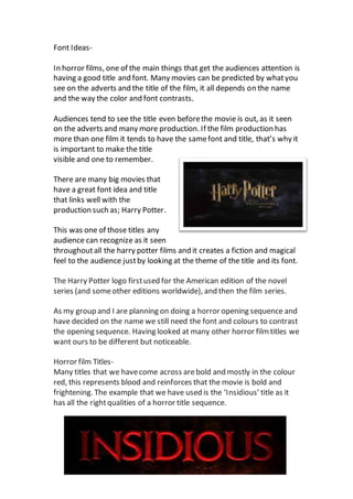
The document discusses font and title design for horror films. It notes that the title and font are important for grabbing audience attention and setting expectations. It highlights the Harry Potter title sequence as one that created a magical feel through its consistent font and title across films. The document concludes by stating that the group planning a horror opening sequence has chosen a name but still needs to design the font and colors to make the title noticeable yet different from other horror films, many of which use bold red fonts alluding to blood.