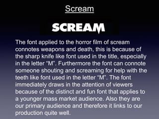
Final Research
fundamental elements of our production
Blair witch project
Blair witch project title font that is used for the film,
immediately suggests that from just looking at the
font it connotes having supernatural events that
occur, super natural suggests the meaning of
relating to things that cannot be explained
according to natural laws like ghosts, spirits and
having a super natural force. This relates to the
font as it looks like it is floating above the
woman’s head in the picture which can connote a
supernatural force holding it up. Also the font is
sharp from the serif font that has been used it on
the lettering this can connote weaponry such as
knifes as they are sharp which are used to injure
people, this connotes danger. Furthermore the
title font used for this supernatural horror film,
ultimately sets the tone of horror and mystery
because the font used is quite harsh to the eye
with the sharp corners and the slight shadowing
backing the letters. This connotes a bigger force
The font used for the title of paranormal activity connotes loneliness from
the lettering being so far aside from each other and the lettering not being
joined together. It connotes lonliness because of the lettering being
distant to each other.Furthermore the television like font also suggests
that you are being watched, from the textured lines running through the
individual letters.We can also say that the shadow, backing the lettering
connotes that someone is always there watching you which relates to the
story line of paranormal activity if a supernatural figure haunting the family
in the narrative. The use of red that is associated in the title of the font
connotes aggression, fear, danger and blood. Red is a very emotionally
intense colour that will stand out in any title.
Paranormal
activity
Scream
The font applied to the horror film of scream
connotes weapons and death, this is because of
the sharp knife like font used in the title, especially
in the letter “M”. Furthermore the font can connote
someone shouting and screaming for help with the
teeth like font used in the letter “M”. The font
immediately draws in the attention of viewers
because of the distinct and fun font that applies to
a younger mass market audience. Also they are
our primary audience and therefore it links to our
production quite well.
• Unknown was our first idea for the title of the film,
however, there is already a film with this name. We
then came up with the name of ‘Unperceived’ a
synonym also this title has not been used for any
other films that have been made. Unperceived is also
a more sophisticated word that will interlink with our
secondary audience. Furthermore It refers to the
unknowing reason of why the dead partner comes
back to haunt the protagonist. We believe that our film
title ‘unperceived’ connotes confusion and because
our genre is supernatural horror the unexplainable
events that occur during our narrative are not able to
be perceived by the characters and the audience.
our chosen film title ‘unperceived’
Skinny Fringe font
Blackout font
Slime Font
FTI64 font
O’Clock shadow font
This font that was found on ‘Dafont’
website, was named scary.TTF. This
sort of font could be used for title for our
film, because of the bold letters that will
attract interest than boring letters with
no shape to the letters.Also the bold
letters may appeal to our specific
audience type of secondary audience of
niche and our primary audience of mass
market because it appeals to a more
unsophisticated audience as it is bold
and in your face, and doesn't need
concentration to figure out what is being
seen as it is simple and big.
Furthermore the font is seen to be cut in
particular places in the letters which can
connote drama that would fit perfectly
into our narrative.
Fonts
This font on the picture shown is
called ‘ShadownsIntoLight.ttf’, it
may be applied to our title font
because it is simplistic yet
effective. By more attention to the
font writing than the narrative,
with this i mean that we want
something that can be used over
the opening sequence and
doesn't detract from it. This can
be used for our film’s title
because like the font it is easy to
read along to and easily
understood. It connotes simplicity
and therefore is not very
Fonts
The font that is seen in the photo
beside is called ‘Death in the
Shadow.ttf’. We think that this
font would be suitable to our film
title because of the filled in font,
which can connote evilness and
death which can share
similarities to our opening scene
of unperceived. Also the sans
serif font flows onto each other
letter like a spirit which can
connote super natural which can
relate to our opening scene and
therefore would suit our film title.
Fonts
The font that was found on da
font, is named ‘BlockShadow-
Regular.ttf’ this font could be
used in our film title because it
would be suitable for our film, this
is because of the shadowing
behind the letters which connotes
someone watching you and
haunting you which relates to our
narrative.
Fonts
Innovative placement of credits in a title sequence
This innovative placement of credits in a title sequence used for ‘Monsters inc’ works
well as you can see that the placement of credits is put in a fun and unique way which
relates to the narrative of the movie of entering the real world through children’s doors.
The placement of the credits work because the colours and font appeal more to the
target audience of younger ages because it is easy to read and the fun shapes make it
more exciting to look at as a younger child. They are fox thinkers because they are
attracted to big visual images and not a lot of text. Therefore why the placement of
credits in monsters inc works well. From this we will be taking inspiration from the
placements of credits but we wont be taking the whole idea from the colour and shape of
the credits because our secondary audience is niche.
The placement of credits used in ‘panic room’ works really well because it
suggests a sense of realism from being set in the location of New York City.
Furthermore the dull colours blend in well with the location which connotes
invasion of personal space because the big font is seen on buildings that you
may live or work in which gives personal identity to the audience. We will take
the placement into consideration for our placement of credits because it
creates tension and a lack of personal space which relates to our narrative as
the antagonist is seen haunting her partner in his house which gives a sense
of invasion of space.
The placement of credits used in the title sequence does work well because in the
narrative it tells a story ‘Psycho’ starting with an insane motel owner who is a killer. The
placement of credits is confusing to look at which relates to the insanity of the antagonist.
The colour green connotes sickness that relates to the mental ill antagonist that is seen to
be insane. Also the blank screens with the writing placed onto it connotes the simplicity of
it, this relates to the simple choice of going to a motel with a blank mind not knowing what
you are in for. We will be using this as inspiration for our placement of credits because it is
simple yet effective. However we would not be using the use of green for our credits
because it doesn't suit our narrative
• As a group we thought the score of a melodic/orchestral score
throughout shots in our narrative. Including instruments such as
violins. Because we believe that it will appeal to a more
sophisticated audience which links to our secondary audience of
niche
• Atonal piece of music which relates to our genre of horror.
Which will help create a mysterious atmosphere to our narrative.
The score would be high pitched making the audience feel
uneasy and have visceral pleasure.
• Another score that could be used for our production would be
orchestral music with scores of cello, viola, violin, piano which
would appeal to a younger audience. The low beat can connote
the feelings of sadness that relates to our characters.
Types of score for our production

Final research

  • 1.
  • 2.
    Blair witch project Blairwitch project title font that is used for the film, immediately suggests that from just looking at the font it connotes having supernatural events that occur, super natural suggests the meaning of relating to things that cannot be explained according to natural laws like ghosts, spirits and having a super natural force. This relates to the font as it looks like it is floating above the woman’s head in the picture which can connote a supernatural force holding it up. Also the font is sharp from the serif font that has been used it on the lettering this can connote weaponry such as knifes as they are sharp which are used to injure people, this connotes danger. Furthermore the title font used for this supernatural horror film, ultimately sets the tone of horror and mystery because the font used is quite harsh to the eye with the sharp corners and the slight shadowing backing the letters. This connotes a bigger force
  • 3.
    The font usedfor the title of paranormal activity connotes loneliness from the lettering being so far aside from each other and the lettering not being joined together. It connotes lonliness because of the lettering being distant to each other.Furthermore the television like font also suggests that you are being watched, from the textured lines running through the individual letters.We can also say that the shadow, backing the lettering connotes that someone is always there watching you which relates to the story line of paranormal activity if a supernatural figure haunting the family in the narrative. The use of red that is associated in the title of the font connotes aggression, fear, danger and blood. Red is a very emotionally intense colour that will stand out in any title. Paranormal activity
  • 4.
    Scream The font appliedto the horror film of scream connotes weapons and death, this is because of the sharp knife like font used in the title, especially in the letter “M”. Furthermore the font can connote someone shouting and screaming for help with the teeth like font used in the letter “M”. The font immediately draws in the attention of viewers because of the distinct and fun font that applies to a younger mass market audience. Also they are our primary audience and therefore it links to our production quite well.
  • 5.
    • Unknown wasour first idea for the title of the film, however, there is already a film with this name. We then came up with the name of ‘Unperceived’ a synonym also this title has not been used for any other films that have been made. Unperceived is also a more sophisticated word that will interlink with our secondary audience. Furthermore It refers to the unknowing reason of why the dead partner comes back to haunt the protagonist. We believe that our film title ‘unperceived’ connotes confusion and because our genre is supernatural horror the unexplainable events that occur during our narrative are not able to be perceived by the characters and the audience. our chosen film title ‘unperceived’
  • 6.
  • 9.
  • 12.
  • 15.
  • 19.
  • 22.
    This font thatwas found on ‘Dafont’ website, was named scary.TTF. This sort of font could be used for title for our film, because of the bold letters that will attract interest than boring letters with no shape to the letters.Also the bold letters may appeal to our specific audience type of secondary audience of niche and our primary audience of mass market because it appeals to a more unsophisticated audience as it is bold and in your face, and doesn't need concentration to figure out what is being seen as it is simple and big. Furthermore the font is seen to be cut in particular places in the letters which can connote drama that would fit perfectly into our narrative. Fonts
  • 23.
    This font onthe picture shown is called ‘ShadownsIntoLight.ttf’, it may be applied to our title font because it is simplistic yet effective. By more attention to the font writing than the narrative, with this i mean that we want something that can be used over the opening sequence and doesn't detract from it. This can be used for our film’s title because like the font it is easy to read along to and easily understood. It connotes simplicity and therefore is not very Fonts
  • 24.
    The font thatis seen in the photo beside is called ‘Death in the Shadow.ttf’. We think that this font would be suitable to our film title because of the filled in font, which can connote evilness and death which can share similarities to our opening scene of unperceived. Also the sans serif font flows onto each other letter like a spirit which can connote super natural which can relate to our opening scene and therefore would suit our film title. Fonts
  • 25.
    The font thatwas found on da font, is named ‘BlockShadow- Regular.ttf’ this font could be used in our film title because it would be suitable for our film, this is because of the shadowing behind the letters which connotes someone watching you and haunting you which relates to our narrative. Fonts
  • 26.
    Innovative placement ofcredits in a title sequence This innovative placement of credits in a title sequence used for ‘Monsters inc’ works well as you can see that the placement of credits is put in a fun and unique way which relates to the narrative of the movie of entering the real world through children’s doors. The placement of the credits work because the colours and font appeal more to the target audience of younger ages because it is easy to read and the fun shapes make it more exciting to look at as a younger child. They are fox thinkers because they are attracted to big visual images and not a lot of text. Therefore why the placement of credits in monsters inc works well. From this we will be taking inspiration from the placements of credits but we wont be taking the whole idea from the colour and shape of the credits because our secondary audience is niche.
  • 27.
    The placement ofcredits used in ‘panic room’ works really well because it suggests a sense of realism from being set in the location of New York City. Furthermore the dull colours blend in well with the location which connotes invasion of personal space because the big font is seen on buildings that you may live or work in which gives personal identity to the audience. We will take the placement into consideration for our placement of credits because it creates tension and a lack of personal space which relates to our narrative as the antagonist is seen haunting her partner in his house which gives a sense of invasion of space.
  • 28.
    The placement ofcredits used in the title sequence does work well because in the narrative it tells a story ‘Psycho’ starting with an insane motel owner who is a killer. The placement of credits is confusing to look at which relates to the insanity of the antagonist. The colour green connotes sickness that relates to the mental ill antagonist that is seen to be insane. Also the blank screens with the writing placed onto it connotes the simplicity of it, this relates to the simple choice of going to a motel with a blank mind not knowing what you are in for. We will be using this as inspiration for our placement of credits because it is simple yet effective. However we would not be using the use of green for our credits because it doesn't suit our narrative
  • 29.
    • As agroup we thought the score of a melodic/orchestral score throughout shots in our narrative. Including instruments such as violins. Because we believe that it will appeal to a more sophisticated audience which links to our secondary audience of niche • Atonal piece of music which relates to our genre of horror. Which will help create a mysterious atmosphere to our narrative. The score would be high pitched making the audience feel uneasy and have visceral pleasure. • Another score that could be used for our production would be orchestral music with scores of cello, viola, violin, piano which would appeal to a younger audience. The low beat can connote the feelings of sadness that relates to our characters. Types of score for our production