(Dipika) Call Girls in Bangur ! 8250192130 ₹2999 Only and Free Hotel Delivery...
In what ways does your media product use, develop or challenge forms and conventions of real media products?
1. -1In what ways does your media product use, develop or challenge forms
and conventions of real media products?
Our media products for ‘The Elusive’ uses, develops and some what challenges forms
and conventions of real media products. Firstly, our main product which was a Horror
Trailer uses these conventions in a way which is very common throughout horror
movie trailers. Horror films are purposely designed to frighten and to cause panic,
dread and alarm and to invoke our inner fears. Therefore these were the first points we
tried to work around linking them to our target audience. Secondly, in terms of the
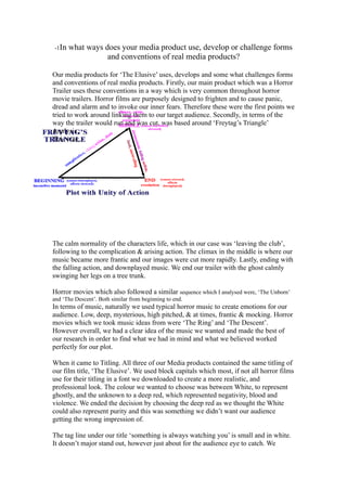
way the trailer would run and was cut, was based around ‘Freytag’s Triangle’
Analysis.
This was;
The calm normality of the characters life, which in our case was ‘leaving the club’,
following to the complication & arising action. The climax in the middle is where our
music became more frantic and our images were cut more rapidly. Lastly, ending with
the falling action, and downplayed music. We end our trailer with the ghost calmly
swinging her legs on a tree trunk.
Horror movies which also followed a similar sequence which I analysed were, ‘The Unborn’
and ‘The Descent’. Both similar from beginning to end.
In terms of music, naturally we used typical horror music to create emotions for our
audience. Low, deep, mysterious, high pitched, & at times, frantic & mocking. Horror
movies which we took music ideas from were ‘The Ring’ and ‘The Descent’.
However overall, we had a clear idea of the music we wanted and made the best of
our research in order to find what we had in mind and what we believed worked
perfectly for our plot.
When it came to Titling. All three of our Media products contained the same titling of
our film title, ‘The Elusive’. We used block capitals which most, if not all horror films
use for their titling in a font we downloaded to create a more realistic, and
professional look. The colour we wanted to choose was between White, to represent
ghostly, and the unknown to a deep red, which represented negativity, blood and
violence. We ended the decision by choosing the deep red as we thought the White
could also represent purity and this was something we didn’t want our audience
getting the wrong impression of.
The tag line under our title ‘something is always watching you’ is small and in white.
It doesn’t major stand out, however just about for the audience eye to catch. We
2. followed the convention of many horror film posters and particularly, ‘The woman in
black’. In addition the font was the same for everything on the poster apart from the
billing block which we used conventionally like all movie posters not only the horror
genre.
When it came to our poster, the way in which I believe we challenged typical
conventions of Horror was our image. Unlike most pictures, it doesn’t give much
away towards the films plot line. Its mysterious, hair covering one eye and the pinkie
chapped lips. However is also somewhat bright and unrealistic. Having said this, the
picture still works well and the way in which we edited it, stands out and is of very
good quality which as a group, we were very happy with. In terms of its layout, we
stuck to the conventions of stereotypical Horror film posters. The title:image ratio was
similar to most posters we looked at. However the positioning of Title, snippet review,
image, tag line & billing block differs from poster to poster. However we including all
of them effectively.
Our magazine cover also, follows the forms and conventions of typical magazine
covers. Especially a horror based one. We have included the tag line at the top of the
bold Red masthead as it draws audiences in immediately. We have the date & price,
cover lines, web link, issue number, ‘Exclusive stories’ and the main star taking up at
least 60% of the whole cover. We stuck to a main colour scheme which was mainly
red and white. This is also a theme reflecting in our product, Good vs. Evil. However
these colours worked well together, conform to horror & stood out well against the
image of Gretel. We challenge real media conventions in terms of our titling as most
magazine covers have their titles overlapping with their images. In some cases where
a whole letter is missing such as ‘EMPIRE’, however realistically only well
established magazines use this quality and we wanted to ironically stick to
conventions and not use this element as our product is not a real established
magazine.
When it came down to our target audience, having our audience relate to our
characters was very important. Although sticking to conventions is important, in this
case we tried the best of our ability to focus on target audience. For example, the
costume used. We have our character ‘Rachael’ in a leopard print dress which is
currently ‘on trend’ in the fashion world. Moreover, the same comes down to the red
heels. The reason we did this was, when our audience see our trailer, these eye
catching items will not only make the time era relevant, however will relate to many
teenage girls fashion taste. Realistically, this will make the film experience positively
scarier as our target audience which we found to be late teens-early twenties will find
things in common with our characters.