Evaluation - Question 1

 In what ways does you media product use, develop or
challenge forms and conventions of real media products?
Conventions of film openings
I learned that there are certain types of forms and conventions that create
film openings. For example:

The conventional order of title sequences: the order is very essential
because it has to follow an specific structure.

The sound used which sets the mood: having sound that matches the pace
of the movie help to create tension and give a clearer sense to the plot.

The story introduction which can establish key characters: the way the
introduction is structured can help to introduce certain characters to the
audience, which helps to understand the plot better.

Specific shots that create tension: shots such as close ups and medium
shots can give the audience a clear sense of the atmosphere in which the
scene is set in.

Key locations and props: the location supports the plot to be more realistic.
Also, the props used can help to structure the characters and their role.

These are all things that make up a good film opening and that demonstrate
my knowledge on all the areas that need to be addressed when creating
one.
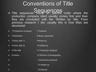
Conventions of Title
Title
                   Sequences
          sequences follow an specific order where  the
production company ident usually comes first and then
they are concluded with the ‘Written by’ title. From
previous research I did, usually this is how titles are
structured:
1 Production company   7 Costume

2 Distributor          8 Music supervisor

3 Actor (star 1)       9 Music by

4 Actor (star 2)       10 Edited by

5 Film title           11 Production designer

6 Actors…              12 Director of photography

                       13 Executive producer

                       14 Written by

                       15 Director
Conventions of Title
              Sequences
Usually, the usual fonts that are usually used for titles are:

- Helvetica Neue

- Arial

- Tahoma

The titles have to be big and readable enough so that the audience are
able to understand them. Also, the speed in which they are shown are
roughly about 2 or 3 seconds. If they were to be longer it would become
boring for the viewer.

The colour of the titles usually depend on the background in which they are
in. If the background is dark, then the titles should be brighter, and if the
background is bright, then the font should be darker. This is mainly so it’s
visible when the clip is playing. The font should be consistent.

The transitions are mainly edited so that they flow with the pace of the clip.
Fading effects are mostly used in order to style the way the titles appear.
Conventions on my film
              opening
Conventional Order

For my thriller opening, I tried to create the order for the titles as organized as
possible. It was not necessary to add some specific titles so I shortened up the
amount of titles included. This is the conventional order I used:

1 Production Company Ident

2 Title of Film

3 Production company

4 Star 1

5 Star 2

5 Casting

6 Music supervised by

7 Edited by

8 Directed by

10 Written by
Conventions of Title Sequence
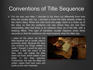
For my own own titles, I decided to lay them out differently from how
they are usually laid out. I decided to have the titles already written in
the man’s diary. When the man turns the page, there is a close up of
the diary so that the audience can see where they are and then
immediately after that there is an extreme close up of the title, with a
shaking effect. This type of transition usually happens every three
seconds so that the audience can read properly what the titles say.
I opted for the colour red for the
titles because red is usually used to
symbolize death. Because the diary
only contains evil things related to
death I thought it would be good to
connect it with the colour of the
titles. Also, red makes the titles
stand out more, which makes it look
better in the final outcome.
Furthermore, the way the tittles are
written makes them look scary and
builds up the main character.
Personal note – Title Sequence

 Learning about the conventional order of title sequences was
 very interesting because before I was taught about it, I never
 actually paid attention to the amount of work and detail that
 goes into creating a title sequence. I appreciate more now the
 way in which they are crated and I also get inspiration from
 different title sequences in order to use learned skills for future
 projects.

 My media product has responded well to the way real media
 products use their forms and conventions because the fact that
 a similar order for titles sequence was followed proves that I
 have used previous examples in order to inspire my own media
 product. From the rough idea that I had to the final there was
 been a strong development that expanded my knowledge in this
 area of media.

Question 1 presenation

  • 1.
    Evaluation - Question1 In what ways does you media product use, develop or challenge forms and conventions of real media products?
  • 2.
    Conventions of filmopenings I learned that there are certain types of forms and conventions that create film openings. For example: The conventional order of title sequences: the order is very essential because it has to follow an specific structure. The sound used which sets the mood: having sound that matches the pace of the movie help to create tension and give a clearer sense to the plot. The story introduction which can establish key characters: the way the introduction is structured can help to introduce certain characters to the audience, which helps to understand the plot better. Specific shots that create tension: shots such as close ups and medium shots can give the audience a clear sense of the atmosphere in which the scene is set in. Key locations and props: the location supports the plot to be more realistic. Also, the props used can help to structure the characters and their role. These are all things that make up a good film opening and that demonstrate my knowledge on all the areas that need to be addressed when creating one.
  • 3.
    Conventions of Title Title Sequences sequences follow an specific order where the production company ident usually comes first and then they are concluded with the ‘Written by’ title. From previous research I did, usually this is how titles are structured: 1 Production company 7 Costume 2 Distributor 8 Music supervisor 3 Actor (star 1) 9 Music by 4 Actor (star 2) 10 Edited by 5 Film title 11 Production designer 6 Actors… 12 Director of photography 13 Executive producer 14 Written by 15 Director
  • 4.
    Conventions of Title Sequences Usually, the usual fonts that are usually used for titles are: - Helvetica Neue - Arial - Tahoma The titles have to be big and readable enough so that the audience are able to understand them. Also, the speed in which they are shown are roughly about 2 or 3 seconds. If they were to be longer it would become boring for the viewer. The colour of the titles usually depend on the background in which they are in. If the background is dark, then the titles should be brighter, and if the background is bright, then the font should be darker. This is mainly so it’s visible when the clip is playing. The font should be consistent. The transitions are mainly edited so that they flow with the pace of the clip. Fading effects are mostly used in order to style the way the titles appear.
  • 5.
    Conventions on myfilm opening Conventional Order For my thriller opening, I tried to create the order for the titles as organized as possible. It was not necessary to add some specific titles so I shortened up the amount of titles included. This is the conventional order I used: 1 Production Company Ident 2 Title of Film 3 Production company 4 Star 1 5 Star 2 5 Casting 6 Music supervised by 7 Edited by 8 Directed by 10 Written by
  • 6.
    Conventions of TitleSequence For my own own titles, I decided to lay them out differently from how they are usually laid out. I decided to have the titles already written in the man’s diary. When the man turns the page, there is a close up of the diary so that the audience can see where they are and then immediately after that there is an extreme close up of the title, with a shaking effect. This type of transition usually happens every three seconds so that the audience can read properly what the titles say. I opted for the colour red for the titles because red is usually used to symbolize death. Because the diary only contains evil things related to death I thought it would be good to connect it with the colour of the titles. Also, red makes the titles stand out more, which makes it look better in the final outcome. Furthermore, the way the tittles are written makes them look scary and builds up the main character.
  • 7.
    Personal note –Title Sequence Learning about the conventional order of title sequences was very interesting because before I was taught about it, I never actually paid attention to the amount of work and detail that goes into creating a title sequence. I appreciate more now the way in which they are crated and I also get inspiration from different title sequences in order to use learned skills for future projects. My media product has responded well to the way real media products use their forms and conventions because the fact that a similar order for titles sequence was followed proves that I have used previous examples in order to inspire my own media product. From the rough idea that I had to the final there was been a strong development that expanded my knowledge in this area of media.