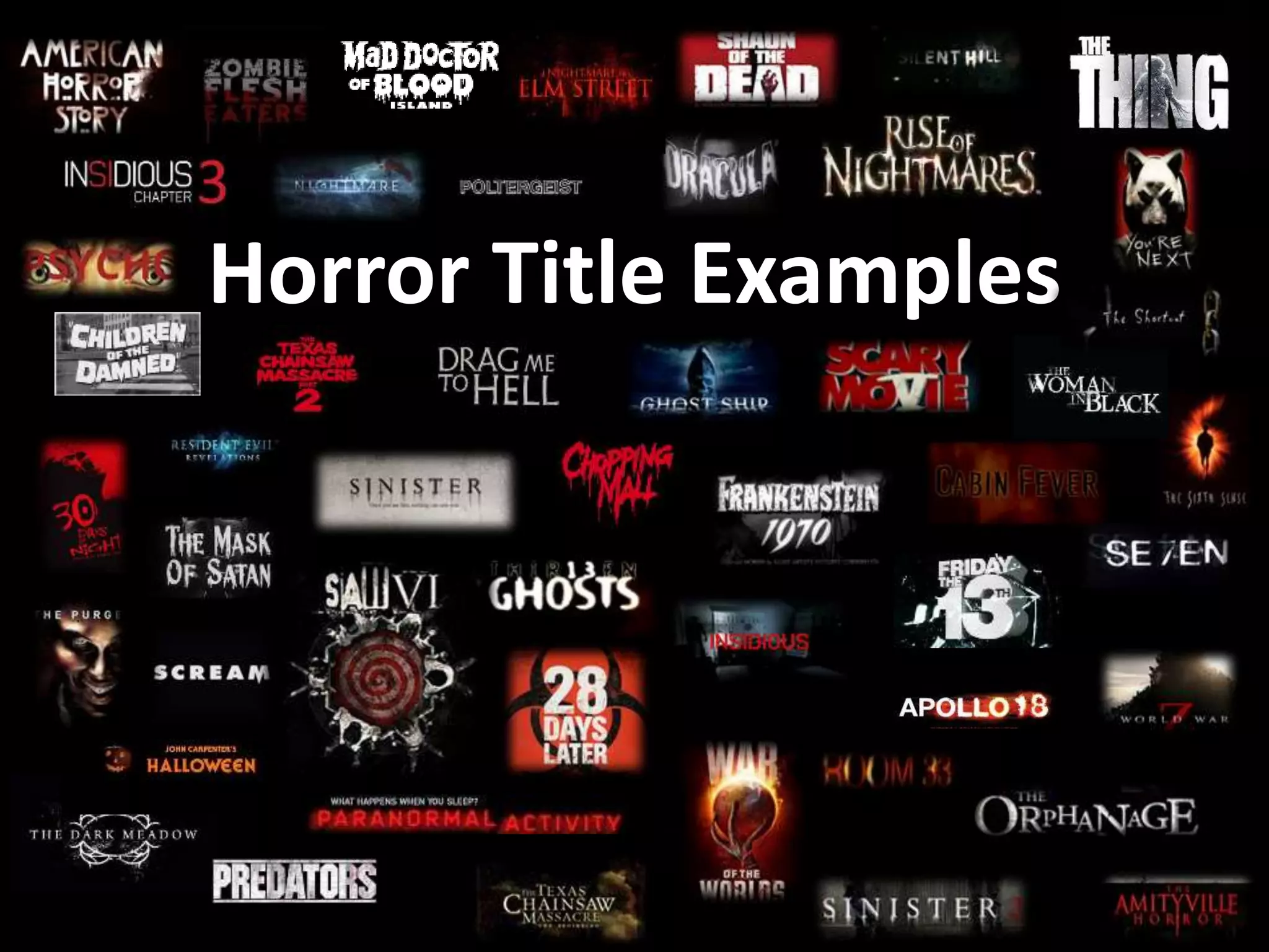
Horror Title Examples
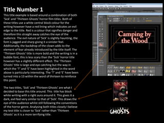
Title Number 1
This title example is based around a combination of both
‘Sick’ and ‘Thirteen Ghosts’ horror film titles. Both of
these titles use a white central block colour for the
writing however have a red lining which indicates an evil
edge to the title. Red is a colour that signifies danger and
therefore this straight away catches the eye of the
audience. The evil nature of ‘Sick’ is slightly haunting, the
font is jagged and sharp giving it a sinister feel.
Additionally, the backdrop of the clown adds to the
element of fear already introduced by the title itself. The
‘Thirteen Ghosts’ title is more bold and the writing is in a
bubble font, this is less scary than the ‘Sick’ horror title
however has a slightly different effect. The ‘Thirteen
Ghosts’ title is large and eye catching but the way in
which the ‘T’ and ‘E’ have been highlighted in the word
above is particularly interesting. The ‘T’ and ‘E’ have been
turned into a 13 within the word of thirteen to reinforce
this point.
The two titles, ‘Sick’ and ‘Thirteen Ghosts’ are what I
decided to base this title around. This title has block
white writing with a right aura around it. This gives it a
dark, evil feel very similar to that of ‘Sick’. This draws the
eye of the audience whilst still following the conventions
of the horror genre. Analysing both titles closely I believe
my test title is closer to ‘Sick’ rather than ‘Thirteen
Ghosts’ as it is a more terrifying title.
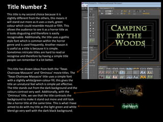
Title Number 2
This title is my second choice because it is
slightly different from the others, this means it
will stand out more as it uses a stark, green
colour which could resemble mould or filth. This
allows the audience to see it as a horror title as
it looks disgusting and therefore is easily
recognisable. Additionally, the title uses a gothic
style font which is common within the horror
genre and is used frequently. Another reason it
is useful as a title is because it is simple.
Sometimes intricate titles are hard to read or
recognise and therefore by having a simple title
people can remember it a lot better.
This title has drawn ideas from both the ‘Texas
Chainsaw Massacre’ and ‘Ominous’ movie titles. The
‘Texas Chainsaw Massacre’ title uses a simple font
with a slightly white/green colour fill, this gives the
title an unnatural feel which is simple yet effective.
The title stands out from the dark background and the
colours contrast very well. Additionally, with the
‘Ominous’ title, we see that the title contrasts the
background to make it stand out more and still look
like a horror title at the same time. This is what I have
aimed to do with my title as the light green and white
blend go very well with the dark black background.
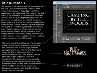
Title Number 3
This example title is based around the Rise of Nightmares
film title. The ‘Rise of Nightmares’ title has a white
innocent feel however is plagued by a mould like
appearance in the background. This represents the dark
aurora of the film as part of the movie title. This makes
audience look at it as it is bright and catches your eye
however as you look closer you instantly know it is a
horror movie title. Another film title that this example is
based around is ‘Sinister’, the fonts are both very similar
and give off the same feeling, the reader automatically
knows that this is a horror title through the use of a
jagged lettering and font. Finally, This horror title is
deceptive because of the white writing, predominantly
white is viewed as an innocent colour however we know
it will not be as it is a horror film/movie.
The horror title of ‘Rise of Nightmares’ and my title
are very similar to each other in the regard of the
font and colour. Both titles are bright and draw
your eye in and however the element of grime and
dirt on the ‘Rise of Nightmares’ title is a
recognisable horror title. This is why this variation
of my title isn't my first choice and is third.
Additionally, this title has some resemblance to
the ‘Sinister’ movie franchise as it has basic gothic
style letters which illustrate a dark feel around the
movie. The title paired with the image in the
background allows for a truly disturbing feel to a
simple title scene or image.
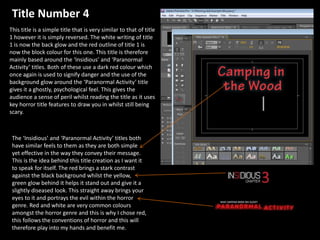
This title is a simple title that is very similar to that of title
1 however it is simply reversed. The white writing of title
1 is now the back glow and the red outline of title 1 is
now the block colour for this one. This title is therefore
mainly based around the ‘Insidious’ and ‘Paranormal
Activity’ titles. Both of these use a dark red colour which
once again is used to signify danger and the use of the
background glow around the ‘Paranormal Activity’ title
gives it a ghostly, psychological feel. This gives the
audience a sense of peril whilst reading the title as it uses
key horror title features to draw you in whilst still being
scary.
The ‘Insidious’ and ‘Paranormal Activity’ titles both
have similar feels to them as they are both simple
yet effective in the way they convey their message.
This is the idea behind this title creation as I want it
to speak for itself. The red brings a stark contrast
against the black background whilst the yellow,
green glow behind it helps it stand out and give it a
slightly diseased look. This straight away brings your
eyes to it and portrays the evil within the horror
genre. Red and white are very common colours
amongst the horror genre and this is why I chose red,
this follows the conventions of horror and this will
therefore play into my hands and benefit me.
Title Number 4
Title Number 5
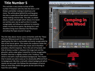
This red title is very similar to that of title
number 4 however with this title the font is a lot
thicker and bolder making it stand out a lot
more. The white glow behind the writing gives
the title a supernatural feel which is beneficial
whilst making a horror title. This title, as stated
above, is bold and bright which allows it to stand
out and be seen, but as well as this it is easily
recognisable and allows an audience to instantly
relate it to the horror genre. By doing this it will
therefore bring more attention the film/movie
and allow the hype around it to grow.
The title idea above shares some similarities with the ‘Texas
Chainsaw Massacre part 2’ title is it large and bold. More
significantly the title is memorable and easily recognisable by
fans of the horror genre. This means the audience relate the
title to horrible events within the movie and it therefore
provokes a fearful response. This is the aim of my bold, red
title of choice number 5, between the large text and the
ghoulish, white under glow I intend for it to be recognisable.
Another title that is slightly similar is the ‘Insidious’ title
which is red with a stark blue/black background. This means
that it stands out and is scary as it is drastically different from
its background. My title is red with a black background which
stands out very well, this follows the stereotypes of horror
titles as most titles within the genre do the same thing to
have the same effect.
Opening credit font
examples:
Title Number 3
Directed by:
Elliott Wigmore
Title Number 4
Directed by:
Elliott Wigmore
Title Number 5
Directed by:
Elliott Wigmore
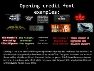
Looking at the main titles and the opening credits I have decided to choose title number 2 as
it is the most appropriate for the theme of my movie/film. The green resembles the leaves of
the wood but also the mold and disease of the horror genre. This follows the conventions of
horror as it is a sharp, spikey font whilst the colours are dark and filthy which resembles and
reflects typical horror movie titles.

Horror Title Examples

  • 1.
  • 2.
    Title Number 1 Thistitle example is based around a combination of both ‘Sick’ and ‘Thirteen Ghosts’ horror film titles. Both of these titles use a white central block colour for the writing however have a red lining which indicates an evil edge to the title. Red is a colour that signifies danger and therefore this straight away catches the eye of the audience. The evil nature of ‘Sick’ is slightly haunting, the font is jagged and sharp giving it a sinister feel. Additionally, the backdrop of the clown adds to the element of fear already introduced by the title itself. The ‘Thirteen Ghosts’ title is more bold and the writing is in a bubble font, this is less scary than the ‘Sick’ horror title however has a slightly different effect. The ‘Thirteen Ghosts’ title is large and eye catching but the way in which the ‘T’ and ‘E’ have been highlighted in the word above is particularly interesting. The ‘T’ and ‘E’ have been turned into a 13 within the word of thirteen to reinforce this point. The two titles, ‘Sick’ and ‘Thirteen Ghosts’ are what I decided to base this title around. This title has block white writing with a right aura around it. This gives it a dark, evil feel very similar to that of ‘Sick’. This draws the eye of the audience whilst still following the conventions of the horror genre. Analysing both titles closely I believe my test title is closer to ‘Sick’ rather than ‘Thirteen Ghosts’ as it is a more terrifying title.
  • 3.
    Title Number 2 Thistitle is my second choice because it is slightly different from the others, this means it will stand out more as it uses a stark, green colour which could resemble mould or filth. This allows the audience to see it as a horror title as it looks disgusting and therefore is easily recognisable. Additionally, the title uses a gothic style font which is common within the horror genre and is used frequently. Another reason it is useful as a title is because it is simple. Sometimes intricate titles are hard to read or recognise and therefore by having a simple title people can remember it a lot better. This title has drawn ideas from both the ‘Texas Chainsaw Massacre’ and ‘Ominous’ movie titles. The ‘Texas Chainsaw Massacre’ title uses a simple font with a slightly white/green colour fill, this gives the title an unnatural feel which is simple yet effective. The title stands out from the dark background and the colours contrast very well. Additionally, with the ‘Ominous’ title, we see that the title contrasts the background to make it stand out more and still look like a horror title at the same time. This is what I have aimed to do with my title as the light green and white blend go very well with the dark black background.
  • 4.
    Title Number 3 Thisexample title is based around the Rise of Nightmares film title. The ‘Rise of Nightmares’ title has a white innocent feel however is plagued by a mould like appearance in the background. This represents the dark aurora of the film as part of the movie title. This makes audience look at it as it is bright and catches your eye however as you look closer you instantly know it is a horror movie title. Another film title that this example is based around is ‘Sinister’, the fonts are both very similar and give off the same feeling, the reader automatically knows that this is a horror title through the use of a jagged lettering and font. Finally, This horror title is deceptive because of the white writing, predominantly white is viewed as an innocent colour however we know it will not be as it is a horror film/movie. The horror title of ‘Rise of Nightmares’ and my title are very similar to each other in the regard of the font and colour. Both titles are bright and draw your eye in and however the element of grime and dirt on the ‘Rise of Nightmares’ title is a recognisable horror title. This is why this variation of my title isn't my first choice and is third. Additionally, this title has some resemblance to the ‘Sinister’ movie franchise as it has basic gothic style letters which illustrate a dark feel around the movie. The title paired with the image in the background allows for a truly disturbing feel to a simple title scene or image.
  • 5.
    This title isa simple title that is very similar to that of title 1 however it is simply reversed. The white writing of title 1 is now the back glow and the red outline of title 1 is now the block colour for this one. This title is therefore mainly based around the ‘Insidious’ and ‘Paranormal Activity’ titles. Both of these use a dark red colour which once again is used to signify danger and the use of the background glow around the ‘Paranormal Activity’ title gives it a ghostly, psychological feel. This gives the audience a sense of peril whilst reading the title as it uses key horror title features to draw you in whilst still being scary. The ‘Insidious’ and ‘Paranormal Activity’ titles both have similar feels to them as they are both simple yet effective in the way they convey their message. This is the idea behind this title creation as I want it to speak for itself. The red brings a stark contrast against the black background whilst the yellow, green glow behind it helps it stand out and give it a slightly diseased look. This straight away brings your eyes to it and portrays the evil within the horror genre. Red and white are very common colours amongst the horror genre and this is why I chose red, this follows the conventions of horror and this will therefore play into my hands and benefit me. Title Number 4
  • 6.
    Title Number 5 Thisred title is very similar to that of title number 4 however with this title the font is a lot thicker and bolder making it stand out a lot more. The white glow behind the writing gives the title a supernatural feel which is beneficial whilst making a horror title. This title, as stated above, is bold and bright which allows it to stand out and be seen, but as well as this it is easily recognisable and allows an audience to instantly relate it to the horror genre. By doing this it will therefore bring more attention the film/movie and allow the hype around it to grow. The title idea above shares some similarities with the ‘Texas Chainsaw Massacre part 2’ title is it large and bold. More significantly the title is memorable and easily recognisable by fans of the horror genre. This means the audience relate the title to horrible events within the movie and it therefore provokes a fearful response. This is the aim of my bold, red title of choice number 5, between the large text and the ghoulish, white under glow I intend for it to be recognisable. Another title that is slightly similar is the ‘Insidious’ title which is red with a stark blue/black background. This means that it stands out and is scary as it is drastically different from its background. My title is red with a black background which stands out very well, this follows the stereotypes of horror titles as most titles within the genre do the same thing to have the same effect.
  • 7.
    Opening credit font examples: TitleNumber 3 Directed by: Elliott Wigmore Title Number 4 Directed by: Elliott Wigmore Title Number 5 Directed by: Elliott Wigmore Looking at the main titles and the opening credits I have decided to choose title number 2 as it is the most appropriate for the theme of my movie/film. The green resembles the leaves of the wood but also the mold and disease of the horror genre. This follows the conventions of horror as it is a sharp, spikey font whilst the colours are dark and filthy which resembles and reflects typical horror movie titles.