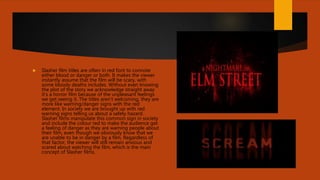
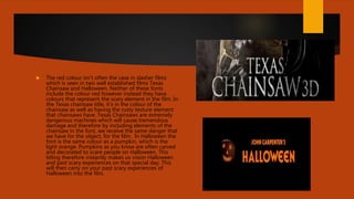
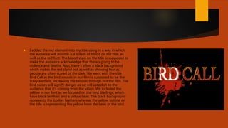
2. Slasher film titles are often in red font to connote
either blood or danger or both. It makes the viewer
instantly assume that the film will be scary, with
some bloody deaths includes. Without even knowing
the plot of the story we acknowledge straight away
it’s a horror film because of the unpleasant feelings
we get seeing it. The titles aren’t welcoming, they are
more like warning/danger signs with the red
element. In society we are brought up with red
warning signs telling us about a safety hazard.
Slasher films manipulate this common sign in society
and include the colour red to make the audience get
a feeling of danger as they are warning people about
their film, even though we obviously know that we
are unable to be in danger by a film. Regardless of
that factor, the viewer will still remain anxious and
scared about watching the film, which is the main
concept of Slasher films.
3. The red colour isn’t often the case in slasher films
which is seen in two well established films Texas
Chainsaw and Halloween. Neither of these fonts
include the colour red however instead they have
colours that represent the scary element in the film. In
the Texas chainsaw title, it’s in the colour of the
chainsaw as well as having the rusty texture element
that chainsaws have. Texas Chainsaws are extremely
dangerous machines which will cause tremendous
damage and therefore by including elements of the
chainsaw in the font, we receive the same danger that
we have for the object, for the film. In Halloween the
font is the same colour as a pumpkin, which is the
light orange. Pumpkins as you know are often carved
and decorated to scare people on Halloween. This
titling therefore instantly makes us vision Halloween
and past scary experiences on that special day. This
will then carry on your past scary experiences of
Halloween into the film.
4. I added the red element into my title using in a way in which,
the audience will assume is a splash of blood on the title, as
well as the red font. The blood stain on the title is supposed to
make the audience acknowledge that there’s going to be
violence and deaths. Also, there’s often a black background
which makes the red stand out as well as showing fear as
people are often scared of the dark. We went with the title
Bird Call as the bird sounds in our film is supposed to be the
scary element, increasing the tension through out the film. The
bird noises will signify danger as we will establish to the
audience that it’s coming from the villain. We included the
yellow in our font as we focused on the bird Starlings, which
have black feathers and a yellow beak. The black background
represents the bodies feathers whereas the yellow outline on
the title is representing the yellow from the beak of the bird.