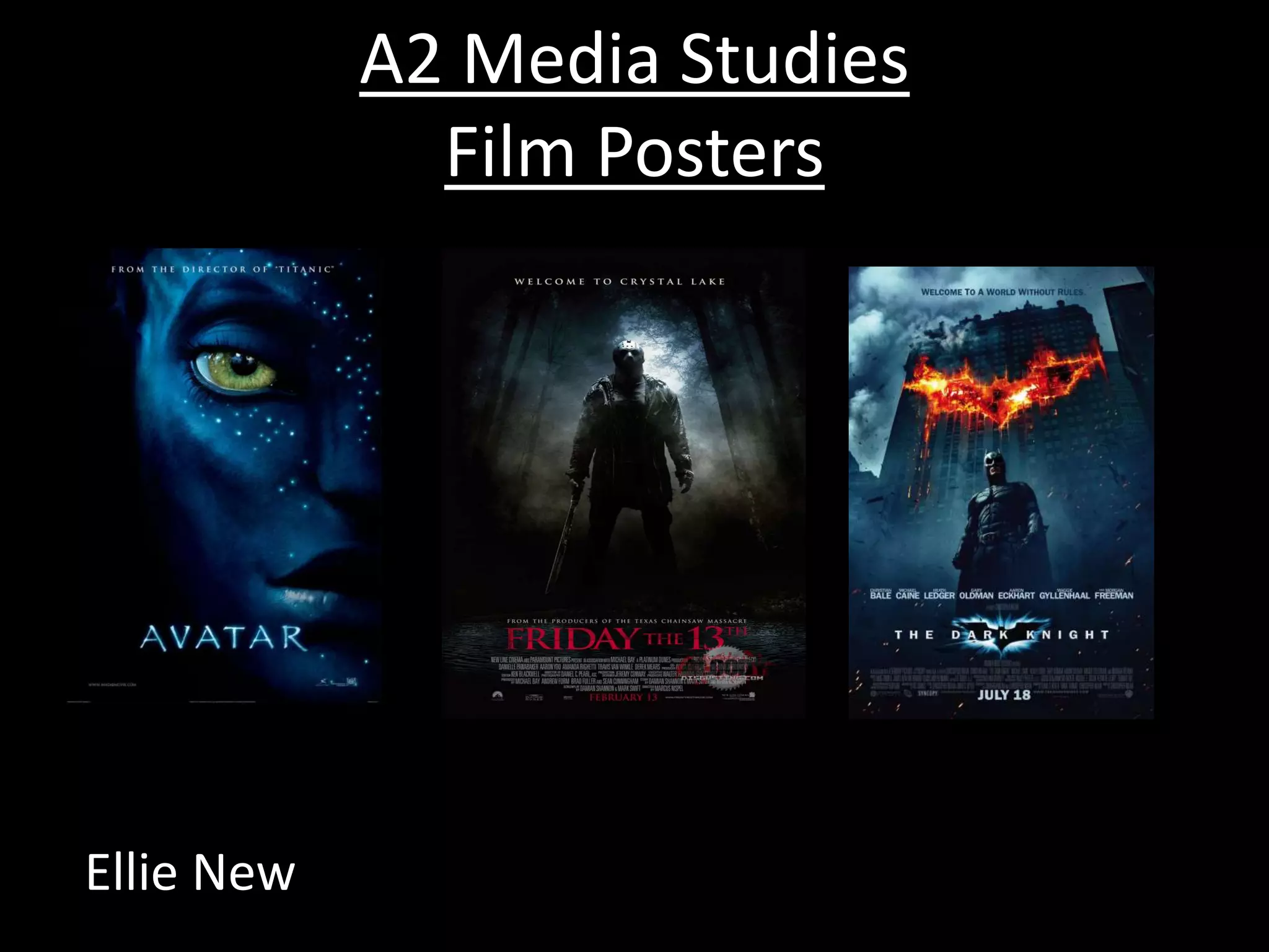
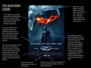
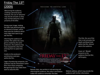
A2 Media Studies
Film Posters
Ellie New
The image upon the poster
demonstrates high standard
graphics, the use of dark
colours contrasts well with
the ‘batman’ symbol
making it stand out.
Short and snappy
tagline, draws the
audience into the
poster making them
want to see the
film. ‘ Welcome ‘
creates a personal
element addressing
the audience.
The protagonist of the
film photographed using a
low angle shot; makes the
character look more
dominant and powerful.
Body language suggests
power and anger, as the
film is an action film it
looks as if the character
is waiting for something
to happen within the
poster, maybe making the
audience excited and on
edge.
Cover lines written upon
the poster presenting
celebrities staring in the
film; as the public maybe a
fan of one of the actors/
actresses' which would
entice them into watching
the film.
Film title and symbolism of the
bat, which is shown twice
within the poster. The title is
written smaller than the first
symbol shown, due to the
popularity of the film the
creators feel the symbol and
image is enough to advertise
the film.
Date of film release
notifying fans of when to
see the film.
Credits to film producers, directors and
actors also shows audience who has
produced the film.
The Dark Night
(2008)
Avatar (2009)
Direct address from
character, makes the
audience think that
they’re staring at them;
creating a personal
experience between
character and audience
which entices the
audience to view the film.
Clear cover image, only
presenting half of the
characters face makes the
audience question who they
are/ what is their motives.
Intertexual reference to
another film the director
has produced; reminding
the audience of the other
film uses synergy to
advertise it. The audience
may have also enjoyed the
other film making them
want to go watch this one.
The title of the film, making
the poster so blank makes the
text stand out making the
poster memorable.
Website given so
audience can enquire
more details about the
film.
Logos of companies which
have produced the film. The
audience may enjoy their
other media constructs.
Friday The 13th
(2009)
Strong cover image, making
the killer look dominant giving
an element of power; which
may scare the audience which
may make them want to go
see the film.
Welcoming the audience,
creating a personal touch.
However, the use of ‘welcome’
may also be sarcastic as they
may not feel welcome in the
presents of the killer.
Informing the audience of
another film within the same
genre created by the same
producers, the audience may
have enjoyed the other film
enticing them to watch this
one.
The title, the use of the
title in red connotes the
death and blood shed
within the film. Almost
warns the audience.
Cover art ‘ Bloody’
presents to the
audience that the film
will be gory.
Credits to the producers
and directors and stars
within the film.
Logos of producing companies, the
audience may be interested in other
films from these companies.
Recognising this may make them
want to view this film. Release date, also written in red warning and
informing the audience, the colour connotation
makes the audience remember the date.
Website address, which may provide the
audience with further information.
A2 Media Film Posters

A2 Media Film Posters

  • 1.
    A2 Media Studies FilmPosters Ellie New
  • 2.
    The image uponthe poster demonstrates high standard graphics, the use of dark colours contrasts well with the ‘batman’ symbol making it stand out. Short and snappy tagline, draws the audience into the poster making them want to see the film. ‘ Welcome ‘ creates a personal element addressing the audience. The protagonist of the film photographed using a low angle shot; makes the character look more dominant and powerful. Body language suggests power and anger, as the film is an action film it looks as if the character is waiting for something to happen within the poster, maybe making the audience excited and on edge. Cover lines written upon the poster presenting celebrities staring in the film; as the public maybe a fan of one of the actors/ actresses' which would entice them into watching the film. Film title and symbolism of the bat, which is shown twice within the poster. The title is written smaller than the first symbol shown, due to the popularity of the film the creators feel the symbol and image is enough to advertise the film. Date of film release notifying fans of when to see the film. Credits to film producers, directors and actors also shows audience who has produced the film. The Dark Night (2008)
  • 3.
    Avatar (2009) Direct addressfrom character, makes the audience think that they’re staring at them; creating a personal experience between character and audience which entices the audience to view the film. Clear cover image, only presenting half of the characters face makes the audience question who they are/ what is their motives. Intertexual reference to another film the director has produced; reminding the audience of the other film uses synergy to advertise it. The audience may have also enjoyed the other film making them want to go watch this one. The title of the film, making the poster so blank makes the text stand out making the poster memorable. Website given so audience can enquire more details about the film. Logos of companies which have produced the film. The audience may enjoy their other media constructs.
  • 4.
    Friday The 13th (2009) Strongcover image, making the killer look dominant giving an element of power; which may scare the audience which may make them want to go see the film. Welcoming the audience, creating a personal touch. However, the use of ‘welcome’ may also be sarcastic as they may not feel welcome in the presents of the killer. Informing the audience of another film within the same genre created by the same producers, the audience may have enjoyed the other film enticing them to watch this one. The title, the use of the title in red connotes the death and blood shed within the film. Almost warns the audience. Cover art ‘ Bloody’ presents to the audience that the film will be gory. Credits to the producers and directors and stars within the film. Logos of producing companies, the audience may be interested in other films from these companies. Recognising this may make them want to view this film. Release date, also written in red warning and informing the audience, the colour connotation makes the audience remember the date. Website address, which may provide the audience with further information.