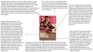
The movie poster summarizes the plot of the film "Baby Driver" through visual elements - it depicts a police chase of a red car in New York with the title and a quote implying the main character relies on music, and includes headshots of the main actors like Ansel Elgort wearing sunglasses and headphones. Credits for the companies, directors, and producers involved in making the film are listed at the bottom in a small, plain font.
We watched both the theatrical trailers for Kong Skull Island, and Rings. We were then asked to create a report on the 7 key conventions of movie trailers. My report is shown below.
The perfect Sundabet Slot mudah menang Promo new member Animated PDF for your conversation. Discover and Share the best GIFs on Tenor
Admin Ramah Cantik Aktif 24 Jam Nonstop siap melayani pemain member Sundabet login via apk sundabet rtp daftar slot gacor daftar
thGAP - BAbyss in Moderno!! Transgenic Human Germline Alternatives ProjectMarc Dusseiller Dusjagr
thGAP - Transgenic Human Germline Alternatives Project, presents an evening of input lectures, discussions and a performative workshop on artistic interventions for future scenarios of human genetic and inheritable modifications.
To begin our lecturers, Marc Dusseiller aka "dusjagr" and Rodrigo Martin Iglesias, will give an overview of their transdisciplinary practices, including the history of hackteria, a global network for sharing knowledge to involve artists in hands-on and Do-It-With-Others (DIWO) working with the lifesciences, and reflections on future scenarios from the 8-bit computer games of the 80ies to current real-world endeavous of genetically modifiying the human species.
We will then follow up with discussions and hands-on experiments on working with embryos, ovums, gametes, genetic materials from code to slime, in a creative and playful workshop setup, where all paticipant can collaborate on artistic interventions into the germline of a post-human future.
The Legacy of Breton In A New Age by Master Terrance LindallBBaez1
Brave Destiny 2003 for the Future for Technocratic Surrealmageddon Destiny for Andre Breton Legacy in Agenda 21 Technocratic Great Reset for Prison Planet Earth Galactica! The Prophecy of the Surreal Blasphemous Desires from the Paradise Lost Governments!
Explore the multifaceted world of Muntadher Saleh, an Iraqi polymath renowned for his expertise in visual art, writing, design, and pharmacy. This SlideShare delves into his innovative contributions across various disciplines, showcasing his unique ability to blend traditional themes with modern aesthetics. Learn about his impactful artworks, thought-provoking literary pieces, and his vision as a Neo-Pop artist dedicated to raising awareness about Iraq's cultural heritage. Discover why Muntadher Saleh is celebrated as "The Last Polymath" and how his multidisciplinary talents continue to inspire and influence.
2137ad Merindol Colony Interiors where refugee try to build a seemengly norm...luforfor
This are the interiors of the Merindol Colony in 2137ad after the Climate Change Collapse and the Apocalipse Wars. Merindol is a small Colony in the Italian Alps where there are around 4000 humans. The Colony values mainly around meritocracy and selection by effort.
1. The actual image on the front of the film
cover, is of a highway with a red car being
chased by numerous police cars. Due to the
graphics of the road, it allows the car to be
seen to racing at an immense speed. In the
background of this police chase, the Empire
State building is visible, which allows us to
set the location of the movie in New York,
America. The camera angle itself, is the
best possible angle to show the city, the
road, the police chase and the general
scene itself, along with the number of
police cars.
The title itself is “Baby Driver”. The
typography of this is iconic to the actual
film plot itself, as the masculine font
looks like some form of painted road
words, allowing driver’s to know the law
in that specific area, and how the road
should be used. The actual colour of the
title, is in cream to stand out against the
colour of the road and the pink sky. The
cream words match the same colour as
the painted lines on the road, which
could be another iconic significance, to
everything being in relation to driving
and roads. The size of the title is big, and
is placed in front of the red car, and
below the images of the cast, to fill the
negative space, and use the area
effectively, by purposely dragging
attention to it.
All the small black words at the bottom
of the page, are all the credits to the
companies, directors, producers etc. The
writing itself is in a dark grey shade, and
is in a very small number font. The
typography itself is in a cliché font that is
generally used on most movie covers for
DVD’s and release posters. Underneath
the names and companies, are a few
movie company logos, who were
involved within the production and
making of this movie. These are actually
known as ‘credits’.
This list of six names, are the significant main
actors of the movie, and are actually placed on
the front cover. They’re also placed in order of
significance within the movie, and whom plays
the most part. Ansel Elgort is placed first as he
is the main actor.
Alongside the list of the actors names, is the images of the actors
involved. Ansel Elgort has the biggest headshot within this small
collage of the actors, due to him being the iconic main actor of this
movie. On Ansel’s headshot, he is wearing sunglasses and
earphones, this is ironically related to the plot of the movie, and how
this signifies him within his work during racing on a crime. A few
props of guns are also produced within the collage, due to the
violence within the film, and to allow the concept of an action movie
to be obvious.
The quotation used just underneath the title, states “All you need is a killer
track”. This holds significance to baby driver himself, and how music allows
him to be guided through his assigned missions. This matches nicely with the
earphones he wears throughout the film, and how music will have some
relation throughout the movie itself. It could also signify the track of the road
that he constantly races along during the movie.
2. The title for this movie poster, holds some significances within it, which mirror what happens within the actual
movie. The words; ‘Mr.’, ‘Mrs.’ and ‘Smith’, are all black in colour. However, the ‘&’ sign is in the colour of red, which
creates a divide between the words ‘Mr.’ and ‘Mrs,’ which is iconic within the movie as well. As for the actual
typography style, it’s in a rather formal style, which matches the attire of what the actors are actually wearing. The
‘&’ symbol, is in a larger number font than the words, possibly to show that the divide between the two is more like
a wall, that is apparent.
Just in front of the actor’s body shots, is their real
names and not their character names. The use for
this on the front page will increase viewings and
interest, due to the name droppings of the two
very successful actors, who are idolised. However,
although the writing varies from rather small to a
bit bigger, it is still obviously placed where a
perspective person is able to see. A god use of
negative space is used up by placing these names
in the gap as well.
Two actors are presented facing opposite each
other, with what looks like their backs against the
wall which we can’t see. The term ‘Keep your back
against the wall, is a self security precaution in
most action movies such as this. It is a self-
insurance that no one can attack you from behind,
and due to you facing forwards, you are always
able to protect yourself. They are both the main
actors of the film, hence why they are priority on
the front cover, and their names are just in front of
their heads. They are equipped with weapons, and
are dressed in formal attire. The weapons they
carry could be for the lack of trust that they have
for one another within the actual film plot. The
iconic black clothing that they both wear,
corresponds to the colour black sometimes being
associated with death, which is involved within this
movie.
This speech in red writing, and placed very
boldly in between the two actors, is a quotation
by the New York Daily Times. This is a review
from a newspaper, which will highly help with
advertisement, appeal and sales. A reliable
review from a well known publisher could be
incorporated on the front page, to enhance the
appeal to viewers. The two words “Smart” and
“Sexy”, are presented in capital letters, to force
attraction to them.
Here are the credits to producers, directors,
sponsors and anyone involved with the
production of this film etc. The typography is the
cliché credit font, and in a light grey colour, which
contrasts well with the theme of black, white, and
red of the poster itself.
This is a small piece of extra information, allowing
the audience to know when the DVD will be
released. It’s in red, bold typography to stand out to
someone looking at this image, however it is in
slightly bigger font size than the credits, and placed
just underneath. Due to the position of the extra
info, it also may avert the eyes of the audience to
look at the credits and who is involved as curiosity.
3. The title is presented in a twisted typography,
which matches the theme/genre of the movie
plot itself. Above the title is the famous Disney
logo, which is the company that took on this film
idea by Tim Burton. The colour purple is
significant, as throughout the movie, the
repeated colour of purple’s and blue’s are the
most popular without viewers realising.
The actor’s name dropped here at the top of the page, will
drag attention to audience members, and heighten appeal
to actually watch the movie. The character in the centre of
the poster is actually the actor, Johnny Depp himself. It is
cleverly placed first, at the top, for an advertisement to
him, himself.
The background of this poster, is a scene
from the actual movie footage itself, and will
create an enhancing effect on to the viewers.
It is a ‘teaser’ of the animation and graphics
that are within this movie, in an attempt to
hype the public. Fantasy objects are painted
on the poster, such at the unrealistically big
mushrooms, never before seen in reality
which causes question as to why they are
there. The castle in the background would
also cause question to what it’s involvement
is within the film plot. The colours used
throughout the mythical poster, are bright
and vibrant. Bright and vibrant colours are
proven to enhance the public, and
psychologically intrigue them to watch the
footage, due to the attraction to the perfect
blend of colours.
The character placed In the direct centre
of the poster, goes by the name of ‘The
Mad Hatter’. Due to his peculiar clothing
and style, this would draw attention to
him, as it’s not a sense of style that you
would wear, however it consists of
certain clothing items we would wear
for different occasions. A top hat is
formal wear for a business man/woman
in earlier history, however a blazer and
vest is accompanied by a pocket watch,
as well as colourful material hanging
down from his blazer. This would cause
for an interrogation of characteristics of
the actual character himself. His vibrant
orange hair and white face also cause
room for curiosity. The actor playing the
character is Johnny Depp, which is why
his name is wrote at the top of the page,
to give him the most credit, due to him
being on the front. The fact that the
main actor ‘Alice’ isn’t on the front of
this poster, could cause confusion, and
may invite people to watch the movie
and find out why.
Here at the bottom of the page, is credits to the producers, creators, Disney and everyone involved in
the making of this movie. There is also additional information regarding the movie in theatres available
to watch in 3D, with all the amazing animations and graphics to make it an enjoyable experience. The
credits are actually in a lavender (purple) colour, to match the purple theory, where in which people are
visually attract ted to.
4. Research
The company I decided to go with, as my producer for my movie, is twisted pictures. My reason for this, is due
to the age range of their audience is suitable for my genre of movie; Horror. Twisted pictures produces mainly
horror movies. The first movie they supported in, was ‘Saw’, in 2004, which led to a nine-picture distribution
deal with the producer company ‘Lionsgate’. The deal was to produce six sequels after the first saw was
released. They became very successful throughout the years, and the age rating on most of their movies, is
18+, which is very suitable for my movie, as I chose the genre of horror. They’ve produced movies such as; Saw
(the entire sequel set), The Tortured, Catching Hell, Havehurst and Jigsaw. To represent this specific company as
a whole, I chose the movie ‘Saw’, to represent it, and research further and find out more details about the
company itself. Saw actually made $103.9 million after being released.
5. Pitch
The age restrictions on my movie, will be 18+, as my genre will be horror. My institution that I have chosen, is
‘Twisted Pictures’, as that company has produced some very popular and successful horror movies. I was
inspired by the movie ‘Saw’, which was actually produced by Twisted Pictures, as of the content within the film
footage. It got amazing reviews and was the first ever movie produced by twisted pictures, in a collaboration
with Lionsgate Studios. I was also inspired by the movie ’IT’, which I know isn’t by the same company, but still I
liked the content enough, and the style of the posters which matched the footage. My movie will appeal to my
audience, as it is already being produced by a horror based production company, and will involve new jump
scares which will be promoted and promised in advertising. The synops is about a teenage girl, that lives in a
typical American neighborhood. Throughout the movie, she commits crimes, tampers with evidence and places
the blame on bad people who deserve to face the consequences. If all fails she kidnaps them and tortures
them for fun. The fonts that I will use will be similar to this font that I’m using now. I will use it because it’s
skinny and very official, which is the look that I am aiming to achieve.