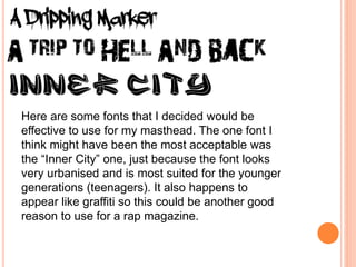
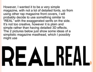
The document discusses options for the masthead design of a rap-styled magazine. It considers targeting audiences aged 16+ and choosing a bold, catchy font like "Inner City" that looks urban and suited to younger readers. While this font captures the rap style, the document recommends a simpler masthead like "REAL" with exaggerated serifs for a plain, no-frills design informed by other rap magazine covers. Sample simplistic masthead designs are shown.