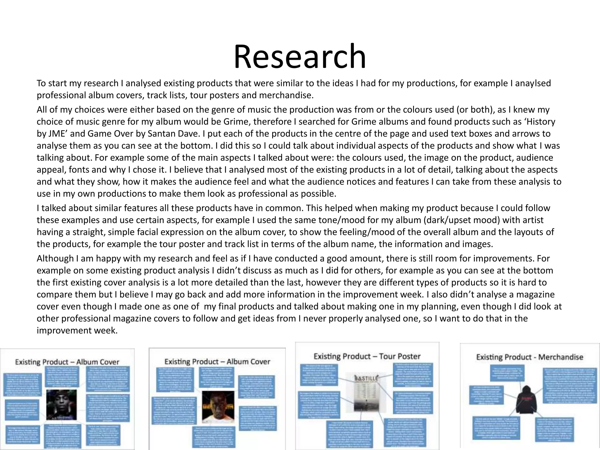
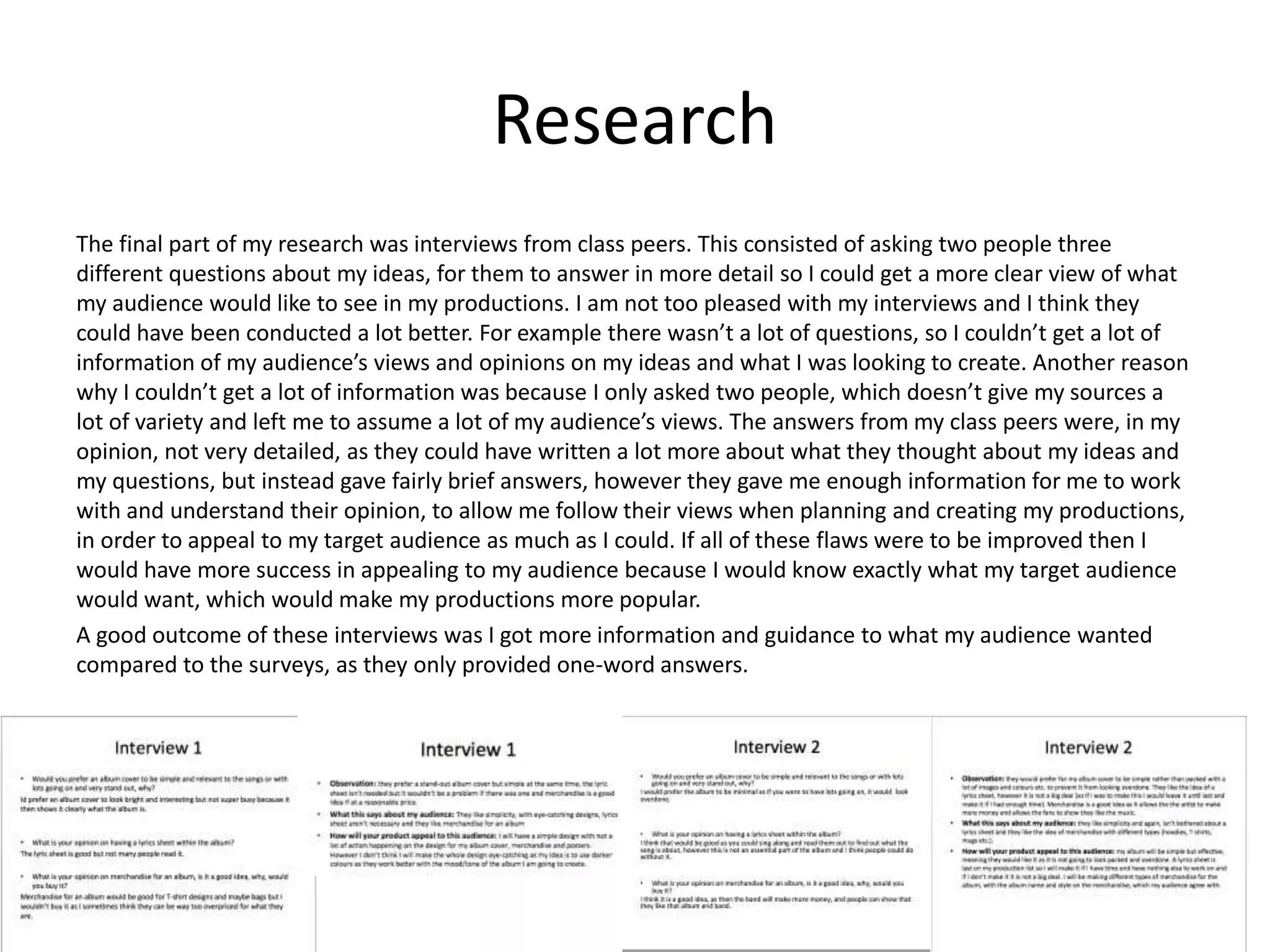
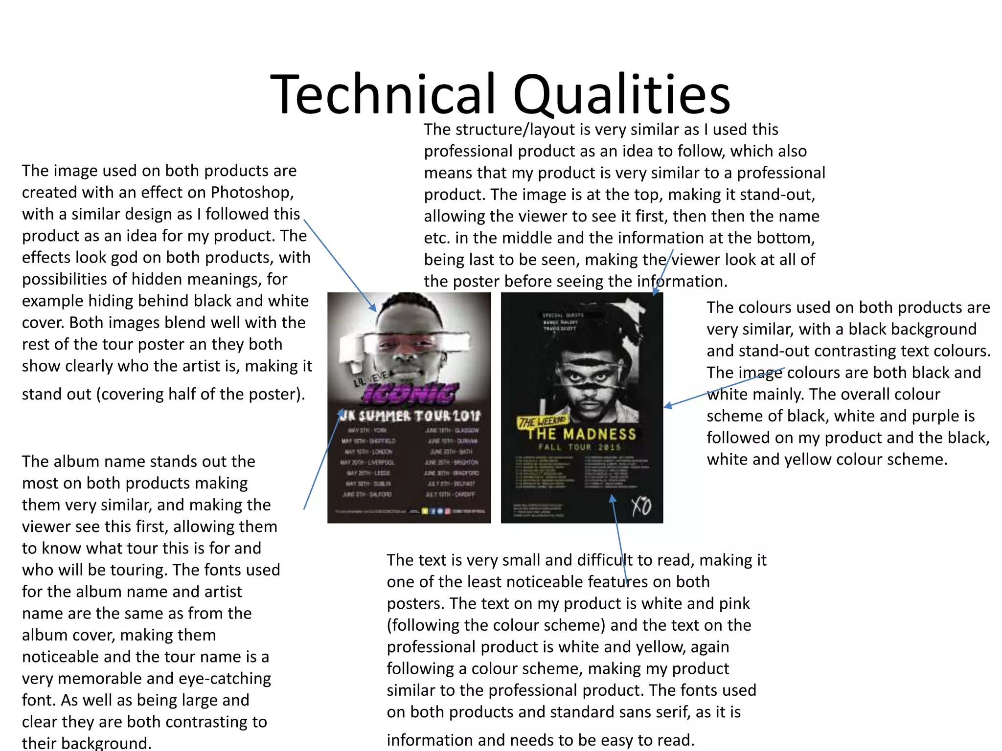
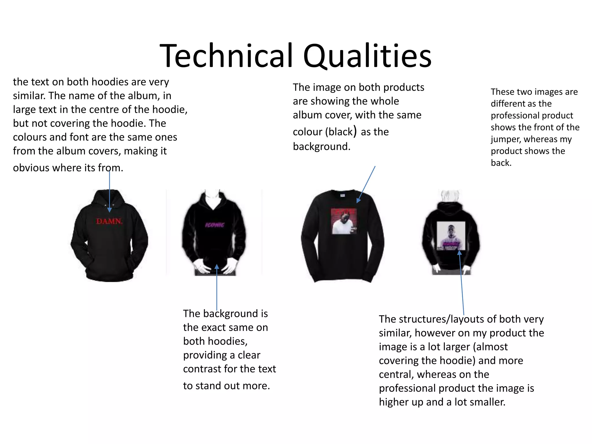
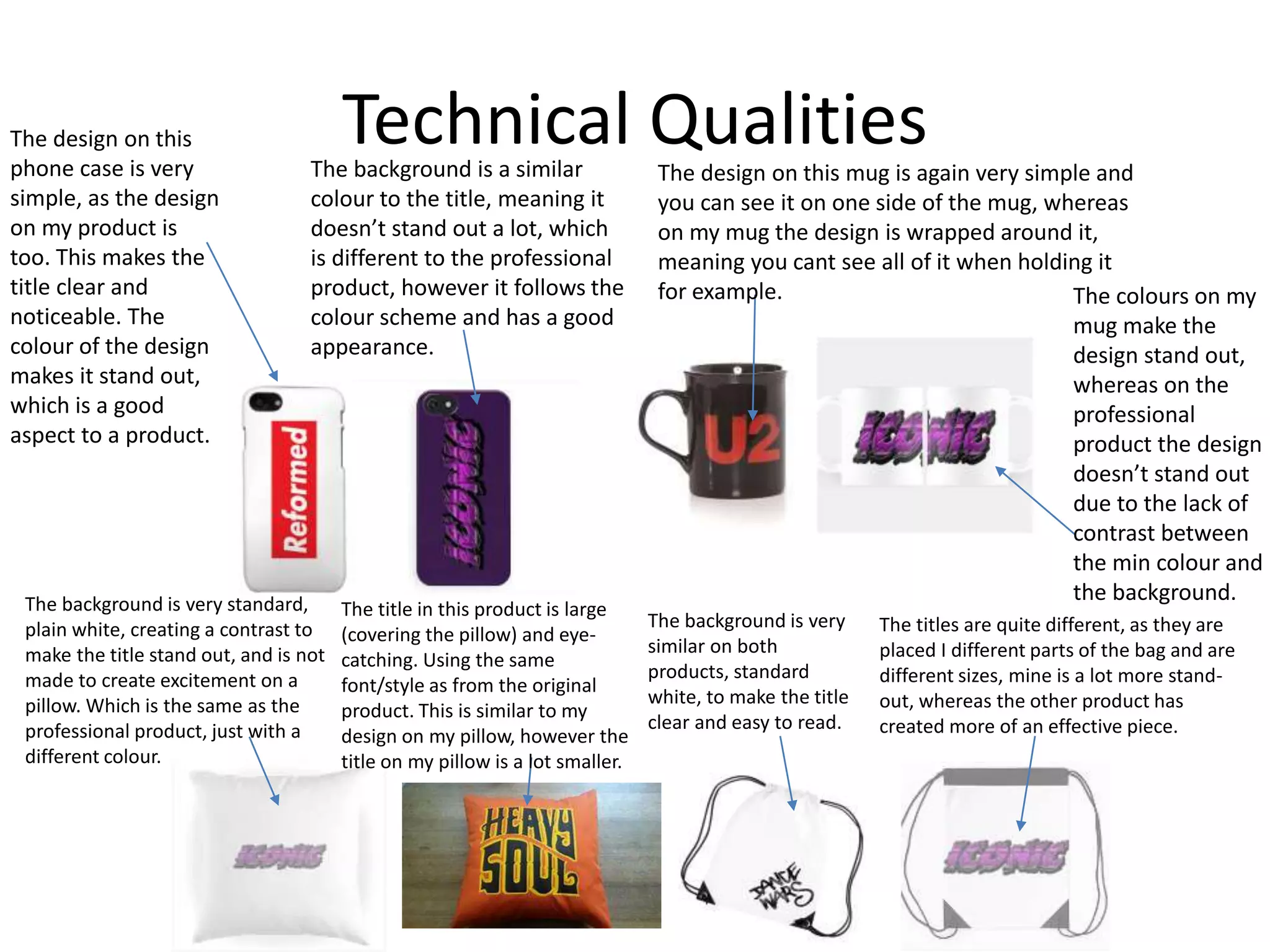
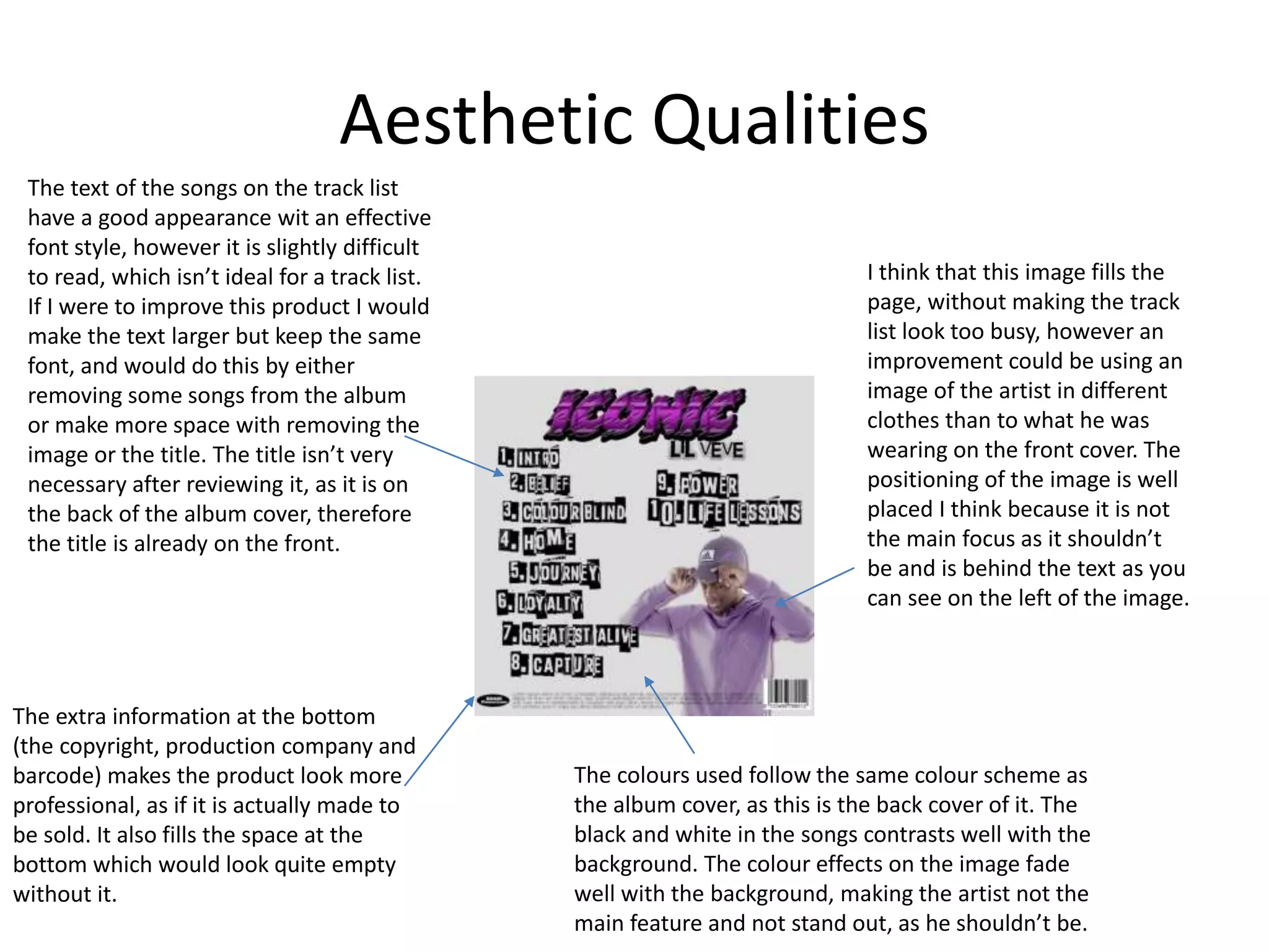
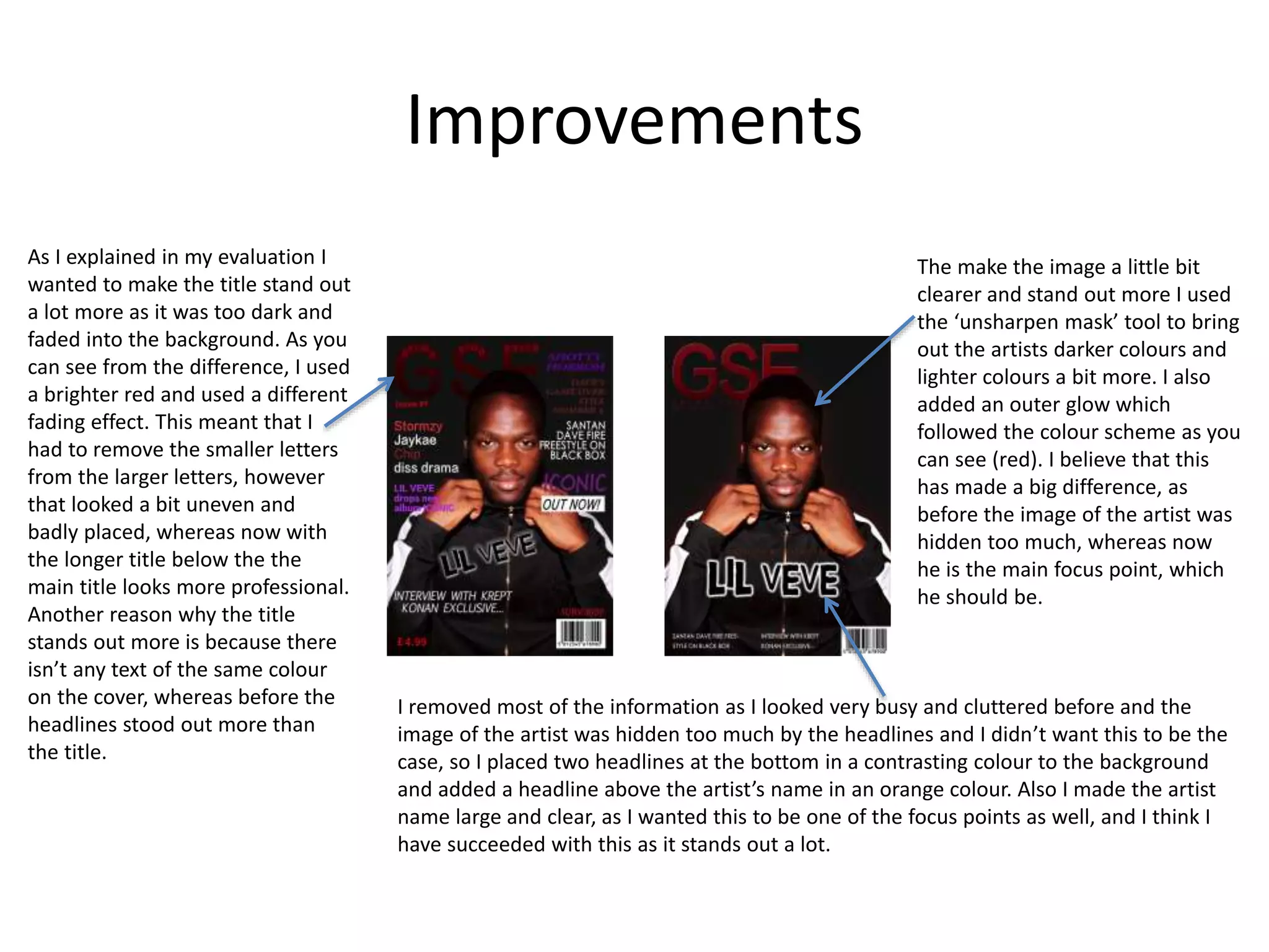
Evaluation
Tom Haase
Production Process Evaluation
Research
To start my research I analysed existing products that were similar to the ideas I had for my productions, for example I anaylsed
professional album covers, track lists, tour posters and merchandise.
All of my choices were either based on the genre of music the production was from or the colours used (or both), as I knew my
choice of music genre for my album would be Grime, therefore I searched for Grime albums and found products such as ‘History
by JME’ and Game Over by Santan Dave. I put each of the products in the centre of the page and used text boxes and arrows to
analyse them as you can see at the bottom. I did this so I could talk about individual aspects of the products and show what I was
talking about. For example some of the main aspects I talked about were: the colours used, the image on the product, audience
appeal, fonts and why I chose it. I believe that I analysed most of the existing products in a lot of detail, talking about the aspects
and what they show, how it makes the audience feel and what the audience notices and features I can take from these analysis to
use in my own productions to make them look as professional as possible.
I talked about similar features all these products have in common. This helped when making my product because I could follow
these examples and use certain aspects, for example I used the same tone/mood for my album (dark/upset mood) with artist
having a straight, simple facial expression on the album cover, to show the feeling/mood of the overall album and the layouts of
the products, for example the tour poster and track list in terms of the album name, the information and images.
Although I am happy with my research and feel as if I have conducted a good amount, there is still room for improvements. For
example on some existing product analysis I didn’t discuss as much as I did for others, for example as you can see at the bottom
the first existing cover analysis is a lot more detailed than the last, however they are different types of products so it is hard to
compare them but I believe I may go back and add more information in the improvement week. I also didn’t analyse a magazine
cover even though I made one as one of my final products and talked about making one in my planning, even though I did look at
other professional magazine covers to follow and get ideas from I never properly analysed one, so I want to do that in the
improvement week.
Research
The next part of my research was audience research. To conduct this is used a website called ‘SurveyMonkey’. This worked by
creating a survey and sending around class, friends and family for them to complete with the questions created so I could
understand who my audience was (age, gender etc.). As you can see at the bottom, the website collected the results and created
a chart to display the results, which made reading the results a lot easier and made it easy to show in my PowerPoint. To discuss
the results I obtained I gave an observation of the what the chart shows (the gender/age of my audience etc.). I then discussed
what this said about my audience, for example ideas that they like, such as certain colours, themes, styles etc., just discussing the
observation in a bit more detail. Finally I discussed how my product was going to appeal to my audience after reading the results I
got, for example if the survey results showed that my audience prefers a simple poster rather than a busy one I talked about how I
can make my poster simple so my audience would like it. I believe that this was very useful, to see what others wanted, as well as
researching professional products, giving me a more clear view of how I was going to make my work. I think that I mostly
appealed to my audience with my productions as I followed my research as I was making my work, to create something that I
wanted but that also appealed to my audience.
If I was to do this again I would ask more people to complete my survey, as I only got around 20 responses, which is a fair amount
but for the best audience research it is always better and more helpful with more responses, as this would achieve a more specific
idea for who my audience is and what they like. I also have only used this website for creating survey and haven't looked at any
others, and although this could be the best possible website to use for surveys, I haven't tried any others so I wouldn’t know. This
might have altered my final products as if I had more responses on my survey or asked different people on a different website
then I may have had different answers, resulting in me changing my idea slightly, for example some of my audience said they
prefer simple ideas with meaning, and this is what I created for my album cover and tour poster, however if more people
answered I could have made a stand-out poster and cover to appeal to my audience, but I am happy with what my audience have
chosen as it is what I was hoping for, as I believe it has a good appearance and was my idea from the start, as I was hoping to
create something similar to pre-existing products.
Research
The final part of my research was interviews from class peers. This consisted of asking two people three
different questions about my ideas, for them to answer in more detail so I could get a more clear view of what
my audience would like to see in my productions. I am not too pleased with my interviews and I think they
could have been conducted a lot better. For example there wasn’t a lot of questions, so I couldn’t get a lot of
information of my audience’s views and opinions on my ideas and what I was looking to create. Another reason
why I couldn’t get a lot of information was because I only asked two people, which doesn’t give my sources a
lot of variety and left me to assume a lot of my audience’s views. The answers from my class peers were, in my
opinion, not very detailed, as they could have written a lot more about what they thought about my ideas and
my questions, but instead gave fairly brief answers, however they gave me enough information for me to work
with and understand their opinion, to allow me follow their views when planning and creating my productions,
in order to appeal to my target audience as much as I could. If all of these flaws were to be improved then I
would have more success in appealing to my audience because I would know exactly what my target audience
would want, which would make my productions more popular.
A good outcome of these interviews was I got more information and guidance to what my audience wanted
compared to the surveys, as they only provided one-word answers.
Planning – Initial plans
The first planning I did was my initial plans which I completed after reading the brief (the overview and tasks of the overall project). I
discussed what my initial ideas were, what I was hoping to create, what I was already good at, what have I done in the past that would
help me and what I would like to emulate. This was useful as it made me think about all the aspects and my previous work that could
help me produce my productions and made me think about what I wanted to create early on, so I didn’t spend more time thinking of
loads of potential ideas but focused one or a few ideas in detail. After teacher feedback I decided to add more detail to my initial
reaction and ideas discussion by talking more about my opinion and the specific work I have done in the past that s similar to what I
have done for this project, for example I talked about my print project where I made a magazine cover and a double page spread in a
previous rotation. I discussed the software I was going to use (Photoshop) in this project and how experienced I was already in using
it, showing how that would make it easier for me to complete my work, as all of my productions have been made on Photoshop apart
from my merchandise.
The next part of my initial plans was the mind maps. I used a website called ‘Bubbl.us’. I created my first mind map to display all the
ideas I had. This website was very useful as it created boxes and lines connecting them for you to write in, so I would use it again if I
needed. I had four main potential ideas: album cover, film cover, video game cover and magazine cover, then added aspects to these
ideas, for example other products I could make related to the main idea and certain colours, fonts and themes I could use for each
idea. This was very useful in helping me choose my main idea, as all the potential ideas were displayed clearly, allowing me to make
my choice knowing all the options and their outcomes. However in improvement week I may have to create more mind maps (one per
potential idea) to show the ideas in more detail, with specific features for each of them.
The final part of my initial plans was creating a mood board, to show the type of colours, images and fonts I wanted to use in my
productions. This wasn’t very useful as I didn’t follow it or use it when making my products, however it is useful to show the colours
etc. I want to use before making my work. I think that there is too much packed into one mood board, and it is a bit confusing so I
think in improvement week I will create more mood boards, possibly one mood board for each of my productions.
Planning – Production Experiments
The next PowerPoint I worked on was my Production Experiments and before creating anything I
used ‘Bubbl.us’ again to make a mind map of my ideas for my experiment. I was planning to make
three experiments using Photoshop so I made three mind maps to show what colours, effects,
images and fonts etc. and created my experiments following these mind maps as I had more than
one option for colours etc. which made it easier to decide those features. Therefore I believe that
making a mind map before working on my experiments was a good idea and if I was to do it again
then I would definitely create a mind map of my ideas to follow.
An improvement to my mind map planning of my experiments would be adding more detail,
although I had a fair amount of detail already but more branches of information to give more
specific ideas would have been even more useful, so I didn’t have to think of anything on the spot
and just follow the plans step by step. On the other hand this would have taken up more of my
time, which means I would have had less time on actually producing my experiments, therefore
maybe I did have the right amount of planning in my mind maps.
Planning – Production Experiments
Next for my production experiments was creating them in Photoshop, and I discussed the processes in my PowerPoint,
as you can see from the screenshots below. The first image at the bottom is the process of my first experiment and I
used my own photography and Photoshop to create an album cover. The photography was useful as I was going to use
my own photography in my main productions and I could see how the different locations and poses/expressions etc.
looked. Then using Photoshop was also useful as I used and tried the different colour effects/edits/techniques to see
what looked good, as you can see at the bottom in the first image the original was a grey colour in the background then
I changed it to a red. I also got a feel for the tools, such as the ‘polygonal lasso tool’ and the ‘quick selection tool’.
Although I have used Photoshop multiple times before this I used these experiments to get used to the tools and
effects again. For the other two experiments I followed tutorials on YouTube to see how they looked to see if they
would look good for an album cover, although the final experiment isn’t made into an album cover it is just made to see
how the effect looked and I am happy that I chose that as an experiment as I was going to create an effect similar to
this one and after reflecting I didn’t think it was a great choice for an album cover, so I chose against it for my final
piece.
The process writing, I think, was fairly detailed for my first one however I didn’t use enough images/screenshots,
compared to my second and third process slides, where I used arrows and screenshots to illustrate my work and to
show what I was talking about. If I was to complete this task again I would include more screenshots, however I am
pleased with my processes and reflections on my production experiments.
Planning – Production Experiments
The final task for my production experiments was reflecting on my processes and my experiment productions. Just from
looking at the three screenshots at the bottom you can see that the first reflection is best and the other two look like
not a lot of effort has been put into them (especially the last one) and this would be a great improvement to my
reflections, to include more detail, information and images to illustrate what I'm talking about, just like my first
reflection is, however the lack of information and detail is also because I was not including the features I was working
on in those experiments in my main productions, therefore I wouldn’t need to say much about it. This was quite helpful
however, as it made me figure out what was useful and worth using in my main productions, which gave me an even
clearer view of what I was going to create for my final products and certain features/effects I could use.
I don’t think improving the reflection would have been a massive help to me when creating my final products because
although I realised certain effects I could use, such as ‘RGB Curves’ etc., I didn’t follow these reflections as much as
expected, as two out of the three reflections show that I wasn’t going to use the effects/features learnt in my final
work, meaning with improvement I still don’t believe that my end product would have been effected that greatly to see
noticeable changes.
Planning – Pre-Production
The next stage of my planning was completing my Pre-Production PowerPoint, and to start this I made three
style sheets for colours, fonts and images. A style sheet is to show what certain features you want to include
before actually making your work and I think that I didn’t include enough aspects for my style sheet, for
example I researched what I style sheet was and it said ‘page margins and parameters are specified in a style
sheet’ and I did not include these aspects. Although these aspects may not have been very helpful when I was
creating my work, they would have still been a good idea to include to show others what I was hoping to
create, to see if I followed my plans well.
Compared to previous style sheets I have created in the previous rotations I think I have improved in making a
style sheet, by spreading the information over three slides to show the information clearly, with more images
to show what I was talking about, however an improvement would be including more information in the text,
as especially for the fonts and image style sheets I didn’t include a lot of detail. I am unaware as to if this would
have helped me massively when producing my work, as I didn’t follow the style sheets, but they were made
just to show my ideas before creating.
I feel as if I did include the right colours, fonts and images because as I explained on each slide I chose these
features for a reason and they all showed what I was talking about clearly, making it easier for the viewer to
understand when reading this work.
Planning – Pre-Production
This part of my planning was creating layouts to show my ideas visually. I didn’t spend a lot of
time on these layouts, which may explain them looking quite undetailed. I first just used shapes
as you can see on each slide at the bottom, then decided to use basic, un-edited images and text
to show how my ideas would look briefly.
Personally I don’t think these layouts were very useful because I didn’t follow them for my final
products but instead chose otherwise when creating, however they were helpful in showing
others (viewers) how I pictured some of my ideas to look like, they just don’t show any detail or
colours, making them very basic.
If I was to do this again then I would spend more time on these layouts, so I could include much
more detail, for example certain colours, fonts and image styles. Although I want to do this only
on PowerPoint using shapes etc. because otherwise if I used another software such as Photoshop
then it would be too similar to my production experiments, which should be a lot different. If I did
this again with more detail as said then I think I would follow these layouts as guide plans when
creating my final productions, which would make it easy when creating my work because it
means I wouldn’t have to think of ideas and positioning's etc. and I can produce my work quickly.
Planning – Pre-Production
This section of my planning included potential occurrences and solutions to these occurrences.
The first screenshot shows the resource list I needed for my production, and I only included five different items, which I don’t
think is very much, however these were the main items needed and the only important ones. A problem with this resource
planning is it doesn’t look very good when looking at it as a whole because there aren’t a lot of aspects mentioned, making the
table look very small. This resource planning was quite useful because I had to think of what costume/props/location etc. were
needed for my production and my photography, so I then knew what to get and it wasn’t left for the last minute, which could have
meant forgetting items, such as costume (clothing), making the process quite organised.
The second screenshot is my contingency planning where I listed potential issues and mishaps that could occur and solutions to
these issues if they were to happen. Fortunately none of these potential issues occurred in the time I was creating my work,
however I know I was prepared for them, for example an injury or the weather preventing me from getting into College, I had
planned to work at home and E-mail my teachers for help and work, meaning I didn’t have to think about what I do if something
were to happen because I already knew it would be taken care of. Again, if I were to do this again then I would add more potential
issues and solutions to these issues, although I did include all the main issues but there is always room for improvement and more
potential issues I could include, but I don’t think this would have effected my work very much, as the important issues that would
prevent me from doing my work were planned for.
The final screenshot is a table of my health and safety planning, where I mentioned issues such as eye strain and back strain and
how I could avoid all of these issues. This was useful as some of the potential issues mentioned could have prevented me from
working on my productions to the best quality, and this planning allowed to prevent these issues and get on with my work and
use all the time I could on production. An improvement could be including more potential issues, even though I am pleased with
the amount I have mentioned already, so I don’t think adding more issues would have effected my productions greatly.
Time Management
• I believe that my time management could have been improved, however I do believe that we didn’t have a
lot of time to work on out PowerPoints, such as research and pre-production.
• The overall time management was one week per section (research etc.) and three weeks for production,
however I only spent two weeks approximately (9 days) on production due to catching up on my pre-
production, however I finished my production in time so it wasn’t a huge deal, the problem was not
leaving me enough time to complete my evaluation.
• If I was to complete this project again then I think I would try and work a little faster to prevent falling
behind schedule. I would also do more work at home because I think if I caught up my work at home more
(as I already did do some work at home) then I would not have had to catch up in class time, when I should
have been starting on new sections of the project.
• I believe that some of my products would definitely have improved if I had more time to work on them,
however some of them are up to where I wanted them to be. For example my PowerPoints could have a
lot more detail and extra slides to improve my final grade. I could have included more research of existing
products, more audience research and a lot more detail in my style sheets and planning pages. In terms of
my actual productions I believe that my album cover, track list and tour poster are well made, with the
colours and styles being very effective, just as I wanted to create. My magazine cover and merchandise
however, could do with some more improvements. I think that my magazine cover is a little to cluttered
and busy and in the improvement week I may change this and improve it and my merchandise is very
basic, and not very well made, as I used a website called ‘Redbubble’ which wasn’t very advanced, so if I
was to do this again I think I would create my merchandise on Photoshop, as this is a much more advanced
website, but it takes a lot more time to create the effects if you want them to look good.
• Overall I am fairly pleased with what I have produced in the time I was given.
Technical Qualities
The style of my product is very similar to the
professional product, as there is a clear image of
the artist on the front in the middle, so you
know who te album is by and the simplicity is in
both of these products, with the title being large
and clear. There are no edits or effects apart
from colour adjustments, making it easy and
clear for people to see and understand it,
meaning my product has a professional aspect.
The background in my album
cover is very simple and
follows the colour scheme,
however this may not be a
great aspect because there is
no contrast, as you can see in
the professional piece next to
it, there is a clear red as the
background and a clear white
as the image in the
foreground (the artist’s
clothing), which makes the
artist stand out more,
allowing viewers to notice it,
whereas my product isn’t as
noticeable.
Compared to the professional product the
title on my product stands out a lot, which is
a good thing because it makes people notice
the album, making people look at it, which
means there’s a chance of them buying it.
My title also follows the colour scheme
(purple), as the rest of the colours are a
The colours used fro both products
follow their own colour scheme, for
example the professional product
uses different shades of reds and my
product follows different shades of
purple, making them both quite
similar with how colours are used on
the cover. A difference in the use of
colours is the professional product
uses a stand-out, bright white,
whereas I don’t have a lot of stand-
out, contrasting colours, which could
have been useful to include.
This image is very simple with no
Photoshop effects apart from colour
adjustments, which is the same
design as mine. The facial expression
on the artist, shows a lot of emotion,
and this is what I tried to create,
however the emotion in my image
doesn’t look as upset as in the
professional product. The contrast
between the artist and his clothing is
quite significant, which could be an
improvement for my product, as the
colours are edited to look fairly
similar, providing no contrast.
Technical Qualities
The background on both track lists are very
simple and contrasting to the information,
making it easy to read. There are no effects
in the background, keeping it simple and
again, easy to read for the viewer, as these
track lists’ purposes are mainly for providing
information.
Both track lists have extra
information at the bottom, for
example production company and
copyright information etc.
however the professional product
has a lot less information then
there is on my product, making
my product look a bit more
cluttered and busy, which I would
change as an improvement if I
were to create this again,
following other professional
products as they all have little
information at the bottom. The
positioning of the information are
both the same, as it should be
last to be read (after the songs).
The colours used in the
background of my product is the
same as the background in the
front cover, which is very
effective, as this is the same as
the professional product. My
track list again follows the same
colour scheme as my album cover
(different shades of purple). I
used a black and white font for
the songs titles to create a
contrast, making the text easier
to read, which is the same as on
the professional product.
The font for the song title has a good appearance,
however for some people it may be hard to read,
and is a lot different to the professional product,
which has a clear, standard font. The text on the
professional product is very formally listed on the
left-hand side, whereas the text on my product is
spread out and more abstract, which may not be a
great aspect, as many other professional products
are standard, easy-to-read fonts/styles.
My track list has an image of the artist,
whereas the professional product
doesn’t, after making it and comparing,
the image isn’t very necessary, as an
image of the artist is already on the
front, as well as the title at the top, isn’t
very necessary.
The professional, product is very simple
and clear and is made for providing
information, rather than a good
appearance, whereas my product is made
for both, however the main appearance is
the front cover, so this track list may be
better with a more simple style.
Technical Qualities
The image used on both products are
created with an effect on Photoshop,
with a similar design as I followed this
product as an idea for my product. The
effects look god on both products, with
possibilities of hidden meanings, for
example hiding behind black and white
cover. Both images blend well with the
rest of the tour poster an they both
show clearly who the artist is, making it
stand out (covering half of the poster).
The structure/layout is very similar as I used this
professional product as an idea to follow, which also
means that my product is very similar to a professional
product. The image is at the top, making it stand-out,
allowing the viewer to see it first, then then the name
etc. in the middle and the information at the bottom,
being last to be seen, making the viewer look at all of
the poster before seeing the information.
The colours used on both products are
very similar, with a black background
and stand-out contrasting text colours.
The image colours are both black and
white mainly. The overall colour
scheme of black, white and purple is
followed on my product and the black,
white and yellow colour scheme.
The text is very small and difficult to read, making it
one of the least noticeable features on both
posters. The text on my product is white and pink
(following the colour scheme) and the text on the
professional product is white and yellow, again
following a colour scheme, making my product
similar to the professional product. The fonts used
on both products and standard sans serif, as it is
information and needs to be easy to read.
The album name stands out the
most on both products making
them very similar, and making the
viewer see this first, allowing them
to know what tour this is for and
who will be touring. The fonts used
for the album name and artist
name are the same as from the
album cover, making them
noticeable and the tour name is a
very memorable and eye-catching
font. As well as being large and
clear they are both contrasting to
their background.
Technical Qualities
The image is very similar to the image on my product as I tried to use
the same pose on the artist. A difference in the images is on my product
the image blends in with the background and doesn’t stand out a lot,
whereas on the professional product the image stands out and contrasts
with the background, however I couldn’t do this as the background is
pat of the photography so if I changed it then the image of the artist
would look very out of place and badly edited.
The structure/layout of this cover is
very similar to my product as I
followed this product as an idea.
The image isi the same place,
making it stand out and the title and
information ae also in similar
positions, making you see the
image, then the title, then the
information in order of size and
colour (the information that stands
out the most).
Compared to the professional
product, my title doesn’t stand
out, and blends in too much with
the background, meaning you cant
see it unless you try and look for
it. The effect on my title looks
good, however the colour choices
aren’t. I used this professional
product as an idea to follow,
which is why it is quite similar. The
letters in the title is quite
effective, however you cant see it
clearly in my product, which is
what I would change if I were to
do tis again.
The colours used create an effective contrast between
the background and the text and the different colours
create a variety on the page, without it looking multi-
coloured and childish, with only blacks, whites, purples
and reds being used. This is fairly similar to the
professional product as a yellow is used in this product
instead, but still has the variety of colours, whilst
following a colour scheme.
The text is very abstract and placed with more of a spread,
as mine is, however I think that I placed too much
information on the page making it look cluttered, which
the professional product does not. The different fonts and
sizes are similar on both products, as the audience for both
products are younger viewers (teenagers), making the
cover look more informal.
Technical Qualities
The structures/layouts of both very
similar, however on my product the
image is a lot larger (almost
covering the hoodie) and more
central, whereas on the
professional product the image is
higher up and a lot smaller.
The image on both products
are showing the whole
album cover, with the same
colour (black) as the
background.
The background is
the exact same on
both hoodies,
providing a clear
contrast for the text
to stand out more.
the text on both hoodies are very
similar. The name of the album, in
large text in the centre of the hoodie,
but not covering the hoodie. The
colours and font are the same ones
from the album covers, making it
obvious where its from.
These two images are
different as the
professional product
shows the front of the
jumper, whereas my
product shows the
back.
Technical QualitiesThe design on this
phone case is very
simple, as the design
on my product is
too. This makes the
title clear and
noticeable. The
colour of the design
makes it stand out,
which is a good
aspect to a product.
The colours on my
mug make the
design stand out,
whereas on the
professional
product the design
doesn’t stand out
due to the lack of
contrast between
the min colour and
the background.
The design on this mug is again very simple and
you can see it on one side of the mug, whereas
on my mug the design is wrapped around it,
meaning you cant see all of it when holding it
for example.
The background is a similar
colour to the title, meaning it
doesn’t stand out a lot, which
is different to the professional
product, however it follows the
colour scheme and has a good
appearance.
The background is very standard,
plain white, creating a contrast to
make the title stand out, and is not
made to create excitement on a
pillow. Which is the same as the
professional product, just with a
different colour.
The title in this product is large
(covering the pillow) and eye-
catching. Using the same
font/style as from the original
product. This is similar to my
design on my pillow, however the
title on my pillow is a lot smaller.
The background is very
similar on both
products, standard
white, to make the title
clear and easy to read.
The titles are quite different, as they are
placed I different parts of the bag and are
different sizes, mine is a lot more stand-
out, whereas the other product has
created more of an effective piece.
Aesthetic Qualities
The background is plain, which is
the style I wanted to go for. I also
wanted the artist to be the main
focus of the album cover, however
he doesn’t stand out very well,
due to the colour of the
background being very similar to
the colour of the artist’s image,
but o the other hand the the
background follows the colour
scheme.
The image of the artist is how I planned
it and how I hoped it would turn out.
The stance of the artist is straight on
and clear, showing who it is and making
him the main focus. The facial
expression of the artist is also straight,
attempting to show an upset/dark
mood and feeling, however I think that
the facial expression could be a bit
more expressional. Also the outline of
the artist could be more visual to stop
the image blending in with the
background as much. On the other
hand this may not improve it as the
image is made to fade into the
background as you can see on the
artist’s head.
The title is very eye-catching, which is how I wanted it
to look and it is also ironically iconic because it is
memorable due to the font and edits on it, along with
the colour choice (which also follows the purple colour
scheme).
The structure of the cover is very
effective as the artist is the main
focus, in the centre of the album
and the album name is clear and
noticeable, with the artist name
smaller beneath, meaning the
viewer would read it after.
Aesthetic Qualities
The text of the songs on the track list
have a good appearance wit an effective
font style, however it is slightly difficult
to read, which isn’t ideal for a track list.
If I were to improve this product I would
make the text larger but keep the same
font, and would do this by either
removing some songs from the album
or make more space with removing the
image or the title. The title isn’t very
necessary after reviewing it, as it is on
the back of the album cover, therefore
the title is already on the front.
I think that this image fills the
page, without making the track
list look too busy, however an
improvement could be using an
image of the artist in different
clothes than to what he was
wearing on the front cover. The
positioning of the image is well
placed I think because it is not
the main focus as it shouldn’t
be and is behind the text as you
can see on the left of the image.
The extra information at the bottom
(the copyright, production company and
barcode) makes the product look more
professional, as if it is actually made to
be sold. It also fills the space at the
bottom which would look quite empty
without it.
The colours used follow the same colour scheme as
the album cover, as this is the back cover of it. The
black and white in the songs contrasts well with the
background. The colour effects on the image fade
well with the background, making the artist not the
main feature and not stand out, as he shouldn’t be.
Aesthetic Qualities
This image here is edited very well in
my opinion creating a memorable and
effective piece. The image shows the
artist and creates an effect that can be
seen to have a lot of meaning. For
example hiding behind a black and
white cover, with the colours behind the
cover representing ‘true colours’ in the
artist. The image also blends well with
the rest of the poster, as it fades into
the bottom half.
The title of the album is shown clearly
in the centre which is eye-catching and
makes people want to read the poster if
they know it is for the album (and the
artist name just above it). The tour
name/title is also very eye-catching
with a memorable and interesting font
and the bright white colour against the
dark black background.
The information text (tour
dates/locations) have a good
appearance when looking at the poster
as a whole, with the half white half pink
style, following the usual colour scheme
of the album. The fonts are small but
clear and easy to read, which is good
because this information shouldn’t be
the first noticed, and should be simple
for the viewer to understand.
The extra information at the bottom
makes the tour poster look quite
professional as many other professional
products link there social media
accounts and websites in small print.
The colours follow the overall colour
scheme of my products (black, white and
purple) and the background colour is very
useful in contrasting the colours of the
texts (white and bright purple). The colours
also symbolise the dark mood/feeling of
the album, with hints of light colours in the
text and one bright colour in the title,
showing bright moods over the dark ones.
Aesthetic Qualities
The title here, in my opinion needs a lot
of improvement because you can hardly
see it unless you look for it and it should
be eye-catching and bright. The effect
with the fading into a brighter red has a
good appearance, and the smaller
words inside the main letters are quite
effective but the problem is not being
able to see it very well.
The image of the artist is how I planned
it and how I hoped it would turn out.
However the problem is the colour of
the background in the photography,
which is black, meaning I cant change
the background colour to make the
image stand out more because that
would make the image look out of
place.
The information on this magazine cover,
in my opinion, is it makes the cover look
quite cluttered, with too much
information. I think that the cover
wouldn’t look as busy if the information
on the left (the circled information) was
removed. I think the variety of fonts and
colours in the information/headlines
are quite effective giving the overall
look a good appearance.
The structure/layout of this magazine
cover is effective in presenting the
information clearly and showing the
image of the artist clearly. The title is in
a good position but it let down with its
colour.
Aesthetic Qualities
The simplicity of this product looks
good as a plain hoodie.
The font is memorable and
noticeable as it is the same as
from the album cover.
The colours contrast well together
making the purple text stand out.
The back of the hoodie doesn’t have
the best appearance, because the
album cover is just placed on and not
blended at all with the background
of the hoodie. The idea is good but it
is not nicely made and the colours
don’t mix well with each other, as it
stands out a lot and the back isn’t
supposed to stand out as much.
This is again very simple, which is the
idea I wanted to have,and I think
that the colour of the background
contrasts well with the text. The size
of the text is toosmall I think, and
could fill th pillow more, however
the positioning (in the centre) of the
text looks good.
I think that this product could look a lot
better with a few improvements, for example
if the text was positioned near the bottom
corner on a 45 degree angle, like a lot of
professional products. Also if the the text was
smaller so it left space either side of it. The
colours however work well with the rest of
the merchandise.
I also think that this product could look better
with some improvements, for example if the
text was smaller, so it fitted on one side of the
mug and it didn’t have to wrap around, so you
can read it when holding it, however with the
length of the text this would leave a lot of extra
space on the mug which might not look as good
as in thought. But again the colours work well
with each other and the rest of the products.
I am most pleased with this product as the case
uses one type of colour but still makes the text
the focus point and has a good overall
appearance. The text is a good size and position
on the phone case, covering it but keeping it
clearly visible. The only fault I see is the fact it
doesn’t follow the colour scheme the rest of the
merchandiseproducts have.
Audience Appeal
The expression of the artist’s faces
appeals to the genre of album (Grime)
because it is an upset, dark mood that
the artist is portraying and this is what
the grime genre usually contains. The
audience appeals to this upset mood
as they feel like they can relate to the
artist.
My audience ranges from the ages 16-
19 and these ages appeal the most to
darker and simple colours, rather than
bright yellows, pinks etc. and I believe
that although I didn’t include many
very dark colours in this cover (apart
from the artist’s hair) I still included
simple colours and didn’t use bright
colours which my audience doesn’t
usually like. Also the colours are a dark
pink/light purple which doesn’t appeal
the best to male audiences however
the colours still work.
There are more males in my audience,
and using a male as the artist appeals
to males more, as shown in research,
meaning I have appealed to these
views.
Original album rather than insert with
lyrics, uncut songs and skits included
was chosen in my survey and this is
what I have created, as there isn’t any
other products relating these
unwanted ideas and my album cove
rdoesnt suggest lyrics/skits/ uncut
versions included.
In my interview one audience member
stated that they want the album cover
to be bright and interesting but not
too much going on, so it shows clearly
what the album is about. Another
audience member stated the album
cover should be minimal otherwise it
would look overdone. I believe that I
have appealed to these views as my
album I very simple and clear and
makes the artist and album stand out
a bit, however I could have made the
stand out a lot more by using a more
contrasting colour for the background
or the artist’s clothes.
Audience Appeal
100% of my audience from the survey I
conducted in my target audience
research wanted a track list, therefore
I appealed to my audience by making
this to go with my album cover which
is my main product.
My audience ranges from the ages 16-
19 and these ages appeal the most to
darker and simple colours, rather than
bright yellows, pinks etc. and I believe
that followed this, as I used dark black
in the font used for the song text and
the album name looks very dark
against the light background. The
colours are a dark pink/light purple in
everything but the text which doesn’t
appeal the to male audiences as much
as I would like however they still give
the overall view a good appearance.
I think that the font used appeals to
my target audience as it quite sketch-
like and interesting, instead of plain
and formal, which appeals more to the
teenage generation. The standard
balck and white in the text is also
more appealing to the teenage
generation as they are not bright
childish colours.
The connotations of the colour purple
combines the stability of blue (making
people feel secure) and the energy of
red (making people feel a boost of
energy, making them want to listen to
the album). Purple also symbolises
power and ambition which people in
my target audience would look up to
and follow. Dark purple which is used
here can portray sad feelings which
are included in the songs on the
album.
Audience Appeal
Stand out tour poster but aslong it has
a good effect then its not a big deal
This tour poster stands out but is also
very simple with the balck and white,
making the white look a lot brighter
and having the purple/pink to contrast
more. Also the deeper meaning behid
the image appeals to my audience as it
can have multiple meanings behind it.
The colours used are mainly black and
white which are very contrasting and
opposite, which brings a bit of mystery
to the poster which can intrigue
people. The connotations of white are
purity and safety, which portrays the
album and tour to be real and a place
of comfortability. The connotations of
black are power, death, evil and
mystery which are very big parts of the
Grime music genre, which people from
my audience can relate to.
The colour purple is used here and this
colour has many connotations that
relate to my target audience, as I
mentioned in the previous slide (track
lost audience appeal) .Dark purple
which is used here can portray sad
feelings which are included in the
songs on the album and would be
involved in the tour shows.
The fonts used appeal to my target
audience as the tour name is very
interesting and exciting, making it
stand out and the location and date
font is standard and simple making it
easy fro the viewer to read, as it is
known for the teenage generation (my
target audience) to prefer simple easy-
to-read fonts for needed information.
Audience Appeal
I made this product as an extra
because ihad enough time and wasn’t
in my main 3 ideas, and instead of
making a lyrics sheet which most of
the people who took my survey
wanted,however this isn’t a fair
judgment because I didn’t ask which
they wanted if I was to make one or
the other.
My audience said they would likely
buy an album if it was advertised on a
magazine cover so I followed this view
by having the main image/focus point
being the artist from the album (my
main product) and the artist name and
album name also mentioned on the
cover.
The colour black in the background
shows the mood of the magazine and
Grime genre and males (the majority
of my target audience) appeal to black
a lot, making them notice it. The bright
colours in the information text (white,
purple and red) make the text stand
out a lot, and make the overall
magazine cover very noticeable and
eye-catching which everyone appeals
to when viewing a magazine cover. The
only problem is the title not being eye-
catching as it blends in with the
background too much.
The font used for the title is
memorable, however it doesn’t stand
out which would be an improvement.
The fonts used for the text are
effective as there’s a variety of fonts
used making it have a good oerall
appearance and they are all easily
readable, which is useful as they are
the headlines and teenagers typically
prefer simple text to read and fonts
with a more sketchy look as they have.
Improvements
As I explained in my evaluation I
wanted to make the title stand out
a lot more as it was too dark and
faded into the background. As you
can see from the difference, I used
a brighter red and used a different
fading effect. This meant that I
had to remove the smaller letters
from the larger letters, however
that looked a bit uneven and
badly placed, whereas now with
the longer title below the the
main title looks more professional.
Another reason why the title
stands out more is because there
isn’t any text of the same colour
on the cover, whereas before the
headlines stood out more than
the title.
The make the image a little bit
clearer and stand out more I used
the ‘unsharpen mask’ tool to bring
out the artists darker colours and
lighter colours a bit more. I also
added an outer glow which
followed the colour scheme as you
can see (red). I believe that this
has made a big difference, as
before the image of the artist was
hidden too much, whereas now
he is the main focus point, which
he should be.
I removed most of the information as I looked very busy and cluttered before and the
image of the artist was hidden too much by the headlines and I didn’t want this to be the
case, so I placed two headlines at the bottom in a contrasting colour to the background
and added a headline above the artist’s name in an orange colour. Also I made the artist
name large and clear, as I wanted this to be one of the focus points as well, and I think I
have succeeded with this as it stands out a lot.
Peer
Feedback
Feedback 1
• What did you like about the product?
Looking at this product there are several aspects that really appeal to me as a
product, firstly the colour schemes and fonts used for the title and the pages
they work really well together and the fonts fit the genre really well.
Secondly the bottom left image with the rip in the page is an awesome
technique you have used and has came out really well and is something that
could be used in the future for a lot of different products.
• What improvements could have been made to the product?
• If I were to improve the product I believe you could have included a variety
of other images, including more people or images with groups of people.
• Also it would have been nice to see an article or a review just to have
more of a variety of pages and to add more realism to the character.
Feedback 2
• What did you like about the product?
– The photos are edited to look very professional. The
product gives all of the information you would expect
to see on those type of products.
– I like that you have kept the same colour scheme
throughout your products
• What improvements could have been made to
the product?
– You could have a more defined font for the text on the
cover, something that relates to the style of product
your doing.
Feedback 3
• What did you like about the product?
I like the layout of each of the designs, they all have similar aspects to them that being the
colour that is used throughout your products, the purple. I really like the track list final
product, as it looks as if it is already a track list, because of how professional it looks. I also
like the font choices you have chosen especially the one you have used on both the album
cover and tour poster.
• What improvements could have been made to
the product?
• You could have created a double-page spread with an exclusive interview or album
review inside. Also you could have added a gradient background to the album
cover just to make it stand out a little more.
Peer Feedback Summary
• What do you agree with from your peer
feedback?
– All three feedbacks state that they like the use of the colour scheme and it
is noticeable and not wasted
– All feedbacks also said that they like edits and effects I used which I agree
with because I think they make the products look a lot more professional
– Two people stated that I could have made another product which gives
more information about the artist, for example an article or double page
spread.
• What do you disagree with from your peer feedback?
– One feedback saidi should include different people in my products and not just one
person but I disagree with this because the album is by one artist and the album is
the main product and everything elseis an extra to this.
Peer Feedback Summary
I think that an improvement I would make that was suggested by the peer feedback would
be creating an article or double page spread, as they state it would bring more realism to
the character and give the audience more information on the artist. Although this may not
be the best idea because then it takes away the mystery of the artist, which can intrigue
many people, for example in the tour poster with the balck and white effected image and
the colour slightly beaming through behind the black and white, as it could have multiple
potential meanings.

Evaluation

  • 1.
  • 2.
  • 3.
    Research To start myresearch I analysed existing products that were similar to the ideas I had for my productions, for example I anaylsed professional album covers, track lists, tour posters and merchandise. All of my choices were either based on the genre of music the production was from or the colours used (or both), as I knew my choice of music genre for my album would be Grime, therefore I searched for Grime albums and found products such as ‘History by JME’ and Game Over by Santan Dave. I put each of the products in the centre of the page and used text boxes and arrows to analyse them as you can see at the bottom. I did this so I could talk about individual aspects of the products and show what I was talking about. For example some of the main aspects I talked about were: the colours used, the image on the product, audience appeal, fonts and why I chose it. I believe that I analysed most of the existing products in a lot of detail, talking about the aspects and what they show, how it makes the audience feel and what the audience notices and features I can take from these analysis to use in my own productions to make them look as professional as possible. I talked about similar features all these products have in common. This helped when making my product because I could follow these examples and use certain aspects, for example I used the same tone/mood for my album (dark/upset mood) with artist having a straight, simple facial expression on the album cover, to show the feeling/mood of the overall album and the layouts of the products, for example the tour poster and track list in terms of the album name, the information and images. Although I am happy with my research and feel as if I have conducted a good amount, there is still room for improvements. For example on some existing product analysis I didn’t discuss as much as I did for others, for example as you can see at the bottom the first existing cover analysis is a lot more detailed than the last, however they are different types of products so it is hard to compare them but I believe I may go back and add more information in the improvement week. I also didn’t analyse a magazine cover even though I made one as one of my final products and talked about making one in my planning, even though I did look at other professional magazine covers to follow and get ideas from I never properly analysed one, so I want to do that in the improvement week.
  • 4.
    Research The next partof my research was audience research. To conduct this is used a website called ‘SurveyMonkey’. This worked by creating a survey and sending around class, friends and family for them to complete with the questions created so I could understand who my audience was (age, gender etc.). As you can see at the bottom, the website collected the results and created a chart to display the results, which made reading the results a lot easier and made it easy to show in my PowerPoint. To discuss the results I obtained I gave an observation of the what the chart shows (the gender/age of my audience etc.). I then discussed what this said about my audience, for example ideas that they like, such as certain colours, themes, styles etc., just discussing the observation in a bit more detail. Finally I discussed how my product was going to appeal to my audience after reading the results I got, for example if the survey results showed that my audience prefers a simple poster rather than a busy one I talked about how I can make my poster simple so my audience would like it. I believe that this was very useful, to see what others wanted, as well as researching professional products, giving me a more clear view of how I was going to make my work. I think that I mostly appealed to my audience with my productions as I followed my research as I was making my work, to create something that I wanted but that also appealed to my audience. If I was to do this again I would ask more people to complete my survey, as I only got around 20 responses, which is a fair amount but for the best audience research it is always better and more helpful with more responses, as this would achieve a more specific idea for who my audience is and what they like. I also have only used this website for creating survey and haven't looked at any others, and although this could be the best possible website to use for surveys, I haven't tried any others so I wouldn’t know. This might have altered my final products as if I had more responses on my survey or asked different people on a different website then I may have had different answers, resulting in me changing my idea slightly, for example some of my audience said they prefer simple ideas with meaning, and this is what I created for my album cover and tour poster, however if more people answered I could have made a stand-out poster and cover to appeal to my audience, but I am happy with what my audience have chosen as it is what I was hoping for, as I believe it has a good appearance and was my idea from the start, as I was hoping to create something similar to pre-existing products.
  • 5.
    Research The final partof my research was interviews from class peers. This consisted of asking two people three different questions about my ideas, for them to answer in more detail so I could get a more clear view of what my audience would like to see in my productions. I am not too pleased with my interviews and I think they could have been conducted a lot better. For example there wasn’t a lot of questions, so I couldn’t get a lot of information of my audience’s views and opinions on my ideas and what I was looking to create. Another reason why I couldn’t get a lot of information was because I only asked two people, which doesn’t give my sources a lot of variety and left me to assume a lot of my audience’s views. The answers from my class peers were, in my opinion, not very detailed, as they could have written a lot more about what they thought about my ideas and my questions, but instead gave fairly brief answers, however they gave me enough information for me to work with and understand their opinion, to allow me follow their views when planning and creating my productions, in order to appeal to my target audience as much as I could. If all of these flaws were to be improved then I would have more success in appealing to my audience because I would know exactly what my target audience would want, which would make my productions more popular. A good outcome of these interviews was I got more information and guidance to what my audience wanted compared to the surveys, as they only provided one-word answers.
  • 6.
    Planning – Initialplans The first planning I did was my initial plans which I completed after reading the brief (the overview and tasks of the overall project). I discussed what my initial ideas were, what I was hoping to create, what I was already good at, what have I done in the past that would help me and what I would like to emulate. This was useful as it made me think about all the aspects and my previous work that could help me produce my productions and made me think about what I wanted to create early on, so I didn’t spend more time thinking of loads of potential ideas but focused one or a few ideas in detail. After teacher feedback I decided to add more detail to my initial reaction and ideas discussion by talking more about my opinion and the specific work I have done in the past that s similar to what I have done for this project, for example I talked about my print project where I made a magazine cover and a double page spread in a previous rotation. I discussed the software I was going to use (Photoshop) in this project and how experienced I was already in using it, showing how that would make it easier for me to complete my work, as all of my productions have been made on Photoshop apart from my merchandise. The next part of my initial plans was the mind maps. I used a website called ‘Bubbl.us’. I created my first mind map to display all the ideas I had. This website was very useful as it created boxes and lines connecting them for you to write in, so I would use it again if I needed. I had four main potential ideas: album cover, film cover, video game cover and magazine cover, then added aspects to these ideas, for example other products I could make related to the main idea and certain colours, fonts and themes I could use for each idea. This was very useful in helping me choose my main idea, as all the potential ideas were displayed clearly, allowing me to make my choice knowing all the options and their outcomes. However in improvement week I may have to create more mind maps (one per potential idea) to show the ideas in more detail, with specific features for each of them. The final part of my initial plans was creating a mood board, to show the type of colours, images and fonts I wanted to use in my productions. This wasn’t very useful as I didn’t follow it or use it when making my products, however it is useful to show the colours etc. I want to use before making my work. I think that there is too much packed into one mood board, and it is a bit confusing so I think in improvement week I will create more mood boards, possibly one mood board for each of my productions.
  • 7.
    Planning – ProductionExperiments The next PowerPoint I worked on was my Production Experiments and before creating anything I used ‘Bubbl.us’ again to make a mind map of my ideas for my experiment. I was planning to make three experiments using Photoshop so I made three mind maps to show what colours, effects, images and fonts etc. and created my experiments following these mind maps as I had more than one option for colours etc. which made it easier to decide those features. Therefore I believe that making a mind map before working on my experiments was a good idea and if I was to do it again then I would definitely create a mind map of my ideas to follow. An improvement to my mind map planning of my experiments would be adding more detail, although I had a fair amount of detail already but more branches of information to give more specific ideas would have been even more useful, so I didn’t have to think of anything on the spot and just follow the plans step by step. On the other hand this would have taken up more of my time, which means I would have had less time on actually producing my experiments, therefore maybe I did have the right amount of planning in my mind maps.
  • 8.
    Planning – ProductionExperiments Next for my production experiments was creating them in Photoshop, and I discussed the processes in my PowerPoint, as you can see from the screenshots below. The first image at the bottom is the process of my first experiment and I used my own photography and Photoshop to create an album cover. The photography was useful as I was going to use my own photography in my main productions and I could see how the different locations and poses/expressions etc. looked. Then using Photoshop was also useful as I used and tried the different colour effects/edits/techniques to see what looked good, as you can see at the bottom in the first image the original was a grey colour in the background then I changed it to a red. I also got a feel for the tools, such as the ‘polygonal lasso tool’ and the ‘quick selection tool’. Although I have used Photoshop multiple times before this I used these experiments to get used to the tools and effects again. For the other two experiments I followed tutorials on YouTube to see how they looked to see if they would look good for an album cover, although the final experiment isn’t made into an album cover it is just made to see how the effect looked and I am happy that I chose that as an experiment as I was going to create an effect similar to this one and after reflecting I didn’t think it was a great choice for an album cover, so I chose against it for my final piece. The process writing, I think, was fairly detailed for my first one however I didn’t use enough images/screenshots, compared to my second and third process slides, where I used arrows and screenshots to illustrate my work and to show what I was talking about. If I was to complete this task again I would include more screenshots, however I am pleased with my processes and reflections on my production experiments.
  • 9.
    Planning – ProductionExperiments The final task for my production experiments was reflecting on my processes and my experiment productions. Just from looking at the three screenshots at the bottom you can see that the first reflection is best and the other two look like not a lot of effort has been put into them (especially the last one) and this would be a great improvement to my reflections, to include more detail, information and images to illustrate what I'm talking about, just like my first reflection is, however the lack of information and detail is also because I was not including the features I was working on in those experiments in my main productions, therefore I wouldn’t need to say much about it. This was quite helpful however, as it made me figure out what was useful and worth using in my main productions, which gave me an even clearer view of what I was going to create for my final products and certain features/effects I could use. I don’t think improving the reflection would have been a massive help to me when creating my final products because although I realised certain effects I could use, such as ‘RGB Curves’ etc., I didn’t follow these reflections as much as expected, as two out of the three reflections show that I wasn’t going to use the effects/features learnt in my final work, meaning with improvement I still don’t believe that my end product would have been effected that greatly to see noticeable changes.
  • 10.
    Planning – Pre-Production Thenext stage of my planning was completing my Pre-Production PowerPoint, and to start this I made three style sheets for colours, fonts and images. A style sheet is to show what certain features you want to include before actually making your work and I think that I didn’t include enough aspects for my style sheet, for example I researched what I style sheet was and it said ‘page margins and parameters are specified in a style sheet’ and I did not include these aspects. Although these aspects may not have been very helpful when I was creating my work, they would have still been a good idea to include to show others what I was hoping to create, to see if I followed my plans well. Compared to previous style sheets I have created in the previous rotations I think I have improved in making a style sheet, by spreading the information over three slides to show the information clearly, with more images to show what I was talking about, however an improvement would be including more information in the text, as especially for the fonts and image style sheets I didn’t include a lot of detail. I am unaware as to if this would have helped me massively when producing my work, as I didn’t follow the style sheets, but they were made just to show my ideas before creating. I feel as if I did include the right colours, fonts and images because as I explained on each slide I chose these features for a reason and they all showed what I was talking about clearly, making it easier for the viewer to understand when reading this work.
  • 11.
    Planning – Pre-Production Thispart of my planning was creating layouts to show my ideas visually. I didn’t spend a lot of time on these layouts, which may explain them looking quite undetailed. I first just used shapes as you can see on each slide at the bottom, then decided to use basic, un-edited images and text to show how my ideas would look briefly. Personally I don’t think these layouts were very useful because I didn’t follow them for my final products but instead chose otherwise when creating, however they were helpful in showing others (viewers) how I pictured some of my ideas to look like, they just don’t show any detail or colours, making them very basic. If I was to do this again then I would spend more time on these layouts, so I could include much more detail, for example certain colours, fonts and image styles. Although I want to do this only on PowerPoint using shapes etc. because otherwise if I used another software such as Photoshop then it would be too similar to my production experiments, which should be a lot different. If I did this again with more detail as said then I think I would follow these layouts as guide plans when creating my final productions, which would make it easy when creating my work because it means I wouldn’t have to think of ideas and positioning's etc. and I can produce my work quickly.
  • 12.
    Planning – Pre-Production Thissection of my planning included potential occurrences and solutions to these occurrences. The first screenshot shows the resource list I needed for my production, and I only included five different items, which I don’t think is very much, however these were the main items needed and the only important ones. A problem with this resource planning is it doesn’t look very good when looking at it as a whole because there aren’t a lot of aspects mentioned, making the table look very small. This resource planning was quite useful because I had to think of what costume/props/location etc. were needed for my production and my photography, so I then knew what to get and it wasn’t left for the last minute, which could have meant forgetting items, such as costume (clothing), making the process quite organised. The second screenshot is my contingency planning where I listed potential issues and mishaps that could occur and solutions to these issues if they were to happen. Fortunately none of these potential issues occurred in the time I was creating my work, however I know I was prepared for them, for example an injury or the weather preventing me from getting into College, I had planned to work at home and E-mail my teachers for help and work, meaning I didn’t have to think about what I do if something were to happen because I already knew it would be taken care of. Again, if I were to do this again then I would add more potential issues and solutions to these issues, although I did include all the main issues but there is always room for improvement and more potential issues I could include, but I don’t think this would have effected my work very much, as the important issues that would prevent me from doing my work were planned for. The final screenshot is a table of my health and safety planning, where I mentioned issues such as eye strain and back strain and how I could avoid all of these issues. This was useful as some of the potential issues mentioned could have prevented me from working on my productions to the best quality, and this planning allowed to prevent these issues and get on with my work and use all the time I could on production. An improvement could be including more potential issues, even though I am pleased with the amount I have mentioned already, so I don’t think adding more issues would have effected my productions greatly.
  • 13.
    Time Management • Ibelieve that my time management could have been improved, however I do believe that we didn’t have a lot of time to work on out PowerPoints, such as research and pre-production. • The overall time management was one week per section (research etc.) and three weeks for production, however I only spent two weeks approximately (9 days) on production due to catching up on my pre- production, however I finished my production in time so it wasn’t a huge deal, the problem was not leaving me enough time to complete my evaluation. • If I was to complete this project again then I think I would try and work a little faster to prevent falling behind schedule. I would also do more work at home because I think if I caught up my work at home more (as I already did do some work at home) then I would not have had to catch up in class time, when I should have been starting on new sections of the project. • I believe that some of my products would definitely have improved if I had more time to work on them, however some of them are up to where I wanted them to be. For example my PowerPoints could have a lot more detail and extra slides to improve my final grade. I could have included more research of existing products, more audience research and a lot more detail in my style sheets and planning pages. In terms of my actual productions I believe that my album cover, track list and tour poster are well made, with the colours and styles being very effective, just as I wanted to create. My magazine cover and merchandise however, could do with some more improvements. I think that my magazine cover is a little to cluttered and busy and in the improvement week I may change this and improve it and my merchandise is very basic, and not very well made, as I used a website called ‘Redbubble’ which wasn’t very advanced, so if I was to do this again I think I would create my merchandise on Photoshop, as this is a much more advanced website, but it takes a lot more time to create the effects if you want them to look good. • Overall I am fairly pleased with what I have produced in the time I was given.
  • 14.
    Technical Qualities The styleof my product is very similar to the professional product, as there is a clear image of the artist on the front in the middle, so you know who te album is by and the simplicity is in both of these products, with the title being large and clear. There are no edits or effects apart from colour adjustments, making it easy and clear for people to see and understand it, meaning my product has a professional aspect. The background in my album cover is very simple and follows the colour scheme, however this may not be a great aspect because there is no contrast, as you can see in the professional piece next to it, there is a clear red as the background and a clear white as the image in the foreground (the artist’s clothing), which makes the artist stand out more, allowing viewers to notice it, whereas my product isn’t as noticeable. Compared to the professional product the title on my product stands out a lot, which is a good thing because it makes people notice the album, making people look at it, which means there’s a chance of them buying it. My title also follows the colour scheme (purple), as the rest of the colours are a The colours used fro both products follow their own colour scheme, for example the professional product uses different shades of reds and my product follows different shades of purple, making them both quite similar with how colours are used on the cover. A difference in the use of colours is the professional product uses a stand-out, bright white, whereas I don’t have a lot of stand- out, contrasting colours, which could have been useful to include. This image is very simple with no Photoshop effects apart from colour adjustments, which is the same design as mine. The facial expression on the artist, shows a lot of emotion, and this is what I tried to create, however the emotion in my image doesn’t look as upset as in the professional product. The contrast between the artist and his clothing is quite significant, which could be an improvement for my product, as the colours are edited to look fairly similar, providing no contrast.
  • 15.
    Technical Qualities The backgroundon both track lists are very simple and contrasting to the information, making it easy to read. There are no effects in the background, keeping it simple and again, easy to read for the viewer, as these track lists’ purposes are mainly for providing information. Both track lists have extra information at the bottom, for example production company and copyright information etc. however the professional product has a lot less information then there is on my product, making my product look a bit more cluttered and busy, which I would change as an improvement if I were to create this again, following other professional products as they all have little information at the bottom. The positioning of the information are both the same, as it should be last to be read (after the songs). The colours used in the background of my product is the same as the background in the front cover, which is very effective, as this is the same as the professional product. My track list again follows the same colour scheme as my album cover (different shades of purple). I used a black and white font for the songs titles to create a contrast, making the text easier to read, which is the same as on the professional product. The font for the song title has a good appearance, however for some people it may be hard to read, and is a lot different to the professional product, which has a clear, standard font. The text on the professional product is very formally listed on the left-hand side, whereas the text on my product is spread out and more abstract, which may not be a great aspect, as many other professional products are standard, easy-to-read fonts/styles. My track list has an image of the artist, whereas the professional product doesn’t, after making it and comparing, the image isn’t very necessary, as an image of the artist is already on the front, as well as the title at the top, isn’t very necessary. The professional, product is very simple and clear and is made for providing information, rather than a good appearance, whereas my product is made for both, however the main appearance is the front cover, so this track list may be better with a more simple style.
  • 16.
    Technical Qualities The imageused on both products are created with an effect on Photoshop, with a similar design as I followed this product as an idea for my product. The effects look god on both products, with possibilities of hidden meanings, for example hiding behind black and white cover. Both images blend well with the rest of the tour poster an they both show clearly who the artist is, making it stand out (covering half of the poster). The structure/layout is very similar as I used this professional product as an idea to follow, which also means that my product is very similar to a professional product. The image is at the top, making it stand-out, allowing the viewer to see it first, then then the name etc. in the middle and the information at the bottom, being last to be seen, making the viewer look at all of the poster before seeing the information. The colours used on both products are very similar, with a black background and stand-out contrasting text colours. The image colours are both black and white mainly. The overall colour scheme of black, white and purple is followed on my product and the black, white and yellow colour scheme. The text is very small and difficult to read, making it one of the least noticeable features on both posters. The text on my product is white and pink (following the colour scheme) and the text on the professional product is white and yellow, again following a colour scheme, making my product similar to the professional product. The fonts used on both products and standard sans serif, as it is information and needs to be easy to read. The album name stands out the most on both products making them very similar, and making the viewer see this first, allowing them to know what tour this is for and who will be touring. The fonts used for the album name and artist name are the same as from the album cover, making them noticeable and the tour name is a very memorable and eye-catching font. As well as being large and clear they are both contrasting to their background.
  • 17.
    Technical Qualities The imageis very similar to the image on my product as I tried to use the same pose on the artist. A difference in the images is on my product the image blends in with the background and doesn’t stand out a lot, whereas on the professional product the image stands out and contrasts with the background, however I couldn’t do this as the background is pat of the photography so if I changed it then the image of the artist would look very out of place and badly edited. The structure/layout of this cover is very similar to my product as I followed this product as an idea. The image isi the same place, making it stand out and the title and information ae also in similar positions, making you see the image, then the title, then the information in order of size and colour (the information that stands out the most). Compared to the professional product, my title doesn’t stand out, and blends in too much with the background, meaning you cant see it unless you try and look for it. The effect on my title looks good, however the colour choices aren’t. I used this professional product as an idea to follow, which is why it is quite similar. The letters in the title is quite effective, however you cant see it clearly in my product, which is what I would change if I were to do tis again. The colours used create an effective contrast between the background and the text and the different colours create a variety on the page, without it looking multi- coloured and childish, with only blacks, whites, purples and reds being used. This is fairly similar to the professional product as a yellow is used in this product instead, but still has the variety of colours, whilst following a colour scheme. The text is very abstract and placed with more of a spread, as mine is, however I think that I placed too much information on the page making it look cluttered, which the professional product does not. The different fonts and sizes are similar on both products, as the audience for both products are younger viewers (teenagers), making the cover look more informal.
  • 18.
    Technical Qualities The structures/layoutsof both very similar, however on my product the image is a lot larger (almost covering the hoodie) and more central, whereas on the professional product the image is higher up and a lot smaller. The image on both products are showing the whole album cover, with the same colour (black) as the background. The background is the exact same on both hoodies, providing a clear contrast for the text to stand out more. the text on both hoodies are very similar. The name of the album, in large text in the centre of the hoodie, but not covering the hoodie. The colours and font are the same ones from the album covers, making it obvious where its from. These two images are different as the professional product shows the front of the jumper, whereas my product shows the back.
  • 19.
    Technical QualitiesThe designon this phone case is very simple, as the design on my product is too. This makes the title clear and noticeable. The colour of the design makes it stand out, which is a good aspect to a product. The colours on my mug make the design stand out, whereas on the professional product the design doesn’t stand out due to the lack of contrast between the min colour and the background. The design on this mug is again very simple and you can see it on one side of the mug, whereas on my mug the design is wrapped around it, meaning you cant see all of it when holding it for example. The background is a similar colour to the title, meaning it doesn’t stand out a lot, which is different to the professional product, however it follows the colour scheme and has a good appearance. The background is very standard, plain white, creating a contrast to make the title stand out, and is not made to create excitement on a pillow. Which is the same as the professional product, just with a different colour. The title in this product is large (covering the pillow) and eye- catching. Using the same font/style as from the original product. This is similar to my design on my pillow, however the title on my pillow is a lot smaller. The background is very similar on both products, standard white, to make the title clear and easy to read. The titles are quite different, as they are placed I different parts of the bag and are different sizes, mine is a lot more stand- out, whereas the other product has created more of an effective piece.
  • 20.
    Aesthetic Qualities The backgroundis plain, which is the style I wanted to go for. I also wanted the artist to be the main focus of the album cover, however he doesn’t stand out very well, due to the colour of the background being very similar to the colour of the artist’s image, but o the other hand the the background follows the colour scheme. The image of the artist is how I planned it and how I hoped it would turn out. The stance of the artist is straight on and clear, showing who it is and making him the main focus. The facial expression of the artist is also straight, attempting to show an upset/dark mood and feeling, however I think that the facial expression could be a bit more expressional. Also the outline of the artist could be more visual to stop the image blending in with the background as much. On the other hand this may not improve it as the image is made to fade into the background as you can see on the artist’s head. The title is very eye-catching, which is how I wanted it to look and it is also ironically iconic because it is memorable due to the font and edits on it, along with the colour choice (which also follows the purple colour scheme). The structure of the cover is very effective as the artist is the main focus, in the centre of the album and the album name is clear and noticeable, with the artist name smaller beneath, meaning the viewer would read it after.
  • 21.
    Aesthetic Qualities The textof the songs on the track list have a good appearance wit an effective font style, however it is slightly difficult to read, which isn’t ideal for a track list. If I were to improve this product I would make the text larger but keep the same font, and would do this by either removing some songs from the album or make more space with removing the image or the title. The title isn’t very necessary after reviewing it, as it is on the back of the album cover, therefore the title is already on the front. I think that this image fills the page, without making the track list look too busy, however an improvement could be using an image of the artist in different clothes than to what he was wearing on the front cover. The positioning of the image is well placed I think because it is not the main focus as it shouldn’t be and is behind the text as you can see on the left of the image. The extra information at the bottom (the copyright, production company and barcode) makes the product look more professional, as if it is actually made to be sold. It also fills the space at the bottom which would look quite empty without it. The colours used follow the same colour scheme as the album cover, as this is the back cover of it. The black and white in the songs contrasts well with the background. The colour effects on the image fade well with the background, making the artist not the main feature and not stand out, as he shouldn’t be.
  • 22.
    Aesthetic Qualities This imagehere is edited very well in my opinion creating a memorable and effective piece. The image shows the artist and creates an effect that can be seen to have a lot of meaning. For example hiding behind a black and white cover, with the colours behind the cover representing ‘true colours’ in the artist. The image also blends well with the rest of the poster, as it fades into the bottom half. The title of the album is shown clearly in the centre which is eye-catching and makes people want to read the poster if they know it is for the album (and the artist name just above it). The tour name/title is also very eye-catching with a memorable and interesting font and the bright white colour against the dark black background. The information text (tour dates/locations) have a good appearance when looking at the poster as a whole, with the half white half pink style, following the usual colour scheme of the album. The fonts are small but clear and easy to read, which is good because this information shouldn’t be the first noticed, and should be simple for the viewer to understand. The extra information at the bottom makes the tour poster look quite professional as many other professional products link there social media accounts and websites in small print. The colours follow the overall colour scheme of my products (black, white and purple) and the background colour is very useful in contrasting the colours of the texts (white and bright purple). The colours also symbolise the dark mood/feeling of the album, with hints of light colours in the text and one bright colour in the title, showing bright moods over the dark ones.
  • 23.
    Aesthetic Qualities The titlehere, in my opinion needs a lot of improvement because you can hardly see it unless you look for it and it should be eye-catching and bright. The effect with the fading into a brighter red has a good appearance, and the smaller words inside the main letters are quite effective but the problem is not being able to see it very well. The image of the artist is how I planned it and how I hoped it would turn out. However the problem is the colour of the background in the photography, which is black, meaning I cant change the background colour to make the image stand out more because that would make the image look out of place. The information on this magazine cover, in my opinion, is it makes the cover look quite cluttered, with too much information. I think that the cover wouldn’t look as busy if the information on the left (the circled information) was removed. I think the variety of fonts and colours in the information/headlines are quite effective giving the overall look a good appearance. The structure/layout of this magazine cover is effective in presenting the information clearly and showing the image of the artist clearly. The title is in a good position but it let down with its colour.
  • 24.
    Aesthetic Qualities The simplicityof this product looks good as a plain hoodie. The font is memorable and noticeable as it is the same as from the album cover. The colours contrast well together making the purple text stand out. The back of the hoodie doesn’t have the best appearance, because the album cover is just placed on and not blended at all with the background of the hoodie. The idea is good but it is not nicely made and the colours don’t mix well with each other, as it stands out a lot and the back isn’t supposed to stand out as much. This is again very simple, which is the idea I wanted to have,and I think that the colour of the background contrasts well with the text. The size of the text is toosmall I think, and could fill th pillow more, however the positioning (in the centre) of the text looks good. I think that this product could look a lot better with a few improvements, for example if the text was positioned near the bottom corner on a 45 degree angle, like a lot of professional products. Also if the the text was smaller so it left space either side of it. The colours however work well with the rest of the merchandise. I also think that this product could look better with some improvements, for example if the text was smaller, so it fitted on one side of the mug and it didn’t have to wrap around, so you can read it when holding it, however with the length of the text this would leave a lot of extra space on the mug which might not look as good as in thought. But again the colours work well with each other and the rest of the products. I am most pleased with this product as the case uses one type of colour but still makes the text the focus point and has a good overall appearance. The text is a good size and position on the phone case, covering it but keeping it clearly visible. The only fault I see is the fact it doesn’t follow the colour scheme the rest of the merchandiseproducts have.
  • 25.
    Audience Appeal The expressionof the artist’s faces appeals to the genre of album (Grime) because it is an upset, dark mood that the artist is portraying and this is what the grime genre usually contains. The audience appeals to this upset mood as they feel like they can relate to the artist. My audience ranges from the ages 16- 19 and these ages appeal the most to darker and simple colours, rather than bright yellows, pinks etc. and I believe that although I didn’t include many very dark colours in this cover (apart from the artist’s hair) I still included simple colours and didn’t use bright colours which my audience doesn’t usually like. Also the colours are a dark pink/light purple which doesn’t appeal the best to male audiences however the colours still work. There are more males in my audience, and using a male as the artist appeals to males more, as shown in research, meaning I have appealed to these views. Original album rather than insert with lyrics, uncut songs and skits included was chosen in my survey and this is what I have created, as there isn’t any other products relating these unwanted ideas and my album cove rdoesnt suggest lyrics/skits/ uncut versions included. In my interview one audience member stated that they want the album cover to be bright and interesting but not too much going on, so it shows clearly what the album is about. Another audience member stated the album cover should be minimal otherwise it would look overdone. I believe that I have appealed to these views as my album I very simple and clear and makes the artist and album stand out a bit, however I could have made the stand out a lot more by using a more contrasting colour for the background or the artist’s clothes.
  • 26.
    Audience Appeal 100% ofmy audience from the survey I conducted in my target audience research wanted a track list, therefore I appealed to my audience by making this to go with my album cover which is my main product. My audience ranges from the ages 16- 19 and these ages appeal the most to darker and simple colours, rather than bright yellows, pinks etc. and I believe that followed this, as I used dark black in the font used for the song text and the album name looks very dark against the light background. The colours are a dark pink/light purple in everything but the text which doesn’t appeal the to male audiences as much as I would like however they still give the overall view a good appearance. I think that the font used appeals to my target audience as it quite sketch- like and interesting, instead of plain and formal, which appeals more to the teenage generation. The standard balck and white in the text is also more appealing to the teenage generation as they are not bright childish colours. The connotations of the colour purple combines the stability of blue (making people feel secure) and the energy of red (making people feel a boost of energy, making them want to listen to the album). Purple also symbolises power and ambition which people in my target audience would look up to and follow. Dark purple which is used here can portray sad feelings which are included in the songs on the album.
  • 27.
    Audience Appeal Stand outtour poster but aslong it has a good effect then its not a big deal This tour poster stands out but is also very simple with the balck and white, making the white look a lot brighter and having the purple/pink to contrast more. Also the deeper meaning behid the image appeals to my audience as it can have multiple meanings behind it. The colours used are mainly black and white which are very contrasting and opposite, which brings a bit of mystery to the poster which can intrigue people. The connotations of white are purity and safety, which portrays the album and tour to be real and a place of comfortability. The connotations of black are power, death, evil and mystery which are very big parts of the Grime music genre, which people from my audience can relate to. The colour purple is used here and this colour has many connotations that relate to my target audience, as I mentioned in the previous slide (track lost audience appeal) .Dark purple which is used here can portray sad feelings which are included in the songs on the album and would be involved in the tour shows. The fonts used appeal to my target audience as the tour name is very interesting and exciting, making it stand out and the location and date font is standard and simple making it easy fro the viewer to read, as it is known for the teenage generation (my target audience) to prefer simple easy- to-read fonts for needed information.
  • 28.
    Audience Appeal I madethis product as an extra because ihad enough time and wasn’t in my main 3 ideas, and instead of making a lyrics sheet which most of the people who took my survey wanted,however this isn’t a fair judgment because I didn’t ask which they wanted if I was to make one or the other. My audience said they would likely buy an album if it was advertised on a magazine cover so I followed this view by having the main image/focus point being the artist from the album (my main product) and the artist name and album name also mentioned on the cover. The colour black in the background shows the mood of the magazine and Grime genre and males (the majority of my target audience) appeal to black a lot, making them notice it. The bright colours in the information text (white, purple and red) make the text stand out a lot, and make the overall magazine cover very noticeable and eye-catching which everyone appeals to when viewing a magazine cover. The only problem is the title not being eye- catching as it blends in with the background too much. The font used for the title is memorable, however it doesn’t stand out which would be an improvement. The fonts used for the text are effective as there’s a variety of fonts used making it have a good oerall appearance and they are all easily readable, which is useful as they are the headlines and teenagers typically prefer simple text to read and fonts with a more sketchy look as they have.
  • 29.
    Improvements As I explainedin my evaluation I wanted to make the title stand out a lot more as it was too dark and faded into the background. As you can see from the difference, I used a brighter red and used a different fading effect. This meant that I had to remove the smaller letters from the larger letters, however that looked a bit uneven and badly placed, whereas now with the longer title below the the main title looks more professional. Another reason why the title stands out more is because there isn’t any text of the same colour on the cover, whereas before the headlines stood out more than the title. The make the image a little bit clearer and stand out more I used the ‘unsharpen mask’ tool to bring out the artists darker colours and lighter colours a bit more. I also added an outer glow which followed the colour scheme as you can see (red). I believe that this has made a big difference, as before the image of the artist was hidden too much, whereas now he is the main focus point, which he should be. I removed most of the information as I looked very busy and cluttered before and the image of the artist was hidden too much by the headlines and I didn’t want this to be the case, so I placed two headlines at the bottom in a contrasting colour to the background and added a headline above the artist’s name in an orange colour. Also I made the artist name large and clear, as I wanted this to be one of the focus points as well, and I think I have succeeded with this as it stands out a lot.
  • 30.
  • 31.
    Feedback 1 • Whatdid you like about the product? Looking at this product there are several aspects that really appeal to me as a product, firstly the colour schemes and fonts used for the title and the pages they work really well together and the fonts fit the genre really well. Secondly the bottom left image with the rip in the page is an awesome technique you have used and has came out really well and is something that could be used in the future for a lot of different products. • What improvements could have been made to the product? • If I were to improve the product I believe you could have included a variety of other images, including more people or images with groups of people. • Also it would have been nice to see an article or a review just to have more of a variety of pages and to add more realism to the character.
  • 32.
    Feedback 2 • Whatdid you like about the product? – The photos are edited to look very professional. The product gives all of the information you would expect to see on those type of products. – I like that you have kept the same colour scheme throughout your products • What improvements could have been made to the product? – You could have a more defined font for the text on the cover, something that relates to the style of product your doing.
  • 33.
    Feedback 3 • Whatdid you like about the product? I like the layout of each of the designs, they all have similar aspects to them that being the colour that is used throughout your products, the purple. I really like the track list final product, as it looks as if it is already a track list, because of how professional it looks. I also like the font choices you have chosen especially the one you have used on both the album cover and tour poster. • What improvements could have been made to the product? • You could have created a double-page spread with an exclusive interview or album review inside. Also you could have added a gradient background to the album cover just to make it stand out a little more.
  • 34.
    Peer Feedback Summary •What do you agree with from your peer feedback? – All three feedbacks state that they like the use of the colour scheme and it is noticeable and not wasted – All feedbacks also said that they like edits and effects I used which I agree with because I think they make the products look a lot more professional – Two people stated that I could have made another product which gives more information about the artist, for example an article or double page spread. • What do you disagree with from your peer feedback? – One feedback saidi should include different people in my products and not just one person but I disagree with this because the album is by one artist and the album is the main product and everything elseis an extra to this.
  • 35.
    Peer Feedback Summary Ithink that an improvement I would make that was suggested by the peer feedback would be creating an article or double page spread, as they state it would bring more realism to the character and give the audience more information on the artist. Although this may not be the best idea because then it takes away the mystery of the artist, which can intrigue many people, for example in the tour poster with the balck and white effected image and the colour slightly beaming through behind the black and white, as it could have multiple potential meanings.

Editor's Notes

  • #4 What were the strengths of your research? How did your research help your product? What were the weaknesses of your research? What could you have done better/improve? What effect would this have had on your product?
  • #5 What were the strengths of your research? How did your research help your product? What were the weaknesses of your research? What could you have done better/improve? What effect would this have had on your product?
  • #6 What were the strengths of your research? How did your research help your product? What were the weaknesses of your research? What could you have done better/improve? What effect would this have had on your product?
  • #7 What were the strengths of your planning? How did your planning help your product? What were the weaknesses of your planning? What could you have done better/improve? What effect would this have had on your product?
  • #8 What were the strengths of your planning? How did your planning help your product? What were the weaknesses of your planning? What could you have done better/improve? What effect would this have had on your product?
  • #9 What were the strengths of your planning? How did your planning help your product? What were the weaknesses of your planning? What could you have done better/improve? What effect would this have had on your product?
  • #10 What were the strengths of your planning? How did your planning help your product? What were the weaknesses of your planning? What could you have done better/improve? What effect would this have had on your product?
  • #11 What were the strengths of your planning? How did your planning help your product? What were the weaknesses of your planning? What could you have done better/improve? What effect would this have had on your product?
  • #12 What were the strengths of your planning? How did your planning help your product? What were the weaknesses of your planning? What could you have done better/improve? What effect would this have had on your product?
  • #13 What were the strengths of your planning? How did your planning help your product? What were the weaknesses of your planning? What could you have done better/improve? What effect would this have had on your product?
  • #14 Did you manage your time well? Did you complete your project on time or would your products have improved with additional time? What would you have done if you had more time to produce your work?
  • #15 Compare your work to similar existing products and discuss the similarities and differences Put your final piece(s) in the centre of a page alongside an existing product Use text boxes and arrows
  • #16 Compare your work to similar existing products and discuss the similarities and differences Put your final piece(s) in the centre of a page alongside an existing product Use text boxes and arrows
  • #17 Compare your work to similar existing products and discuss the similarities and differences Put your final piece(s) in the centre of a page alongside an existing product Use text boxes and arrows
  • #18 Compare your work to similar existing products and discuss the similarities and differences Put your final piece(s) in the centre of a page alongside an existing product Use text boxes and arrows
  • #19 Compare your work to similar existing products and discuss the similarities and differences Put your final piece(s) in the centre of a page alongside an existing product Use text boxes and arrows
  • #20 Compare your work to similar existing products and discuss the similarities and differences Put your final piece(s) in the centre of a page alongside an existing product Use text boxes and arrows
  • #21 Does your work look good? Was it creative? What aspects of your game’s visuals do you like? What would you improve? How would you improve it? Discuss the strengths and weaknesses Put your final piece(s) in the centre of a page and analyse them Use text boxes and arrows
  • #22 Does your work look good? Was it creative? What aspects of your game’s visuals do you like? What would you improve? How would you improve it? Discuss the strengths and weaknesses Put your final piece(s) in the centre of a page and analyse them Use text boxes and arrows
  • #23 Does your work look good? Was it creative? What aspects of your game’s visuals do you like? What would you improve? How would you improve it? Discuss the strengths and weaknesses Put your final piece(s) in the centre of a page and analyse them Use text boxes and arrows
  • #24 Does your work look good? Was it creative? What aspects of your game’s visuals do you like? What would you improve? How would you improve it? Discuss the strengths and weaknesses Put your final piece(s) in the centre of a page and analyse them Use text boxes and arrows
  • #25 Does your work look good? Was it creative? What aspects of your game’s visuals do you like? What would you improve? How would you improve it? Discuss the strengths and weaknesses Put your final piece(s) in the centre of a page and analyse them Use text boxes and arrows
  • #26 How have you appealed to your target audience? What specific bits of content would appeal to your target audience. Refer to your findings from your questionnaire. Put your final piece(s) in the centre of a page and analyse them Use text boxes and arrows
  • #27 How have you appealed to your target audience? What specific bits of content would appeal to your target audience. Refer to your findings from your questionnaire. Put your final piece(s) in the centre of a page and analyse them Use text boxes and arrows
  • #28 How have you appealed to your target audience? What specific bits of content would appeal to your target audience. Refer to your findings from your questionnaire. Put your final piece(s) in the centre of a page and analyse them Use text boxes and arrows
  • #29 How have you appealed to your target audience? What specific bits of content would appeal to your target audience. Refer to your findings from your questionnaire. Put your final piece(s) in the centre of a page and analyse them Use text boxes and arrows
  • #30 What changes would you make to your product based upon your peer feedback and why?
  • #36 What changes would you make to your product based upon your peer feedback and why?