- The student improved their Photoshop and design skills between the preliminary and main tasks. The preliminary masthead and images were basic, whereas the main task versions used effects like drop shadows and made more creative design choices.
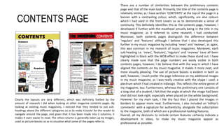
- Both contents pages had similar structures but the main task version was more refined with additions like distinct section headings and a plectrum-shaped page reference.
- The images in the main task were of higher quality due to better equipment and lighting. They were also edited more skillfully to achieve specific aesthetic effects that fit the magazine genre.
- The typography and font choices on the main task cover were more strategically designed and executed to maximize readability and intrigue compared to the preliminary