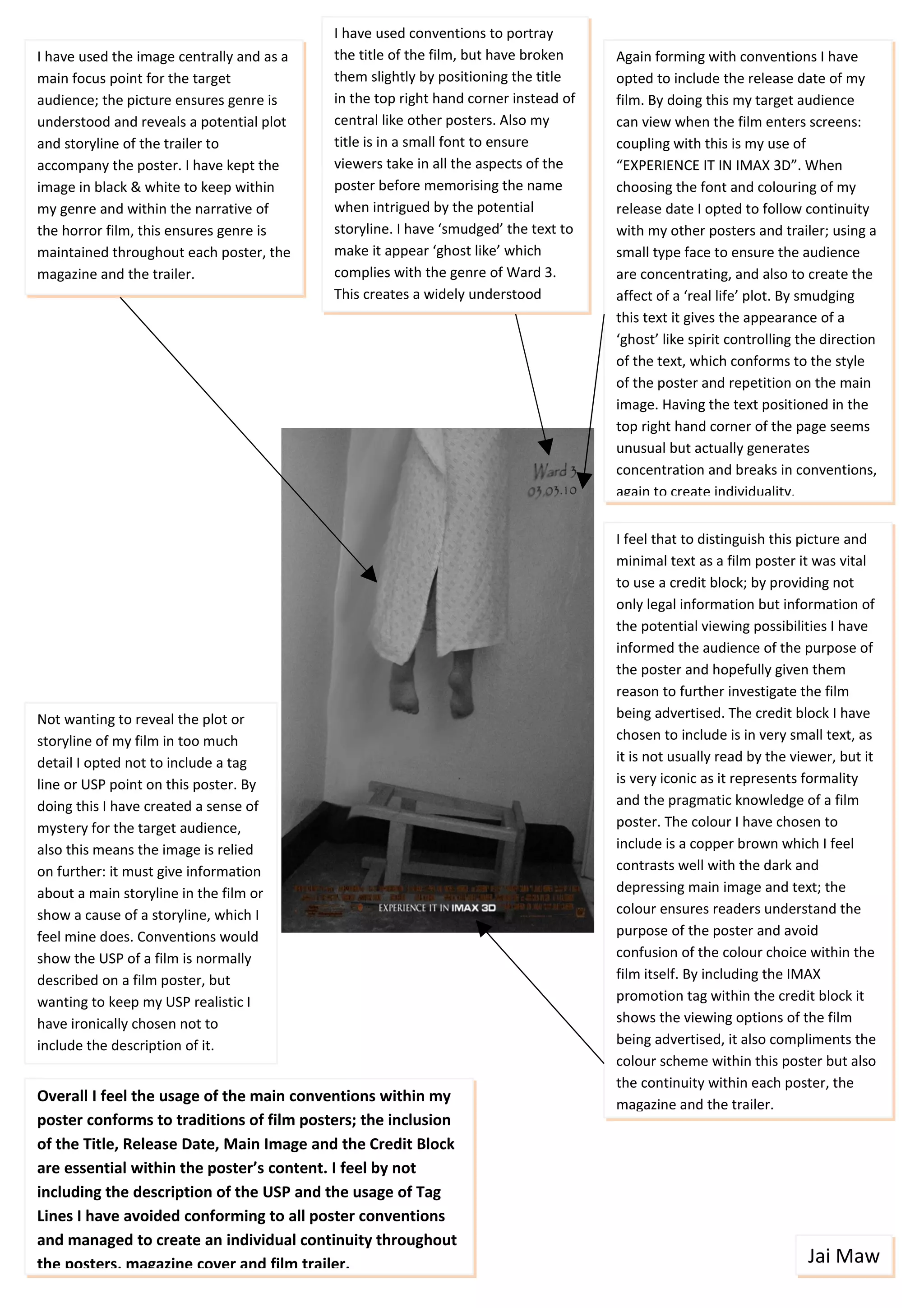
I have used conventions to portray
I have used the image centrally and as a   the title of the film, but have broken    Again forming with conventions I have
main focus point for the target            them slightly by positioning the title    opted to include the release date of my
audience; the picture ensures genre is     in the top right hand corner instead of   film. By doing this my target audience
understood and reveals a potential plot    central like other posters. Also my       can view when the film enters screens:
and storyline of the trailer to            title is in a small font to ensure        coupling with this is my use of
accompany the poster. I have kept the      viewers take in all the aspects of the    “EXPERIENCE IT IN IMAX 3D”. When
image in black & white to keep within      poster before memorising the name         choosing the font and colouring of my
my genre and within the narrative of       when intrigued by the potential           release date I opted to follow continuity
the horror film, this ensures genre is     storyline. I have ‘smudged’ the text to   with my other posters and trailer; using a
maintained throughout each poster, the     make it appear ‘ghost like’ which         small type face to ensure the audience
magazine and the trailer.                  complies with the genre of Ward 3.        are concentrating, and also to create the
                                           This creates a widely understood          affect of a ‘real life’ plot. By smudging
                                           narrative.                                this text it gives the appearance of a
                                                                                     ‘ghost’ like spirit controlling the direction
                                                                                     of the text, which conforms to the style
                                                                                     of the poster and repetition on the main
                                                                                     image. Having the text positioned in the
                                                                                     top right hand corner of the page seems
                                                                                     unusual but actually generates
                                                                                     concentration and breaks in conventions,
                                                                                     again to create individuality.


                                                                                     I feel that to distinguish this picture and
                                                                                     minimal text as a film poster it was vital
                                                                                     to use a credit block; by providing not
                                                                                     only legal information but information of
                                                                                     the potential viewing possibilities I have
                                                                                     informed the audience of the purpose of
                                                                                     the poster and hopefully given them
                                                                                     reason to further investigate the film
Not wanting to reveal the plot or                                                    being advertised. The credit block I have
storyline of my film in too much                                                     chosen to include is in very small text, as
detail I opted not to include a tag                                                  it is not usually read by the viewer, but it
line or USP point on this poster. By                                                 is very iconic as it represents formality
doing this I have created a sense of                                                 and the pragmatic knowledge of a film
mystery for the target audience,                                                     poster. The colour I have chosen to
also this means the image is relied                                                  include is a copper brown which I feel
on further: it must give information                                                 contrasts well with the dark and
about a main storyline in the film or                                                depressing main image and text; the
show a cause of a storyline, which I                                                 colour ensures readers understand the
feel mine does. Conventions would                                                    purpose of the poster and avoid
show the USP of a film is normally                                                   confusion of the colour choice within the
described on a film poster, but                                                      film itself. By including the IMAX
wanting to keep my USP realistic I                                                   promotion tag within the credit block it
have ironically chosen not to                                                        shows the viewing options of the film
include the description of it.                                                       being advertised, it also compliments the
                                                                                     colour scheme within this poster but also
                                                                                     the continuity within each poster, the
Overall I feel the usage of the main conventions within my                           magazine and the trailer.
poster conforms to traditions of film posters; the inclusion
of the Title, Release Date, Main Image and the Credit Block
are essential within the poster’s content. I feel by not
including the description of the USP and the usage of Tag
Lines I have avoided conforming to all poster conventions
and managed to create an individual continuity throughout
the posters, magazine cover and film trailer.                                                                         Jai Maw

F:\Media Studies\Evaluation Blog\Evaluation Blog Poster #1 Analysis

  • 1.
    I have usedconventions to portray I have used the image centrally and as a the title of the film, but have broken Again forming with conventions I have main focus point for the target them slightly by positioning the title opted to include the release date of my audience; the picture ensures genre is in the top right hand corner instead of film. By doing this my target audience understood and reveals a potential plot central like other posters. Also my can view when the film enters screens: and storyline of the trailer to title is in a small font to ensure coupling with this is my use of accompany the poster. I have kept the viewers take in all the aspects of the “EXPERIENCE IT IN IMAX 3D”. When image in black & white to keep within poster before memorising the name choosing the font and colouring of my my genre and within the narrative of when intrigued by the potential release date I opted to follow continuity the horror film, this ensures genre is storyline. I have ‘smudged’ the text to with my other posters and trailer; using a maintained throughout each poster, the make it appear ‘ghost like’ which small type face to ensure the audience magazine and the trailer. complies with the genre of Ward 3. are concentrating, and also to create the This creates a widely understood affect of a ‘real life’ plot. By smudging narrative. this text it gives the appearance of a ‘ghost’ like spirit controlling the direction of the text, which conforms to the style of the poster and repetition on the main image. Having the text positioned in the top right hand corner of the page seems unusual but actually generates concentration and breaks in conventions, again to create individuality. I feel that to distinguish this picture and minimal text as a film poster it was vital to use a credit block; by providing not only legal information but information of the potential viewing possibilities I have informed the audience of the purpose of the poster and hopefully given them reason to further investigate the film Not wanting to reveal the plot or being advertised. The credit block I have storyline of my film in too much chosen to include is in very small text, as detail I opted not to include a tag it is not usually read by the viewer, but it line or USP point on this poster. By is very iconic as it represents formality doing this I have created a sense of and the pragmatic knowledge of a film mystery for the target audience, poster. The colour I have chosen to also this means the image is relied include is a copper brown which I feel on further: it must give information contrasts well with the dark and about a main storyline in the film or depressing main image and text; the show a cause of a storyline, which I colour ensures readers understand the feel mine does. Conventions would purpose of the poster and avoid show the USP of a film is normally confusion of the colour choice within the described on a film poster, but film itself. By including the IMAX wanting to keep my USP realistic I promotion tag within the credit block it have ironically chosen not to shows the viewing options of the film include the description of it. being advertised, it also compliments the colour scheme within this poster but also the continuity within each poster, the Overall I feel the usage of the main conventions within my magazine and the trailer. poster conforms to traditions of film posters; the inclusion of the Title, Release Date, Main Image and the Credit Block are essential within the poster’s content. I feel by not including the description of the USP and the usage of Tag Lines I have avoided conforming to all poster conventions and managed to create an individual continuity throughout the posters, magazine cover and film trailer. Jai Maw