Download to read offline
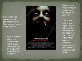
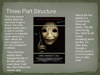
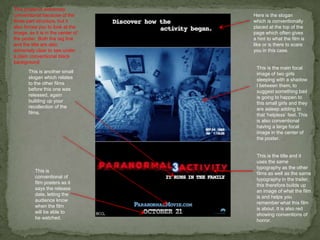
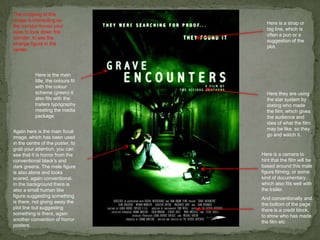
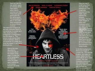

The document provides guidance on designing effective horror movie posters. It analyzes the structure and elements of a sample poster. The poster follows conventions like using a three-part structure with a large central image to draw the eye. It prominently features the title, actors, and release date. Effective horror posters convey a sense of fear through images and text that hint at the plot without giving too much away. The document stresses the importance of consistency across marketing materials like trailers and posters to build recognition of the film as a package.


