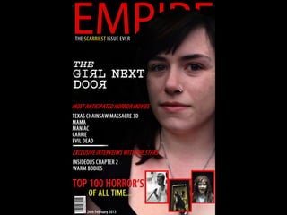
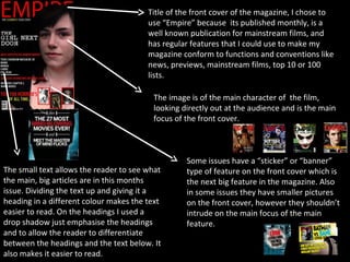
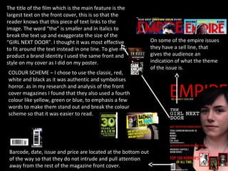
The document summarizes the evaluation of a magazine front cover design. It notes that the main character from the featured film is the central focus of the cover. Headings are used to divide up text blocks and draw attention to different sections. Color schemes and text sizing are used intentionally to emphasize certain elements and make information easier to read. Non-essential details like barcodes and pricing are placed at the bottom of the cover.