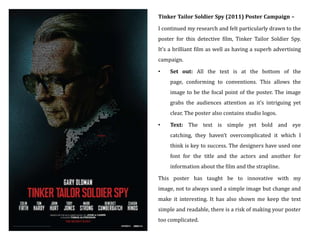
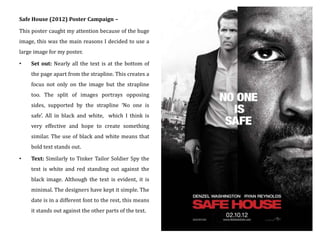
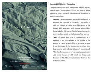
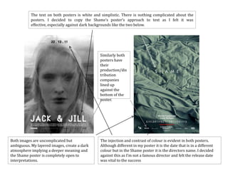
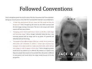
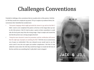
The document analyzes several film posters and how they use and challenge conventions of real film posters. It summarizes key conventions the posters employ, such as large eye-catching titles, intriguing images, and placement of text. It then examines how the document creator's media product poster draws influence from the analyzed posters in its use of a bold central image, font choices, and studio logos. Some conventions, like persuasive language or character names, are purposefully not included to simplify the design. The poster challenges conventions by centering the title and using an ambiguous layered image instead of a single focal point.