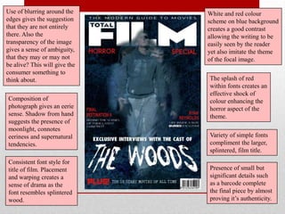
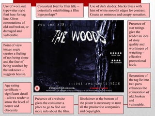
EVALUATION
In what ways does my media product use, develop or
challenge forms and conventions of real media
products?
After researching into my chosen film genre and conventions of film trailers, I
noted key concepts within them, using that to inform my final task enabling it to
appear more professional.

Some of these key concepts consisted of:

• Enigma code (cliff hanger) – leaves viewer wanting more.
• Establishes at least 3 of these: Who? What? Where? When? Why? - but
  doesn‟t give away too much of the plot
• Faster pace
• Creates a sense of atmosphere quickly

This research I used as a guide for what to include within my trailer such as the
enigma code, though I twisted it around within the end of my trailer using this
feature as a shock/scare moment also.

I feel that my production piece was fairly successful, though if I could redo it
again I would make the sound editing a lot more fluid and less jumpy and
jagged.
EVALUATION
How effective is the combination of my main product
and ancillary texts?
Within the project the ancillary tasks should reinforce the message of the main
task, the trailer. I feel that this is true as the sense of the unknown and being
watched is present to some extent within both ancillary texts.


                                  The magazine cover feature shows the
                                  unknown force „toying‟ with their lives in the
                                  woods, whereas the film poster captures the
                                  sense of being watched by that „unknown‟,
                                  mush as is suggested within my trailer.
In the media industry, after the making of a film, the promotional packages are
a common and natural course, consisting of trailers, posters, magazine features,
even radio adverts in some cases.

For my media promotional package, my main task was the trailer and for the
ancillary tasks I chose to create a Film Poster and a Magazine Front Cover
featuring the film I was creating.

As a marketing strategy the three texts could work effectively together,
grasping an audience through new media technologies, tv, magazines and
billboards. The target audience for my film would be ranging within the young
adult collective, e.g. 15-25, as they could relate to the characters on an age
basis, therefore becoming more affected by the plot and increasing the ability
for the viewer to imagine themselves in that same situation, thus enhancing the
horror.

These three texts combined, I feel would effectively do as they would have
been intended for in the actual media industry.
Use of blurring around the     White and red colour
edges gives the suggestion     scheme on blue background
that they are not entirely     creates a good contrast
there. Also the                allowing the writing to be
transparency of the image      easily seen by the reader
gives a sense of ambiguity,    yet also imitate the theme
that they may or may not       of the focal image.
be alive? This will give the
consumer something to
think about.                   The splash of red
                               within fonts creates an
                               effective shock of
Composition of                 colour enhancing the
photograph gives an eerie      horror aspect of the
sense. Shadow from hand        theme.
suggests the presence of
moonlight, connotes
eeriness and supernatural      Variety of simple fonts
tendencies.                    compliment the larger,
                               splintered, film title.
Consistent font style for
title of film. Placement       Presence of small but
and warping creates a          significant details such
sense of drama as the          as a barcode complete
font resembles splintered      the final piece by almost
wood.                          proving it‟s authenticity.
Use of worn out       Consistent font for film title –          Use of dark shades: blacks blues with
typewriter style      potentially establishing a film           hint of white moonlit edges for contrast.
font here for tag     logo perhaps?                             Create an ominous and creepy sensation.
line. Gives
connotations of                                                                             Presence of
old and broken, or                                                                          star ratings
damaged and                                                                                 give the
vulnerable.                                                                                 reader an idea
                                                                                            of story
Point of view                                                                               quality and
image angle                                                                                 worthiness of
creates a feeling                                                                           watching –
of not being alone                                                                          effective
and the fear of                                                                             promotional
being watched by                                                                            hook.
the unknown –
suggests hostile.                                                                           Separation of
                                                                                            the tag lie into
Age rating                                                                                  two parts
certificate –                                                                               enhances the
significant detail                                                                          connotation of
– allows reader to                                                                          old, broken
                     Presence of a website               Disclaimer at the bottom of        and
know the level of    gives the consumer a                the poster is necessary to note
horror and                                                                                  vulnerable.
                     place to go to find out             all the production companies
obscenity            more info about the film.           and copyrights.
EVALUATION
What have I learned from my audience feedback?
“Editing was effective, although the soundtrack could have been a bit more
fluid. It felt a bit disjointed at times, which was distracting from the rest of the
trailer.”
- I agree with this feedback. I also feel like my sound editing felt a bit
    disjointed at times, therefore I feel I‟ve learned the significance of the sound
    on the imagery and if I could redo it I would have spent more time on the
    sound creating a more fluid soundtrack.

“ The amount of written slides were quite a lot. Possibly could have narrowed
the words down onto maybe two or three slides to speed up the pace of the
trailer, other than this I enjoyed the ending camera shot, it definitely made me
jump.”
 - I‟m not sure I fully agree with the beginning of this statement though I do
understand the meaning of it. I feel instead I should have perhaps shortened
the time between slides, therefore speeding up the pace


FEEDBACK

Evaluation Part 1

  • 1.
    EVALUATION In what waysdoes my media product use, develop or challenge forms and conventions of real media products?
  • 2.
    After researching intomy chosen film genre and conventions of film trailers, I noted key concepts within them, using that to inform my final task enabling it to appear more professional. Some of these key concepts consisted of: • Enigma code (cliff hanger) – leaves viewer wanting more. • Establishes at least 3 of these: Who? What? Where? When? Why? - but doesn‟t give away too much of the plot • Faster pace • Creates a sense of atmosphere quickly This research I used as a guide for what to include within my trailer such as the enigma code, though I twisted it around within the end of my trailer using this feature as a shock/scare moment also. I feel that my production piece was fairly successful, though if I could redo it again I would make the sound editing a lot more fluid and less jumpy and jagged.
  • 3.
    EVALUATION How effective isthe combination of my main product and ancillary texts?
  • 4.
    Within the projectthe ancillary tasks should reinforce the message of the main task, the trailer. I feel that this is true as the sense of the unknown and being watched is present to some extent within both ancillary texts. The magazine cover feature shows the unknown force „toying‟ with their lives in the woods, whereas the film poster captures the sense of being watched by that „unknown‟, mush as is suggested within my trailer.
  • 5.
    In the mediaindustry, after the making of a film, the promotional packages are a common and natural course, consisting of trailers, posters, magazine features, even radio adverts in some cases. For my media promotional package, my main task was the trailer and for the ancillary tasks I chose to create a Film Poster and a Magazine Front Cover featuring the film I was creating. As a marketing strategy the three texts could work effectively together, grasping an audience through new media technologies, tv, magazines and billboards. The target audience for my film would be ranging within the young adult collective, e.g. 15-25, as they could relate to the characters on an age basis, therefore becoming more affected by the plot and increasing the ability for the viewer to imagine themselves in that same situation, thus enhancing the horror. These three texts combined, I feel would effectively do as they would have been intended for in the actual media industry.
  • 6.
    Use of blurringaround the White and red colour edges gives the suggestion scheme on blue background that they are not entirely creates a good contrast there. Also the allowing the writing to be transparency of the image easily seen by the reader gives a sense of ambiguity, yet also imitate the theme that they may or may not of the focal image. be alive? This will give the consumer something to think about. The splash of red within fonts creates an effective shock of Composition of colour enhancing the photograph gives an eerie horror aspect of the sense. Shadow from hand theme. suggests the presence of moonlight, connotes eeriness and supernatural Variety of simple fonts tendencies. compliment the larger, splintered, film title. Consistent font style for title of film. Placement Presence of small but and warping creates a significant details such sense of drama as the as a barcode complete font resembles splintered the final piece by almost wood. proving it‟s authenticity.
  • 7.
    Use of wornout Consistent font for film title – Use of dark shades: blacks blues with typewriter style potentially establishing a film hint of white moonlit edges for contrast. font here for tag logo perhaps? Create an ominous and creepy sensation. line. Gives connotations of Presence of old and broken, or star ratings damaged and give the vulnerable. reader an idea of story Point of view quality and image angle worthiness of creates a feeling watching – of not being alone effective and the fear of promotional being watched by hook. the unknown – suggests hostile. Separation of the tag lie into Age rating two parts certificate – enhances the significant detail connotation of – allows reader to old, broken Presence of a website Disclaimer at the bottom of and know the level of gives the consumer a the poster is necessary to note horror and vulnerable. place to go to find out all the production companies obscenity more info about the film. and copyrights.
  • 8.
    EVALUATION What have Ilearned from my audience feedback?
  • 9.
    “Editing was effective,although the soundtrack could have been a bit more fluid. It felt a bit disjointed at times, which was distracting from the rest of the trailer.” - I agree with this feedback. I also feel like my sound editing felt a bit disjointed at times, therefore I feel I‟ve learned the significance of the sound on the imagery and if I could redo it I would have spent more time on the sound creating a more fluid soundtrack. “ The amount of written slides were quite a lot. Possibly could have narrowed the words down onto maybe two or three slides to speed up the pace of the trailer, other than this I enjoyed the ending camera shot, it definitely made me jump.” - I‟m not sure I fully agree with the beginning of this statement though I do understand the meaning of it. I feel instead I should have perhaps shortened the time between slides, therefore speeding up the pace FEEDBACK