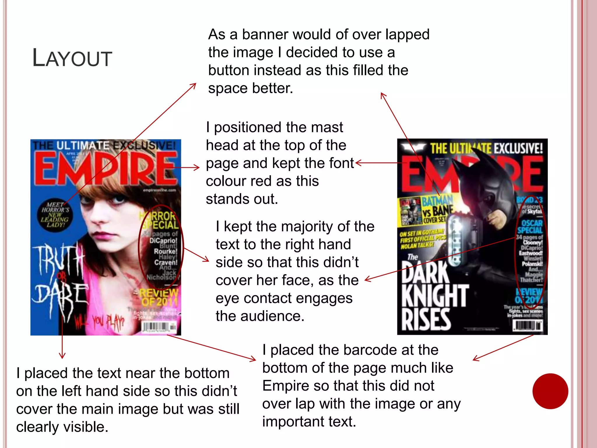
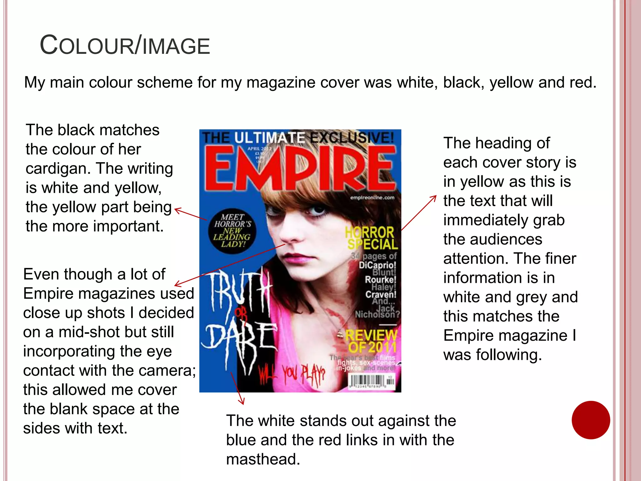
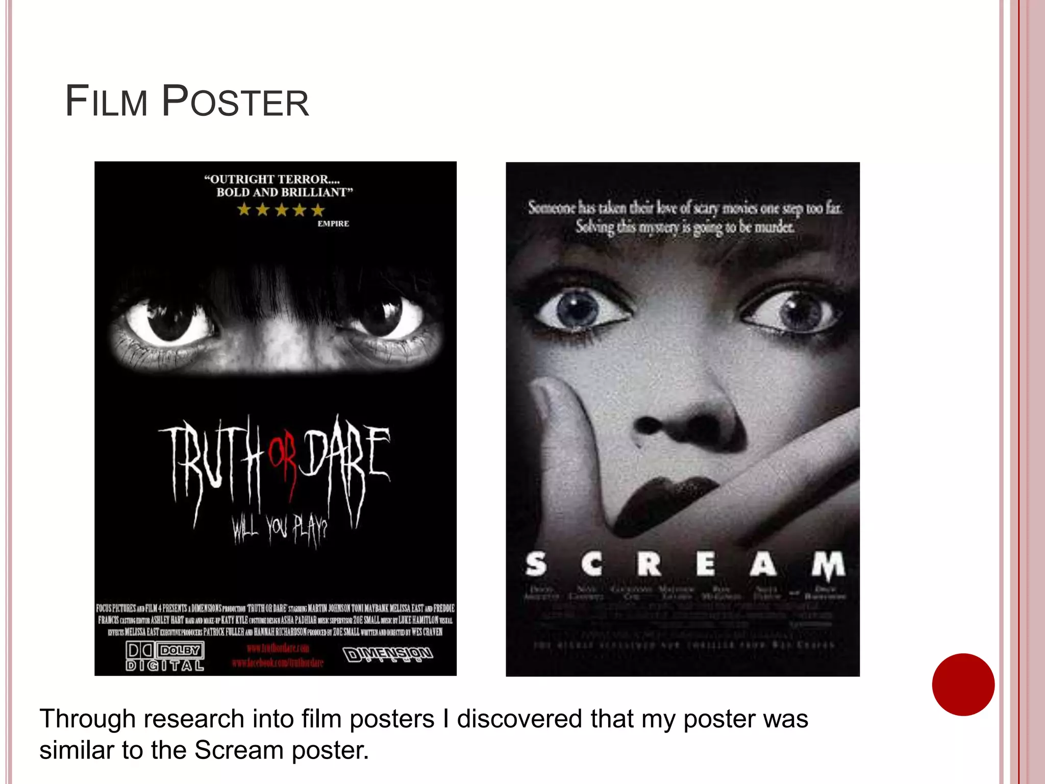
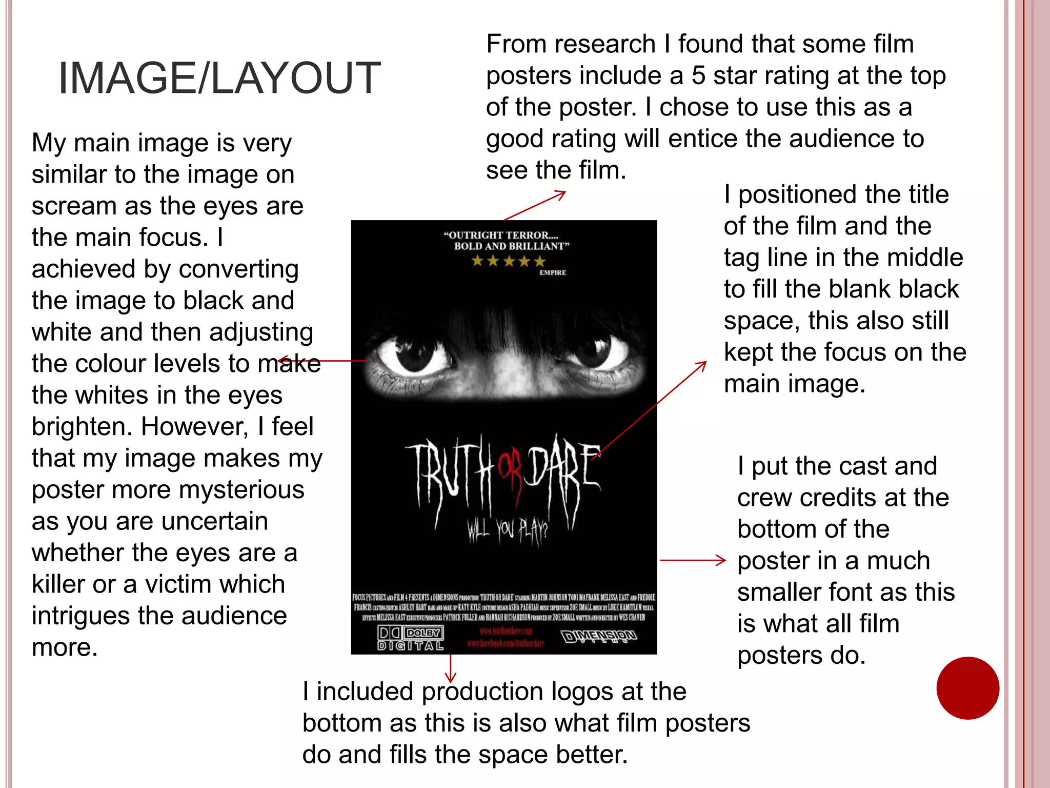
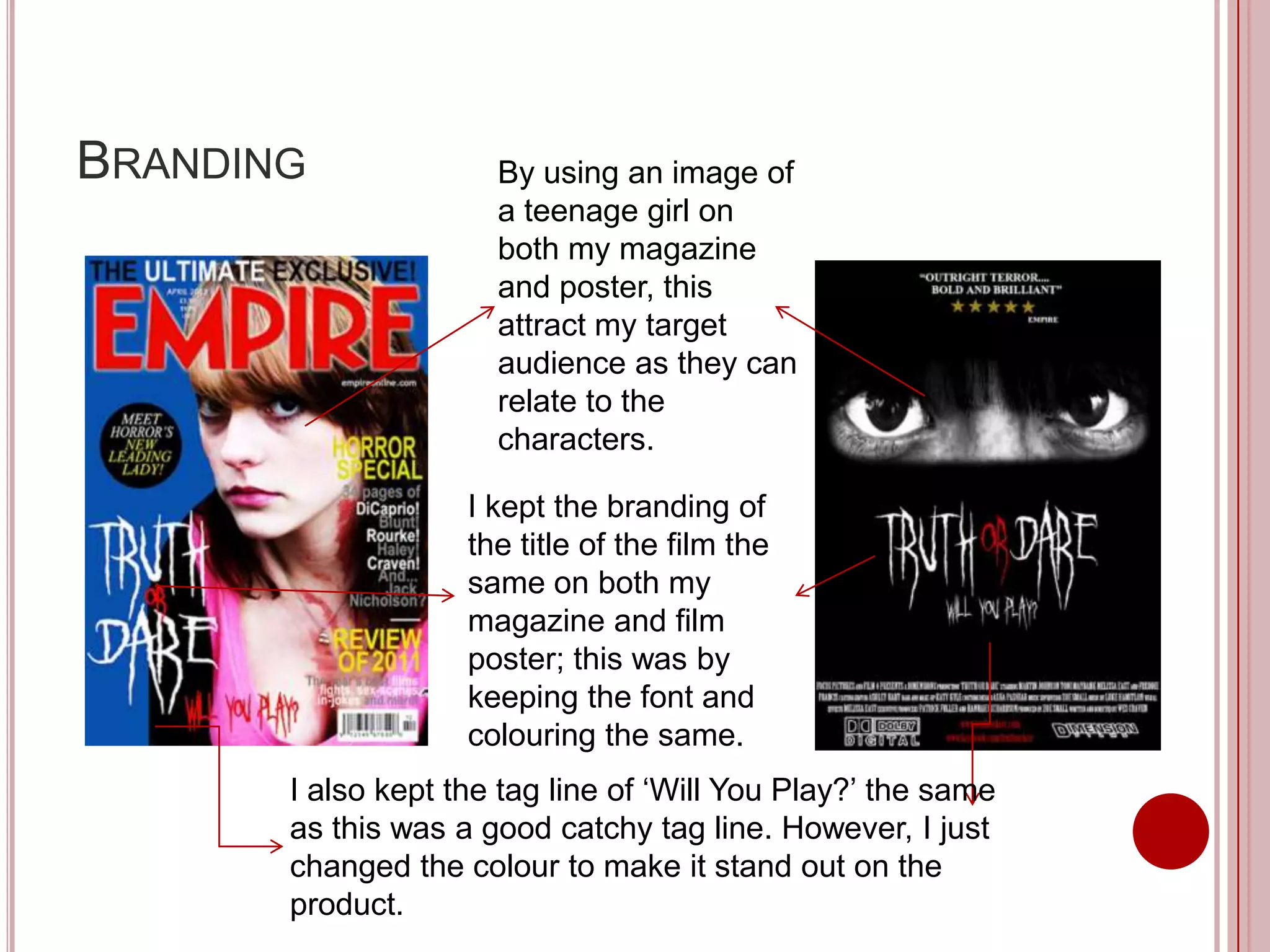
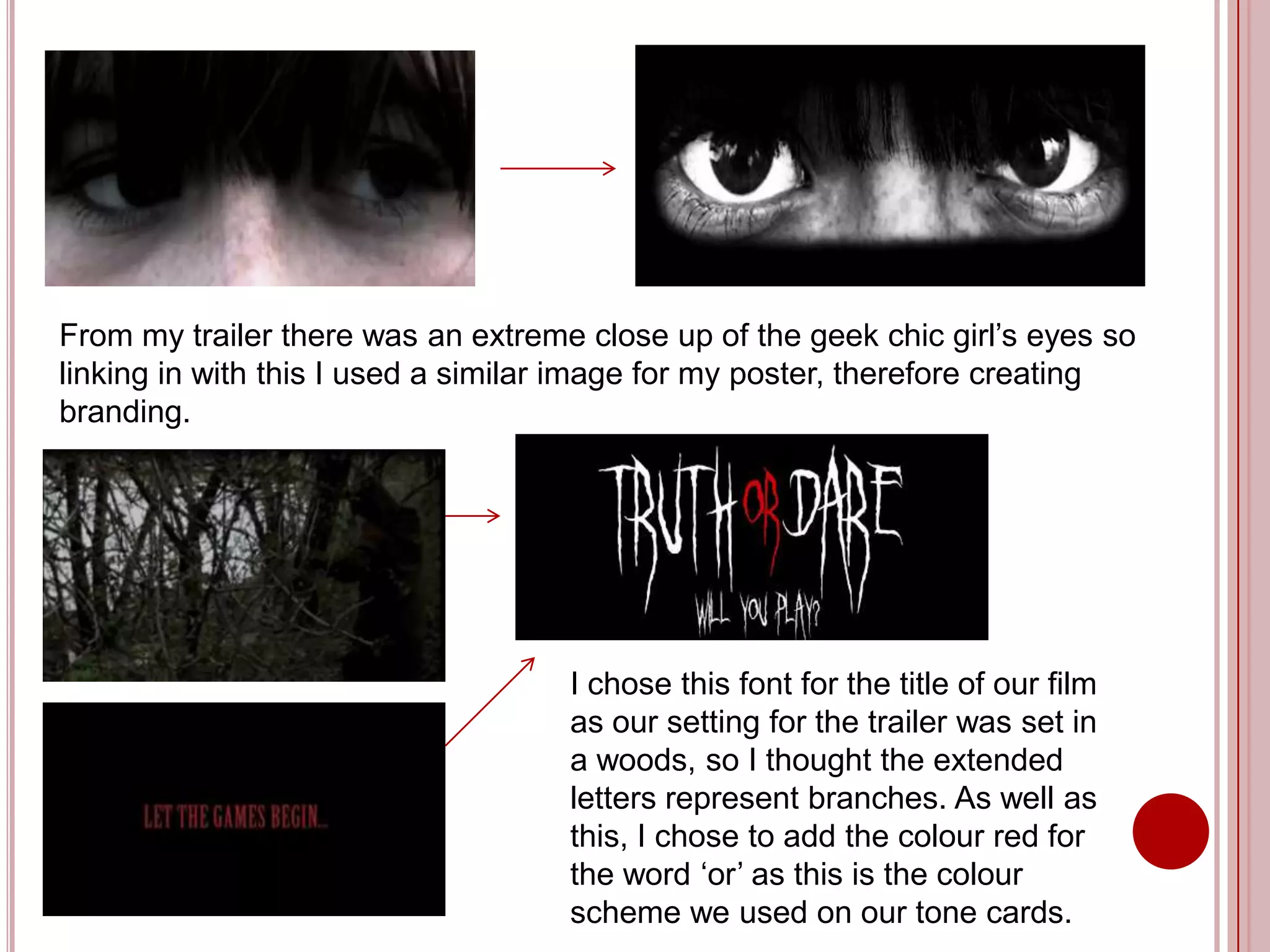
H WEFFECTI VE I S THE
  O
C M I N TI O O YO R M I N
 OB A N F U A
 PR D C A D A C LLA Y
   O U TS N N I      R
         TA S?
           SK
MAGAZINE COVER


I based my magazine cover on a current Batman Empire magazine which
is a popular film magazine.
Before I chose the cover I wanted to focus on I checked out a selection
of magazine covers to gain an understanding of how they were laid out
and to find the right layout to suit my mid shot image.


In the end I found that none of these magazines were suitable as
the text around the image wouldn’t fit properly and would cover up
her face which is the main focus.
As a banner would of over lapped
                              the image I decided to use a
  LAYOUT                      button instead as this filled the
                              space better.

                              I positioned the mast
                              head at the top of the
                              page and kept the font
                              colour red as this
                              stands out.
                                I kept the majority of the
                                text to the right hand
                                side so that this didn’t
                                cover her face, as the
                                eye contact engages
                                the audience.

                                       I placed the barcode at the
I placed the text near the bottom      bottom of the page much like
on the left hand side so this didn’t   Empire so that this did not
cover the main image but was still     over lap with the image or any
clearly visible.                       important text.
COLOUR/IMAGE
My main colour scheme for my magazine cover was white, black, yellow and red.

The black matches
the colour of her                                          The heading of
cardigan. The writing                                      each cover story is
is white and yellow,                                       in yellow as this is
the yellow part being                                      the text that will
the more important.                                        immediately grab
                                                           the audiences
                                                           attention. The finer
Even though a lot of                                       information is in
Empire magazines used                                      white and grey and
close up shots I decided                                   this matches the
on a mid-shot but still                                    Empire magazine I
incorporating the eye                                      was following.
contact with the camera;
this allowed me cover
the blank space at the
sides with text.           The white stands out against the
                           blue and the red links in with the
                           masthead.
FILM POSTER


Through research into film posters I discovered that my poster was
similar to the Scream poster.
From research I found that some film
  IMAGE/LAYOUT                         posters include a 5 star rating at the top
                                       of the poster. I chose to use this as a
My main image is very                  good rating will entice the audience to
similar to the image on                see the film.
scream as the eyes are                                       I positioned the title
the main focus. I                                            of the film and the
achieved by converting                                       tag line in the middle
the image to black and                                       to fill the blank black
white and then adjusting                                     space, this also still
the colour levels to make                                    kept the focus on the
the whites in the eyes                                       main image.
brighten. However, I feel
that my image makes my                                        I put the cast and
poster more mysterious                                        crew credits at the
as you are uncertain                                          bottom of the
whether the eyes are a                                        poster in a much
killer or a victim which                                      smaller font as this
intrigues the audience                                        is what all film
more.                                                         posters do.
                       I included production logos at the
                       bottom as this is also what film posters
                       do and fills the space better.
MARKETTING
I would market my film poster outside the cinema on screens so
that it would entice people attending the cinema if they were
uncertain what film to see. I would also place it at bus stands as my
target audience of teenagers (16+) are more likely to see and notice
it here as this is the transport they use daily. I would also place it in
HMV as this would market the poster to a wider audience and is a
well known department store.

Facebook and Twitter are two social networking sites that I would
also publish my poster. This allows it to be a seen by a wider
audience and will attract my target audience as these are social
networking sites that they use daily.
BRANDING              By using an image of
                      a teenage girl on
                      both my magazine
                      and poster, this
                      attract my target
                      audience as they can
                      relate to the
                      characters.

                    I kept the branding of
                    the title of the film the
                    same on both my
                    magazine and film
                    poster; this was by
                    keeping the font and
                    colouring the same.
       I also kept the tag line of ‘Will You Play?’ the same
       as this was a good catchy tag line. However, I just
       changed the colour to make it stand out on the
       product.
From my trailer there was an extreme close up of the geek chic girl’s eyes so
linking in with this I used a similar image for my poster, therefore creating
branding.


                                    I chose this font for the title of our film
                                    as our setting for the trailer was set in
                                    a woods, so I thought the extended
                                    letters represent branches. As well as
                                    this, I chose to add the colour red for
                                    the word ‘or’ as this is the colour
                                    scheme we used on our tone cards.

Evaluation 2.) How effective is the combination of your main products and ancillary tasks?

  • 1.
    H WEFFECTI VEI S THE O C M I N TI O O YO R M I N OB A N F U A PR D C A D A C LLA Y O U TS N N I R TA S? SK
  • 2.
    MAGAZINE COVER I basedmy magazine cover on a current Batman Empire magazine which is a popular film magazine.
  • 3.
    Before I chosethe cover I wanted to focus on I checked out a selection of magazine covers to gain an understanding of how they were laid out and to find the right layout to suit my mid shot image. In the end I found that none of these magazines were suitable as the text around the image wouldn’t fit properly and would cover up her face which is the main focus.
  • 4.
    As a bannerwould of over lapped the image I decided to use a LAYOUT button instead as this filled the space better. I positioned the mast head at the top of the page and kept the font colour red as this stands out. I kept the majority of the text to the right hand side so that this didn’t cover her face, as the eye contact engages the audience. I placed the barcode at the I placed the text near the bottom bottom of the page much like on the left hand side so this didn’t Empire so that this did not cover the main image but was still over lap with the image or any clearly visible. important text.
  • 5.
    COLOUR/IMAGE My main colourscheme for my magazine cover was white, black, yellow and red. The black matches the colour of her The heading of cardigan. The writing each cover story is is white and yellow, in yellow as this is the yellow part being the text that will the more important. immediately grab the audiences attention. The finer Even though a lot of information is in Empire magazines used white and grey and close up shots I decided this matches the on a mid-shot but still Empire magazine I incorporating the eye was following. contact with the camera; this allowed me cover the blank space at the sides with text. The white stands out against the blue and the red links in with the masthead.
  • 6.
    FILM POSTER Through researchinto film posters I discovered that my poster was similar to the Scream poster.
  • 7.
    From research Ifound that some film IMAGE/LAYOUT posters include a 5 star rating at the top of the poster. I chose to use this as a My main image is very good rating will entice the audience to similar to the image on see the film. scream as the eyes are I positioned the title the main focus. I of the film and the achieved by converting tag line in the middle the image to black and to fill the blank black white and then adjusting space, this also still the colour levels to make kept the focus on the the whites in the eyes main image. brighten. However, I feel that my image makes my I put the cast and poster more mysterious crew credits at the as you are uncertain bottom of the whether the eyes are a poster in a much killer or a victim which smaller font as this intrigues the audience is what all film more. posters do. I included production logos at the bottom as this is also what film posters do and fills the space better.
  • 8.
    MARKETTING I would marketmy film poster outside the cinema on screens so that it would entice people attending the cinema if they were uncertain what film to see. I would also place it at bus stands as my target audience of teenagers (16+) are more likely to see and notice it here as this is the transport they use daily. I would also place it in HMV as this would market the poster to a wider audience and is a well known department store. Facebook and Twitter are two social networking sites that I would also publish my poster. This allows it to be a seen by a wider audience and will attract my target audience as these are social networking sites that they use daily.
  • 9.
    BRANDING By using an image of a teenage girl on both my magazine and poster, this attract my target audience as they can relate to the characters. I kept the branding of the title of the film the same on both my magazine and film poster; this was by keeping the font and colouring the same. I also kept the tag line of ‘Will You Play?’ the same as this was a good catchy tag line. However, I just changed the colour to make it stand out on the product.
  • 10.
    From my trailerthere was an extreme close up of the geek chic girl’s eyes so linking in with this I used a similar image for my poster, therefore creating branding. I chose this font for the title of our film as our setting for the trailer was set in a woods, so I thought the extended letters represent branches. As well as this, I chose to add the colour red for the word ‘or’ as this is the colour scheme we used on our tone cards.