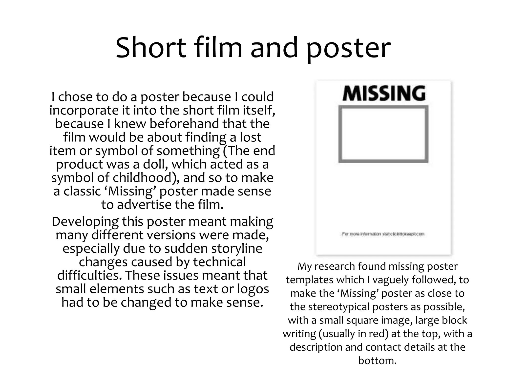
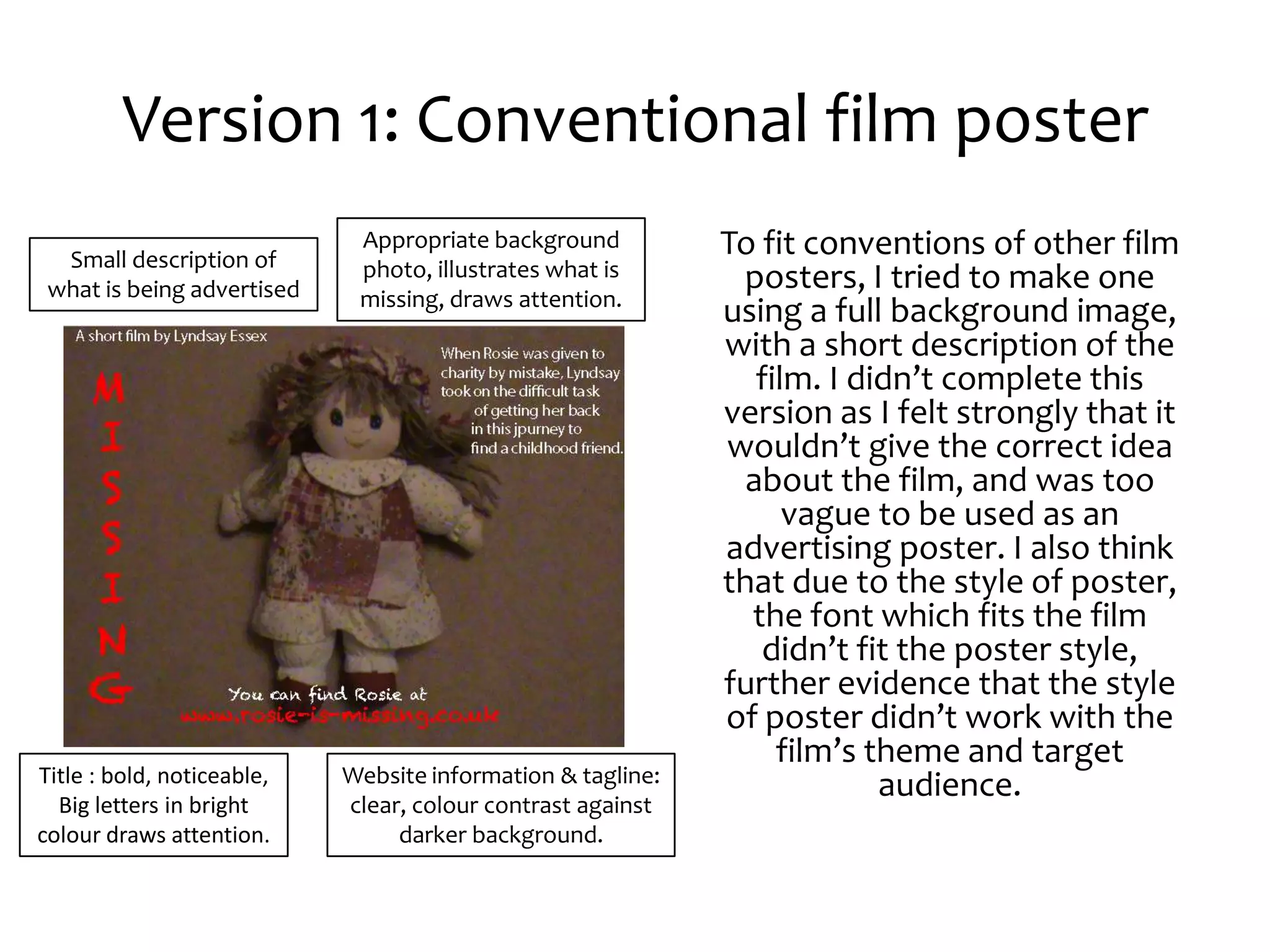
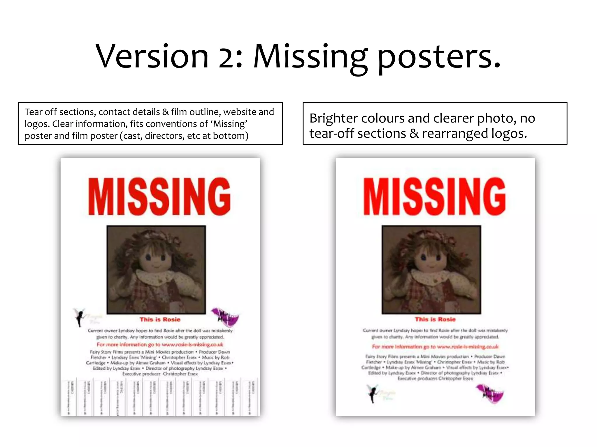
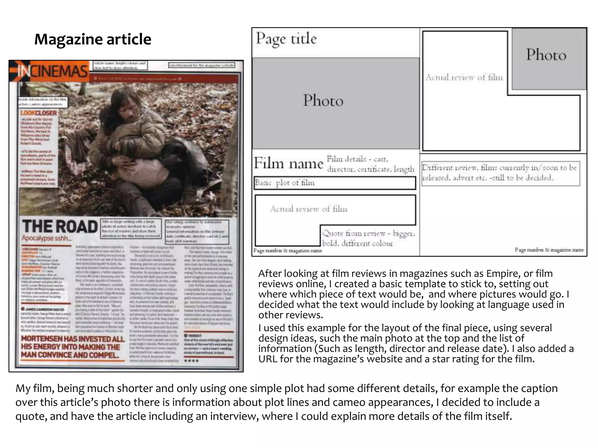
Question 2: How effective is the
combination of your main product
       and ancillary tasks?
           Lyndsay Essex
Short film and poster
 I chose to do a poster because I could
incorporate it into the short film itself,
  because I knew beforehand that the
    film would be about finding a lost
item or symbol of something (The end
  product was a doll, which acted as a
 symbol of childhood), and so to make
  a classic ‘Missing’ poster made sense
            to advertise the film.
 Developing this poster meant making
  many different versions were made,
    especially due to sudden storyline
       changes caused by technical              My research found missing poster
   difficulties. These issues meant that     templates which I vaguely followed, to
  small elements such as text or logos        make the ‘Missing’ poster as close to
    had to be changed to make sense.          the stereotypical posters as possible,
                                              with a small square image, large block
                                             writing (usually in red) at the top, with a
                                              description and contact details at the
                                                              bottom.
Version 1: Conventional film poster
  Small description of
                             Appropriate background          To fit conventions of other film
                             photo, illustrates what is       posters, I tried to make one
 what is being advertised    missing, draws attention.
                                                             using a full background image,
                                                             with a short description of the
                                                                film. I didn’t complete this
                                                             version as I felt strongly that it
                                                             wouldn’t give the correct idea
                                                               about the film, and was too
                                                                   vague to be used as an
                                                             advertising poster. I also think
                                                             that due to the style of poster,
                                                               the font which fits the film
                                                                didn’t fit the poster style,
                                                             further evidence that the style
                                                             of poster didn’t work with the
                                                                  film’s theme and target
Title : bold, noticeable,   Website information & tagline:
  Big letters in bright     clear, colour contrast against
                                                                          audience.
colour draws attention.          darker background.
Version 2: Missing posters.
Tear off sections, contact details & film outline, website and
logos. Clear information, fits conventions of ‘Missing’          Brighter colours and clearer photo, no
poster and film poster (cast, directors, etc at bottom)          tear-off sections & rearranged logos.
Finished product
The final version had been    Changed text to fit the changed storyline,
changed to fit last-minute    logos, more clear font on link to website.
story changes, as well as a
clear photo and text.
The difference between
the first attempt and the
finished version shows the
development of ideas and
discovering that
something which is
conventionally correct is
wrong for my piece.
Magazine article


                                                 After looking at film reviews in magazines such as Empire, or film
                                                 reviews online, I created a basic template to stick to, setting out
                                                 where which piece of text would be, and where pictures would go. I
                                                 decided what the text would include by looking at language used in
                                                 other reviews.
                                                 I used this example for the layout of the final piece, using several
                                                 design ideas, such the main photo at the top and the list of
                                                 information (Such as length, director and release date). I also added a
                                                 URL for the magazine’s website and a star rating for the film.

My film, being much shorter and only using one simple plot had some different details, for example the caption
over this article’s photo there is information about plot lines and cameo appearances, I decided to include a
quote, and have the article including an interview, where I could explain more details of the film itself.
Effect of a good review
• Film institutions benefit from a good review,
  as the publicity gained from positive press
  will gain the institution and any
  organisations associated with it popularity,
  and in turn more money, as reviews are
  essentially free advertisements which many
  people read before seeing a film, and has
  the ability to change the audience’s opinions
  on what they see.
Finished magazine article
                       Title – film name mimics
                       poster, short line on article.


                                                                             Film still &
                                                                             caption,
Film stills have
                                                                             photo
captions.
                                                                             taken for
Brief plot                                                                   the article,
summary &                                                                    film
article                                                                      website
intro.                                                                       URL, star
                                                                             rating.
Film
information
– certificate,                                                               Short
director,                                                                    reviews,
producer,                                                                    few
genre,                                                                       magazines
running time                                                                 have a
and release                                                                  single
                                                        Reference to next
date.              Page numbers, magazine                                    review on a
                                                        weeks issue – with
                   name, website URL.                                        page.
                                                        tagline.
Reviews representation of film
• By putting the review along
  side reviews of animated
  and bright, childish short
  films suggests that the short
  film in the main review fits
  the same style.

 • Caption/photo
Magazine background images
•       Very few magazines I looked at had just a plain white background, and so I decided to add a
        background image, relating to the magazine article, rather than the short film aspect. I found a
        number of images, tested each against the text and tried using Photoshop on a few. Many
        didn’t work because the font I had decided to use wasn’t clear against the background, or
        didn’t work across the double page spread.


                                                                               Tried with white text and different
                                                                               font but was still unclear, didn’t
                                                                               show filmstrip. Also the dull colour
                                        Didn’t show much of filmstrip,         wouldn’t fit a bright review about
Article text font and colour            unclear text. Against background       a happy film, more colours were
wasn’t clear over this design.          texture.                               needed.


                                                                               I cut off the plain side and used a zoom
                                                                               of the filmstrip, as it added more
                                                                               colours, as colourful has connotations
                                                                               of ‘bright’ and happy , fitting the style of
    Some areas too dark & some too      Still looked plain white, titles and   the film, and kept with the house style
    light for text colour and font.     bottom headers of magazine             of film which is appropriate in a movie-
    Didn’t fit with theme and style.    weren’t clear.                         based magazine.
Other Ideas:
• As the main object in the film is a doll, to appeal
  to a wider audience of younger children Rosie
  could be sold as a separate toy. However as the
  toy I used is an existing toy from the early 90’s,
  so if this was a real film, an original and
  distinctive toy would would have been created
  and sold separately.
• The music used in the film could also be used to
  advertise both the film and the band, if a music
  video was created to go with the song, the film
  could also be used to advertise the band.
Summary
• Overall, I think the combination of magazine
  article and film poster works well, as the
  poster can be incorporated into the film as
  well as advertise the film, and the magazine
  is a good way of reaching larger numbers of
  the target audience (Older teens/Young
  adults, who are more interested in films, and
  so more likely to watch a short silent film.).

Evaluation question 2

  • 1.
    Question 2: Howeffective is the combination of your main product and ancillary tasks? Lyndsay Essex
  • 2.
    Short film andposter I chose to do a poster because I could incorporate it into the short film itself, because I knew beforehand that the film would be about finding a lost item or symbol of something (The end product was a doll, which acted as a symbol of childhood), and so to make a classic ‘Missing’ poster made sense to advertise the film. Developing this poster meant making many different versions were made, especially due to sudden storyline changes caused by technical My research found missing poster difficulties. These issues meant that templates which I vaguely followed, to small elements such as text or logos make the ‘Missing’ poster as close to had to be changed to make sense. the stereotypical posters as possible, with a small square image, large block writing (usually in red) at the top, with a description and contact details at the bottom.
  • 3.
    Version 1: Conventionalfilm poster Small description of Appropriate background To fit conventions of other film photo, illustrates what is posters, I tried to make one what is being advertised missing, draws attention. using a full background image, with a short description of the film. I didn’t complete this version as I felt strongly that it wouldn’t give the correct idea about the film, and was too vague to be used as an advertising poster. I also think that due to the style of poster, the font which fits the film didn’t fit the poster style, further evidence that the style of poster didn’t work with the film’s theme and target Title : bold, noticeable, Website information & tagline: Big letters in bright clear, colour contrast against audience. colour draws attention. darker background.
  • 4.
    Version 2: Missingposters. Tear off sections, contact details & film outline, website and logos. Clear information, fits conventions of ‘Missing’ Brighter colours and clearer photo, no poster and film poster (cast, directors, etc at bottom) tear-off sections & rearranged logos.
  • 5.
    Finished product The finalversion had been Changed text to fit the changed storyline, changed to fit last-minute logos, more clear font on link to website. story changes, as well as a clear photo and text. The difference between the first attempt and the finished version shows the development of ideas and discovering that something which is conventionally correct is wrong for my piece.
  • 6.
    Magazine article After looking at film reviews in magazines such as Empire, or film reviews online, I created a basic template to stick to, setting out where which piece of text would be, and where pictures would go. I decided what the text would include by looking at language used in other reviews. I used this example for the layout of the final piece, using several design ideas, such the main photo at the top and the list of information (Such as length, director and release date). I also added a URL for the magazine’s website and a star rating for the film. My film, being much shorter and only using one simple plot had some different details, for example the caption over this article’s photo there is information about plot lines and cameo appearances, I decided to include a quote, and have the article including an interview, where I could explain more details of the film itself.
  • 7.
    Effect of agood review • Film institutions benefit from a good review, as the publicity gained from positive press will gain the institution and any organisations associated with it popularity, and in turn more money, as reviews are essentially free advertisements which many people read before seeing a film, and has the ability to change the audience’s opinions on what they see.
  • 8.
    Finished magazine article Title – film name mimics poster, short line on article. Film still & caption, Film stills have photo captions. taken for Brief plot the article, summary & film article website intro. URL, star rating. Film information – certificate, Short director, reviews, producer, few genre, magazines running time have a and release single Reference to next date. Page numbers, magazine review on a weeks issue – with name, website URL. page. tagline.
  • 9.
    Reviews representation offilm • By putting the review along side reviews of animated and bright, childish short films suggests that the short film in the main review fits the same style. • Caption/photo
  • 10.
    Magazine background images • Very few magazines I looked at had just a plain white background, and so I decided to add a background image, relating to the magazine article, rather than the short film aspect. I found a number of images, tested each against the text and tried using Photoshop on a few. Many didn’t work because the font I had decided to use wasn’t clear against the background, or didn’t work across the double page spread. Tried with white text and different font but was still unclear, didn’t show filmstrip. Also the dull colour Didn’t show much of filmstrip, wouldn’t fit a bright review about Article text font and colour unclear text. Against background a happy film, more colours were wasn’t clear over this design. texture. needed. I cut off the plain side and used a zoom of the filmstrip, as it added more colours, as colourful has connotations of ‘bright’ and happy , fitting the style of Some areas too dark & some too Still looked plain white, titles and the film, and kept with the house style light for text colour and font. bottom headers of magazine of film which is appropriate in a movie- Didn’t fit with theme and style. weren’t clear. based magazine.
  • 11.
    Other Ideas: • Asthe main object in the film is a doll, to appeal to a wider audience of younger children Rosie could be sold as a separate toy. However as the toy I used is an existing toy from the early 90’s, so if this was a real film, an original and distinctive toy would would have been created and sold separately. • The music used in the film could also be used to advertise both the film and the band, if a music video was created to go with the song, the film could also be used to advertise the band.
  • 12.
    Summary • Overall, Ithink the combination of magazine article and film poster works well, as the poster can be incorporated into the film as well as advertise the film, and the magazine is a good way of reaching larger numbers of the target audience (Older teens/Young adults, who are more interested in films, and so more likely to watch a short silent film.).