Download to read offline

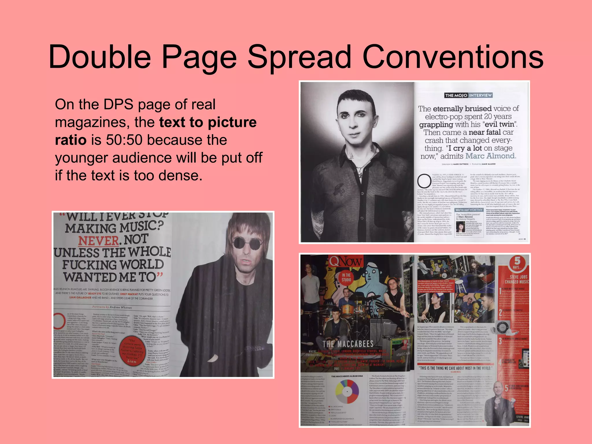
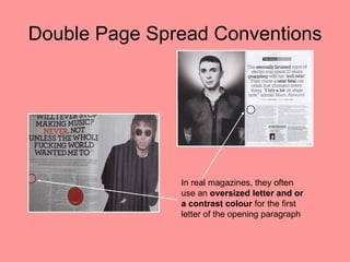
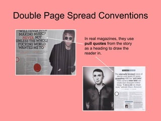
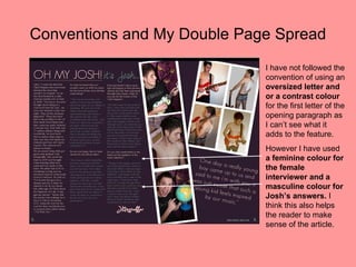
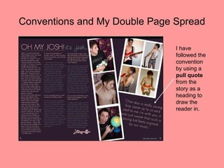

The document discusses conventions for double page spreads in magazines. It notes that magazines typically use a 50:50 text to picture ratio on double page spreads since too much text could put off younger readers. It also mentions that magazines commonly use an oversized first letter of the opening paragraph or a contrasting color, and pull quotes from the story as a heading. The document then discusses how the creator of the double page spread followed some conventions, like the 50:50 ratio, but not others, such as using a special first letter.


