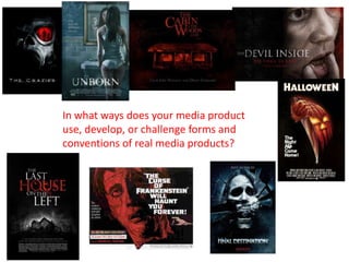
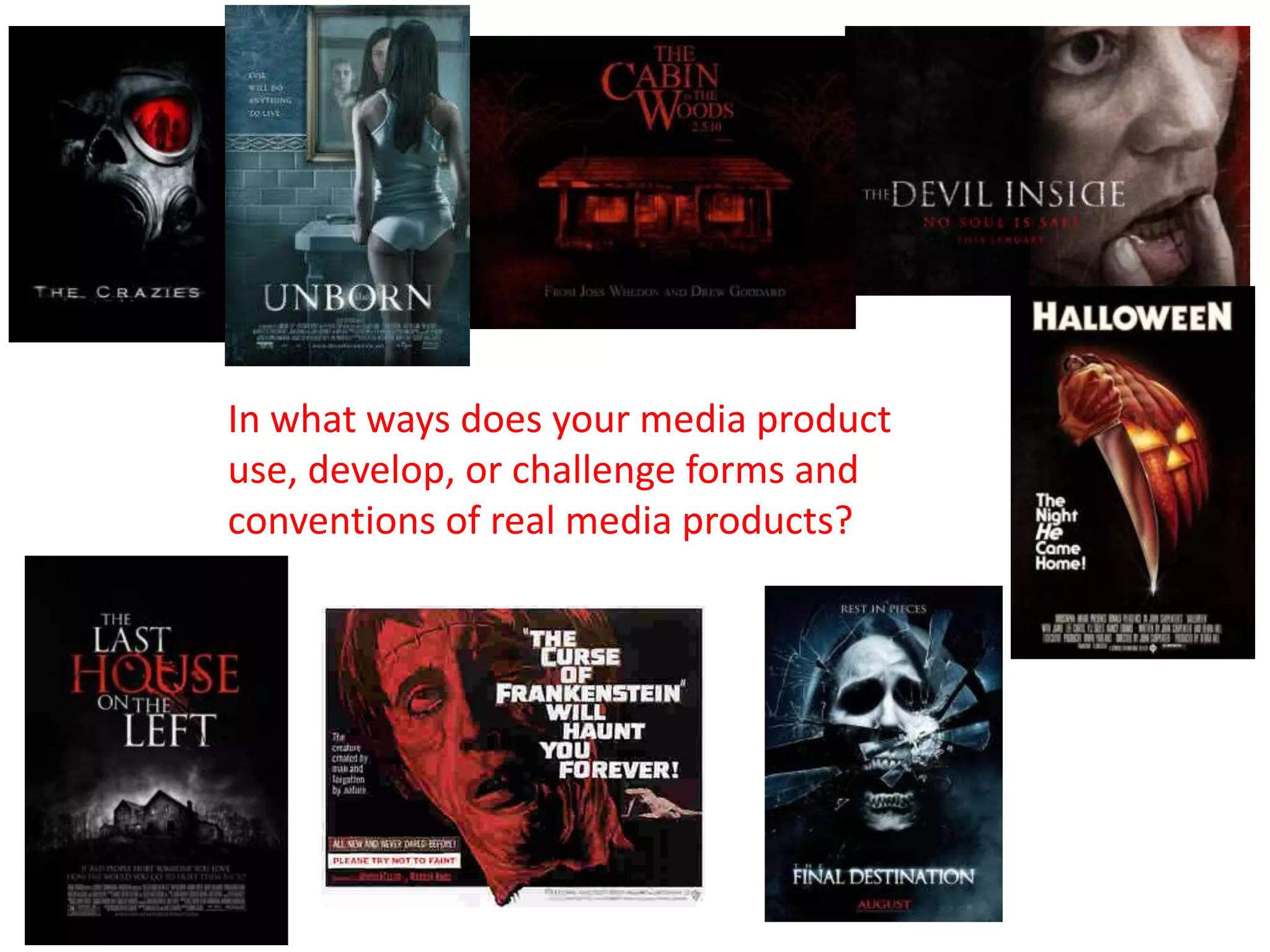
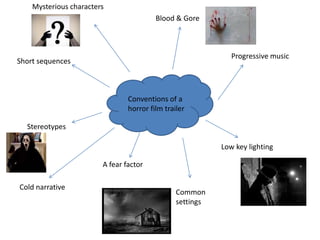
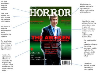
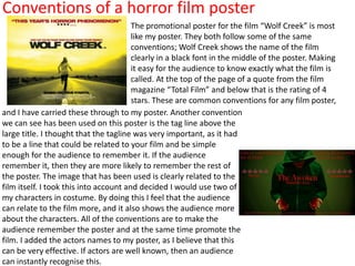
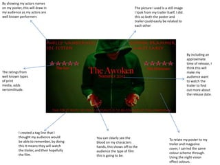
In what ways does your media product
use, develop, or challenge forms and
conventions of real media products?
Mysterious characters
                                         Blood & Gore


                                                              Progressive music
Short sequences


                                Conventions of a
                                horror film trailer

  Stereotypes

                                                           Low key lighting

                        A fear factor

Cold narrative
                                                Common
                                                settings
Conventions of a horror film magazine
                            Fangoria is a similar magazine to mine. The conventions that
                            Fangoria uses are very similar to mine. For example; the
                            colour scheme that has been used is mainly red and
                            black, both of these colours resemble blood and death. Two
                            things that we commonly associate with horror. Also the
                            magazine has one main image like mine, but instead of
                            having an actor as the main image they have the character of
                            the film in full costume and make-up. This could help sell the
                            magazine and promote the film at the same time, as it allows
                            the audience to see exactly what the main character looks
                            like. At the same time a picture of the actor could be just as
                            effective, if the actor is very well known, and has a fan base.
The picture is a very important part of the magazine. It is the
first thing that will draw the attention of the audience. The
picture is of course related to the feature article of the magazine
which is clearly shown with the large title of the films name.
Fangoria have also used sub stories around the image, allowing
the audience to see what else is included in the magazine.
The large
masthead to
                      By including the
make the
                      website address for
magazine
                      my magazine, it
stand out
                      allows me to reach a
                      wider audience.
Date, issue
number, and
price to make
the magazine
more realistic           I decided to use a
                         picture of one of my
                         actors. As my actor
Sub stories to           is quite well
show the                 known, I think this
audience what            will appeal to my
else is                  target
included in the          audience, and
magazine                 further afield.

The large feature          The background of
article title, is a        my
clear message to           magazine, relates to
the audience. A            the editing
big selling point          technique I used in
                           my trailer. The
                           colours resemble
                           the night vision
 I used a plus
                           effect
 sign, to show
 what else is
 included in the
 magazine. By              I added the
 using this I think        barcode to make
 it makes the sub          my magazine
 stories stand out         more realistic
 more.
Conventions of a horror film poster
                                        The promotional poster for the film “Wolf Creek” is most
                                        like my poster. They both follow some of the same
                                        conventions; Wolf Creek shows the name of the film
                                        clearly in a black font in the middle of the poster. Making
                                        it easy for the audience to know exactly what the film is
                                        called. At the top of the page of a quote from the film
                                        magazine “Total Film” and below that is the rating of 4
                                        stars. These are common conventions for any film poster,
and I have carried these through to my poster. Another convention
we can see has been used on this poster is the tag line above the
large title. I thought that the tagline was very important, as it had
to be a line that could be related to your film and be simple
enough for the audience to remember it. If the audience
remember it, then they are more likely to remember the rest of
the poster. The image that has been used is clearly related to the
film itself. I took this into account and decided I would use two of
my characters in costume. By doing this I feel that the audience
can relate to the film more, and it also shows the audience more
about the characters. All of the conventions are to make the
audience remember the poster and at the same time promote the
film. I added the actors names to my poster, as I believe that this
can be very effective. If actors are well known, then an audience
can instantly recognise this.
By showing my actors names
on my poster, this will draw in                                        The picture I used is a still image
my audience as my actors are                                           I took from my trailer itself. I did
well known performers                                                  this so both the poster and
                                                                       trailer could easily be related to
                                                                       each other


                                                                                                              By including an
                                                                                                              approximate
                                                                                                              time of release, I
                                                                                                              think this will
The ratings from                                                                                              make my
well known types                                                                                              audience want
of print                                                                                                      to watch the
media, adds                                                                                                   trailer to find
verisimilitude.                                                                                               out more about
                                                                                                              the release date.


           I created a tag line that I
           thought my audience would         You can clearly see the                            To relate my poster to my
           be able to remember, by doing     blood on my characters                             trailer and magazine
           this it means they will watch     hands, this shows off to the                       cover, I carried the same
           the trailer, and then hopefully   audience the type of film                          colour scheme through.
           the film.                         this is going to be.                               Using the night vision
                                                                                                effect colours.

Evaluation - Question One

  • 1.
    In what waysdoes your media product use, develop, or challenge forms and conventions of real media products?
  • 2.
    Mysterious characters Blood & Gore Progressive music Short sequences Conventions of a horror film trailer Stereotypes Low key lighting A fear factor Cold narrative Common settings
  • 3.
    Conventions of ahorror film magazine Fangoria is a similar magazine to mine. The conventions that Fangoria uses are very similar to mine. For example; the colour scheme that has been used is mainly red and black, both of these colours resemble blood and death. Two things that we commonly associate with horror. Also the magazine has one main image like mine, but instead of having an actor as the main image they have the character of the film in full costume and make-up. This could help sell the magazine and promote the film at the same time, as it allows the audience to see exactly what the main character looks like. At the same time a picture of the actor could be just as effective, if the actor is very well known, and has a fan base. The picture is a very important part of the magazine. It is the first thing that will draw the attention of the audience. The picture is of course related to the feature article of the magazine which is clearly shown with the large title of the films name. Fangoria have also used sub stories around the image, allowing the audience to see what else is included in the magazine.
  • 4.
    The large masthead to By including the make the website address for magazine my magazine, it stand out allows me to reach a wider audience. Date, issue number, and price to make the magazine more realistic I decided to use a picture of one of my actors. As my actor Sub stories to is quite well show the known, I think this audience what will appeal to my else is target included in the audience, and magazine further afield. The large feature The background of article title, is a my clear message to magazine, relates to the audience. A the editing big selling point technique I used in my trailer. The colours resemble the night vision I used a plus effect sign, to show what else is included in the magazine. By I added the using this I think barcode to make it makes the sub my magazine stories stand out more realistic more.
  • 5.
    Conventions of ahorror film poster The promotional poster for the film “Wolf Creek” is most like my poster. They both follow some of the same conventions; Wolf Creek shows the name of the film clearly in a black font in the middle of the poster. Making it easy for the audience to know exactly what the film is called. At the top of the page of a quote from the film magazine “Total Film” and below that is the rating of 4 stars. These are common conventions for any film poster, and I have carried these through to my poster. Another convention we can see has been used on this poster is the tag line above the large title. I thought that the tagline was very important, as it had to be a line that could be related to your film and be simple enough for the audience to remember it. If the audience remember it, then they are more likely to remember the rest of the poster. The image that has been used is clearly related to the film itself. I took this into account and decided I would use two of my characters in costume. By doing this I feel that the audience can relate to the film more, and it also shows the audience more about the characters. All of the conventions are to make the audience remember the poster and at the same time promote the film. I added the actors names to my poster, as I believe that this can be very effective. If actors are well known, then an audience can instantly recognise this.
  • 6.
    By showing myactors names on my poster, this will draw in The picture I used is a still image my audience as my actors are I took from my trailer itself. I did well known performers this so both the poster and trailer could easily be related to each other By including an approximate time of release, I think this will The ratings from make my well known types audience want of print to watch the media, adds trailer to find verisimilitude. out more about the release date. I created a tag line that I thought my audience would You can clearly see the To relate my poster to my be able to remember, by doing blood on my characters trailer and magazine this it means they will watch hands, this shows off to the cover, I carried the same the trailer, and then hopefully audience the type of film colour scheme through. the film. this is going to be. Using the night vision effect colours.