Download to read offline
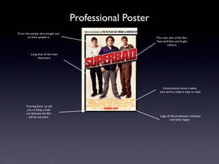
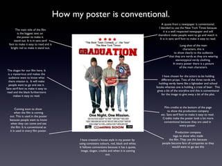
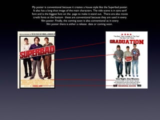
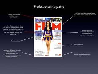
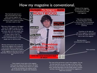
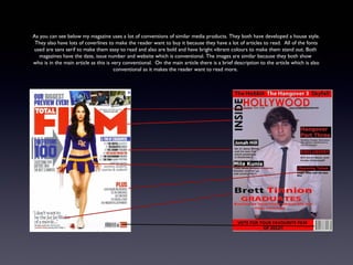

The document discusses conventions for ancillary products like movie posters and magazines. It notes that conventions include using sans serif fonts, prominent placement of the main title in bright colors, images of main characters, credits, and release dates. The document also discusses how the example poster and magazine it created follow conventions like developing a consistent house style, including coverlines and descriptions to entice readers, and using the route of the eye format.


![Poster ta juno_(b)[1]](https://cdn.slidesharecdn.com/ss_thumbnails/postertajunob1-101203082357-phpapp01-thumbnail.jpg?width=640&height=640&fit=bounds)


![Poster mockup [compatibility mode]](https://cdn.slidesharecdn.com/ss_thumbnails/postermockupcompatibilitymode-110407035257-phpapp02-thumbnail.jpg?width=640&height=640&fit=bounds)


