The combination of the magazine's main product and ancillary texts is effective at engaging readers. [1] The front cover uses emotional imagery of a crying woman to provoke intrigue about the soap opera's drama. [2] Additional characters on the cover in angry poses contrast with the main character's vulnerability to further intrigue audiences. [3] When combined with a billboard and trailer, the magazine, billboard, and trailer work together to make the story more realistic for audiences.


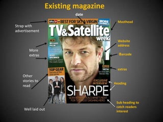
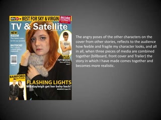
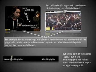


![Getting Started with Apache Spark: Big Data Made Simple [Free Meetup]](https://cdn.slidesharecdn.com/ss_thumbnails/apachesparkgettingstarted-260203175547-8361bcc3-thumbnail.jpg?width=640&height=640&fit=bounds)


