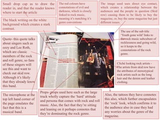
Double page spread annotations
Leah Aston
The image used uses direct eye contact,
which creates a relationship between the
audiences and the people in question (Skid
row) causing them to be likely to buy the
magazine, or, buy the same magazine but just
different issues.
Small drop cap as to draw the
reader in, and that the reader knows
where to start the article
The red colours have
connotations of evil and
darkness, which is closely
linked to rock music,
meaning it’s matching it’s
genre conventions
The black writing on the white
background which creates a stark
contrast.
Quote- this quote talks
about singers such as
ozzy and Lee Roth,
which are classic
members of the rock
and roll genre, so fans
of these singers will
see this and want to
check out skid row.
Although it’s likely
that they already know
this band.
The use of the sub title
‘Youth gone wild’ links to
the rock music subculture of
recklessness and going wild,
so it keeps to the
connotations of the rock
genre.
The microphone at the
top left hand corner of
the page emulates the
fact that this is a
musical band.
Cliché looking rock artists -
The artists from skid row have
the attributes of stereotypical
rock artists such as the long
hair and the denim and leather
clothing.
Also, the tattoos they have connotes
this also, which further encapsulates
the ‘rock’ look, which confirms it to
the audience also in case they had
any worries about the genre of the
magazine.
Props- props used here such as the large
truck wholly capture the ‘hard’ attitude
and persona that comes with rock and roll
music. Also, the fact that they’re sitting
and leaning on it perhaps connotes that
they’re dominating the rock genre.
The title ‘siblings for a day’ is a play on
words of the song ‘king for a day’ by the
band pierce the veil, which is the same
band these brothers started. So, the
magazine uses humour and pun’s to draw
the audience in.
Quote- the use of ellipses
at the end of the quote
makes the audience want
to read on as they want to
find out more about ‘the
fight’or what happened
next.
The use of paint splatters all over
the page brings a reckless mood to
the magazine- linking to the rock
genre of recklessness or
carelessness, which brings in the
rock and roll audience.
Clothing – Pierce the veil
aren’t a hard rock band,
and are in fact a ‘post hard-
core’ rock band. Their
outfits emulate this, e.g.
backwards caps and rock
band shirts. This confirms
the genre.
Posing – the way the
artists are posing further
encapsulates the reckless
attitude and mood that
comes with rock music.
The use of fists does this,
as it creates a mood that
the artists have a care
free attitude. Also, the
raising of the fist from
Vic Fuentes (Yellow T-
shirt) shows the audience
that even in a fight, they
shouldn’t back down
(shown in the way he is
recoiling his fist back)
which further confirms
this attitude.
Tattoos- Mike Fuentes’
(Black t-shirt) tattoos
confirms the stereotypical
view of rock music artists,
so audiences will see this
and immediately link this
back to rock and roll and
the ‘alternative’attitude
this music tries to create.
Colour scheme – the uses of reds and blues gives this
spread a fun mood which isn't usually attributed to
rock music. Perhaps they do this to show that rock
music is constantly changing, or, to emulate the fun
and care free mood that this band, and more directly,
have.
Colour scheme- the use of black, red and white fully mimic the rock and roll genre, as
these colours and this genre are both connected with ‘darkness’ and ‘blood’. This spread is
keeping with the stereotypicalview of rock and roll music, which is good because the
audience may believe this view too, so they’ll link the genre and the moods together.
Quote- ‘we’re being the best MCR we can be’ shows the audience that the band appreciate thefans by trying
hard, which would create a relationshipbetween the band and the fans. This quote then makes them want to
find out more, because the article mightinvolve new music or new tours.
Images- The use of these images create
more of a relationship between theband
and fans as they show emotion,which is
what the fans want to see in the band in
order to create a personal relationship.

Double page spread annotations

  • 1.
    Double page spreadannotations Leah Aston
  • 2.
    The image useduses direct eye contact, which creates a relationship between the audiences and the people in question (Skid row) causing them to be likely to buy the magazine, or, buy the same magazine but just different issues. Small drop cap as to draw the reader in, and that the reader knows where to start the article The red colours have connotations of evil and darkness, which is closely linked to rock music, meaning it’s matching it’s genre conventions The black writing on the white background which creates a stark contrast. Quote- this quote talks about singers such as ozzy and Lee Roth, which are classic members of the rock and roll genre, so fans of these singers will see this and want to check out skid row. Although it’s likely that they already know this band. The use of the sub title ‘Youth gone wild’ links to the rock music subculture of recklessness and going wild, so it keeps to the connotations of the rock genre. The microphone at the top left hand corner of the page emulates the fact that this is a musical band. Cliché looking rock artists - The artists from skid row have the attributes of stereotypical rock artists such as the long hair and the denim and leather clothing. Also, the tattoos they have connotes this also, which further encapsulates the ‘rock’ look, which confirms it to the audience also in case they had any worries about the genre of the magazine. Props- props used here such as the large truck wholly capture the ‘hard’ attitude and persona that comes with rock and roll music. Also, the fact that they’re sitting and leaning on it perhaps connotes that they’re dominating the rock genre.
  • 3.
    The title ‘siblingsfor a day’ is a play on words of the song ‘king for a day’ by the band pierce the veil, which is the same band these brothers started. So, the magazine uses humour and pun’s to draw the audience in. Quote- the use of ellipses at the end of the quote makes the audience want to read on as they want to find out more about ‘the fight’or what happened next. The use of paint splatters all over the page brings a reckless mood to the magazine- linking to the rock genre of recklessness or carelessness, which brings in the rock and roll audience. Clothing – Pierce the veil aren’t a hard rock band, and are in fact a ‘post hard- core’ rock band. Their outfits emulate this, e.g. backwards caps and rock band shirts. This confirms the genre. Posing – the way the artists are posing further encapsulates the reckless attitude and mood that comes with rock music. The use of fists does this, as it creates a mood that the artists have a care free attitude. Also, the raising of the fist from Vic Fuentes (Yellow T- shirt) shows the audience that even in a fight, they shouldn’t back down (shown in the way he is recoiling his fist back) which further confirms this attitude. Tattoos- Mike Fuentes’ (Black t-shirt) tattoos confirms the stereotypical view of rock music artists, so audiences will see this and immediately link this back to rock and roll and the ‘alternative’attitude this music tries to create. Colour scheme – the uses of reds and blues gives this spread a fun mood which isn't usually attributed to rock music. Perhaps they do this to show that rock music is constantly changing, or, to emulate the fun and care free mood that this band, and more directly, have.
  • 4.
    Colour scheme- theuse of black, red and white fully mimic the rock and roll genre, as these colours and this genre are both connected with ‘darkness’ and ‘blood’. This spread is keeping with the stereotypicalview of rock and roll music, which is good because the audience may believe this view too, so they’ll link the genre and the moods together. Quote- ‘we’re being the best MCR we can be’ shows the audience that the band appreciate thefans by trying hard, which would create a relationshipbetween the band and the fans. This quote then makes them want to find out more, because the article mightinvolve new music or new tours. Images- The use of these images create more of a relationship between theband and fans as they show emotion,which is what the fans want to see in the band in order to create a personal relationship.