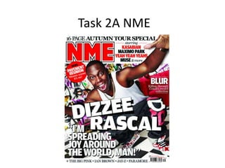
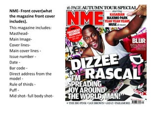
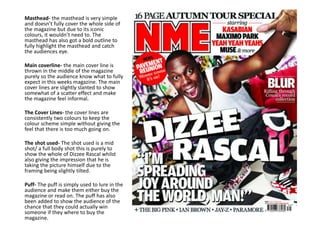
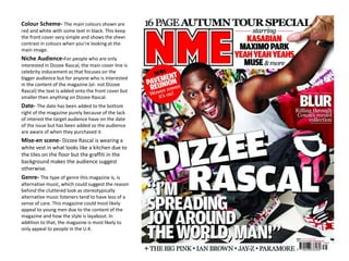
Task 2A NME
NME- Front cover(what
the magazine front cover
includes).
This magazine includes:
Masthead-
Main Image-
Cover lines-
Main cover lines -
Issue number -
Date -
Bar code -
Direct address from the
model -
Rule of thirds -
Puff -
Mid shot- full body shot-
Masthead- the masthead is very simple
and doesn’t fully cover the whole side of
the magazine but due to its iconic
colours, it wouldn’t need to. The
masthead has also got a bold outline to
fully highlight the masthead and catch
the audiences eye.
Main coverline- the main cover line is
thrown in the middle of the magazine
purely so the audience know what to fully
expect in this weeks magazine. The main
cover lines are slightly slanted to show
somewhat of a scatter effect and make
the magazine feel informal.
The Cover Lines- the cover lines are
consistently two colours to keep the
colour scheme simple without giving the
feel that there is too much going on.
The shot used- The shot used is a mid
shot/ a full body shot this is purely to
show the whole of Dizzee Rascal whilst
also giving the impression that he is
taking the picture himself due to the
framing being slightly tilted.
Puff- The puff is simply used to lure in the
audience and make them either buy the
magazine or read on. The puff has also
been added to show the audience of the
chance that they could actually win
someone if they where to buy the
magazine.
Main image- The main image also links into
the main cover line as that is a picture of
Dizzee Rascal. This picture has been shown as
a front cover image purely because Dizzee
Rascal is of an icon of rap/ hip hop music and
also become an iconic artist.
The Layout- The layout is quite simple but
also gives the impression of a cluttered look
due to how some of the text is tilted and
squelched into the frame.
Barcode- The barcode has been put to the
bottom right of the front cover simply
because that is isn’t too important but still
important enough to not be put in the third
left of the magazine.
The Issue Number- The issue number has
been also added by the barcode due to its
lack of appeal to the target audience.
Straplines- The straplines are located at the
top and are put in a slightly bigger font then
the cover lines purely because of how it
could appeal to the target audience.
Direct Address- Dizzee Rascal (the model) is
looking directly at the camera/ the audience
to simply show that he’s looking right at you.
Colour Scheme- The main colours shown are
red and white with some text in black. This keep
the front cover very simple and shows the sheer
contrast in colours when you’re looking at the
main image.
Niche Audience-For people who are only
interested in Dizzee Rascal, the main cover line is
celebrity inducement as that focuses on the
bigger audience but for anyone who is interested
in the content of the magazine (ei- not Dizzee
Rascal) the text is added onto the front cover but
smaller then anything on Dizzee Rascal.
Date- The date has been added to the bottom
right of the magazine purely because of the lack
of interest the target audience have on the date
of the issue but has been added so the audience
are aware of when they purchased it.
Mise-en scene- Dizzee Rascal is wearing a
white vest in what looks like a kitchen due to
the tiles on the floor but the graffiti in the
background makes the audience suggest
otherwise.
Genre- The type of genre this magazine is, is
alternative music, which could suggest the reason
behind the cluttered look as stereotypically
alternative music listeners tend to have less of a
sense of care. This magazine could most likely
appeal to young men due to the content of the
magazine and how the style is layabout. In
addition to that, the magazine is most likely to
only appeal to people in the U.K.
Denotation- Denotation is used on this
front cover purely to show the
audience will get familiar with the
actual style of the NME and start to
recognise the magazine from a
distance due to its uniqueness. The
masthead has a white and a black
outline on the individual letter itself
purely to aid the intention of it
becoming familiar to the target
audience.
Connotation – The connotation is
shown in this magazine purely to stand
out due to red being such a dominate
colour and white being so bright once
put onto a magazine with red added
in.
Rule of thirds- The magazine front
cover has left the bottom left of the
magazine with barely any content and
text purely become it is known as the
dead space, in other words the
audience are most likely to not see or
furthermore even read anything on
the bottom left on the magazine.

Task 2 a NME

  • 1.
  • 2.
    NME- Front cover(what themagazine front cover includes). This magazine includes: Masthead- Main Image- Cover lines- Main cover lines - Issue number - Date - Bar code - Direct address from the model - Rule of thirds - Puff - Mid shot- full body shot-
  • 3.
    Masthead- the mastheadis very simple and doesn’t fully cover the whole side of the magazine but due to its iconic colours, it wouldn’t need to. The masthead has also got a bold outline to fully highlight the masthead and catch the audiences eye. Main coverline- the main cover line is thrown in the middle of the magazine purely so the audience know what to fully expect in this weeks magazine. The main cover lines are slightly slanted to show somewhat of a scatter effect and make the magazine feel informal. The Cover Lines- the cover lines are consistently two colours to keep the colour scheme simple without giving the feel that there is too much going on. The shot used- The shot used is a mid shot/ a full body shot this is purely to show the whole of Dizzee Rascal whilst also giving the impression that he is taking the picture himself due to the framing being slightly tilted. Puff- The puff is simply used to lure in the audience and make them either buy the magazine or read on. The puff has also been added to show the audience of the chance that they could actually win someone if they where to buy the magazine.
  • 4.
    Main image- Themain image also links into the main cover line as that is a picture of Dizzee Rascal. This picture has been shown as a front cover image purely because Dizzee Rascal is of an icon of rap/ hip hop music and also become an iconic artist. The Layout- The layout is quite simple but also gives the impression of a cluttered look due to how some of the text is tilted and squelched into the frame. Barcode- The barcode has been put to the bottom right of the front cover simply because that is isn’t too important but still important enough to not be put in the third left of the magazine. The Issue Number- The issue number has been also added by the barcode due to its lack of appeal to the target audience. Straplines- The straplines are located at the top and are put in a slightly bigger font then the cover lines purely because of how it could appeal to the target audience. Direct Address- Dizzee Rascal (the model) is looking directly at the camera/ the audience to simply show that he’s looking right at you.
  • 5.
    Colour Scheme- Themain colours shown are red and white with some text in black. This keep the front cover very simple and shows the sheer contrast in colours when you’re looking at the main image. Niche Audience-For people who are only interested in Dizzee Rascal, the main cover line is celebrity inducement as that focuses on the bigger audience but for anyone who is interested in the content of the magazine (ei- not Dizzee Rascal) the text is added onto the front cover but smaller then anything on Dizzee Rascal. Date- The date has been added to the bottom right of the magazine purely because of the lack of interest the target audience have on the date of the issue but has been added so the audience are aware of when they purchased it. Mise-en scene- Dizzee Rascal is wearing a white vest in what looks like a kitchen due to the tiles on the floor but the graffiti in the background makes the audience suggest otherwise. Genre- The type of genre this magazine is, is alternative music, which could suggest the reason behind the cluttered look as stereotypically alternative music listeners tend to have less of a sense of care. This magazine could most likely appeal to young men due to the content of the magazine and how the style is layabout. In addition to that, the magazine is most likely to only appeal to people in the U.K.
  • 6.
    Denotation- Denotation isused on this front cover purely to show the audience will get familiar with the actual style of the NME and start to recognise the magazine from a distance due to its uniqueness. The masthead has a white and a black outline on the individual letter itself purely to aid the intention of it becoming familiar to the target audience. Connotation – The connotation is shown in this magazine purely to stand out due to red being such a dominate colour and white being so bright once put onto a magazine with red added in. Rule of thirds- The magazine front cover has left the bottom left of the magazine with barely any content and text purely become it is known as the dead space, in other words the audience are most likely to not see or furthermore even read anything on the bottom left on the magazine.