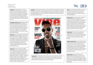
The magazine cover features the artist Miguel posing shirtless with sunglasses. The masthead "VIBE" is in red to stand out against the white background. Sans serif fonts are used throughout to relate to the R&B genre. Miguel is the main focus of the bright central image, with lighting emphasizing his expression and hand gesture. The color scheme uses red, white, black and grey consistently. The design follows principles like the rule of thirds to direct attention to the key elements advertising the magazine's content.
1. Salford City College
Eccles Centre
AS Media Studies
Foundation Portfolio
Masthead The masthead ‘VIBE’ is in red and
contrasts with the background colour white, so it
stands out and alone could attract someone to
read it due to the size of the text and how bold it
is, this shows that the magazine is confident with
their style and want to be recognised. The title
also has a gradient effect as it gradually fades from
red to white, matching with the colour scheme of
the cover.
Typefaces The fonts used on the cover are all sans serif fonts; this could refer to the genre of
the magazine, to show that it is about one genre of music and not multiple ones. The largest
cover lines on the cover are in black to signify their importance, and stand out more clearly
on the white background. The colours of the fonts are black, white, red or grey matching in
with the covers colour scheme.
Main cover line The main cover line is in black so it
contrasts from the white background, this is
important as it tells the reader who the magazine will
be mainly featuring, as it relates to the main cover
image. The text underneath ‘Sex, Drugs and R&B’ is a
play on the saying ‘Sex Drugs and Rock and Roll’
explaining why the artist is posing in the way he is in
the main image, and hinting to the possible contents
inside the magazine. Both of these titles are also
bolder than the rest of the text on the page
Photography /Mise en scene The lighting is bright
both the left and right sides of the singers face,
this shows how he is the main focus of the cover.
There is also a light shining on either side of his
arm and hand to emphasise what he is doing. The
light is not so dominant on the face though as it
usually is on a magazine cover, as the artist is
wearing mostly black items of clothing it matches
in well with the theme.
Model credit The model credit is relating to the
singer Miguel who is the main feature for the
magazine cover. As it mentions ‘Sex, Drugs and R&B’
it could be referring to his lifestyle, so the content
could be quite personal and therefore attract
readers.
Main image The main image a picture of the artist
Miguel, this would attract R&B fans and also fans
of the artist himself. The image is in the centre of
the magazine, and is the main focus. Although the
image itself has a different effect as the featured
artist is doing a hand gesture and facial expression
that would usually be associated with rock
magazines. The featured artist is also wearing
circular sunglasses, this adds to the persona he is
portraying for the issue.
Cover lines The sizes of the cover lines differ
along with the colours, so that they stand out. The
sizes are different to signify which feature is the
most important ‘The Big List Issue’ is the largest
cover line apart from the main, signifying it is
largely featured within the magazine. ’50 Greatest
Albums*’ features at the near bottom of the left
hand side of the cover, and it follows on the
opposite side ‘We dare you to disagree’ this could
intrigue the reader, although the text is quite
small so it appears to be quite secretive.
Colour The main colours which feature on the cover
are black, red, white and grey. All of the colours
contrast from each other, for example the red
masthead and black cover lines clearly stand out on
the white background.
Design Principles Used? The rule of thirds has been
followed as the first thing a reader would see are the
main cover lines due to them being in the main
optical area. Also, the cover seems to have quite an
informal balance due to the expression being pulled
by the featured artist, and as he is shirtless. The
Gutenberg design principle has also been followed, as
the main focus is in the left side of the cover, as it
shows the artists face.
House Style The most dominant colour on the cover is red, due to the size of the title,
and its feature on some of the cover lines. But the rest of the colours in the colour
scheme feature within the text, so it is evenly balanced out, and therefore the cover
looks professional and goes with the theme of the magazine.
Target Audience The target audience for this
magazine would be R&B fans, as it mentions in the
bottom left corner ’50 Greatest Albums’ this could
intrigue them, and fans of the artist Miguel would also
be interested in the magazine, although this could be
mostly women as the artist could be seen to be young
and attractive.