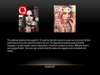
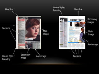
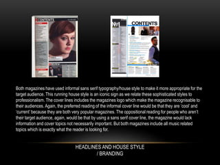
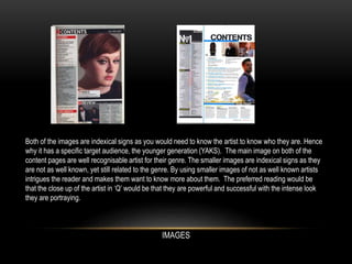
GENRE
• The genre of the magazine I have chosen is
pop/rock. We can recognise the genre is
pop/rock because the theme of the colours tend
to be quite colorful and a young pop icon is
used. The two magazines I have chosen to
analyse are ‘Q’ and ‘Billboard’.
Skyline
Masthead
Cover
line
Anchorage
Main Image
Pug/Puff
Masthead
Cover
line
Main Image
Both of the front covers use informal Sans Serif typography in their mastheads which is an iconic sign.
We associate current magazines like ‘Q’ and ‘Billboard’ with informal Sans Serif or Script typography as it
appeals to a younger audience. The mastheads are also the magazines logo which make the magazine
recognisable to their audiences. The preferred reading of the informal masthead would be that they are
‘cool’ and ‘current’ because they are both very popular magazines. The oppositional reading for people
who aren’t their target audience would be that by using a sans serif masthead, the magazine would lack
information and cover topics not necessarily important. The cover lines used in ‘Q’ are all Sans Serif to
give the magazine a more mature appeal to it. On the other hand, ‘Billboard’ uses some Script typography
which gives the magazine a personal touch to it.
MASTHEAD AND COVERLINES
The main image in both magazines use a current iconic artists recognisable to the majority, if not all aged
audiences. The oppositional reading to both of these images would be that even though both of these
artists are role models to many people, they have a seductive and naughty side to them. The preferred
reading would be that these artists are strong and powerful. This is emphasised by the intense close up
and the eye contact they are making with the audience. The way the focus of the eyes is very direct
makes the audience believe that they are looking at them. The indexical sign to both of these images
would be that they are ‘priceless’ as they have a very precious metal in between their lips. The
oppositional reading to Q magazine would be that they are promoting provocative topics by having their
artist wearing red lipstick.
MAIN IMAGE
The preferred reading to the pug/puff in ‘Q’ would be that John Lennon is known as an icon and his fans
would want to know more about him others may not. The Oppositional reading would be that the
language of ‘unseen images’ used is inappropriate, it would be invading his privacy. ‘Billboard’ doesn’t
use a pug/puff which. The iconic sign would be that this makes the magazine look minimalistic and
mature.
PUG/PUFF
Headline
Main
Image
House Style /
Branding
Secondary
image
Sections
Headline
Anchorage Sections
Main
Image
Secondary
images
House Style /
Branding
Anchorage
Both magazines have used informal sans serif typography/house style to make it more appropriate for the
target audience. This running house style is an iconic sign as we relate these sophisticated styles to
professionalism. The cover lines includes the magazines logo which make the magazine recognisable to
their audiences. Again, the preferred reading of the informal cover line would be that they are ‘cool’ and
‘current’ because they are both very popular magazines. The oppositional reading for people who aren’t
their target audience, again, would be that by using a sans serif cover line, the magazine would lack
information and cover topics not necessarily important. But both magazines include all music related
topics which is exactly what the reader is looking for.
HEADLINES AND HOUSE STYLE
/ BRANDING
Both of the images are indexical signs as you would need to know the artist to know who they are. Hence
why it has a specific target audience, the younger generation (YAKS). The main image on both of the
content pages are well recognisable artist for their genre. The smaller images are indexical signs as they
are not as well known, yet still related to the genre. By using smaller images of not as well known artists
intrigues the reader and makes them want to know more about them. The preferred reading would be
that the close up of the artist in ‘Q’ would be that they are powerful and successful with the intense look
they are portraying.
IMAGES
Strapline &
Headline
Strapline
Main Image
Main Image
House Style /
Branding
House Style /
Branding
Headline
Columns
Columns
The text on both magazines uses the informal typography of sans serif which is an iconic sign as this is
shown in many different pop/rock magazines and seen as cool and trendy. Again, the preferred reading of
the informal cover line would be that they are ‘cool’ and ‘current’ because they are both very popular
magazines. The oppositional reading for people who aren’t their target audience, again, would be that by
using a sans serif cover line, the magazine would lack information and cover topics not necessarily
important. ‘Q’ have a running house style of having the first letter of each featured artist featured in red on
top of the text. For example, ‘L’ for Lady Gaga. The ‘L’ is a symbolic sign ask ‘Q’ are famous for their red
‘Q’. By having a red ‘L’, people find it recognisable.
STRAPLINE & HEADLINE & TYPOGRAPHY
IMAGES
Both images feature a close up image of the artist. In ‘Billboard’, the language ‘fiercely’ links with the pose
the artist is pulling. It is an iconic sign because it’s a reference to the subject of the double page spread.
The preferred reading would be that they want the artist to look fierce, powerful and a role model to the
reader. The oppositional might be that with such smooth skin and hair in the image, this may contradict
the message they’re trying to get across. The image in ‘Q’ shows the artist covering her breasts is very
sexual which relates to the colour red, commonly a connotation of sex and love. The preferred reading
would be that Lady Gaga is revealing her natural beauty and encourages readers to embrace themselves
for who they are. The oppositional reading may be that it is too sexual and portraying the wrong
message. Both images take up one whole page with the story on the other page.

Music Magazine Analysis

  • 1.
    GENRE • The genreof the magazine I have chosen is pop/rock. We can recognise the genre is pop/rock because the theme of the colours tend to be quite colorful and a young pop icon is used. The two magazines I have chosen to analyse are ‘Q’ and ‘Billboard’.
  • 2.
  • 3.
    Both of thefront covers use informal Sans Serif typography in their mastheads which is an iconic sign. We associate current magazines like ‘Q’ and ‘Billboard’ with informal Sans Serif or Script typography as it appeals to a younger audience. The mastheads are also the magazines logo which make the magazine recognisable to their audiences. The preferred reading of the informal masthead would be that they are ‘cool’ and ‘current’ because they are both very popular magazines. The oppositional reading for people who aren’t their target audience would be that by using a sans serif masthead, the magazine would lack information and cover topics not necessarily important. The cover lines used in ‘Q’ are all Sans Serif to give the magazine a more mature appeal to it. On the other hand, ‘Billboard’ uses some Script typography which gives the magazine a personal touch to it. MASTHEAD AND COVERLINES
  • 4.
    The main imagein both magazines use a current iconic artists recognisable to the majority, if not all aged audiences. The oppositional reading to both of these images would be that even though both of these artists are role models to many people, they have a seductive and naughty side to them. The preferred reading would be that these artists are strong and powerful. This is emphasised by the intense close up and the eye contact they are making with the audience. The way the focus of the eyes is very direct makes the audience believe that they are looking at them. The indexical sign to both of these images would be that they are ‘priceless’ as they have a very precious metal in between their lips. The oppositional reading to Q magazine would be that they are promoting provocative topics by having their artist wearing red lipstick. MAIN IMAGE
  • 5.
    The preferred readingto the pug/puff in ‘Q’ would be that John Lennon is known as an icon and his fans would want to know more about him others may not. The Oppositional reading would be that the language of ‘unseen images’ used is inappropriate, it would be invading his privacy. ‘Billboard’ doesn’t use a pug/puff which. The iconic sign would be that this makes the magazine look minimalistic and mature. PUG/PUFF
  • 6.
    Headline Main Image House Style / Branding Secondary image Sections Headline AnchorageSections Main Image Secondary images House Style / Branding Anchorage
  • 7.
    Both magazines haveused informal sans serif typography/house style to make it more appropriate for the target audience. This running house style is an iconic sign as we relate these sophisticated styles to professionalism. The cover lines includes the magazines logo which make the magazine recognisable to their audiences. Again, the preferred reading of the informal cover line would be that they are ‘cool’ and ‘current’ because they are both very popular magazines. The oppositional reading for people who aren’t their target audience, again, would be that by using a sans serif cover line, the magazine would lack information and cover topics not necessarily important. But both magazines include all music related topics which is exactly what the reader is looking for. HEADLINES AND HOUSE STYLE / BRANDING
  • 8.
    Both of theimages are indexical signs as you would need to know the artist to know who they are. Hence why it has a specific target audience, the younger generation (YAKS). The main image on both of the content pages are well recognisable artist for their genre. The smaller images are indexical signs as they are not as well known, yet still related to the genre. By using smaller images of not as well known artists intrigues the reader and makes them want to know more about them. The preferred reading would be that the close up of the artist in ‘Q’ would be that they are powerful and successful with the intense look they are portraying. IMAGES
  • 9.
    Strapline & Headline Strapline Main Image MainImage House Style / Branding House Style / Branding Headline Columns Columns
  • 10.
    The text onboth magazines uses the informal typography of sans serif which is an iconic sign as this is shown in many different pop/rock magazines and seen as cool and trendy. Again, the preferred reading of the informal cover line would be that they are ‘cool’ and ‘current’ because they are both very popular magazines. The oppositional reading for people who aren’t their target audience, again, would be that by using a sans serif cover line, the magazine would lack information and cover topics not necessarily important. ‘Q’ have a running house style of having the first letter of each featured artist featured in red on top of the text. For example, ‘L’ for Lady Gaga. The ‘L’ is a symbolic sign ask ‘Q’ are famous for their red ‘Q’. By having a red ‘L’, people find it recognisable. STRAPLINE & HEADLINE & TYPOGRAPHY
  • 11.
    IMAGES Both images featurea close up image of the artist. In ‘Billboard’, the language ‘fiercely’ links with the pose the artist is pulling. It is an iconic sign because it’s a reference to the subject of the double page spread. The preferred reading would be that they want the artist to look fierce, powerful and a role model to the reader. The oppositional might be that with such smooth skin and hair in the image, this may contradict the message they’re trying to get across. The image in ‘Q’ shows the artist covering her breasts is very sexual which relates to the colour red, commonly a connotation of sex and love. The preferred reading would be that Lady Gaga is revealing her natural beauty and encourages readers to embrace themselves for who they are. The oppositional reading may be that it is too sexual and portraying the wrong message. Both images take up one whole page with the story on the other page.