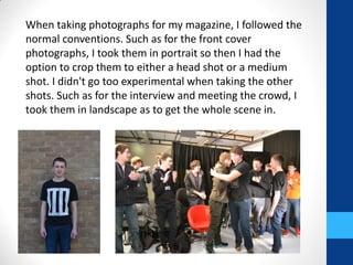
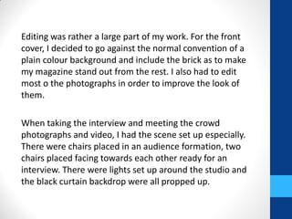
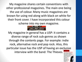
My media product follows conventions of real music magazines. It has elements like masthead, bar code, and price. The color scheme of red, black, and white is used to clearly identify it as a music magazine. Photos were taken in portrait format for the cover to allow cropping, and landscape for interior shots. The audience is teenagers and young adults who are fans of rock music. Research was done on magazines like Kerrang, Q, and NME to inform the design. Digital distribution through websites and social media was also considered to reach this audience.
2. In what ways does
your media product
use, develop or
challenge forms and
conventions of real
media products?
3. My project looks like a music magazine as it follows the
conventions of a typical music magazine. It had all the
required elements of a magazines. For example, it has
everything from masthead and sell lines to bar code and
price. It’s specifically a music magazine, not only because
the text relates to music, but because it follows
conventions that a music magazine would have. Such as,
most music magazines are known for using the colour red
in some form on their magazine. Other colours that go
with this are black and white. I have used this particular
colour scheme, mostly to conform to the most common
music magazine convention so that the readers would be
able to clearly tell it was a music magazine from first glace.
4. I have also used the particular shot type for the front cover
that most magazines use instead of going for a shot type
that would subvert the usual convention in order not to
push the boundaries and make my publication look
unprofessional and unrealistic.
In my blog, I have looked at many
magazine front covers, contents pages
and double page spreads. Such as
Kerrang, Q and NME. I mainly looked
at these to pick out what I liked about
them, such as how they presented a
certain aspect of magazines such as
the placement of bar code or the
colour scheme.
5. My magazine doesn’t fit into a particular genre. Although,
it is leaning more towards a pop/rock genre. I chose to do
this in order to stay true to the title of my magazine:
'DIVERSE'. I wanted to include a diverse range of music
genres, but not too diverse as I want the genres I include to
be able to relate to each others in some way. Such as I
wouldn't include country and opera as they're their own
niche genres that don't relate well with genres such as
rock.
For the models that I used on my magazine, I got friends of
mine to pose for photos, imitating a band and therefore
becoming music artists. I gave them a persona: The
Thieves, and then created a back story and tried to work
with that. I attempted to bring the band to life in the
magazine through the story but mostly the photos such as
for the interview and meeting the crowd. In the interview,
it is set in a studio with lights, an interviewer, a studio
audience and even appropriate chairs.
6. When taking photographs for my magazine, I followed the
normal conventions. Such as for the front cover
photographs, I took them in portrait so then I had the
option to crop them to either a head shot or a medium
shot. I didn't go too experimental when taking the other
shots. Such as for the interview and meeting the crowd, I
took them in landscape as to get the whole scene in.
7. Editing was rather a large part of my work. For the front
cover, I decided to go against the normal convention of a
plain colour background and include the brick as to make
my magazine stand out from the rest. I also had to edit
most o the photographs in order to improve the look of
them.
When taking the interview and meeting the crowd
photographs and video, I had the scene set up especially.
There were chairs placed in an audience formation, two
chairs placed facing towards each other ready for an
interview. There were lights set up around the studio and
the black curtain backdrop were all propped up.
10. My magazine mostly contains people who are of young adult age. I
haven't put any of the people in my magazine in a negative light. If
anything, they are shown in a positive light. For example, I have
included a photograph of my band members meeting their fans which
shows that they are nice and considerate of their fans and have time
to meet them. Also, the fans themselves are of a similar age and are
shown to be passionate as they are clearly enjoying meeting the band
who they must really like and are passionate enough about them to go
to a meet and greet opportunity event. Through the band members, I
have shown that that particular age group can be capable of obtaining
power as they have obviously gained fans and loyal followers and are
successful enough to be on the front cover of a magazine.
Gender in my magazine is dominantly male. In fact, there are no
females in the entirety of my three pages. This, however, was not
intentional but it does help convey the target audience, who I predict
to be mostly male. The male gender is represented as powerful as they
people in my magazine are all mostly famous.
These two demographics are the only two that have been focused on
in my magazine.
11. My magazine combines the following aspects in order to
represent a particular social group. The model on the front
cover is sporting a closed off, hard expression. This is joined with
the expressive fonts, all of the text being laid out in a straight
forward fashion and the lack of usage of complex words .All of
this combined helps to represent teenagers as it almost mimics
them. This is because teenagers are known for being at that
stage where they are still learning so they don’t know too much
yet they still think they have a high status in the world.
When creating this magazine, I knew I wanted it to be aimed at
young adults. With that in mind, I was rather experimental with
the fonts especially. I used ones that would be interesting to
read and look at as I know that’s what young adults are known
to like. If I were aiming for a more mature audience, I would’ve
used formal fonts. I also put models that were of a similar age to
the intended audience as to give them a connection with the
magazine.
12. The magazine carries the theme of rock through it. Especially
with the music band I have put into the magazine. I tried to pose
Sam a kind of a rock star seeing as his band does produce rock
music. I tried to get this stereotype across though his harsh,
careless expression on the front cover and in the interview, his
response are straight-forward. “Okay, I’m going to be straight
with you. Warren was taking the band places it didn’t want to
go.”
14. What kind of media
institution might
distribute your
media product and
why?
15. The most likely magazine publishing house to own my magazine
is IPC. This is because it is very popular and owns many popular
magazines. Also, one of the main reasons I think this particular
publishing house would own my magazine is because it also
owns NME. This is important as NME is similar to my own
magazine and would attract the same sort of audience as that
magazine but then my magazine is even more diverse so could
then attract even more people on top of that. Also, it is quoted
as “the UK's leading consumer magazine and digital publisher.”
This means that it works with the technological side of the
magazine publication. This relates to my magazine as because of
it’s target audience, it will be best if there is a digital copy of the
magazine for the readers to buy as well as they are becoming
increasingly popular.
My magazine will be circulated monthly. This is because this is
the most common option for magazines to be circulated. Also, if
it was more often than this then it wouldn’t contain as much
content as it does.
16. I have looked at this website which shows statistics on how well
various magazines are selling.
http://www.pressgazette.co.uk/uk-magazines-lose-print-sales-
average-63-cent-full-abc-breakdown-all-503-titles
From this, I have discovered that BBC Music Magazine has
dropped sales 2.2%, Kerrang has dropped sales down 8.9%, Q
has dropped 14.2% and NME has dropped 21.1% in just one
year. From my findings, I have discovered that music magazines
aren’t at their most popular in the present time.
I decided to look into why this was and found the following
website:
http://www.theguardian.com/media/2014/feb/13/nme-sales-
falling-off-charts-music-magazine-circulation
This tells us that magazine sale are dropping as people are
becoming more in favour of digital methods. I have included a
website for my magazine and added the address onto the front
cover so the readers will have easy access to the digital side of
my magazine.
17. It will be available through subscription as this way, the readers
can just sign up and receive the magazine easier and this will be
a good option for the magazine to have as it makes the
magazine easy for the readers to obtain. Also, most magazines
nowadays have a subscription option so it would be pointless
not too. It will also help with predicting sales and popularity
and even if the magazine are reaching the allocated target
audience or if there are a more diverse range of readers than
expected.
The magazines website will be modern. It will be high tech yet
easy accessible and straight forward. All of the material featured
in the printed version of the magazine will be available in the
digital version and some will be on the website also. There will
also be extra content on the magazine such as videos and other
technical content that relates to the content inside of each
monthly edition of the magazine.
Furthermore, such media institutions as social networks, would
help with distributing the magazine. Such as Facebook, Twitter
and Tumblr.
19. Who would be the
audience for your
media product?
20. My target audience for my magazine is teenagers and young
adults of both genders, but mostly male, aged from 16 to 24. I
have chosen to target this particular group of people as they are
roughly the same target audience as other well known
magazines that are similar to mine as they would all attract a
similar audience. Such as NME, whose target audience would be
the same. They would also be music enthusiasts.
This particular target audience
would most likely be classed as C1,
C2 or D on the standard
occupational classification. This
means the magazine would target
people of lower middle class,
skilled working class and working
class.
23. My magazine shares certain conventions with
other professional magazines. The main one being
the use of colour. Many music magazines are
known for using red along with black on white for
their front cover. I have incorporated this colour
scheme into my own magazine.
My magazine in general has a USP: it contains a
diverse range of rock sub-genres as shown
through the contents page. For example: indie
rock, alternative rock and pop rock. Also, this
particular issue has the USP of having an exclusive
interview with the band: The Thieves.
24. I wanted my anchorage line to be catchy so that it would attract the target
audience and communicate the idea that the magazine is interesting to
read. So I used a combination of a metaphor and sibilance in order to
make the title sound good.
For the layouts of the front cover and the double page spread, I tried to
keep it simple and easy to navigate around. I didn’t want it to look too
overcrowded. For my contents page, this was more complex as there was
more to put on the page. However, I tried to keep it fairly simple whilst
also including everything necessary. I wanted it to look full of content also,
hence the inclusion of lots of text on this page. This is good for the target
audience as because they are younger, they are known to prefer easy to
understand things. I also kept the colour scheme simple for this reason but
included a colour from the rainbow to improve the overall look so that it
wouldn’t be dull and boring.
I was experimental with the fonts as I wanted them to look expressive and
interesting. If the page looks interesting, then the audience are more likely
to think that the magazine is also interesting.
For locations of the photo-shoots, I chose to do the individual ones for the
front cover outside in front of a brick wall as then I would have a ready
made, interesting looking front cover that would stand out from the
crowd. For the other photographs, I took them in a studio in order to give
it a realistic look. I didn’t use any specific pros in my photographs, except
the chairs, which I picked out the nicer looking ones for the interviewee
and interviewer opposed to the crowd.
26. What have you learnt
about technologies
from the process of
constructing the
product?
27. The process I had to go through in order to create the final product
was a long one. I had to start off by getting the photographs which I
had to of thought of and gotten inspiration for beforehand. I had to
organise the set, props, people and camera. I then took these
photographs and looked through them and analysed a few and then
finally pick out the best one. I did most of this deliberation on a blog
post.
The next step was making the actual magazine. It was at this point
where I would open up Photoshop. I began by editing the chosen
photographs so that they looked of the correct standard for my
magazine. For example, I had to edit the photograph of the model on
the front cover so that they looked better and I also had to crop the
image to the correct size. I then used this as a base for my magazine by
then adding the key elements of each page on top, such as the
masthead. Once I had adding everything, put them all to a suitable
colour, shape and position, then I went and got feedback from peers
and then made any necessary changes and then my production was
finished. I recorded most steps of piecing together each magazine
piece on my blog
28. For all of my photographs, I used a Nikon D3100, which is a digital SLR
camera. It was used first of all for the individuals photo shoot. I had to
adjust the zoom when doing this shoot in order to close down the
space around each of the models. I used flash for these shots as I was
holding the camera myself and without flash, the pictures turned out
not as good quality you can’t get a steady shot whilst holding a camera
and not using flash. The use of flash also added extra light to the shot,
enabling the photograph to show up more detail.
I then used the same camera for the interview and meeting the crowd
shoots. For these, we were all in a studio and had set up lights so the
flash was unnecessary. Also, when using it, the people in the shoot
looked too white. So, because of all this, I couldn’t use flash. Instead, I
put the shutter down and tried that. However, as I was holding it by
hand, the photographs weren’t turning out the best of quality. In
order to get around this problem, I used a tripod and balanced the
camera on that for both shoots. This way, the camera was perfectly
still so it didn’t need the flash on and I was able to get a high quality
photograph using this method.
29. For this project, I used a few different websites for different purposes.
The main website that I have used is Google images to find images of other magazines in
order to complete my research:
https://www.google.co.uk/imghp?hl=en&tab=wi&ei=9009U_y5BImG0AWCwoHgAQ&ve
d=0CAQQqi4oAg
To research into fonts, I used:
http://www.dafont.com/
To show case my research, planning, drafting, final products and evaluation, I have put
them all on my blog. This is a Blogger blog. I have put in screen grabs, final products and
steps of various things I have done for my production. I have then added in YouTube
videos to show case the interview and meeting the crowd and also some answers for my
evaluation. I will also use slideshare and prezi to show case my evaluation.
Photoshop played a massive role in creating my
magazine. I use this to edit all of my photographs
and then to create the actual magazine itself. This
was a decision I am thoroughly pleased with. This
is because everything I needed was on
Photoshop., Using this software, I had access to a
wide range of tools to work with in order to alter,
adjust and improve each photograph and each
piece of the production.
31. What have you learnt
about the conventions of
magazine productions
and what progress have
you made from the
student mag?
32. When creating my preliminary task – the college magazine – I focused
more on the text that I included. I didn’t really focus on the theme and
colour as it didn’t really follow a particular theme and there wasn’t a
colour scheme. The only colours that I actually used were black and
white. I also didn’t really have anything to base this magazine off as
college magazines aren’t a popular genre and there is a large range of
them without any being specifically well known.
Whereas, for my music magazine, I thought this through before hand a
lot more. It was easier to research as it is a very popular genre. Also,
there are many popular ones that I took inspiration from. After I had
researched, it was easier to make certain decisions. Such as I knew
what colours I wanted to use as I had seen them used often and I knew
that I wanted to experiment with fonts as I had also seem some
interesting fonts used on other popular magazines. Also, I connected
all three pages together better in my music magazine.
I have learnt how to narrow my magazine down so that it fits a certain
niche opposed to being a general looking magazine. I have also learnt
to be experiential with certain aspects of the magazine in order to
maintain reader interest