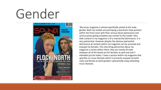
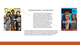
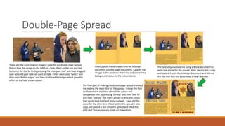
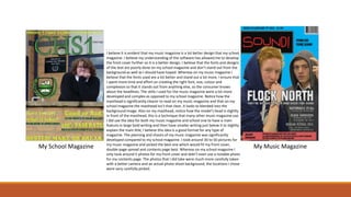
- The document discusses the target audience, distribution, and conventions of Joe Jackson's music magazine project.
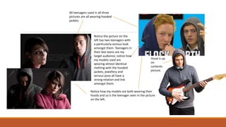
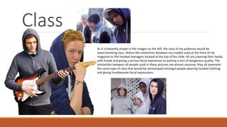
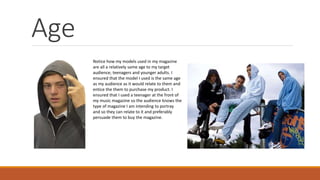
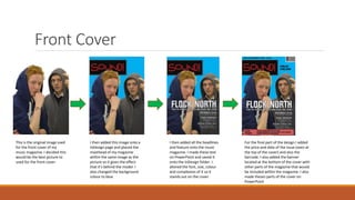
- The target audience is described as late teens and people in their 20s, as represented by the models on the cover wearing trendy clothes.
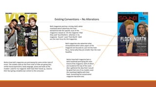
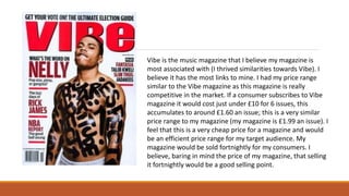
- Distribution partners discussed include major retailers, IPC Media as a leading UK publisher, and similarities to the distribution of competitor magazine Vibe.
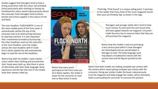
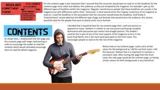
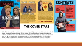
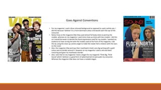
- Conventions from real magazines, such as prominent mastheads and cover styles, are used, while some aspects like banner placement are altered for effect.
Palestine last event orientationfvgnh .pptxRaedMohamed3
An EFL lesson about the current events in Palestine. It is intended to be for intermediate students who wish to increase their listening skills through a short lesson in power point.
2024.06.01 Introducing a competency framework for languag learning materials ...Sandy Millin
http://sandymillin.wordpress.com/iateflwebinar2024
Published classroom materials form the basis of syllabuses, drive teacher professional development, and have a potentially huge influence on learners, teachers and education systems. All teachers also create their own materials, whether a few sentences on a blackboard, a highly-structured fully-realised online course, or anything in between. Despite this, the knowledge and skills needed to create effective language learning materials are rarely part of teacher training, and are mostly learnt by trial and error.
Knowledge and skills frameworks, generally called competency frameworks, for ELT teachers, trainers and managers have existed for a few years now. However, until I created one for my MA dissertation, there wasn’t one drawing together what we need to know and do to be able to effectively produce language learning materials.
This webinar will introduce you to my framework, highlighting the key competencies I identified from my research. It will also show how anybody involved in language teaching (any language, not just English!), teacher training, managing schools or developing language learning materials can benefit from using the framework.
The Roman Empire A Historical Colossus.pdfkaushalkr1407
The Roman Empire, a vast and enduring power, stands as one of history's most remarkable civilizations, leaving an indelible imprint on the world. It emerged from the Roman Republic, transitioning into an imperial powerhouse under the leadership of Augustus Caesar in 27 BCE. This transformation marked the beginning of an era defined by unprecedented territorial expansion, architectural marvels, and profound cultural influence.
The empire's roots lie in the city of Rome, founded, according to legend, by Romulus in 753 BCE. Over centuries, Rome evolved from a small settlement to a formidable republic, characterized by a complex political system with elected officials and checks on power. However, internal strife, class conflicts, and military ambitions paved the way for the end of the Republic. Julius Caesar’s dictatorship and subsequent assassination in 44 BCE created a power vacuum, leading to a civil war. Octavian, later Augustus, emerged victorious, heralding the Roman Empire’s birth.
Under Augustus, the empire experienced the Pax Romana, a 200-year period of relative peace and stability. Augustus reformed the military, established efficient administrative systems, and initiated grand construction projects. The empire's borders expanded, encompassing territories from Britain to Egypt and from Spain to the Euphrates. Roman legions, renowned for their discipline and engineering prowess, secured and maintained these vast territories, building roads, fortifications, and cities that facilitated control and integration.
The Roman Empire’s society was hierarchical, with a rigid class system. At the top were the patricians, wealthy elites who held significant political power. Below them were the plebeians, free citizens with limited political influence, and the vast numbers of slaves who formed the backbone of the economy. The family unit was central, governed by the paterfamilias, the male head who held absolute authority.
Culturally, the Romans were eclectic, absorbing and adapting elements from the civilizations they encountered, particularly the Greeks. Roman art, literature, and philosophy reflected this synthesis, creating a rich cultural tapestry. Latin, the Roman language, became the lingua franca of the Western world, influencing numerous modern languages.
Roman architecture and engineering achievements were monumental. They perfected the arch, vault, and dome, constructing enduring structures like the Colosseum, Pantheon, and aqueducts. These engineering marvels not only showcased Roman ingenuity but also served practical purposes, from public entertainment to water supply.
Unit 8 - Information and Communication Technology (Paper I).pdfThiyagu K
This slides describes the basic concepts of ICT, basics of Email, Emerging Technology and Digital Initiatives in Education. This presentations aligns with the UGC Paper I syllabus.
Ethnobotany and Ethnopharmacology:
Ethnobotany in herbal drug evaluation,
Impact of Ethnobotany in traditional medicine,
New development in herbals,
Bio-prospecting tools for drug discovery,
Role of Ethnopharmacology in drug evaluation,
Reverse Pharmacology.
Welcome to TechSoup New Member Orientation and Q&A (May 2024).pdfTechSoup
In this webinar you will learn how your organization can access TechSoup's wide variety of product discount and donation programs. From hardware to software, we'll give you a tour of the tools available to help your nonprofit with productivity, collaboration, financial management, donor tracking, security, and more.
Synthetic Fiber Construction in lab .pptxPavel ( NSTU)
Synthetic fiber production is a fascinating and complex field that blends chemistry, engineering, and environmental science. By understanding these aspects, students can gain a comprehensive view of synthetic fiber production, its impact on society and the environment, and the potential for future innovations. Synthetic fibers play a crucial role in modern society, impacting various aspects of daily life, industry, and the environment. ynthetic fibers are integral to modern life, offering a range of benefits from cost-effectiveness and versatility to innovative applications and performance characteristics. While they pose environmental challenges, ongoing research and development aim to create more sustainable and eco-friendly alternatives. Understanding the importance of synthetic fibers helps in appreciating their role in the economy, industry, and daily life, while also emphasizing the need for sustainable practices and innovation.
The French Revolution, which began in 1789, was a period of radical social and political upheaval in France. It marked the decline of absolute monarchies, the rise of secular and democratic republics, and the eventual rise of Napoleon Bonaparte. This revolutionary period is crucial in understanding the transition from feudalism to modernity in Europe.
For more information, visit-www.vavaclasses.com
We all have good and bad thoughts from time to time and situation to situation. We are bombarded daily with spiraling thoughts(both negative and positive) creating all-consuming feel , making us difficult to manage with associated suffering. Good thoughts are like our Mob Signal (Positive thought) amidst noise(negative thought) in the atmosphere. Negative thoughts like noise outweigh positive thoughts. These thoughts often create unwanted confusion, trouble, stress and frustration in our mind as well as chaos in our physical world. Negative thoughts are also known as “distorted thinking”.
The Indian economy is classified into different sectors to simplify the analysis and understanding of economic activities. For Class 10, it's essential to grasp the sectors of the Indian economy, understand their characteristics, and recognize their importance. This guide will provide detailed notes on the Sectors of the Indian Economy Class 10, using specific long-tail keywords to enhance comprehension.
For more information, visit-www.vavaclasses.com
2. 1. Who would be the
audience for your music
magazine?
3. For this piece of work I believe it is evident my target audience will be mainly aimed at people
around the ages of late teens and in their 20's; I attempted to template my magazine to fit these
criteria for the ideal reader. The way in which the models within the magazine and the headlines
I am advertising indicates the type of audience I am intending to target. On the magazine front
cover both models I used are both younger in generation and are dressed as if they are
integrated within the younger generation; which will ultimately lead to a relation with the older
teenage and younger adult audience I am intending to target. Both models are also dressed like
someone who I believe would be the ideal audience for my magazine; both are wearing hooded
jackets with their hood up looking at the camera in a particularly serious pose; this will
ultimately sub-consciously lead to relation with my target audience who are viewing my
magazine looking to purchase it. I decided to choose this particular audience because the music
that is intended to be advertised on my music magazine is the music that I, being the creator,
listens to so it will be easy for me to relate to which make it better as a magazine in the long run.
5. Notice how the models used on the front cover
of my magazine are wearing cloths that you
would depict as someone who would be the
prime consumers of my magazine. The models
used are wearing hooded jackets with their
hoods up and are trendy cloths and jewellery
such as a ring on one of the fingers.
I ensured that the models I
used for my music magazine
would be the similar age range
to my target audience so the
consumer would be made
aware of the age range
intended for this type of
magazine.
It is important that the consumer (preferably my target audience) are related to the front
cover. I ensured that my models are giving off a cool and serious look, providing a pose that I
believe someone of my target audience would appreciate and relate to as most people in
their late teens and early twenties are all trying to give off a cool look themselves; making
this magazine relatable to them.
Thousands of older teenagers and
people in their twenties attend
Reading festival and many other
festivals. Using Reading Festival in one
of my main headings entices the
reader and would persuade them to
purchase the magazine as they would
want to know all the information
about the Reading Festival.
Studies suggest that teenagers tend to have
a strong association with the colour red and
black (most particularly with clothing) so
having my masthead this colour would
subconsciously attract the consumer.
6. Notice the picture on the
left has two teenagers with
a particularly serious look
amongst them. Teenagers in
their late teens are my
target audience; notice how
my models used are
wearing almost identical
clothing with the hooded
jackets, jewellery and
serious pose all have a
strong relation and link
amongst them.
Notice how my models are both wearing their
hoods and so is the teenager seen in the picture
on the left.
All teenagers used in all three
pictures are all wearing hooded
jackets.
Hood is up
on
contents
picture.
8. Teenagers and younger adults don’t tend to have
much money. To overcome this and ensure they
still have appeal towards my magazine I ensured I
made the price low to reassure them that they can
still purchase the magazine.
Studies suggest that teenagers tend to have a
strong association with the colour red and black
(most particularly with clothing) so having my
masthead this colour would subconsciously attract
the consumer. Even teenagers tend to favour
phones and school supplies in the colours of red
and black.
Notice how the models I used are portraying
a very serious pose which is how teenagers
are stereotyped and you would expect a
teenager to look. The body language used
may depict a troublesome nature with the
serious look and the figures pointed to the
sky.
Notice how both models are making complete eye contact with
the camera which means giving complete eye contact with the
consumer. Giving eye contact makes the buyer subconsciously
trust the magazine and helps engage the reader; which ultimately
leads to persuading the consumer to consume the product.
The main headline ‘FLOCK NORTH’ is one of
the most notable parts of the front cover. It
automatically catches the eye of the
consumer due to its bold writing and easy-
to-read text and font. It is also important
that I maintained consistency by ensuring
the other headlines used are the same font
as the main headline; once the reader
notices the main headline with it’s bold
font in block capitals the will automatically
begin to read the rest of the headlines.
Notice how with my models I used a darker
colour within their clothing and ensured that
their hoods were both up. Also there is sense
of informality with their body language, facial
expression and the fact that one of my models
have their sleeves rolled up.
Notice how every word
portrayed on the front cover are
all in block capitals, this makes it
easier for the consumer to read
and so they notice it easily.
‘Think Big, Think Sound’ is a unique selling point. It portrays
to the reader that if you think of the music magazine Sound
then your are thinking ‘big’ as shown in the logo.
9. Assuming that I have enticed the audience to point where they
purchase my item I have had many specific ways on how I have
addressed the audiences to suite their needs. For example for the
front cover and the double-page spread I used my forms of
colloquial language in order to make the reader understand what
they are reading and so they can relate to it. For example if the
reader is interested in the article then they would understand that
the band ‘Flock North’ have had an absence from the music world,
therefore terms such as ‘They’re back’ and ‘They’re bigger, better
and back for good’ would relate to the reader and make them
want to continue reading about this particularly topic. During the
article I also often addressed colloquially other bands and
different type of albums; for example I often name albums that
Flock North have done such as ‘Parliaments and Presidents’ and
‘Static Station’ in the assumption that the reader would know
them and relate to them; this would address them.
10. As shown here, I emphasised that this page was
the contents page with larger, bold writing in
order to encourage the reader to read the
contents which would ultimately encourage
them to read the whole magazine.
For the contents page it was important that I ensured that the consumer would want to read on so the headlines for the
contents page must relate and address the audience so they are tempted by the magazine. For example I split up the
different types of headlines within the magazine; ‘Regulars’ would ensure people that these headlines are usually in the
magazine just with differences within them. ‘Exclusives’ is what would entice the irregular customers of my magazine to
read on; I used the headlines in the assumption that the consumer would know the headlines. And finally in
‘Entertainment’ would advertise the different type of gigs and festivals that would entice the audience; this section
would be ideal for the people that want to attend some music festivals.
I decided that it would be best for my contents page that I used one picture as
opposed to many; I believe it is better to use one picture portraying complete
dominance with persuasive eye contact and straight posture. The models I
used for this Is part of one of the main aspects of the magazine as he is in the
band Flock North; this is the main band portrayed on the front cover. This
encourages people to read on for the rest of the magazine.
Notice how on my contents page I used a very similar
colour for the background as I did for my front cover; I did
this because I believe that it is important to maintain a
consistent style. After turning the page from the front
cover, the next page would be the contents page, so having
similar colours for both backgrounds is very beneficial.
11. 3. How does your media
product represent
particular social groups?
12. Class
As it is blatantly shown in the images on the left, the class of my audience would be
lower/working class. Notice the similarities between my models used at the front of my
magazine to the hooded teenagers located at the top of the slide. All are covering their heads
with hoods and giving a serious facial expression to portray a sort of dangerous quality. The
similarities between all people used in these pictures are almost uncanny; they all represent
the same type of class that would be stereotyped amongst people wearing hooded clothing
and giving troublesome facial expressions.
13. Age
Notice how my models used in my magazine
are all a relatively same age to my target
audience; teenagers and younger adults. I
ensured that the model I used is the same age
as my audience as it would relate to them and
entice the them to purchase my product. I
ensured that I used a teenager at the front of
my music magazine so the audience knows the
type of magazine I am intending to portray
and so they can relate to it and preferably
persuade them to buy the magazine.
14. Gender
My music magazine is almost specifically aimed at the male
gender. Both my models are portraying a dominant male position
within the front cover with their serious facial expressions and
serious poses giving complete eye contact to the reader. Very
little content in my magazine is of a matriarchal dominance. It is
very patriarchal. However despite the obvious patriarchal
dominance all content within my magazine can be accessed and
enjoyed my females. The only thing patriarchal about my
magazine is artists within them; they are mostly all male.
However all of the bands are for females as well and aren’t
intended just for males. I have a section within my magazine that
specifies on music festivals which is primarily enjoyed my both
male and female as both genders substantially enjoy attending
music festivals.
15. THE COVER STARS
Notice how in every picture I used for my cover stars they are all portraying complete eye contact with the
reader, portraying a very serious look. This eye contact and troublesome look they are showing to the
audience sort of connotes a sense of confrontation with the consumer which also gives a very persuasive
look. The age and gender I used for these cover stars are the exact age and gender I am intending to
denote with my target audience, attempting to relate to the audience so they purchase my product.
16. 4. In what ways does your media
product use, develop or
challenge forms and
conventions of real media
products?
17. Existing Conventions – No Alterations
Both magazines portray a strong, bold, white
masthead which advertises the main
band/artist that this specific issue of the
magazine is based on. On the magazine ‘Vibe’
they used ‘Soul Brothers’, whereas in my
magazine, ‘Sound’ I used ‘Flock North’. Both
are the main focus for the magazines.
Both magazines also advertise other
artists/bands which other aspect of the
magazine are focused on, just not the main
focus, hence why they are smaller than the main
headline.
Notice how both magazine bare a
bold masthead portraying the main
brand of the magazine, both of which
are located at the top of the cover.
Also I gathered the idea that it would
be good that one of my models cover
the masthead slightly with their
head. Something the reciprocated
magazine had done also.
Notice how both magazines are portraying the same similar style of
music. The models used on the front cover of Vibe are giving very
similar facial expressions, body language, poses and looks as the
models I used for my magazine. Both have their hands up, close to
their face giving complete eye contact to the consumer.
18. Existing Conventions – Some Alterations
I wanted to use a banner in my music magazine as
does most magazines. The music magazine Vibe uses
its banner in the top of the page, just above the
masthead. Whereas on my front cover I decided to
put the banner on the bottom of my magazine, as I
believe people’s attention will be more diverted to a
banner if it’s at the bottom; if it was at the top, they
could be distracted from the banner by the
masthead. Also, as opposed to the Vibe magazine,
on my banner I have a lot more writing and content
on it. I decided to put my banner on the bottom
because I believe it would be efficient for the
consumer to read the main headlines first and then
read the banner afterwards to increase persuasion.
Note how both magazines used a similar style to portray the features; there is a dominant
masthead, portraying the main story, and there are smaller features beneath, portraying
lesser stories. However not how on my music magazine, mine are slightly more organised
and grouped together with a consistent colour. Whereas Vibe magazine has multiple
colours, and the news features are slightly more spread out and spontaneous.
19. Goes Against Conventions
• For my magazine I used a blue coloured background as opposed to used a white one. I
did this because I believe it is a more dominant colour and would catch the eye of the
consumer.
• Notice how on the magazine Vibe they used almost full body shots to portray the
models, whereas on my magazine I used more close up shots with less models. I did this
so it would be easier to denote the facial expressions used for my models. I wanted my
audience to have strong link with the models used at the front of the magazine; I did
this by using the close-up camera angle to make the reader feel a relation with the stars
on the cover.
• Also, the magazine Vibe portrays their masthead in bold, very big writing with a gold
colour and no border around it. However on my magazine I used a red and black
colouring and gave my masthead a border.
• Also, note that on my magazine I have a slogan for my magazine ‘Think Big, Think
Sound’ which I believe is a good form of advertisement to persuade my consumer.
Whereas the magazine Vibe does not have a notable slogan.
20. 5. What kind of media
institution might distribute
your media product and why?
21. How I AdvertiseSound!
Some of the examples above are of how I believe I would like to
advertise my product. Due to the fact that festivals are full of
eccentric music lovers, it would be an ideal place to advertise am
music magazine product. Also, advertising my music magazine
product on a t-shirt would indicate that the person wearing it has a
passion for the magazine which would encourage people to buy it.
Sound!
THINK BIG
THINK SOUND
It is important for the sake of my music magazine that I advertise my product well, otherwise the consumer would not know to buy my product and would favour amongst another brand. These forms of
advertisement are devised to persuade the consumer to purchase my product. I have to assume that nobody knows what my magazine has to offer, therefore advertising my logo for a price in heavily located
areas, a music festival for example, would encourage the reader to give my music magazine a try. I believe it would be ideal to sponsor a music festival as it so packed with music lovers.
22. Distribution
There are many way I believe it would be effective to distribute my product. Firstly I believe that
it would be a given to distribute my products to all most convenience stores as this is trademark
place to purchase a music magazine such as mine. I would also like to exploit larger retail
supermarkets to sell my product such as Tesco, Asda, Sainsbury’s etc…
There are also a publisher that I believe distribution would be good with them. This publisher is
IPC media. The reason for this is that they are one of the leading media institutions in the UK.
Over 25 million consumers in the UK read a magazine published by IPC Media, therefor it is
guarantee that them distributing my music magazine would give me good insurance they are
doing an adequate job. Also, due to the fact they are so popular, so many people would use it
therefor increase the popularity of my magazine.
23. Vibe is the music magazine that I believe my magazine is
most associated with (I thrived similarities towards Vibe). I
believe it has the most links to mine. I had my price range
similar to the Vibe magazine as this magazine is really
competitive in the market. If a consumer subscribes to Vibe
magazine it would cost just under £10 for 6 issues, this
accumulates to around £1.60 an issue; this is a very similar
price range to my magazine (my magazine is £1.99 an issue). I
feel that this is a very cheap price for a magazine and would
be an efficient price range for my target audience. My
magazine would be sold fortnightly for my consumers. I
believe, baring in mind the price of my magazine, that selling
it fortnightly would be a good selling point.
24. 6. What have you learnt
about technologies from
the process of constructing
this product?
25. Front Cover
This is the original image used
for the front cover of my
music magazine. I decided this
would be the best picture to
used for the front cover.
I then added this image onto a
InDesign page and placed the
masthead of my magazine
within the same image as the
picture so it gives the effect
that it’s behind the model. I
also changed the background
colour to blue.
I then added all the headlines
and feature onto the music
magazine. I made these text
on PowerPoint and saved it
onto the InDesign folder. I
altered the font, size, colour
and complexion of it so it
stands out on the cover.
For the final part of the design I added
the price and date of the issue (seen at
the top of the cover) and also the
barcode. I also added the banner
located at the bottom of the cover with
other parts of the magazine that would
be included within the magazine. I also
made theses parts of the cover on
PowerPoint
26. Contents Page
This is the original image I
used for my contents page.
I then placed the image onto
Photoshop and erased the
background wall using the lasso tool.
I used the lasso tool to draw around
the image and then erased the
background completely.
I then added this image onto an
InDesign document and changed
the background colour to the
similar colour of the front cover,
blue. I also created the text on
PowerPoint and saved it onto the
document and placed it in the right
position
The next step involved me creating three red, stand-
out boxes and placing them onto this contents page.
As seen by the titles of these boxes, this is wear the
information for the contents will be held. For the text
used in the document were all made on PowerPoint
and saved onto this document. I made the box by
firstly drawing a rectangle within PowerPoint and then
altering the colour by clicking ‘format’ and then ‘shape
fill’ and filled with the red colour.
This is now the final design for
my image. I added all of the
content for my music
magazine onto these pages in
the same consistent font used
for the other text within the
contents page.
27. Double-Page Spread
These are the main original images I used for my double-page spread.
Notice how the image on the left has a fade effect on the top and the
bottom; I did this by firstly pressing the ‘marquee tool’ and then dragged
over selected part I did not want to fade. I then went onto ‘Select’ and
then onto ‘Refine edges’ and then feathered the edges which gave the
effect of the fade shown above.
I then placed these images onto an InDesign
document (double-page document). I placed the
images in the positions that I like and altered the
background colour to the colour above.
The next step involved me using a Word document to
write the article for the spread. After I wrote this I copy
and pasted it onto the InDesign document and altered
the size and font and positioned it how I wanted.
The final part of making the double-page spread involved
me making the main title for the spread. I chose the font
on PowerPoint and then altered the colour and
complexion of it by pressing ‘format’ and then ‘text fill’
and then ‘texture’ and then I picked an efficient colour
that would look bold and stand out well. I also did the
same for the other bits of text within the spread. I also
copy and pasted a star onto the spread and filled this
with text I has previously made on PowerPoint.
28. 7. Looking back at your
preliminary task, what do you
feel you have learnt in the
progression from it to the full
product?
29. My School Magazine My Music Magazine
I believe it is evident that my music magazine is a lot better design that my school
magazine. I believe my understanding of the software has allowed me to develop
the front cover further so it is a better design. I believe that the fonts and designs
of the text are poorly done on my school magazine and don’t stand out from the
background as well as I should have hoped. Whereas on my music magazine I
believe that the fonts used are a lot better and stand out a lot more. I ensure that
I spent more time and effort on creating the right font, size, colour and
complexion so that it stands out from anything else, so the consumer knows
about the headlines. The skills I used for the music magazine were a lot more
developed and complex as opposed to my school magazine. Notice how the
masthead is significantly clearer to read on my music magazine and that on my
school magazine the masthead isn’t that clear, it looks to blended into the
background image. Also on my masthead, notice how the model’s head is slightly
in front of the masthead, this is a technique that many other music magazine use.
I did use the idea for both my music magazine and school one to have a main
feature in large bold writing and then have smaller writing just below it to slightly
explain the main title, I believe this idea is a good format for any type of
magazine. The planning and shoots of my music magazine was significantly
developed compared to my school magazine. I took around 30 to 50 pictures for
my music magazine and picked the best one which would fit my front cover,
double-page spread and contents page best. Whereas on my school magazine I
only took around 5 photos for my front cover and didn’t even use a notable photo
for my contents page. The photos that I did take were much more carefully taken
with a better camera and an actual photo shoot background, the locations I chose
were very carefully picked.