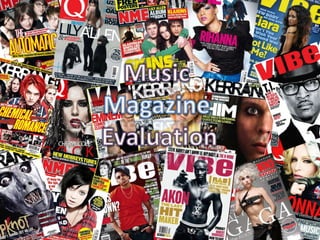
The document discusses the design and content choices made for a student-created music magazine. It aims to conform to conventions of real music magazines through elements like a top strip, central cover image, barcode/price, and third-left layout. The magazine targets youth interested in genres like hip hop, grime, and R&B. Font and layout choices are meant to attract this audience while challenging conventions in an appealing way. Social groups like "Aspirers" and "Creators" are the intended targets, represented through topics, artists, and an interactive website. Careful attention is paid to audience engagement and psychological triggers to attract readers and sales.
Снежное королевство MultiGRAD (МультиГРАД) появится в год 100-летия российской анимации в крупнейшем парке г.Москвы. Здесь зритель сможет вспомнить любимые мультфильмы, поблуждать в мульт-лабиринте, увидеть советский анимационный раритет и узнать, как создаются мультфильмы сейчас.
В Снежном королевстве MultiGRAD можно будет не только окунуться в мир волшебных иллюзий мультипликации, но и найти развлечения на любой вкус.
In the vast landscape of cinema, stories have been told, retold, and reimagined in countless ways. At the heart of this narrative evolution lies the concept of a "remake". A successful remake allows us to revisit cherished tales through a fresh lens, often reflecting a different era's perspective or harnessing the power of advanced technology. Yet, the question remains, what makes a remake successful? Today, we will delve deeper into this subject, identifying the key ingredients that contribute to the success of a remake.
Maximizing Your Streaming Experience with XCIPTV- Tips for 2024.pdfXtreame HDTV
In today’s digital age, streaming services have become an integral part of our entertainment lives. Among the myriad of options available, XCIPTV stands out as a premier choice for those seeking seamless, high-quality streaming. This comprehensive guide will delve into the features, benefits, and user experience of XCIPTV, illustrating why it is a top contender in the IPTV industry.
Tom Selleck Net Worth: A Comprehensive Analysisgreendigital
Over several decades, Tom Selleck, a name synonymous with charisma. From his iconic role as Thomas Magnum in the television series "Magnum, P.I." to his enduring presence in "Blue Bloods," Selleck has captivated audiences with his versatility and charm. As a result, "Tom Selleck net worth" has become a topic of great interest among fans. and financial enthusiasts alike. This article delves deep into Tom Selleck's wealth, exploring his career, assets, endorsements. and business ventures that contribute to his impressive economic standing.
Follow us on: Pinterest
Early Life and Career Beginnings
The Foundation of Tom Selleck's Wealth
Born on January 29, 1945, in Detroit, Michigan, Tom Selleck grew up in Sherman Oaks, California. His journey towards building a large net worth began with humble origins. , Selleck pursued a business administration degree at the University of Southern California (USC) on a basketball scholarship. But, his interest shifted towards acting. leading him to study at the Hills Playhouse under Milton Katselas.
Minor roles in television and films marked Selleck's early career. He appeared in commercials and took on small parts in T.V. series such as "The Dating Game" and "Lancer." These initial steps, although modest. laid the groundwork for his future success and the growth of Tom Selleck net worth. Breakthrough with "Magnum, P.I."
The Role that Defined Tom Selleck's Career
Tom Selleck's breakthrough came with the role of Thomas Magnum in the CBS television series "Magnum, P.I." (1980-1988). This role made him a household name and boosted his net worth. The series' popularity resulted in Selleck earning large salaries. leading to financial stability and increased recognition in Hollywood.
"Magnum P.I." garnered high ratings and critical acclaim during its run. Selleck's portrayal of the charming and resourceful private investigator resonated with audiences. making him one of the most beloved television actors of the 1980s. The success of "Magnum P.I." played a pivotal role in shaping Tom Selleck net worth, establishing him as a major star.
Film Career and Diversification
Expanding Tom Selleck's Financial Portfolio
While "Magnum, P.I." was a cornerstone of Selleck's career, he did not limit himself to television. He ventured into films, further enhancing Tom Selleck net worth. His filmography includes notable movies such as "Three Men and a Baby" (1987). which became the highest-grossing film of the year, and its sequel, "Three Men and a Little Lady" (1990). These box office successes contributed to his wealth.
Selleck's versatility allowed him to transition between genres. from comedies like "Mr. Baseball" (1992) to westerns such as "Quigley Down Under" (1990). This diversification showcased his acting range. and provided many income streams, reinforcing Tom Selleck net worth.
Television Resurgence with "Blue Bloods"
Sustaining Wealth through Consistent Success
In 2010, Tom Selleck began starring as Frank Reagan i
Experience the thrill of Progressive Puzzle Adventures, like Scavenger Hunt Games and Escape Room Activities combined Solve Treasure Hunt Puzzles online.
240529_Teleprotection Global Market Report 2024.pdfMadhura TBRC
The teleprotection market size has grown
exponentially in recent years. It will grow from
$21.92 billion in 2023 to $28.11 billion in 2024 at a
compound annual growth rate (CAGR) of 28.2%. The
teleprotection market size is expected to see
exponential growth in the next few years. It will grow
to $70.77 billion in 2028 at a compound annual
growth rate (CAGR) of 26.0%.
From the Editor's Desk: 115th Father's day Celebration - When we see Father's day in Hindu context, Nanda Baba is the most vivid figure which comes to the mind. Nanda Baba who was the foster father of Lord Krishna is known to provide love, care and affection to Lord Krishna and Balarama along with his wife Yashoda; Letter’s to the Editor: Mother's Day - Mother is a precious life for their children. Mother is life breath for her children. Mother's lap is the world happiness whose debt can never be paid.
Young Tom Selleck: A Journey Through His Early Years and Rise to Stardomgreendigital
Introduction
When one thinks of Hollywood legends, Tom Selleck is a name that comes to mind. Known for his charming smile, rugged good looks. and the iconic mustache that has become synonymous with his persona. Tom Selleck has had a prolific career spanning decades. But, the journey of young Tom Selleck, from his early years to becoming a household name. is a story filled with determination, talent, and a touch of luck. This article delves into young Tom Selleck's life, background, early struggles. and pivotal moments that led to his rise in Hollywood.
Follow us on: Pinterest
Early Life and Background
Family Roots and Childhood
Thomas William Selleck was born in Detroit, Michigan, on January 29, 1945. He was the second of four children in a close-knit family. His father, Robert Dean Selleck, was a real estate investor and executive. while his mother, Martha Selleck, was a homemaker. The Selleck family relocated to Sherman Oaks, California. when Tom was a child, setting the stage for his future in the entertainment industry.
Education and Early Interests
Growing up, young Tom Selleck was an active and athletic child. He attended Grant High School in Van Nuys, California. where he excelled in sports, particularly basketball. His tall and athletic build made him a standout player, and he earned a basketball scholarship to the University of Southern California (U.S.C.). While at U.S.C., Selleck studied business administration. but his interests shifted toward acting.
Discovery of Acting Passion
Tom Selleck's journey into acting was serendipitous. During his time at U.S.C., a drama coach encouraged him to try acting. This nudge led him to join the Hills Playhouse, where he began honing his craft. Transitioning from an aspiring athlete to an actor took time. but young Tom Selleck became drawn to the performance world.
Early Career Struggles
Breaking Into the Industry
The path to stardom was a challenging one for young Tom Selleck. Like many aspiring actors, he faced many rejections and struggled to find steady work. A series of minor roles and guest appearances on television shows marked his early career. In 1965, he debuted on the syndicated show "The Dating Game." which gave him some exposure but did not lead to immediate success.
The Commercial Breakthrough
During the late 1960s and early 1970s, Selleck began appearing in television commercials. His rugged good looks and charismatic presence made him a popular brand choice. He starred in advertisements for Pepsi-Cola, Revlon, and Close-Up toothpaste. These commercials provided financial stability and helped him gain visibility in the industry.
Struggling Actor in Hollywood
Despite his success in commercials. breaking into large acting roles remained a challenge for young Tom Selleck. He auditioned and took on small parts in T.V. shows and movies. Some of his early television appearances included roles in popular series like Lancer, The F.B.I., and Bracken's World. But, it would take a
From Slave to Scourge: The Existential Choice of Django Unchained. The Philos...Rodney Thomas Jr
#SSAPhilosophy #DjangoUnchained #DjangoFreeman #ExistentialPhilosophy #Freedom #Identity #Justice #Courage #Rebellion #Transformation
Welcome to SSA Philosophy, your ultimate destination for diving deep into the profound philosophies of iconic characters from video games, movies, and TV shows. In this episode, we explore the powerful journey and existential philosophy of Django Freeman from Quentin Tarantino’s masterful film, "Django Unchained," in our video titled, "From Slave to Scourge: The Existential Choice of Django Unchained. The Philosophy of Django Freeman!"
From Slave to Scourge: The Existential Choice of Django Unchained – The Philosophy of Django Freeman!
Join me as we delve into the existential philosophy of Django Freeman, uncovering the profound lessons and timeless wisdom his character offers. Through his story, we find inspiration in the power of choice, the quest for justice, and the courage to defy oppression. Django Freeman’s philosophy is a testament to the human spirit’s unyielding drive for freedom and justice.
Don’t forget to like, comment, and subscribe to SSA Philosophy for more in-depth explorations of the philosophies behind your favorite characters. Hit the notification bell to stay updated on our latest videos. Let’s discover the principles that shape these icons and the profound lessons they offer.
Django Freeman’s story is one of the most compelling narratives of transformation and empowerment in cinema. A former slave turned relentless bounty hunter, Django’s journey is not just a physical liberation but an existential quest for identity, justice, and retribution. This video delves into the core philosophical elements that define Django’s character and the profound choices he makes throughout his journey.
Link to video: https://youtu.be/GszqrXk38qk
Panchayat Season 3 - Official Trailer.pdfSuleman Rana
The dearest series "Panchayat" is set to make a victorious return with its third season, and the fervor is discernible. The authority trailer, delivered on May 28, guarantees one more enamoring venture through the country heartland of India.
Jitendra Kumar keeps on sparkling as Abhishek Tripathi, the city-reared engineer who ends up functioning as the secretary of the Panchayat office in the curious town of Phulera. His nuanced depiction of a young fellow exploring the difficulties of country life while endeavoring to adjust to his new environmental factors has earned far and wide recognition.
Neena Gupta and Raghubir Yadav return as Manju Devi and Brij Bhushan Dubey, separately. Their dynamic science and immaculate acting rejuvenate the hardships of town administration. Gupta's depiction of the town Pradhan with an ever-evolving outlook, matched with Yadav's carefully prepared exhibition, adds profundity and credibility to the story.
New Difficulties and Experiences
The trailer indicates new difficulties anticipating the characters, as Abhishek keeps on wrestling with his part in the town and his yearnings for a superior future. The series has reliably offset humor with social editorial, and Season 3 looks ready to dig much more profound into the intricacies of rustic organization and self-awareness.
Watchers can hope to see a greater amount of the enchanting and particular residents who have become fan top picks. Their connections and the one of a kind cut of-life situations give a reviving and interesting portrayal of provincial India, featuring the two its appeal and its difficulties.
A Mix of Humor and Heart
One of the signs of "Panchayat" is its capacity to mix humor with sincere narrating. The trailer features minutes that guarantee to convey giggles, as well as scenes that pull at the heartstrings. This equilibrium has been a critical calculate the show's prosperity, resounding with crowds across different socioeconomics.
Creation Greatness
The creation quality remaining parts first rate, with the beautiful setting of Phulera town filling in as a scenery that upgrades the narrating. The meticulousness in portraying provincial life, joined with sharp composition and solid exhibitions, guarantees that "Panchayat" keeps on hanging out in the packed web series scene.
Expectation and Delivery
As the delivery date draws near, expectation for "Panchayat" Season 3 is at a record-breaking high. The authority trailer has previously created critical buzz, with fans enthusiastically anticipating the continuation of Abhishek Tripathi's excursion and the new undertakings that lie ahead in Phulera.
All in all, the authority trailer for "Panchayat" Season 3 recommends that watchers are in for another drawing in and engaging ride. Yet again with its charming characters, convincing story, and ideal mix of humor and show, the new season is set to enamor crowds. Write in your schedules and prepare to get back to the endearing universe of "Panchayat."
Skeem Saam in June 2024 available on ForumIsaac More
Monday, June 3, 2024 - Episode 241: Sergeant Rathebe nabs a top scammer in Turfloop. Meikie is furious at her uncle's reaction to the truth about Ntswaki.
Tuesday, June 4, 2024 - Episode 242: Babeile uncovers the truth behind Rathebe’s latest actions. Leeto's announcement shocks his employees, and Ntswaki’s ordeal haunts her family.
Wednesday, June 5, 2024 - Episode 243: Rathebe blocks Babeile from investigating further. Melita warns Eunice to stay clear of Mr. Kgomo.
Thursday, June 6, 2024 - Episode 244: Tbose surrenders to the police while an intruder meddles in his affairs. Rathebe's secret mission faces a setback.
Friday, June 7, 2024 - Episode 245: Rathebe’s antics reach Kganyago. Tbose dodges a bullet, but a nightmare looms. Mr. Kgomo accuses Melita of witchcraft.
Monday, June 10, 2024 - Episode 246: Ntswaki struggles on her first day back at school. Babeile is stunned by Rathebe’s romance with Bullet Mabuza.
Tuesday, June 11, 2024 - Episode 247: An unexpected turn halts Rathebe’s investigation. The press discovers Mr. Kgomo’s affair with a young employee.
Wednesday, June 12, 2024 - Episode 248: Rathebe chases a criminal, resorting to gunfire. Turf High is rife with tension and transfer threats.
Thursday, June 13, 2024 - Episode 249: Rathebe traps Kganyago. John warns Toby to stop harassing Ntswaki.
Friday, June 14, 2024 - Episode 250: Babeile is cleared to investigate Rathebe. Melita gains Mr. Kgomo’s trust, and Jacobeth devises a financial solution.
Monday, June 17, 2024 - Episode 251: Rathebe feels the pressure as Babeile closes in. Mr. Kgomo and Eunice clash. Jacobeth risks her safety in pursuit of Kganyago.
Tuesday, June 18, 2024 - Episode 252: Bullet Mabuza retaliates against Jacobeth. Pitsi inadvertently reveals his parents’ plans. Nkosi is shocked by Khwezi’s decision on LJ’s future.
Wednesday, June 19, 2024 - Episode 253: Jacobeth is ensnared in deceit. Evelyn is stressed over Toby’s case, and Letetswe reveals shocking academic results.
Thursday, June 20, 2024 - Episode 254: Elizabeth learns Jacobeth is in Mpumalanga. Kganyago's past is exposed, and Lehasa discovers his son is in KZN.
Friday, June 21, 2024 - Episode 255: Elizabeth confirms Jacobeth’s dubious activities in Mpumalanga. Rathebe lies about her relationship with Bullet, and Jacobeth faces theft accusations.
Monday, June 24, 2024 - Episode 256: Rathebe spies on Kganyago. Lehasa plans to retrieve his son from KZN, fearing what awaits.
Tuesday, June 25, 2024 - Episode 257: MaNtuli fears for Kwaito’s safety in Mpumalanga. Mr. Kgomo and Melita reconcile.
Wednesday, June 26, 2024 - Episode 258: Kganyago makes a bold escape. Elizabeth receives a shocking message from Kwaito. Mrs. Khoza defends her husband against scam accusations.
Thursday, June 27, 2024 - Episode 259: Babeile's skillful arrest changes the game. Tbose and Kwaito face a hostage crisis.
Friday, June 28, 2024 - Episode 260: Two women face the reality of being scammed. Turf is rocked by breaking
Hollywood Actress - The 250 hottest galleryZsolt Nemeth
Hollywood Actress amazon album eminent worldwide media, female-singer, actresses, alhletina-woman, 250 collection.
Highest and photoreal-print exclusive testament PC collage.
Focused television virtuality crime, novel.
The sheer afterlife of the work is activism-like hollywood-actresses point com.
173 Illustrate, 250 gallery, 154 blog, 120 TV serie logo, 17 TV president logo, 183 active hyperlink.
HD AI face enhancement 384 page plus Bowker ISBN, Congress LLCL or US Copyright.
Scandal! Teasers June 2024 on etv Forum.co.zaIsaac More
Monday, 3 June 2024
Episode 47
A friend is compelled to expose a manipulative scheme to prevent another from making a grave mistake. In a frantic bid to save Jojo, Phakamile agrees to a meeting that unbeknownst to her, will seal her fate.
Tuesday, 4 June 2024
Episode 48
A mother, with her son's best interests at heart, finds him unready to heed her advice. Motshabi finds herself in an unmanageable situation, sinking fast like in quicksand.
Wednesday, 5 June 2024
Episode 49
A woman fabricates a diabolical lie to cover up an indiscretion. Overwhelmed by guilt, she makes a spontaneous confession that could be devastating to another heart.
Thursday, 6 June 2024
Episode 50
Linda unwittingly discloses damning information. Nhlamulo and Vuvu try to guide their friend towards the right decision.
Friday, 7 June 2024
Episode 51
Jojo's life continues to spiral out of control. Dintle weaves a web of lies to conceal that she is not as successful as everyone believes.
Monday, 10 June 2024
Episode 52
A heated confrontation between lovers leads to a devastating admission of guilt. Dintle's desperation takes a new turn, leaving her with dwindling options.
Tuesday, 11 June 2024
Episode 53
Unable to resort to violence, Taps issues a verbal threat, leaving Mdala unsettled. A sister must explain her life choices to regain her brother's trust.
Wednesday, 12 June 2024
Episode 54
Winnie makes a very troubling discovery. Taps follows through on his threat, leaving a woman reeling. Layla, oblivious to the truth, offers an incentive.
Thursday, 13 June 2024
Episode 55
A nosy relative arrives just in time to thwart a man's fatal decision. Dintle manipulates Khanyi to tug at Mo's heartstrings and get what she wants.
Friday, 14 June 2024
Episode 56
Tlhogi is shocked by Mdala's reaction following the revelation of their indiscretion. Jojo is in disbelief when the punishment for his crime is revealed.
Monday, 17 June 2024
Episode 57
A woman reprimands another to stay in her lane, leading to a damning revelation. A man decides to leave his broken life behind.
Tuesday, 18 June 2024
Episode 58
Nhlamulo learns that due to his actions, his worst fears have come true. Caiphus' extravagant promises to suppliers get him into trouble with Ndu.
Wednesday, 19 June 2024
Episode 59
A woman manages to kill two birds with one stone. Business doom looms over Chillax. A sobering incident makes a woman realize how far she's fallen.
Thursday, 20 June 2024
Episode 60
Taps' offer to help Nhlamulo comes with hidden motives. Caiphus' new ideas for Chillax have MaHilda excited. A blast from the past recognizes Dintle, not for her newfound fame.
Friday, 21 June 2024
Episode 61
Taps is hungry for revenge and finds a rope to hang Mdala with. Chillax's new job opportunity elicits mixed reactions from the public. Roommates' initial meeting starts off on the wrong foot.
Monday, 24 June 2024
Episode 62
Taps seizes new information and recruits someone on the inside. Mary's new job
Create a Seamless Viewing Experience with Your Own Custom OTT Player.pdfGenny Knight
As the popularity of online streaming continues to rise, the significance of providing outstanding viewing experiences cannot be emphasized enough. Tailored OTT players present a robust solution for service providers aiming to enhance their offerings and engage audiences in a competitive market. Through embracing customization, companies can craft immersive, individualized experiences that effectively hold viewers' attention, entertain them, and encourage repeat usage.
As a film director, I have always been awestruck by the magic of animation. Animation, a medium once considered solely for the amusement of children, has undergone a significant transformation over the years. Its evolution from a rudimentary form of entertainment to a sophisticated form of storytelling has stirred my creativity and expanded my vision, offering limitless possibilities in the realm of cinematic storytelling.
Meet Dinah Mattingly – Larry Bird’s Partner in Life and Loveget joys
Get an intimate look at Dinah Mattingly’s life alongside NBA icon Larry Bird. From their humble beginnings to their life today, discover the love and partnership that have defined their relationship.
Meet Crazyjamjam - A TikTok Sensation | Blog EternalBlog Eternal
Crazyjamjam, the TikTok star everyone's talking about! Uncover her secrets to success, viral trends, and more in this exclusive feature on Blog Eternal.
Source: https://blogeternal.com/celebrity/crazyjamjam-leaks/
5. “ In what way does your media product use, develop or challenge forms and conventions of real media products? ”
6. I personally believe that my magazine conforms most of the typical codes and conventions of a music magazine, this is clear through a top strip, I was meant to add a bottom strip however I felt that I wanted only a top strip as I thought it looked more attractive, the most important barcode and price as well as the date and issue, there is also a very large and eye catching central image on both the cover and contents which covers most of the A4 area I was given, most of the models in each image all maintained eye contact except from the contents page, I did this to ensure that the reader or audience felt welcomed and on a personal level with the model in the image, I also made sure that I included a third left layout as this is an essential convention of a music magazine, if I had not included this it would have not been easily identified as a music magazine. By placing a central image on the cover, contents and double page spread it allowed readers or audiences to easily identify the magazine being of music genre. The main genres I was aiming my magazine to feature were Hip Hop, UK Grime and R&B etc. I included well known artist names from all these genres to ensure that all audience could easily identify the magazine as being a mixture of all these types of music. I have tried challenging the typical format of a magazine by using mass variety of different fonts on my cover, some audiences may say that they could find it confusing however I have used it in such a way that it adds to the attractiveness and style that I was going for, I have used about 10 different fonts on my cover and contents to give it a more funky look.
7. “ How does your media product represent particular social groups? .....and also attract/address your audience? ”
8. In the beginning I intended my magazine on having a similar layout as a well known R&B and Hip Hop magazine called “Vibe”. Looking at a recent audience profile for Vibe magazine it stated that there target audience for the magazine was predominantly “Young, Urban followers of the Hip Hop culture”. To support this reference I have listed the website below for further research and proof. Reference - http://coolspotters.com/magazines/vibe-magazine As I intended on using Vibe as an example of what I wanted my finished magazine to look similar to. When handing out my questionnaire I handed out my questionnaires to more female than male audiences as I found that looking and observing many of the Vibe front covers that most of the artists that were featured on the cover were more female than male so I just assumed it was common sense that I should hand it out to more female than male audiences, however only a couple more as I wanted my audience to be wide spread and not biased or one sided. I only gave my questionnaires out to those audiences who were aged between 12 to 25+ as I wanted to identify and see what my target audience wanted and then act upon it to create a magazine that was accurate from my results from the questionnaire as well as the key objective which was being appealing to the audience. For my central imaged I used a fellow classmate to model as a new and upcoming artist called “Preeya Kalidas” who previously played “Amira Shah” on Eastenders, I found that it would be interesting and conventional if I used her as she is a actress aspiring singer/artist trying to make it big in the music industry, as my magazine was based around the concept of loads of different sub genres of music bonded and mixed into one cost efficient magazine called “Original” and was targeted to mainly aspirers I found that it was only common sense and meaningful that I used her as an example as many audiences after looking at the cover could automatically relate to the image and aspire to be like her. I believe that my audience would be ably to connect and relate to this , and I hoped they would understand the new and fresh approach I was attempting to incorporate on my front cover.
9. “ How does your media product represent particular social groups? And also attract/address your audience? ”
10. The genre I had chosen for my magazine was Urban which was made up of several other sub genre’s such as Hip Hop, R&B, Reggae, UK Grime etc. For my central image I have used a young and youthful model to play the part of a upcoming, current Urban artist on the market at the moment, I have used a young and youthful model to make the audience feel welcomed and comfortable and feel like they could some how relate to the model on a personal level, also as Urban is a fresh and new mixture of many other sub genres it was only logical that the models I used were also as young and fresh similar to the genre. Whilst researching and looking at existing and current magazines on the market at the moment from a similar genre, I looked closely at the types and groups of people that were featured on the cover and on majority of the magazines only one artist or model featured on each cover, for example a magazine that demonstrated this was Vibe magazine [Below] who only predominantly feature one person and one person only on their covers, looking through the many thousands of covers not one had featured more than one model on the cover, I then decided to continue this trend of only featuring one model as well to ensure that I kept with the style and layout of a well known and realistic magazine to ensure mines looked similar and realistic looking too. By doing this it would ensure that if my magazine was on a shelf or stand, it would instantly catch the eye of audiences both young and even old along with my chosen target audience, this would result to a wider target audience and would come as an advantage as it would increase the popularity and reputation. I also believe that the colour scheme I have included would also catch the eye of audiences all ages as it is both bright and unusual, younger audiences would possible feel attracted to the bright and unusual colour and elder audiences may be intrigued or aware about the unusual colour scheme and then may purchase the magazine to read more, an elder audience may also become attracted to it as the magazine talks about very mature topics such as “Celebrity relationships”, and an elder audience could some what relate to this.
11. [Continued] Also after taking all the aspects that would have been expected and considered when creating a realistic magazine, I personally believe that in general my magazine mainly represents the youthfulness of our generation which is basically something new, fresh, funky and different. Looking back at my audience demographics I had decided to aim my magazine mainly towards 3 main social groups, these consisted of Aspirers, Constrained and Creators. Looking back at my magazine I feel that maybe I have not appealed so much to Constrained audiences as I put quiet a high price on my magazine which was £2.95, as this group of people tend to be poor and sometimes struggling I feel that I haven't appealed to them on a whole as £2.95 is quiet an expensive price to pay for a normal magazine that in this case isn't even well known or branded. However on the other hand looking at the remainder two social groups, I feel that “Aspirers” would remain and continue to read my magazine as the magazine features new upcoming artists who are people to look up to and as that what aspirers are all about I think it would come as and advantage, and as for creators it would appeal to them as they are basically viral distributers in the form of readers, as the magazine has its own website, creators would find this interesting and appreciate the website which they could then further distribute and spread the news about, this would come as an advantage as creators would distribute and spread the word of the magazine in a cost efficient manner. If the popularity and reputation of the magazine increased as well as the funding for the magazine increased slightly then the possibility of advertising clothes, shoes and latest gadgets like headphones or designer clothing for example would increase massively.
12. The word “Preeya” is in bold and is the 2 nd largest font on the cover, this is to ensure that audiences such as Aspirers easily see this and become attracted and persuaded by the word, they read this and feel an instant urge to go on ahead and purchase the magazine and read on to find out more about the gossip it briefly talks about on the cover. It also adds to the attractiveness of the magazine as it would be the 2 nd thing that would catch the audiences eye and would then trigger them into buying the magazine and reading more. [Front Cover] I priced my magazine at £2.95 as most of the people that completed my questionnaire were willing to pay anything between £2.50 and £4.00 (Left) and as I was aiming my magazine towards a constrained social class I then decided to place it at the bottom end of the price range to ensure all my audience were able to have access to the magazine, I also did this to ensure that if the magazine was to actually be distributed then the company should make a small profit out of it too this is another reason why I increased the price a little. The masthead is large, instantly visible and identifiable, it is almost the 2 nd largest specimen on the page, this is to ensure that the audience can instantly identify and tell the difference to the masthead to the rest of the text on the cover. The text going around the image of the model also adds to the feel of the magazine, it adds a sort of “sexy” feel to the cover, I included this as the sub genre R&B which is included in Urban is mainly focused around sex symbols and portraying women and men is a sexual manner, I thought I would add this to ensure that it had a bit of each genre contained within it. Like many magazines the central image is the main thing that catches the readers eyes, this is simply because it sets a sort of atmosphere for the reader through many elements within the central image such as the quality of the image, mise – en – scene, uses of colour, feelings and expressions on the models faces, this enables to reader to instantly identify the genre of the magazine. The model retains eye contact with the audience making them feel welcomed and on a personal level with the model.
13. The right side of my magazine contains lists the names of numerous well known urban artists that are a similar age to my target audience who are on the market at the moment, this makes my magazine, overall content along with features all the more reliable. For my cover I decided to include the date, issue and barcode as it is one of the vital codes and conventions of a magazine, I also decided to include it as it gives the cover a more realistic and believable look. I decided to include the magazines very own online website where audience could keep track of the latest gossip and movement in the urban music industry, I also included this as one of my target social group the creators would see this and instantly become aware and appealed by it, as they tend to market the magazine across a mass audience it is a cheap and cost efficient for the institutions, my looking at the audience the Creators in my target group will then target my magazine across a mass audience using maybe YouTube or social networking sites such as Facebook or Twitter, this would come as an advantage as the news of my magazine would be advertised for free. I have included a puff that is over exaggerative and in most cases placed on the cover to catch the audiences eyes, by reading this puff it would trigger them into thinking what is said is true and actually just as good as it sounds, these are one of the very few conventions that institutions use to psychologically adjust audiences minds into purchasing the magazine. I have added a “Tip – on” or “Freebie” consisting of a free iTunes download, audiences would instantly become attracted to this as on iTunes a reader would have to pay maybe a pound at the least to purchase this magazine, therefore by putting this freebie on audiences would instantly find it useful and “worth it”, this would trigger the audience into then purchasing the magazine. The third left layout is large, bold and eye catching, the third left on my cover takes up most of the A4 space I was given, I did this to ensure that all of my audience were able to see this and it would be the maybe the first or second thing that caught the audiences eye, on the third left I have included my own twist to the lyric of a song written by a well known urban group called the Pussycat Dolls, I have done this as audiences will see this and automatically identify what it is about and find interest in it and then want to maybe purchase the magazine. I have used a simple rhetorical questions to show the audience that they have an option, I did it to make the audience feel like they are in control and have power.
14. One mistake that I had made in my magazine was the fact that on the contents page the model does not retain eye contact, this mistake would have made the difference between whether a reader purchased the magazine or not as my the model maintaining eye contact it give the reader a weird sense of comfort and connectivity as they feel that they are on a sort of personal level with the model as the image looks more inviting and welcoming, by my model not maintaining eye contact it could put certain readers off buying the magazine and could also make some audience feel uncomfortable and out of place when there reading the magazine. [Contents Page] Looking back at the feedback I had received form my questionnaire I tried including all the things that most people chose, the most popular features that people wanted were exclusive interviews , events or gigs and latest artist gossip , these are the three main things I included to ensure that all my audiences were happy. I included quotes with extra large quotations marks, I did this so readers can easily see the quote and find some sort of interest and attractive towards it triggering them to some how become attracted and lured into purchasing the magazine, this would appeal to a lot of Aspirers as they would see this and would want to then purchase the magazine and find out more about what the particular artist is up to, they would want to purchase it to read the article and some how find comfort and interest out of it as they are the social group that tend to want to find belonging in a social group above themselves. My masthead is large and bold, it is positions in an unusual and attractive way, I did this to make sure it is the second thing that catches the readers eye, it is something new and not something you would typically see in any other magazine. The position of the word is what makes it so attractive and appealing. I have included large and clear page numbers that are in a simple and bold fonts, I included page number to help my audience to navigate around my magazine easily, this would make the audience feel slightly less confused and almost feel like they are in control of what they can read. I have put both the features and regulars in two separate columns to avoid my audience becoming confused, I also did this to appeal to the needs of my audience as it helps them as it makes it easier for them to access what type of news and gossip they want easily.
15. By incorporating the “urban language” on my contents page along with my cover and double page spread, by doing this I have made the audience feel more comfortable whilst reading it as they can relate to it and also understand it better whereas if it was in formal English some audience could find great difficulty understanding what the text is trying to say. I have done this to make sure my magazine is relatable to the relatively young target audience. I have made use of personal pronouns such as “your” within my contents page and front cover , to further interact with my target audience or reader on a more comfortable and personal level. I have used a brick wall as my main background image, I did this as I believe it represents the youthfulness and originality (similarly to the name of the magazine) of the magazine, as brick walls in art tend to get associated with the word Urban, I only felt that it was appropriate to use this, I also felt it gave the magazine a more rough and edgy feel, it also added to the attractiveness of the contents on a whole as well. I also used this as a background as it represents “the streets” and instead of using something more modern and sophisticated I have instead manipulated that and used something more simple yet meaningful and effective, it symbolises all the young audiences of today's society. I have use individual thin square like boxes to separate each article to avoid the audiences becoming confused about what’s what, I put a white outline around it to make it stand out and easily seen. I put the word “exclusive” in bold and italics, I then put a white glow around it to make it eye catching easily caught by the audiences eye, the reason why I chose to put a glow around it was because it is the main thing that most audiences look at first thing, it is something the audience desire and look forward to reading, as exclusive in media means something new and something no body has read or even seen before this triggers audience into thinking that they are one of the very few that after reading the article will know more about the specific subject or artist, by reading the exclusive article audience somehow feel more important than other people as they believe they are the only person that knows something that very few others know, it makes the audience feel special and wanted, it puts them in such a position that they just cant resist the temptation and result to finally purchasing the magazine. Institutions use these so called technique to psychologically make audiences feel as though they are important and actually worth something. I included a competition to make the audience feel as though they can gain something out of purchasing the magazine.
16. I made sure that I laid my main article in columns, however in the beginning I started by placing the individual questions and answers in carious different sizes, however my teacher than told me that I was unable to do this as she said it was not a code and convention of a music magazine so if I did do this I would loose marks as it does not meet the requirements that were asked for for the magazine, another problem that it would cause was that if it was actually published than the audiences would find great difficulty finding their way around which order the magazine was meant to be in, it would cause a great deal of confusion for many audiences and this may then put some audiences of buying the magazine as well as taking the attraction and appeal away from the audience and the look of the double page spread. [Double Page Spread] I included key maybe influential quotes from the interview and placed them on the opposite page on top of the large central image, I did this as audiences will instantly see this and maybe find attraction to this and by reading what is quoted they might find that it is something interesting and then may find that they then want to purchase the magazine to find out more, the large quotes on the opposite page also add to the style I was aiming my magazine for as well as adding to the attractiveness of the double page, it also compliments the central image as well, I made sure that I did not overlap the central image too much as I did not want to take the audiences eye and focus away from my main image. I made sure that my central image was large and took up most of my right side page to ensure that it caught my audiences eyes, as it is the central image it is meant to be the dominant feature of the page so I ensured I followed the convention correctly my making the image extra large, when I started I decided to put a couple of smaller images underneath however once I placed them where I wanted I found that it made the page look slightly to overcrowded and crammed, I found that it took away the focus from the main image so I then decided to remove them as I felt that it could put some of my audiences of buying the magazine, after removing the images I found that the page looked better however I wanted something to fill in the empty space so I decided to place a star that was also featured on my front cover to show a link between both the cover and double page spread showing the audience that both pages belong to the same magazine. “ ”
17. Looking back at my final media product now I can clearly see the continuous “house colour” that runs through the magazine where it begins with the colour purple on the cover and then the contents being both purple and blue which then leads to the double page spread which is blue, the contents page is basically a mixture of both the font cover and double page spread colour scheme, I did this as I personally felt that it worked well. I did this simply as it makes all the pages seem as though they are meant to go together as well as allowing the reader to identify what he/she is reading all belongs to the same magazine. My magazine generally uses a lot of bright colours purely because the target audience were young and youthful and “bright colours” are stereotypically know to attract a younger audience, i have used some dark colours like black for example however this is purely because I wanted specific words to stand out more compared to others. Looking at my colour scheme overall it is easy to identify that my magazine is not aimed at an older audience. Another way that you can tell that it may not be aimed at an elder audience is the use of “new” urban words and language used throughout the magazine. The use of colours not only makes the magazine stand out but also makes it look unusual and in some cases maybe slightly unrealistic. The simple yet effective structure of the cover, contents and double page spread adds to the clarity of my product which in this case was actually requested and chosen by my chosen target audience [who were aged between 12 and 25] within the feedback of my questionnaires, and by meeting my audiences needs it would have hopefully made my magazine slightly more attractive and appealing. The simple yet effective structure and the continual use of house colours and clarity has added to the realism and professionalism of my magazine. The image I have used for my magazine to generally represent the genre Urban are images that are in some cases appealing, original and different, all the images in my magazine are different in one way or another for example my cover features an image of a model who has a reflection , the contents an image of a model who has been airbrushed and the double page spread a model who is in black and white, all the images I have used some what go against some of the typical codes and conventions however this just adds to the whole idea of it being original and different , the images also represent youth and fun, something funky and fresh and I believe all my images represent this one way or another.
18. “ What kind of media institution might distribute your media product and why? ”
19. The media institution that would distribute my music magazine would be the InterMedia and IPC Media (International Publishing Company), however the main institution that would distribute my magazine would have to be IPC Media. This is purely based around the fact that this well known institution distribute and produce over 60 different iconic media brands which include nearly 26 million adult readers. I personally believe that they would distribute my magazine simply because my magazine is aimed towards a target audience aged anywhere between 12 and 25 however I want any audience to find attraction to my magazine regardless what age. I also found that InterMedia was an ideal institution to distribute my magazine as I researched the different types of magazines they actually distributed and I had found that they distributed a wide range of different well known music magazines that are on the market at the moment, I had discovered that they distributed the magazines Vibe which is a well known urban magazine on the market at the moment, I found that it would be reasonable for me to want this institution to distribute my magazine as the chosen genre for my magazine was also Urban so I found that my magazine fitted well with the genres of magazine that the institution distributed. [Reference] : http://en.wikipedia.org/wiki/InterMedia_Partners http://www.intermediaadvisors.com/ The type of retail shop I would like my magazine to be sold at would be book stores such as Waterstones and WHSmith as these are well known stores which distribute a wide range of different magazines including a variety of music magazines as well as the fact that thousands of audiences will visit stores everyday and will see the magazine and then will hopefully purchase it.
20. “ What have you learnt about the technologies from the process of constructing this product? ”
21. Once again I was required to use both Adobe Photoshop and Adobe InDesign when creating the components I needed for my music magazine and similarly to before I also once again used the Nikon D19 to take my images for the magazine. During the time I was slowly building my magazine I had further developed a better understanding and knowledge since the production of the school magazine on how to use both InDesign and Photshop better, and more efficiently, unlike the time when I first began using InDesign when I began putting my school magazine together this time round when putting my music magazine together I felt more confident using the programme by my self and I personally felt that I came across fewer problems and issues, I felt I had made lesser mistakes than when I first began and as for Photoshop I felt more confident using the programme of experimenting I discovered new tools and applications that I could use to make my images slightly more attracting and appealing, I felt that as I used the more tools the outcome of my images were greater. As a result I believe that my knowledge, understanding and ability on how to use these programmes independently and with confidence has strengthened, this is purely based around the fact that I was prepared to experiment and take a risk and as a result them risks were rewarding. As I was constantly looking at existing magazines I learnt that the codes and conventions played a significant part in the magazine as the codes and conventions are what gives the magazine its identity, it is what helps audiences become attracted to them and it also helps during the planning process and basically helping a magazine become as successful and profitable as it possibly can. For my magazine I had to do quiet a bit of editing in regards to my images which consisted of my central images for my cover, contents and double page spread, my back ground image for my contents page and also the small image that was on the left hand side of the title of my article on the double page spread. Whilst editing these images I specifically learnt the importance of layering a certain image if a effect needs to be added ( from personal experiences), looking at both my preliminary task and my final product I can honestly say that the power of technology has a massive impact during the productions steps of the final product. independently and I had found that this time round I had experimented more with tools I might not have even looked at twice before, as a result
22. “ Looking back at you preliminary task, what do you feel you have learnt in the progression from it to the full production ”
24. [ Looking back at both my school and music magazine I can identify to significant differences between the two. ] It is very clear that there has been improvements from when I began creating my school magazine to the end of finishing my music magazine, I personally believe that it wasn't simply down to my improved knowledge on the typical codes and conventions of magazine but my improved knowledge, understanding and familiarisation on using professional software's that are used by real media institutions. By correcting and analysing the mistakes I had made on my preliminary task, it helped me better my current knowledge and I also learnt about what a significant and crucial role the typical codes and conventions of a magazine played when attracting a specific target audience and also whilst portraying the objective of the magazine clearly to the target audience. After completing my research for my preliminary task, I observed and noticed that school magazines tend to bend to rules and usually didn't really abide by the typical codes and conventions of a magazine this was simply down to the mere fact that school magazines tend to be published and distributed within the school and within the school only except parents, carers or guardians, school magazines tend to have to commercial pressure, as in the actual world of magazines everything tends to have a specific image or subject that is then usually manufactured and finally presented as reality to the audience or readers. The improvement and development in technology also plays a BIG part in helping magazine institutions create a “fake” image and lifestyle and portray it as something realistic, the power of technology place a massive part in this process of selling a very unrealistic image and then manipulating it to create a so called realistic and “plastic” image that is then ultimately sold to the audience under false pretences. This can sometimes lead to certain audiences becoming some what “mislead”, the image that magazines sometimes sell can project a certain way of thinking and believing into some specific audience for example Aspirers who tend to be people that want to be in the social class above them, there are certain elements of the magazine that can be incredibly influential in the way they can manipulate the choices and actions audiences take when in certain situations. Another key thing is that sometimes style choices can also affect audiences behaviour towards society for example, a social class that are the most vulnerable to this are followers.