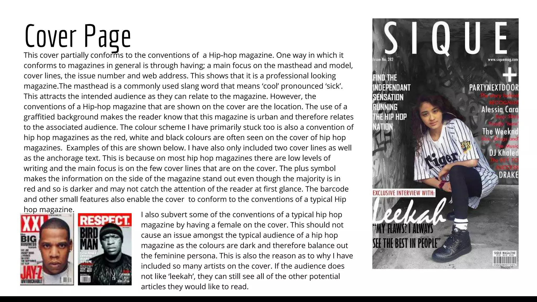
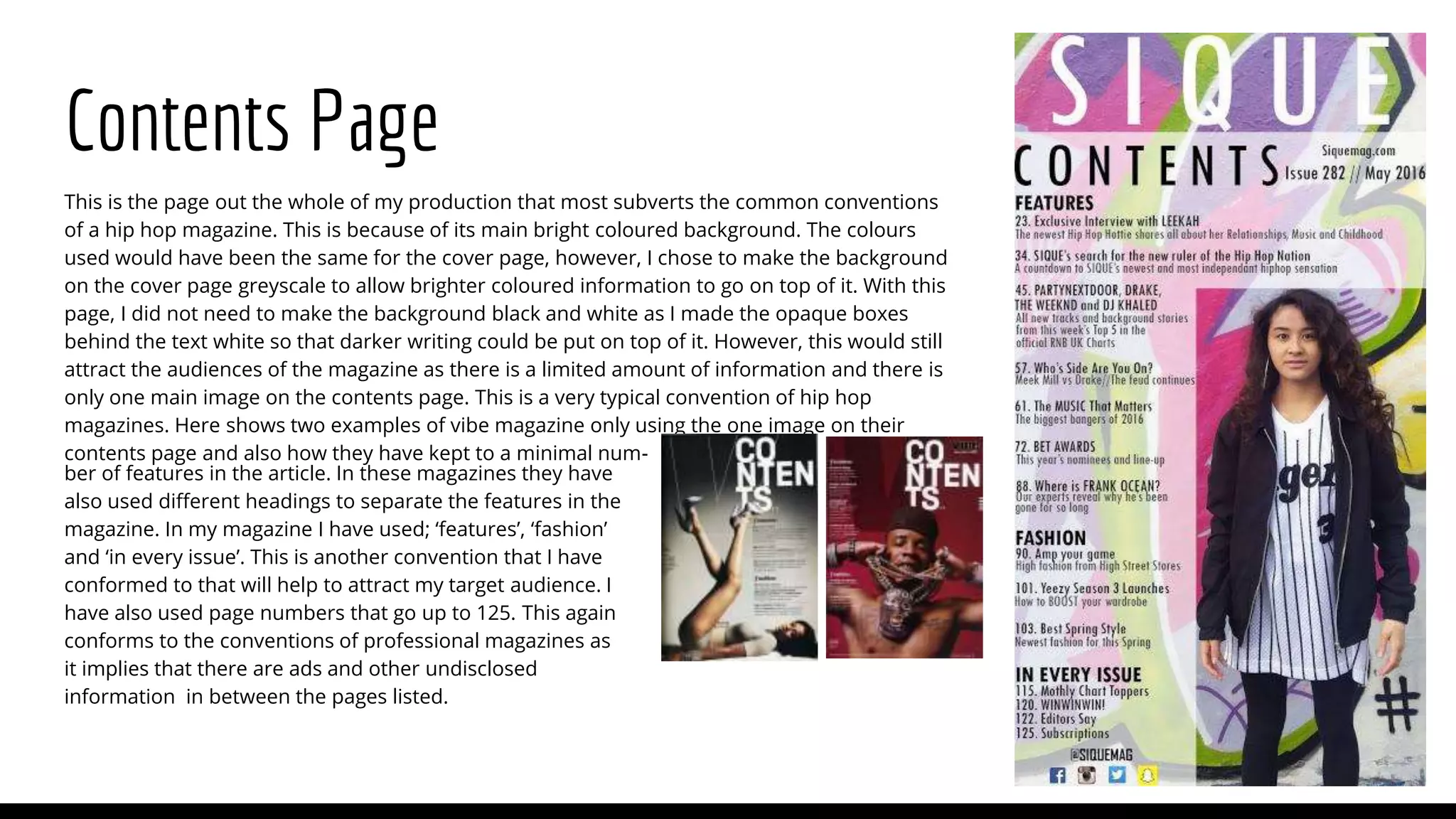
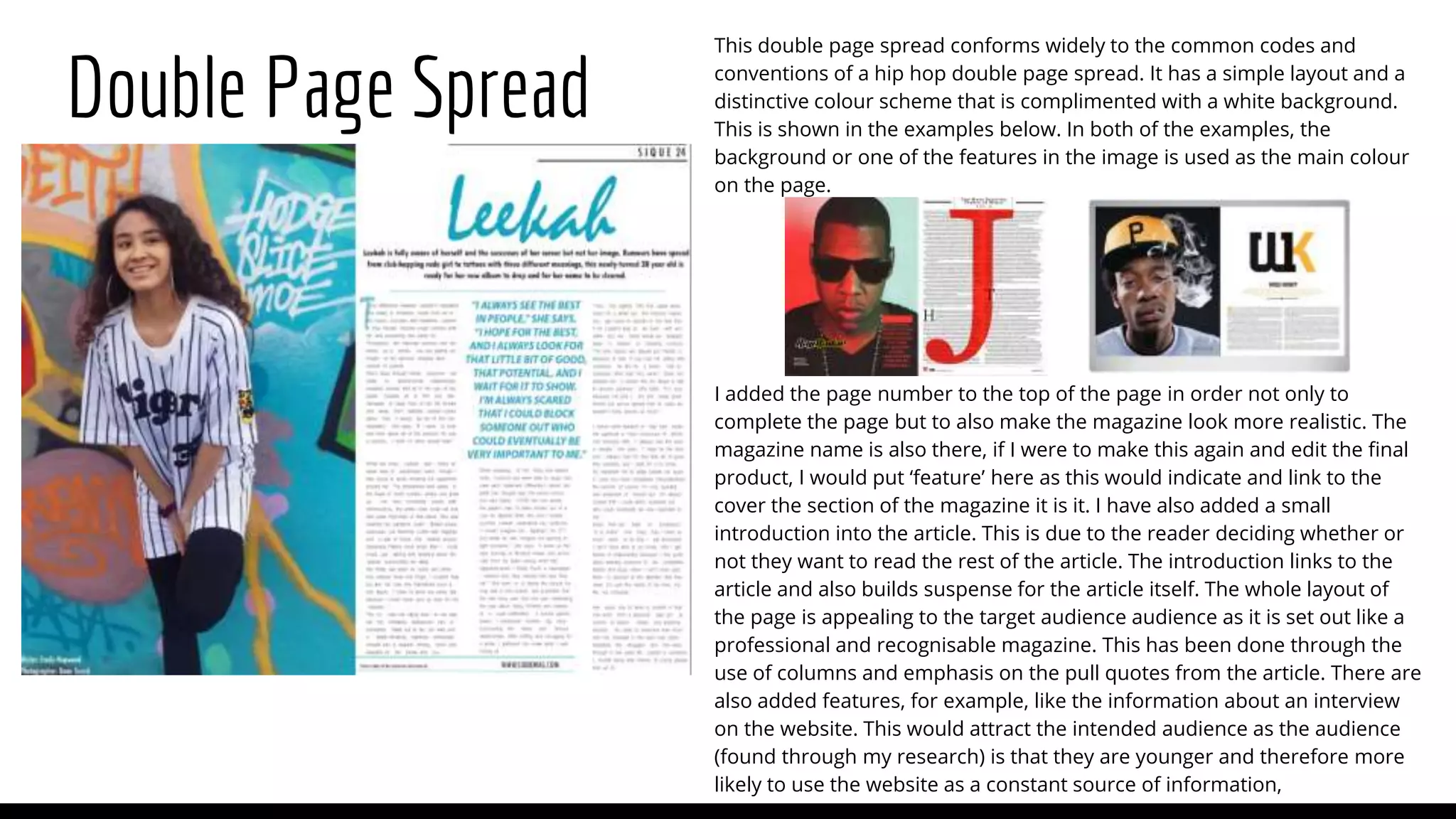
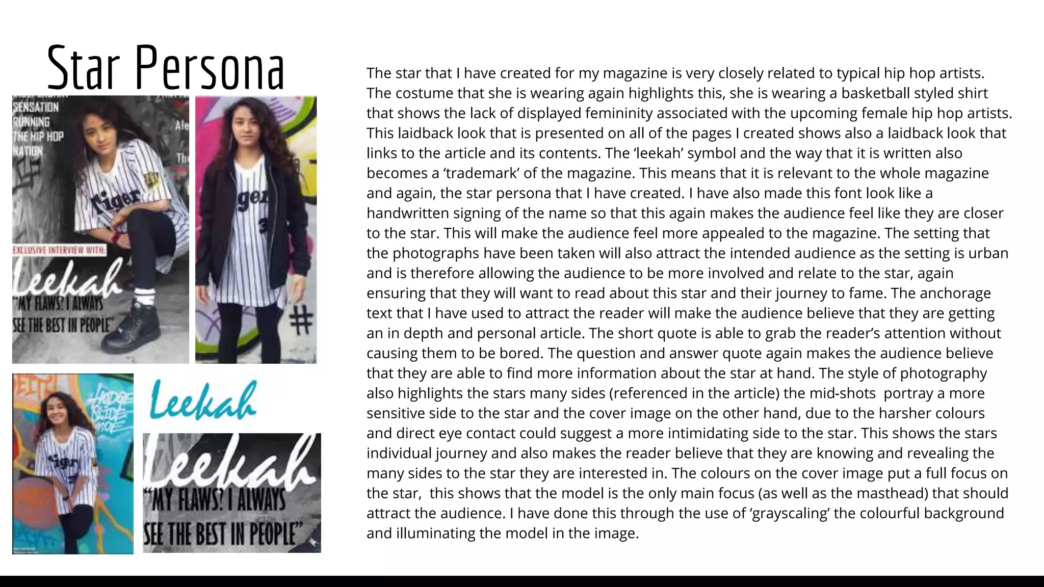
This is the second textual analysis I have done for my A2 blog where I am doing a Regional Magazine. This textual analysis is about the contents pages.
This is my analysis of album covers within my genre to gain knowledge of how to create my digipack and poster. I also looked into the synergy and how the album represented all aspects of an artist.
This is an analysis of my questionnaire, it shows the results of 94 people's answers and I have applied this to the content and information in my magazine.
This is a task designed to prepare me for my music magazine design and preparation. It describes the processes I have been through and the methods I used to design and construct a school magazine.
Acetabularia Information For Class 9 .docxvaibhavrinwa19
Acetabularia acetabulum is a single-celled green alga that in its vegetative state is morphologically differentiated into a basal rhizoid and an axially elongated stalk, which bears whorls of branching hairs. The single diploid nucleus resides in the rhizoid.
Francesca Gottschalk - How can education support child empowerment.pptxEduSkills OECD
Francesca Gottschalk from the OECD’s Centre for Educational Research and Innovation presents at the Ask an Expert Webinar: How can education support child empowerment?
How to Make a Field invisible in Odoo 17Celine George
It is possible to hide or invisible some fields in odoo. Commonly using “invisible” attribute in the field definition to invisible the fields. This slide will show how to make a field invisible in odoo 17.
Operation “Blue Star” is the only event in the history of Independent India where the state went into war with its own people. Even after about 40 years it is not clear if it was culmination of states anger over people of the region, a political game of power or start of dictatorial chapter in the democratic setup.
The people of Punjab felt alienated from main stream due to denial of their just demands during a long democratic struggle since independence. As it happen all over the word, it led to militant struggle with great loss of lives of military, police and civilian personnel. Killing of Indira Gandhi and massacre of innocent Sikhs in Delhi and other India cities was also associated with this movement.
Read| The latest issue of The Challenger is here! We are thrilled to announce that our school paper has qualified for the NATIONAL SCHOOLS PRESS CONFERENCE (NSPC) 2024. Thank you for your unwavering support and trust. Dive into the stories that made us stand out!
Welcome to TechSoup New Member Orientation and Q&A (May 2024).pdfTechSoup
In this webinar you will learn how your organization can access TechSoup's wide variety of product discount and donation programs. From hardware to software, we'll give you a tour of the tools available to help your nonprofit with productivity, collaboration, financial management, donor tracking, security, and more.
Introduction to AI for Nonprofits with Tapp NetworkTechSoup
Dive into the world of AI! Experts Jon Hill and Tareq Monaur will guide you through AI's role in enhancing nonprofit websites and basic marketing strategies, making it easy to understand and apply.
1. Evaluation Question 1:
In what way does your media product use,
develop or challenge forms and conventions of
real media products?
2. Cover Page
I also subvert some of the conventions of a typical hip hop
magazine by having a female on the cover. This should not
cause an issue amongst the typical audience of a hip hop
magazine as the colours are dark and therefore balance out
the feminine persona. This is also the reason as to why I have
included so many artists on the cover. If the audience does
not like ‘leekah’, they can still see all of the other potential
articles they would like to read.
This cover partially conforms to the conventions of a Hip-hop magazine. One way in which it
conforms to magazines in general is through having; a main focus on the masthead and model,
cover lines, the issue number and web address. This shows that it is a professional looking
magazine.The masthead is a commonly used slang word that means ‘cool’ pronounced ‘sick’.
This attracts the intended audience as they can relate to the magazine. However, the
conventions of a Hip-hop magazine that are shown on the cover are the location. The use of a
graffitied background makes the reader know that this magazine is urban and therefore relates
to the associated audience. The colour scheme I have primarily stuck too is also a convention of
hip hop magazines as the red, white and black colours are often seen on the cover of hip hop
magazines. Examples of this are shown below. I have also only included two cover lines as well
as the anchorage text. This is because on most hip hop magazines there are low levels of
writing and the main focus is on the few cover lines that are on the cover. The plus symbol
makes the information on the side of the magazine stand out even though the majority is in
red and so is darker and may not catch the attention of the reader at first glance. The barcode
and other small features also enable the cover to conform to the conventions of a typical Hip
hop magazine.
3. Contents Page
This is the page out the whole of my production that most subverts the common conventions
of a hip hop magazine. This is because of its main bright coloured background. The colours
used would have been the same for the cover page, however, I chose to make the background
on the cover page greyscale to allow brighter coloured information to go on top of it. With this
page, I did not need to make the background black and white as I made the opaque boxes
behind the text white so that darker writing could be put on top of it. However, this would still
attract the audiences of the magazine as there is a limited amount of information and there is
only one main image on the contents page. This is a very typical convention of hip hop
magazines. Here shows two examples of vibe magazine only using the one image on their
contents page and also how they have kept to a minimal num-
ber of features in the article. In these magazines they have
also used different headings to separate the features in the
magazine. In my magazine I have used; ‘features’, ‘fashion’
and ‘in every issue’. This is another convention that I have
conformed to that will help to attract my target audience. I
have also used page numbers that go up to 125. This again
conforms to the conventions of professional magazines as
it implies that there are ads and other undisclosed
information in between the pages listed.
4. Double Page Spread
This double page spread conforms widely to the common codes and
conventions of a hip hop double page spread. It has a simple layout and a
distinctive colour scheme that is complimented with a white background.
This is shown in the examples below. In both of the examples, the
background or one of the features in the image is used as the main colour
on the page.
I added the page number to the top of the page in order not only to
complete the page but to also make the magazine look more realistic. The
magazine name is also there, if I were to make this again and edit the final
product, I would put ‘feature’ here as this would indicate and link to the
cover the section of the magazine it is it. I have also added a small
introduction into the article. This is due to the reader deciding whether or
not they want to read the rest of the article. The introduction links to the
article and also builds suspense for the article itself. The whole layout of
the page is appealing to the target audience audience as it is set out like a
professional and recognisable magazine. This has been done through the
use of columns and emphasis on the pull quotes from the article. There are
also added features, for example, like the information about an interview
on the website. This would attract the intended audience as the audience
(found through my research) is that they are younger and therefore more
likely to use the website as a constant source of information,
5. Star Persona The star that I have created for my magazine is very closely related to typical hip hop artists.
The costume that she is wearing again highlights this, she is wearing a basketball styled shirt
that shows the lack of displayed femininity associated with the upcoming female hip hop artists.
This laidback look that is presented on all of the pages I created shows also a laidback look that
links to the article and its contents. The ‘leekah’ symbol and the way that it is written also
becomes a ‘trademark’ of the magazine. This means that it is relevant to the whole magazine
and again, the star persona that I have created. I have also made this font look like a
handwritten signing of the name so that this again makes the audience feel like they are closer
to the star. This will make the audience feel more appealed to the magazine. The setting that
the photographs have been taken will also attract the intended audience as the setting is urban
and is therefore allowing the audience to be more involved and relate to the star, again
ensuring that they will want to read about this star and their journey to fame. The anchorage
text that I have used to attract the reader will make the audience believe that they are getting
an in depth and personal article. The short quote is able to grab the reader’s attention without
causing them to be bored. The question and answer quote again makes the audience believe
that they are able to find more information about the star at hand. The style of photography
also highlights the stars many sides (referenced in the article) the mid-shots portray a more
sensitive side to the star and the cover image on the other hand, due to the harsher colours
and direct eye contact could suggest a more intimidating side to the star. This shows the stars
individual journey and also makes the reader believe that they are knowing and revealing the
many sides to the star they are interested in. The colours on the cover image put a full focus on
the star, this shows that the model is the only main focus (as well as the masthead) that should
attract the audience. I have done this through the use of ‘grayscaling’ the colourful background
and illuminating the model in the image.