This document provides a step-by-step tutorial for creating a frequency distribution table in Excel. It explains how to:
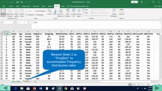
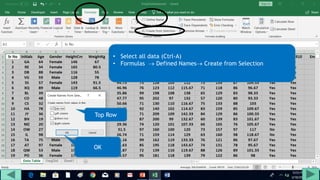
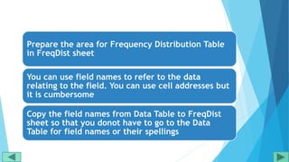
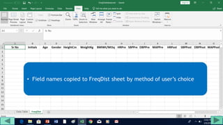
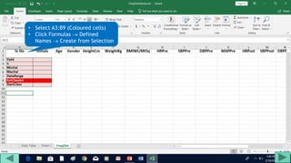
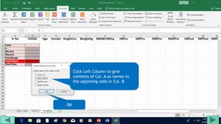
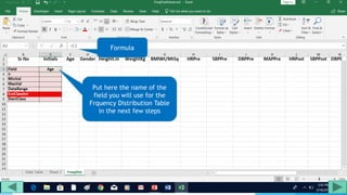
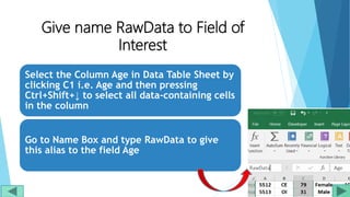
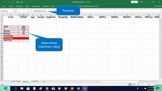
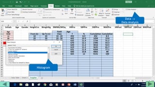
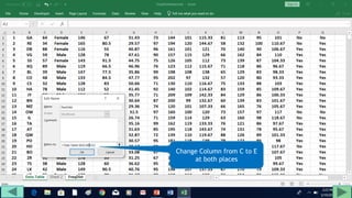
1. Prepare the data by naming columns and creating a "FreqDist" sheet.
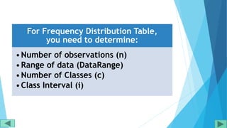
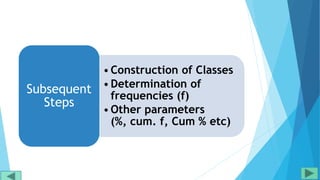
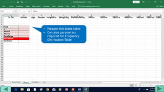
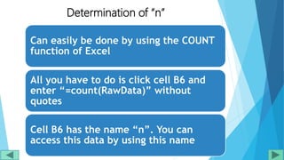
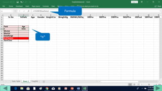
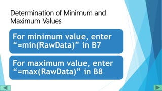
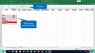
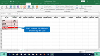
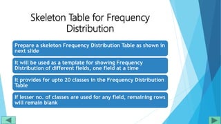
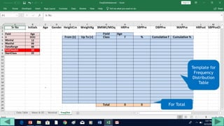
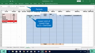
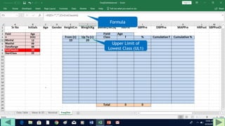
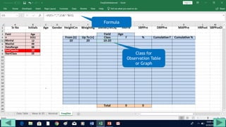
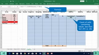
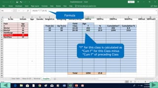
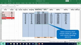
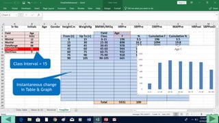
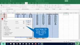
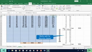
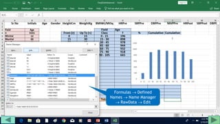
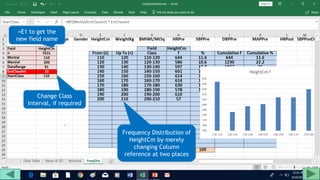
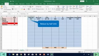
2. Fill out a template table with parameters like number of observations, class interval, and minimum/maximum values.
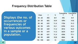
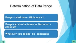
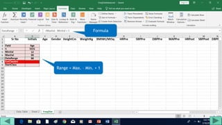
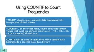
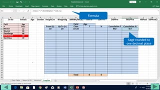
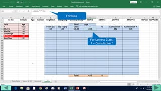
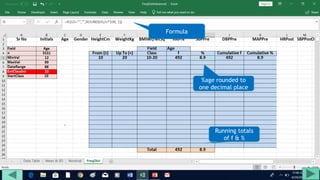
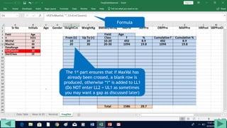
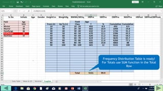
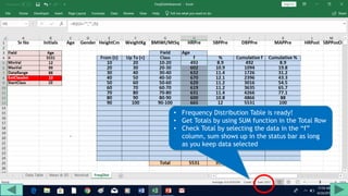
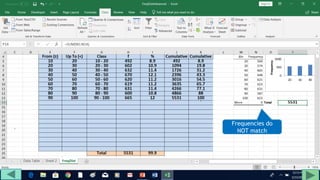
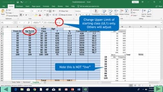
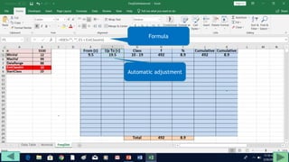
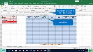
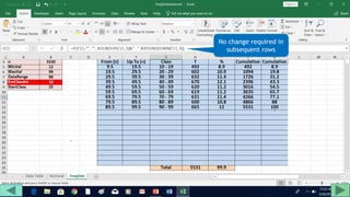
3. Use formulas to determine values like class limits, frequencies, and cumulative percentages.
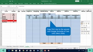
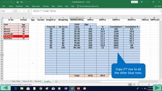
4. Copy formulas down to automatically generate the full distribution table.
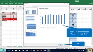
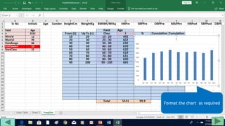
The tutorial demonstrates an easy way to analyze numeric data sets in Excel by creating frequency distributions.
This document defines key terms and concepts related to frequency distributions and describes how to create a frequency distribution from a dataset. It explains how to find the range of data, calculate class intervals, and construct a frequency table. An example is provided showing these steps to create a frequency distribution for a sample dataset. The document also covers interpolation, which is determining percentiles for values not reported in the frequency table. Finally, it lists and defines several visual displays that can be used to depict a frequency distribution such as histograms, frequency polygons, ogives, and pie charts.
The document discusses various ways of summarizing and displaying quantitative data, including through frequency tables, relative frequency tables, and two-way frequency tables. It provides examples and definitions for key terms related to frequency tables such as class boundaries, class midpoints, class width, marginal frequencies, and conditional relative frequency. The document also discusses how frequency tables can be used to validate data, explore trends, compare data over time or between samples.
This document discusses frequency distributions and how to construct them from raw data. It provides examples of creating stem-and-leaf displays, frequency tables, relative frequency tables, and cumulative frequency tables from various data sets. Key concepts covered include class width, class boundaries, tallying data, and calculating relative frequencies and percentages. Overall, the document serves as a tutorial on how to organize and summarize data using various types of frequency distributions.
A stemplot is a method to display data by splitting each number into a stem and leaf, with the ones digit as the leaf and other digits as the stem. It allows comparison of two data sets side by side. A dotplot displays the frequency of data values and is useful when the data is categorical. It may not be suitable to display continuous numeric data like golf scores.
The document discusses different statistical methods for organizing and summarizing data, including frequency tables, stem-and-leaf plots, histograms, and scatter plots. It provides examples of each method and explains how to interpret the results, such as looking for relationships between variables in scatter plots. Key terms defined include correlation, variables, and linear regression lines.
This document provides an overview of frequency distributions and how to construct a frequency distribution table from a set of data. It discusses the key steps: 1) determining the range of the data, 2) choosing the number of classes, 3) calculating the class width, and 4) tallying the frequency of observations within each class interval to populate the table. Guidelines for constructing frequency tables are also outlined, such as using mutually exclusive and exhaustive class intervals of uniform width. An example of constructing a 7-class frequency table from a set of 50 observations is shown to demonstrate the process.
This document discusses different methods for presenting data, including textual, tabular, and graphical presentations. Tabular presentations include frequency distribution tables that are ungrouped, grouped, simple, and complete. Graphical presentations include bar charts, histograms, frequency polygons, pie charts, and pictographs to visually depict quantitative data using bars, rectangles, lines, circles, or pictures. The examples provided demonstrate how to construct different types of tables and graphs for a set of sample data.
lesson 3 presentation of data and frequency distributionNerz Baldres
This document provides an overview of key concepts for presenting data and constructing frequency distributions. It defines different methods for presenting data including textual, tabular, and graphical forms. Tabular methods include components like table headings and stubs. Graphical methods are shown like bar graphs, line graphs, and pie charts. Frequency distributions arrange data by class intervals and calculate frequencies. Terms are defined for range, class interval, and cumulative and relative frequency. Examples demonstrate how to construct frequency distributions and calculate cumulative and relative frequencies.
This document provides information about frequency distributions and constructing frequency distribution tables. It defines a frequency distribution as a representation of data in a tabular format showing the number of observations within intervals. It then outlines the general process for constructing a frequency table which includes determining the range, number of classes, class width, and recording the frequencies in a table. An example is provided of constructing a frequency table from data on the ages of 50 men who died from gunfire using 7 classes. Guidelines for constructing frequency tables are also listed.
This document discusses frequency distributions and graphic presentations of data. It defines a frequency distribution as a grouping of data into categories showing the number of observations in each category. It describes the steps to construct a frequency distribution and provides examples using employee salary data. It also discusses types of graphic presentations like histograms, frequency polygons, cumulative frequency distributions, bar charts, and pie charts that can be used to visually display frequency distribution data.
2.1 frequency distributions, histograms, and related topicsleblance
The document discusses frequency distributions and related topics such as histograms and ogives. It explains how to construct a frequency table by determining classes, tallying data, calculating frequencies and relative frequencies, and finding class boundaries and midpoints. It then describes how to make histograms and relative frequency histograms based on the frequency table. Finally, it discusses different distribution shapes that histograms may take on such as mound-shaped, uniform, skewed, bimodal, and outliers, as well as how to make an ogive graph of cumulative frequencies.
This presentation gives you a brief idea;
-definition of frequency distribution
- types of frequency distribution
-types of charts used in the distribution
-a problem on creating types of distribution
-advantages and limitations of the distribution
This document provides an overview of methods for presenting data, including textual, tabular, and graphical methods. It discusses topics such as ungrouped vs. grouped data, frequency distribution tables, stem-and-leaf plots, class boundaries, class midpoints, and class width. The objectives are to describe how to prepare a stem-and-leaf plot, describe data textually, construct a frequency distribution table, create graphs, and interpret graphs and tables. Examples are provided to illustrate these concepts and methods.
This presentation discusses frequency distribution graphs. It provides examples of constructing frequency distribution tables and calculating class midpoints and cumulative frequencies. The key graphs for representing frequency distributions are described as histograms, frequency polygons, and cumulative frequency curves for continuous or quantitative data. Bar charts, line graphs and pie charts are also introduced as options to display grouped or ungrouped categorical data. Examples of each type of graph are included.
Chapter 2: Frequency Distribution and GraphsMong Mara
This document discusses different types of graphs and charts that can be used to represent frequency distributions of data, including histograms, frequency polygons, ogives, bar charts, pie charts, and stem-and-leaf plots. It provides examples of how to construct each graph or chart using sample data sets and discusses key aspects of each type such as class intervals, relative frequencies, and ordering of data. Guidelines are given for determining the optimal number of classes and class widths for grouped data. Exercises at the end provide practice applying these techniques to additional data sets.
Topic: Frequency Distribution
Student Name: Abdul Hafeez
Class: B.Ed. (Hons) Elementary
Project Name: “Young Teachers' Professional Development (TPD)"
"Project Founder: Prof. Dr. Amjad Ali Arain
Faculty of Education, University of Sindh, Pakistan
The document provides instructions for organizing raw data into a frequency distribution table and describes different ways to represent the distribution graphically, including histograms, frequency polygons, and cumulative frequency curves. It explains how to calculate class intervals and frequencies from raw data and construct tables showing the distribution. It also discusses representing the same data through vertical bar graphs, line graphs connecting class points, and curves showing cumulative frequencies below given values.
The document discusses the steps to construct a frequency distribution table (FDT):
1. Find the range and number of classes or intervals.
2. Estimate the class width and list the lower and upper class limits.
3. Tally the observations in each interval and record the frequencies.
It also describes how to calculate relative frequencies and cumulative frequencies to vary the FDT.
The document provides steps for constructing a frequency table from a set of test score data: 1) Compute the range and class interval size, 2) Set up the table with class intervals, 3) Tally the observations in each interval and compute frequencies, 4) Compute cumulative and relative frequencies. An example is provided using 30 test scores ranging from 76 to 99 grouped into intervals of size 4.
1. The document discusses different methods for presenting numerical data, including tables, graphs, and numerical techniques.
2. It provides examples of tabular data arranged in classes with frequencies, class marks, cumulative frequencies, and relative frequencies.
3. The document also describes histograms and bar graphs as ways to graphically display class data, with histograms using rectangle heights and bar graphs using points at the class midpoint and frequency coordinates.
This document discusses frequency distribution and methods for presenting grouped data. It defines key terms like class interval, class frequency, and class midpoint. It also provides steps for constructing a frequency distribution, including determining the number of classes and class interval. Examples are given to illustrate a frequency distribution table, relative frequency distribution, and different types of graphs - histograms, frequency polygons, cumulative frequency curves, line graphs, bar charts and pie charts - that can be used to present grouped quantitative data.
This document discusses frequency distributions and methods for graphically presenting frequency distribution data. It defines a frequency distribution as a tabulation or grouping of data into categories showing the number of observations in each group. The document outlines the parts of a frequency table as class limits, class size, class boundaries, and class marks. It then provides steps for constructing a frequency distribution table from a set of data. Finally, it discusses histograms and frequency polygons as methods for graphically presenting frequency distribution data, and provides examples of how to construct these graphs in Excel.
This document summarizes Chapter 2 of a statistics textbook. It covers descriptive statistics including frequency distributions, graphs of distributions, measures of central tendency, variation, and position. Section 2.1 discusses constructing frequency distributions and graphs including histograms, polygons, relative histograms, and ogives. Examples are provided to demonstrate how to construct these graphs from sample data on internet usage times. Key steps include determining class widths, limits, frequencies, midpoints, boundaries, and plotting the graphs.
This section expands on frequency distributions by discussing additional features: midpoints, which are the averages of class limits; relative frequency, which shows what portion of the data falls in each class; and cumulative frequency, which is the running total of all previous classes' frequencies. It provides an example calculating these values for a given
Introduction to micro soft Training ms Excel.pptdejene3
The document provides an introduction and outline for a training on basic Microsoft Excel skills. It covers how to open Excel, an overview of the Excel screen and interface elements, working with formulas including common functions like IF, AND, OR, and NOT, more advanced formulas like nested IF and RANK, and other topics like sorting data and conditional formatting. The training is intended for graduate students at Mattu University for the class of 2023.
1. SQL is a language used to query, analyze, and manipulate data from databases. It is one of the most widely used tools for working with data.
2. The question provides a sample table called "airbnb_listings" with columns for id, city, country, number_of_rooms, and year_listed.
3. SQL can filter data by specifying conditions in a WHERE clause. Examples filter the listings table to return rows where the number_of_rooms is greater than or equal to 3, or where number_of_rooms is greater than 3.
This document provides examples of useful functions and formulas in Microsoft Excel across several categories including common text, math, conditional, date and time functions. It demonstrates how to use functions like UPPER, ROUND, COUNTIF, IF, and DATE among many others to manipulate text, perform calculations, add conditional logic, work with dates and times. Instructions are provided on copying formulas down a column and removing formulas to paste only values.
The document discusses statistical analysis and Excel functions for organizing and summarizing data. It provides information on entering data into Excel sheets, describes functions like SUM, AVERAGE, COUNT, and STDEV that calculate values like sums, means, numbers of data points, and standard deviations. It also discusses using Excel to group data using functions like FREQUENCY and analyzing descriptive statistics using the Data Analysis ToolPak.
Just some excel courses. Have fun and learn from basic to advance, to develope strong skills in operating Excel.
Microsoft Office Excel was never so easy to understand like now!
Statistics is both the science of uncertainty and the technology.docxrafaelaj1
Statistics is both the science of uncertainty and the technology of extracting information from data.
A statistic is a summary measure of data.
Descriptive statistics are methods that describe and summarize data.
Microsoft Excel supports statistical analysis in two ways:
1. Statistical functions
2. Analysis Toolpak add-in
Statistical Methods for Summarizing Data
A frequency distribution is a table that shows the number of observations in each of several nonoverlapping groups.
Categorical variables naturally define the groups in a frequency distribution.
To construct a frequency distribution, we need only count the number of observations that appear in each category.
This can be done using the Excel COUNTIF function.
Frequency Distributions for Categorical Data
Example 3.16: Constructing a Frequency Distribution for Items in the Purchase Orders Database
List the item names in a column on the spreadsheet.
Use the function =COUNTIF($D$4:$D$97,cell_reference), where cell_reference is the cell containing the item name
Example 3.16: Constructing a Frequency Distribution for Items in the Purchase Orders Database
Construct a column chart to visualize the frequencies.
Relative frequency is the fraction, or proportion, of the total.
If a data set has n observations, the relative frequency of category i is:
We often multiply the relative frequencies by 100 to express them as percentages.
A relative frequency distribution is a tabular summary of the relative frequencies of all categories.
Relative Frequency Distributions
Example 3.17: Constructing a Relative Frequency Distribution for Items in the Purchase Orders Database
First, sum the frequencies to find the total number (note that the sum of the frequencies must be the same as the total number of observations, n).
Then divide the frequency of each category by this value.
For numerical data that consist of a small number of discrete values, we may construct a frequency distribution similar to the way we did for categorical data; that is, we simply use COUNTIF to count the frequencies of each discrete value.
Frequency Distributions for Numerical Data
In the Purchase Orders data, the A/P terms are all whole numbers 15, 25, 30, and 45.
Example 3.18: Frequency and Relative Frequency Distribution for A/P Terms
A graphical depiction of a frequency distribution for numerical data in the form of a column chart is called a histogram.
Frequency distributions and histograms can be created using the Analysis Toolpak in Excel.
Click the Data Analysis tools button in the Analysis group under the Data tab in the Excel menu bar and select Histogram from the list.
Excel Histogram Tool
Specify the Input Range corresponding to the data. If you include the column header, then also check the Labels box so Excel knows that the range contains a label. The Bin Range defines the groups (Excel calls these “bins”) used for the frequency distribution.
Histogra.
Use of Excel Spreadsheets in Computing GradesElli May Cañas
This document discusses using Excel to compute grades. It explains how Excel formulas can be used to automatically calculate totals, averages, dropped scores, and weighted averages. Common functions like SUM, AVERAGE, MIN, and COUNT are described. Conditional logic and lookup functions like IF, AND, OR, ISBLANK, and VLOOKUP allow Excel to perform different calculations based on cell values. The document provides examples of formulas to calculate class averages that drop scores, apply weighting, and perform letter grade conversions using lookup tables.
Spreadsheets are used to record and calculate numerical data through formulas in cells organized into rows and columns. Formulas can perform basic math operations and more complex calculations by referencing values in other cells. Spreadsheet programs offer formatting options, functions, charting capabilities, and other features to analyze and present calculated data.
This document provides an overview and introduction to using Microsoft Excel. It explains key parts of the Excel interface like the title bar, menu bar, toolbars, and worksheet tabs. It also demonstrates how to enter formulas, functions, and logical formulas in Excel. Common functions discussed include SUM, AVERAGE, MEDIAN, and IF. The document is intended to familiarize new Excel users with the basic features and capabilities of the program.
This document provides an overview of techniques for presenting numerical data in tables and charts. It discusses ordered arrays, stem-and-leaf displays, frequency distributions, histograms, polygons, ogives, bar charts, pie charts, and scatter diagrams. The chapter goals are to teach how to create and interpret these various data presentation methods using Microsoft Excel. Examples are provided for frequency distributions, histograms, polygons, and ogives to illustrate how to construct and make sense of these graphical representations of quantitative data.
The document provides information on spreadsheets and their uses. It discusses objectives of learning spreadsheets, introduces Excel as the program used for spreadsheets, and describes key spreadsheet components like worksheets, cells, formulas, and functions. Functions allow automatic calculations and include statistical and financial functions. Formulas can include cell references, operators, and functions. Examples demonstrate using formulas to calculate averages, minimums, and conditional statements.
This document provides an overview of key functions and features for working with Excel spreadsheets. It discusses setting up spreadsheet cells and formatting, entering data, sorting data, using formulas like AVERAGE and IF-THEN, and running summary calculations on a separate worksheet. The document demonstrates how to design a spreadsheet to store student grades and performance data, and use formulas to automatically calculate averages, determine if students pass or repeat courses, and assign grade point values.
This document provides an overview of Excel formulas and functions including MAX, MIN, AVG, IF, and nested IF functions. It includes examples and step-by-step instructions for using these functions to calculate statistics and conditional values. Hands-on exercises guide the user through entering formulas to find averages, maximums, minimums, assign letter grades, and conditionally sum values. The document also introduces more advanced statistical functions and the Analysis ToolPak add-in.
This document provides steps to create pivot tables and charts in Microsoft Excel using data from LMS. It describes how to create a pivot table to summarize stand volumes by species. It also explains how to create column and pie charts to visualize timber volume and age class distribution data from LMS tables in Excel. Charts are formatted and can be copied into PowerPoint presentations. Formulas using IF statements are used to group stand data into age classes for the age class distribution chart.
The document discusses various data analysis and visualization techniques in Microsoft Excel including filtering, sorting, formulas, functions, pivot tables, charts and conditional formatting. It provides step-by-step instructions on how to use these tools to extract insights from data by filtering to select specific records, using formulas and functions to perform calculations, sorting data, validating data entry, creating pivot tables and pivot charts to summarize data, and formatting cells based on conditions.
SQL, or Structured Query Language, is a powerful and versatile programming language used for managing and manipulating relational databases. With its intuitive syntax and wide-ranging capabilities, SQL has become a cornerstone of modern data management systems, enabling users to interact with databases efficiently and effectively.
One of the primary functions of SQL is to retrieve data from databases using queries. These queries allow users to specify the data they want to retrieve, filter it based on certain criteria, and perform various operations on it. SQL queries typically consist of several components, including:
1. **SELECT statement**: The SELECT statement is used to specify the columns of data that should be retrieved from the database. It allows users to choose which fields they want to include in the query's results.
2. **FROM clause**: The FROM clause specifies the table or tables from which the data should be retrieved. It identifies the source of the data for the query.
3. **WHERE clause**: The WHERE clause is used to filter the data based on specific conditions. It allows users to narrow down the results of their query by specifying criteria that must be met by the data.
4. **JOIN clause**: The JOIN clause is used to combine data from multiple tables in a database. It allows users to create relationships between tables based on common fields and retrieve data that spans multiple tables.
5. **GROUP BY clause**: The GROUP BY clause is used to group the results of a query based on one or more columns. It allows users to aggregate data and perform calculations on groups of records rather than individual records.
6. **HAVING clause**: The HAVING clause is used in conjunction with the GROUP BY clause to filter groups of data based on specific conditions. It allows users to apply conditions to groups of records after they have been grouped by the GROUP BY clause.
7. **ORDER BY clause**: The ORDER BY clause is used to sort the results of a query based on one or more columns. It allows users to specify the order in which the data should be displayed.
SQL also provides a wide range of functions and operators for performing calculations, manipulating strings and dates, and performing various other tasks. These functions and operators enhance the flexibility and power of SQL queries, enabling users to perform complex operations on their data with ease.
In addition to querying data, SQL is also used for managing database structures, creating and modifying tables, defining relationships between tables, and enforcing constraints to maintain data integrity. SQL's data definition language (DDL) allows users to create, alter, and drop database objects such as tables, indexes, and views, while its data manipulation language (DML) allows users to insert, update, delete, and retrieve data from tables.
Overall, SQL is a fundamental tool for working with relational databases, providing users with the ability to retrieve, manipulate, and manage
MIRCROSOFT EXCEL- brief and useful for beginners by RISHABH BANSALRishabh Bansal
the above presentation gives you a brief explanation of Microsoft excel. it includes various formulas, tips, explanations and shortcut keys that are useful for a beginner.
i found it useful, i hope u will also find it useful.
if you LIKE MY PRESENTATION you could FOLLOW ME on SLIDESHARE and FACEBOOK and add your suggestions for more.
best of luck..
ENGR 102B Microsoft Excel Proficiency LevelsPlease have your in.docxYASHU40
ENGR 102B: Microsoft Excel Proficiency Levels
Please have your instructor or TA initial each level as you complete it. If you need additional help, ask the TAs or use the help guide within Excel.
Once you master Excel Levels I through IV, you can note Excel as a skill on your resume!
Please see D2L Content for this week for your Excel Homework assignment (individual), which is due via D2L Dropbox by the due date specified in the D2L News for your section.
If you use a Mac, please be sure to submit your homework in a format that the grader and instructor can open on a PC.
Level I: Basic Functions Initials _______
1. Calculating an Average: Calculate the arithmetic average of the 5 values listed below. Enter the values in cells A2 through A6. Place a descriptive label in cell A1.
3.6, 3.8, 3.5, 3.7, 3.6
First, calculate the average the long way, by summing the values and dividing by 5:
You will enter the following formula into a blank cell to accomplish this:
=(A2+A3+A4+A5+A6)/5
Second, calculate the average using Excel’s AVERAGE( ) function by entering the following formula in a cell:
=AVERAGE(cellrange)
Replace the “cellrange” with the actual addresses in your spreadsheet of the range of cells holding the five values (i.e., for this problem, the cell range is A2:A6).
2. Determining Velocities (in kph): Some friends at the University of Calgary are coming south for spring break. Help them avoid a speeding ticket by completing a velocity conversion worksheet that calculates the conversion from mph to kph in increments of 10 from 10 to 100. A conversion factor you will need is 0.62 miles/km; you will need this factor to convert from miles/hour to km/hour. Place the conversion factor in its own cell and then reference it in your conversion calculations using absolute cell referencing (e.g., $C$2). Refer to the CBT video on Absolute and Relative Cell Referencing from the “Preparation for the Excel Workshop” assignment if you don’t remember how to do this.
Level II: Advanced Functions Initials _______
1. Projectile Motion I: (See following page for Fig. 1 Excel chart) A projectile is launched at the angle 35o from the horizontal with a velocity equal to 30 m/s. Neglecting air resistance and assuming a horizontal surface, determine how far away from the launch site the projectile will land.
To answer this problem, you will need:
1. Excel’s trigonometry functions to handle the 35o angle, and
2. Equations relating distance to velocity and acceleration
When velocity is constant, as in the horizontal motion of our particle (since we’re neglecting air resistance), the distance traveled is simply the initial horizontal velocity times the time of flight:
(Equation 1)
What keeps the projectile from flying forever is gravity. Since the gravitational acceleration is constant, the vertical distance traveled becomes
(Equation 2)
Because the projectile ends up back on the ground, the final value of y is zero (a hor ...
Similar to Excel tutorial for frequency distribution (20)
ESA/ACT Science Coffee: Diego Blas - Gravitational wave detection with orbita...Advanced-Concepts-Team
Presentation in the Science Coffee of the Advanced Concepts Team of the European Space Agency on the 07.06.2024.
Speaker: Diego Blas (IFAE/ICREA)
Title: Gravitational wave detection with orbital motion of Moon and artificial
Abstract:
In this talk I will describe some recent ideas to find gravitational waves from supermassive black holes or of primordial origin by studying their secular effect on the orbital motion of the Moon or satellites that are laser ranged.
(June 12, 2024) Webinar: Development of PET theranostics targeting the molecu...Scintica Instrumentation
Targeting Hsp90 and its pathogen Orthologs with Tethered Inhibitors as a Diagnostic and Therapeutic Strategy for cancer and infectious diseases with Dr. Timothy Haystead.
When I was asked to give a companion lecture in support of ‘The Philosophy of Science’ (https://shorturl.at/4pUXz) I decided not to walk through the detail of the many methodologies in order of use. Instead, I chose to employ a long standing, and ongoing, scientific development as an exemplar. And so, I chose the ever evolving story of Thermodynamics as a scientific investigation at its best.
Conducted over a period of >200 years, Thermodynamics R&D, and application, benefitted from the highest levels of professionalism, collaboration, and technical thoroughness. New layers of application, methodology, and practice were made possible by the progressive advance of technology. In turn, this has seen measurement and modelling accuracy continually improved at a micro and macro level.
Perhaps most importantly, Thermodynamics rapidly became a primary tool in the advance of applied science/engineering/technology, spanning micro-tech, to aerospace and cosmology. I can think of no better a story to illustrate the breadth of scientific methodologies and applications at their best.
The debris of the ‘last major merger’ is dynamically youngSérgio Sacani
The Milky Way’s (MW) inner stellar halo contains an [Fe/H]-rich component with highly eccentric orbits, often referred to as the
‘last major merger.’ Hypotheses for the origin of this component include Gaia-Sausage/Enceladus (GSE), where the progenitor
collided with the MW proto-disc 8–11 Gyr ago, and the Virgo Radial Merger (VRM), where the progenitor collided with the
MW disc within the last 3 Gyr. These two scenarios make different predictions about observable structure in local phase space,
because the morphology of debris depends on how long it has had to phase mix. The recently identified phase-space folds in Gaia
DR3 have positive caustic velocities, making them fundamentally different than the phase-mixed chevrons found in simulations
at late times. Roughly 20 per cent of the stars in the prograde local stellar halo are associated with the observed caustics. Based
on a simple phase-mixing model, the observed number of caustics are consistent with a merger that occurred 1–2 Gyr ago.
We also compare the observed phase-space distribution to FIRE-2 Latte simulations of GSE-like mergers, using a quantitative
measurement of phase mixing (2D causticality). The observed local phase-space distribution best matches the simulated data
1–2 Gyr after collision, and certainly not later than 3 Gyr. This is further evidence that the progenitor of the ‘last major merger’
did not collide with the MW proto-disc at early times, as is thought for the GSE, but instead collided with the MW disc within
the last few Gyr, consistent with the body of work surrounding the VRM.
Mending Clothing to Support Sustainable Fashion_CIMaR 2024.pdfSelcen Ozturkcan
Ozturkcan, S., Berndt, A., & Angelakis, A. (2024). Mending clothing to support sustainable fashion. Presented at the 31st Annual Conference by the Consortium for International Marketing Research (CIMaR), 10-13 Jun 2024, University of Gävle, Sweden.
EWOCS-I: The catalog of X-ray sources in Westerlund 1 from the Extended Weste...Sérgio Sacani
Context. With a mass exceeding several 104 M⊙ and a rich and dense population of massive stars, supermassive young star clusters
represent the most massive star-forming environment that is dominated by the feedback from massive stars and gravitational interactions
among stars.
Aims. In this paper we present the Extended Westerlund 1 and 2 Open Clusters Survey (EWOCS) project, which aims to investigate
the influence of the starburst environment on the formation of stars and planets, and on the evolution of both low and high mass stars.
The primary targets of this project are Westerlund 1 and 2, the closest supermassive star clusters to the Sun.
Methods. The project is based primarily on recent observations conducted with the Chandra and JWST observatories. Specifically,
the Chandra survey of Westerlund 1 consists of 36 new ACIS-I observations, nearly co-pointed, for a total exposure time of 1 Msec.
Additionally, we included 8 archival Chandra/ACIS-S observations. This paper presents the resulting catalog of X-ray sources within
and around Westerlund 1. Sources were detected by combining various existing methods, and photon extraction and source validation
were carried out using the ACIS-Extract software.
Results. The EWOCS X-ray catalog comprises 5963 validated sources out of the 9420 initially provided to ACIS-Extract, reaching a
photon flux threshold of approximately 2 × 10⁻⁸ photons cm−2
s
−1
. The X-ray sources exhibit a highly concentrated spatial distribution,
with 1075 sources located within the central 1 arcmin. We have successfully detected X-ray emissions from 126 out of the 166 known
massive stars of the cluster, and we have collected over 71 000 photons from the magnetar CXO J164710.20-455217.
ESR spectroscopy in liquid food and beverages.pptxPRIYANKA PATEL
With increasing population, people need to rely on packaged food stuffs. Packaging of food materials requires the preservation of food. There are various methods for the treatment of food to preserve them and irradiation treatment of food is one of them. It is the most common and the most harmless method for the food preservation as it does not alter the necessary micronutrients of food materials. Although irradiated food doesn’t cause any harm to the human health but still the quality assessment of food is required to provide consumers with necessary information about the food. ESR spectroscopy is the most sophisticated way to investigate the quality of the food and the free radicals induced during the processing of the food. ESR spin trapping technique is useful for the detection of highly unstable radicals in the food. The antioxidant capability of liquid food and beverages in mainly performed by spin trapping technique.
2. Frequency Distribution Table
Displays the no. of
occurrences or
frequencies of
various outcomes
in a sample or a
population.
Class f %
Cumulative
f
Cumulative
%
10 - 20 492 8.9 492 8.9
20 - 30 602 10.9 1094 19.8
30 - 40 632 11.4 1726 31.2
40 - 50 670 12.1 2396 43.3
50 - 60 620 11.2 3016 54.5
60 - 70 619 11.2 3635 65.7
70 - 80 631 11.4 4266 77.1
80 - 90 600 10.8 4866 88
90 - 100 665 12 5531 100
3. Let us start with a set of data
To illustrate how easy it is with Excel, a set of
fictitious data of 5531 patients of Hypertension who
were treated with an antihypertensive drug is
presented
Data set is resident in Sheet1 which has been
renamed “Data Table” to make it easy to remember
4. Rename Sheet 2 as
“FreqDist” to
accommodate Frequency
Distribution table
5. Should be descriptive i.e. they should indicate the type of data
contained in the field
Units of measurement should be mentioned where needed e.g.
HeightCm, WeightKg etc
Many workers use underscore to separate the field name and
units e.g. Height_cm, Weight_kg
In this presentation, underscores have been dispensed with and
the first letter of the units has been capitalized for convenience
e.g. HeightCm instead of Height_cm
Field Titles
6. In Excel, data is referred to as addresses of
the cells in which it resides
It is impossible to remember the cell addresses
in which data of Age, Height and all other
numeric fields reside
We can give names to a range of data so as to
use the Range Name e.g. Age instead of cell
address (C2:C5532)
7. Select the entire data and instruct
Excel to give the Name in the top
cell of each column to all the data
below that field name e.g.
C2:C5532 would be named as Age,
E2:E5532 as HeightCm and so on
8. • Select all data (Ctrl-A)
• Formulas Defined Names Create from Selection
Top Row
OK
9. For Frequency Distribution Table,
you need to determine:
•Number of observations (n)
•Range of data (DataRange)
•Number of Classes (c)
•Class Interval (i)
11. Prepare the area for Frequency Distribution Table
in FreqDist sheet
You can use field names to refer to the data
relating to the field. You can use cell addresses but
it is cumbersome
Copy the field names from Data Table to FreqDist
sheet so that you donot have to go to the Data
Table for field names or their spellings
12. • Field names copied to FreqDist sheet by method of user’s choice
13. • Prepare this blank table
• Contains parameters
required for Frequency
Distribution Table
14. We will now give the name “Field” to B3, “n” to
B4 and so on I.e. contents in Cells A3 to A9 will
be used as Names for Cells B3 to B9 for
convenience
This can be done in one go by giving B3:B9 the
names from the left column as shown in the next
slides
15. • Select A3:B9 (Coloured cells)
• Click Formulas Defined
Names Create from Selection
16. Click Left Column to give
contents of Col. A as names to
the adjoining cells in Col. B
OK
18. Put here the name of the
field you will use for the
Frquency Distribution Table
in the next few steps
Formula
19. Give name RawData to Field of
Interest
Select the Column Age in Data Table Sheet by
clicking C1 i.e. Age and then pressing
Ctrl+Shift+↓ to select all data-containing cells
in the column
Go to Name Box and type RawData to give
this alias to the field Age
20. Why use a single Alias?
You can use cell references or range names of different ranges
(fields) for creating separate Frequency Distribution tables
Using a single alias for all fields, turn by turn, has the
advantage that you only change the column reference of
RawData and it starts representing the new field
Saves plenty of time and energy
22. Determination of “n”
Can easily be done by using the COUNT
function of Excel
All you have to do is click cell B6 and
enter “=count(RawData)” without
quotes
Cell B6 has the name “n”. You can
access this data by using this name
23. Determination of “n”
“=” tells Excel that what follows is a
formula and not merely text
COUNT function counts all cells which
contain numeric data, even if it is zero,
i.e. it gives “n”
It will not count cells which are blank
or contain text
31. No. of Classes (C)
Several formulas available
to calculate C
Best to go by conventions in
your area of work
32. Class Interval (i): General
“i” should be an odd number below 8
(1, 3, 5, 7) or 2 or 10.
Larger and smaller numbers can be
multiples or factors of these (2.5, 7.5,
15, 25, 50, 75, 100, 125, 200, 250 etc)
33. i = Range/c
Fractions are avoided by modified formula as
i = roundup(Range/C, 0)
This ROUNDs the answer UP to the next higher
whole number (0 decimal places)
In the given worksheet, the user has to enter
“i” manually but he must keep the principles
on this and previous slide in mind
Class Interval (i): Calculation
35. Lower Limit of Lowest Class (LL1)
LL1 is the key calculation in frequency
distribution
LL1 must be a multiple of i
Should be less than or equal to minimum
value so that the lowest class contains the
minimum value
36. Ll1 (Contd)
In the formula “=int(MinVal/EntClassInt) * EntClassInt”,
int(MinVal/EntClassInt) calculates the quotient (integer) of the division
(whole number and ignores the remainder or modulus)
On multiplication with class interval (EntClassInt), it gives LL1
Here, MinVal = 12, i = 10, LL1 = int(12/10) * 10 = int(1.2) * 10 = 1 * 10
= 10. Hence the lowest class (StartClass) should begin with 10
39. Construction of Classes: General
Principles
All classes should be equal & continuous (No gaps
even if the frequency for the relevant class is 0)
Open-ended classes not provided for in this
presentation
Classes with zero data are not allowed at the top
or bottom
40. Skeleton Table for Frequency
Distribution
Prepare a skeleton Frequency Distribution Table as shown in
next slide
It will be used as a template for showing Frequency
Distribution of different fields, one field at a time
It provides for upto 20 classes in the Frequency Distribution
Table
If lesser no. of classes are used for any field, remaining rows
will remain blank
44. If(E5 = “”, “”, ……………..)
“=If(E5 = “”, “”, ………..) in the next slide means that if the
“From” cell (E5 here) is blank, leave this cell also blank
This ensures Blank rows, if there is no data in the “From”
cell of any row
The formula in the next slide adds “I” to LL1 to get UL1
46. Concatenation Operation
The formula in the next slide, concatenates (joins
fragments of text) the numbers in “From” and
“To” columns, separated by a hyphen.
This column is not required for mathematical
operations but is very useful to show the classes
when you prepare an observation table or a graph
or chart from the Frequency Distribution Table
48. Using COUNTIF to Count
Frequencies
“COUNT” simply counts numeric-data containing cells
irrespective of their values
“COUNTIF”, on the other hand, counts cells that contain
values that meet pre-defined criteria e.g. < 10, > 20, ≥ 30,
<> (not equal to) 40 and so on
COUNTIF will be used to count cells which contain data
belonging to a specific class, turn by turn
49. Two Methods of Determining
Frequencies
Frequency (f) for 30-40 class = Count cells
containing values ≥ 30 and < 40
f for 30-40 class also determined as Cumulative f for < 40
minus Cumulative f for < 30
In this presentation, the second method has been used
50. Need for “From” and “Upto”
ColumnsNow we shall ask Excel to read an UPTO value from a
cell (e.g. F5) and count the cells in the range in
question (RawData) that contain values below that
(F5)
For this reason, we have to have separate “From (≥)”
and “Upto (<)” columns.
The mathematical symbols also indicate that for the
30-40 class, all values 30 or more (upto, but less than
40) will be placed in the 30-40 class whereas 40 and
above (upto, but less than 50) in the 40-50 class
56. Copy first row to the second
and change formulas of two
cells (Next slide)
57. The 1st part ensures that if MaxVal has
already been crossed, a blank row is
produced, otherwise “i“ is added to LL1
(Do NOT enter LL2 = UL1 as sometimes
you may want a gap as discussed later)
Formula
58. “f” for this class is calculated as
“Cum f” for this Class minus
“Cum f” of preceding Class
Formula
62. • Frequency Distribution Table is ready!
• Get Totals by using SUM function in the Total Row
• Check Total by selecting the data in the “f”
column, sum shows up in the status bar as long
as you keep data selected
68. All you have to do is to change the
EntClassInt value which you had
entered earlier
Let us see the effects of changing the
Class interval from 10 to 15
76. Save this Workbook for Future Use
A little laborious to get the Frequency
Distribution for the first time
Save this table
After this comes the easy part
77. To get the frequency distribution of other fields,
turn by turn, all you have to do is to change the
cell reference of the RawData range
To get the frequency distribution of HeightCm,
you have to change the cell reference of
RawData to that of HeightCm i.e. from
$C$2:$C$5532 to $E$2:$E$5532
If your data is in a rectangular table, just change
the two column references from C to E, without
disturbing the row numbers.
81. Frequency Distribution of
HeightCm by merely
changing Column
reference at two places
=E1 to get the
new field name
Change Class
Interval, if required
82. This way you can change Columns in RawData
to the columns of any other numeric field to
get the frequency distribution of that field
You can also change the graph type and its
formatting as desired
84. Change Upper Limit of
starting class (UL1) only.
Others will adjust
Note this is NOT “live”
85. For true (Actual) Class Limits,
subtract half unit from lower limit
and add half unit to upper limit e.g.
for 10-19, you should take 9.5-19.5
into account. For 20-29, take 19.5
to 29.5 into account and so on