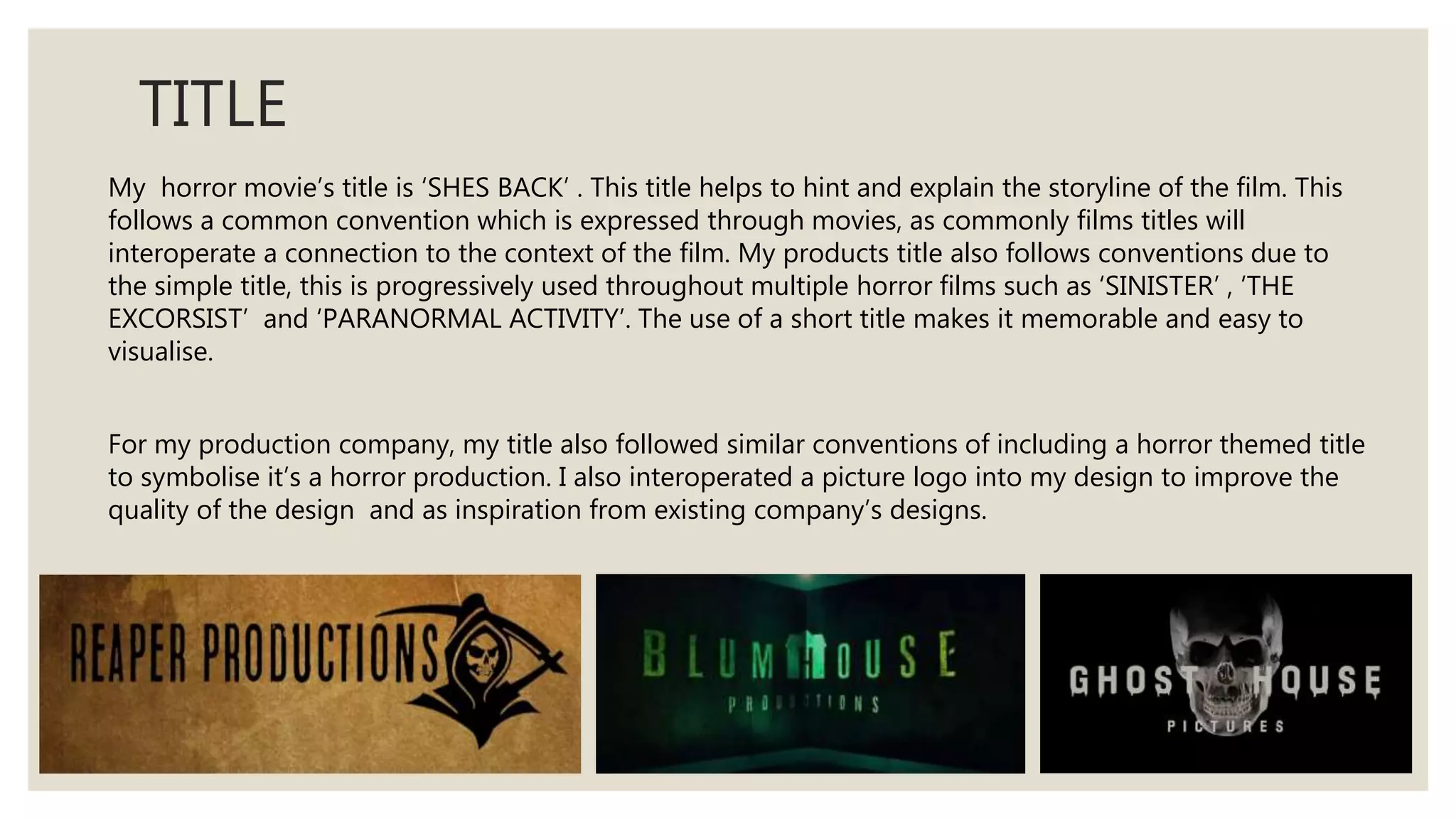
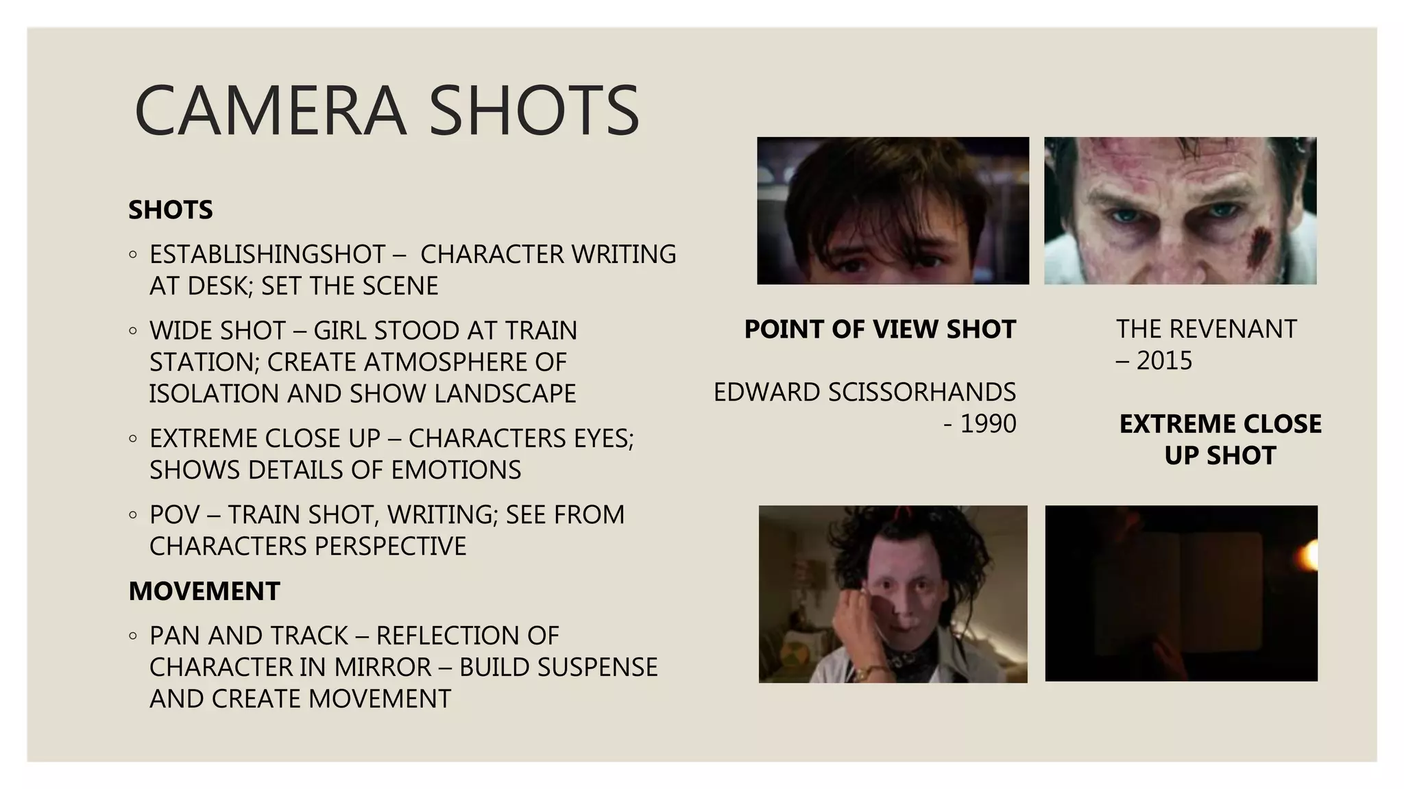
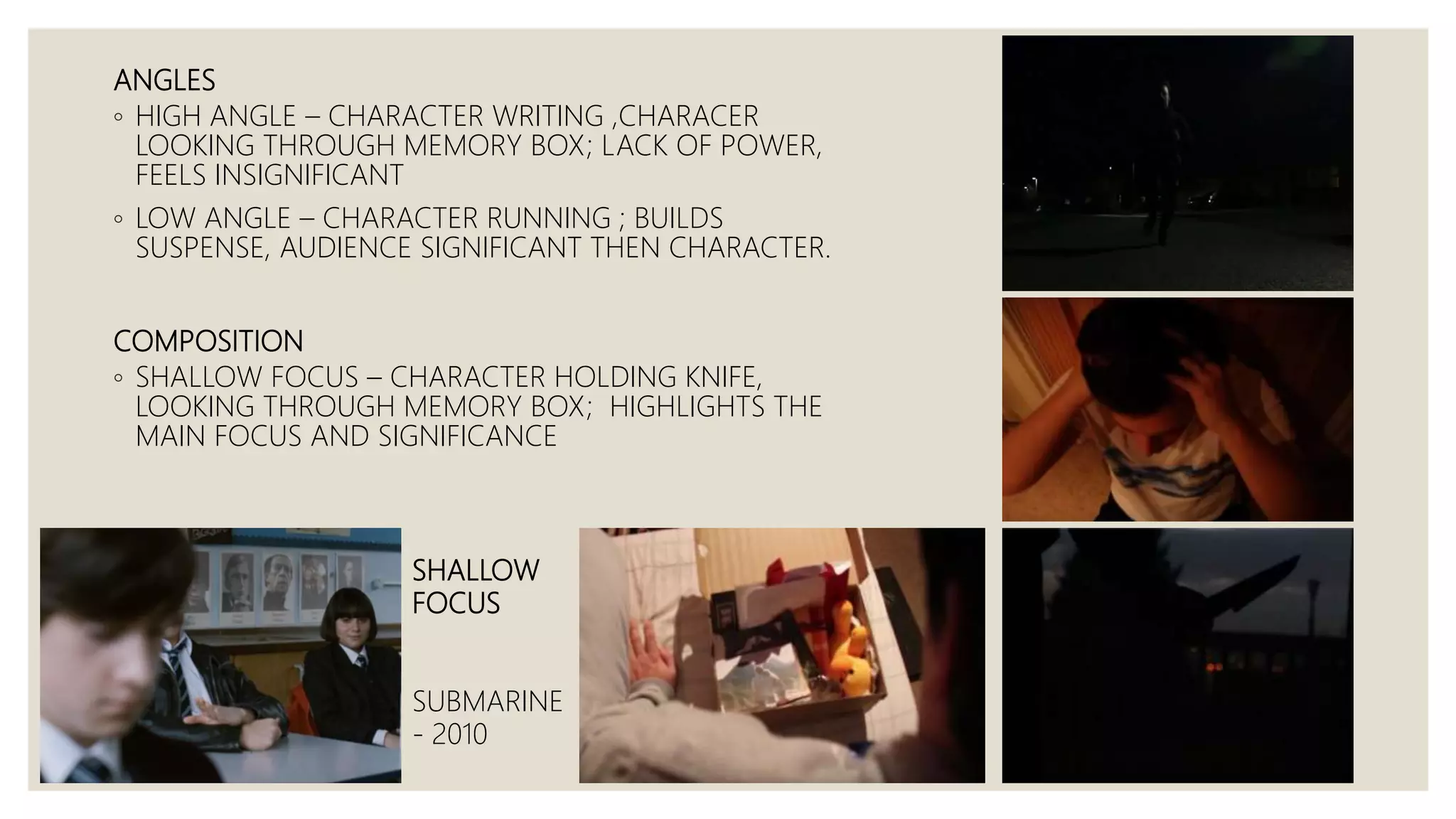
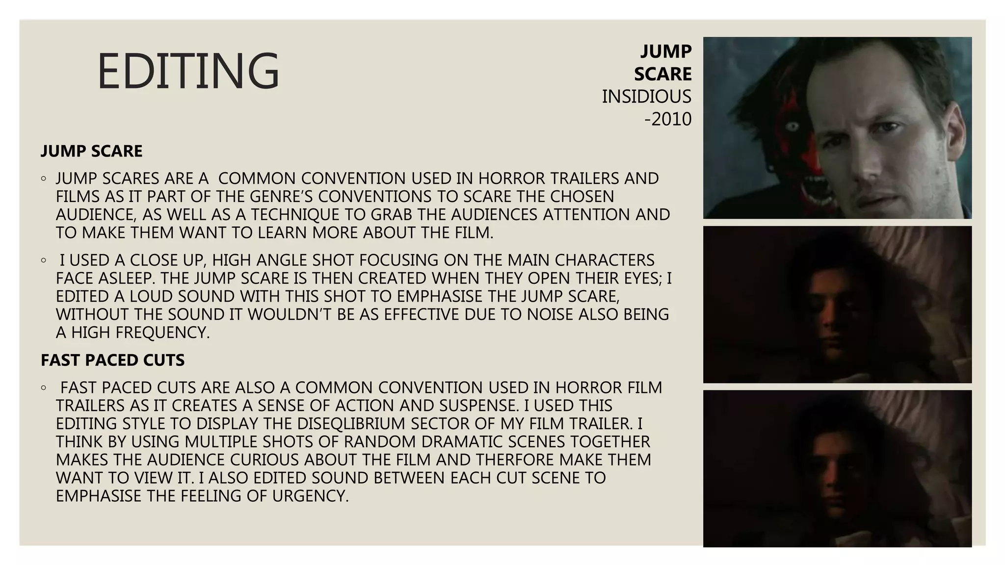
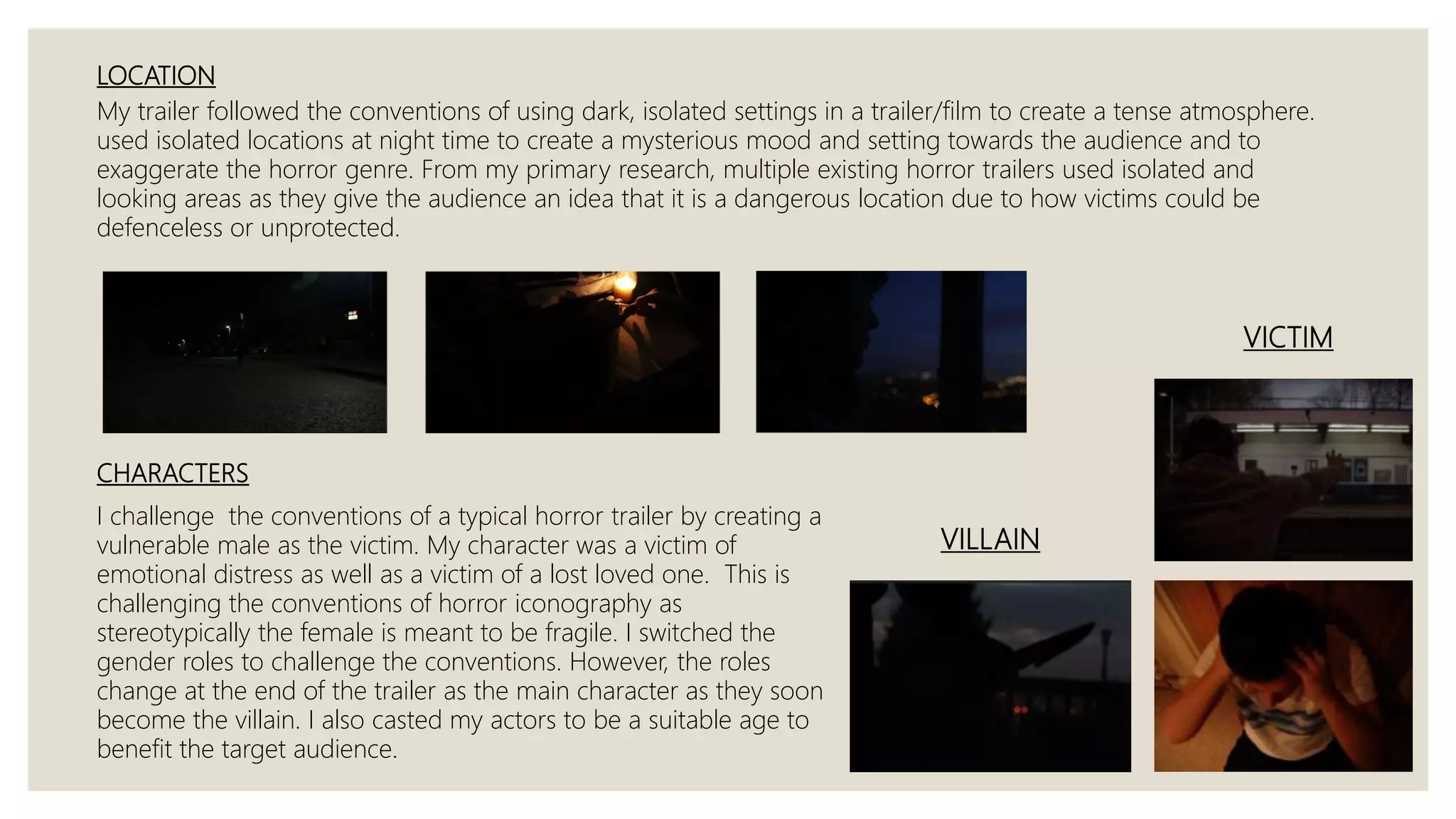
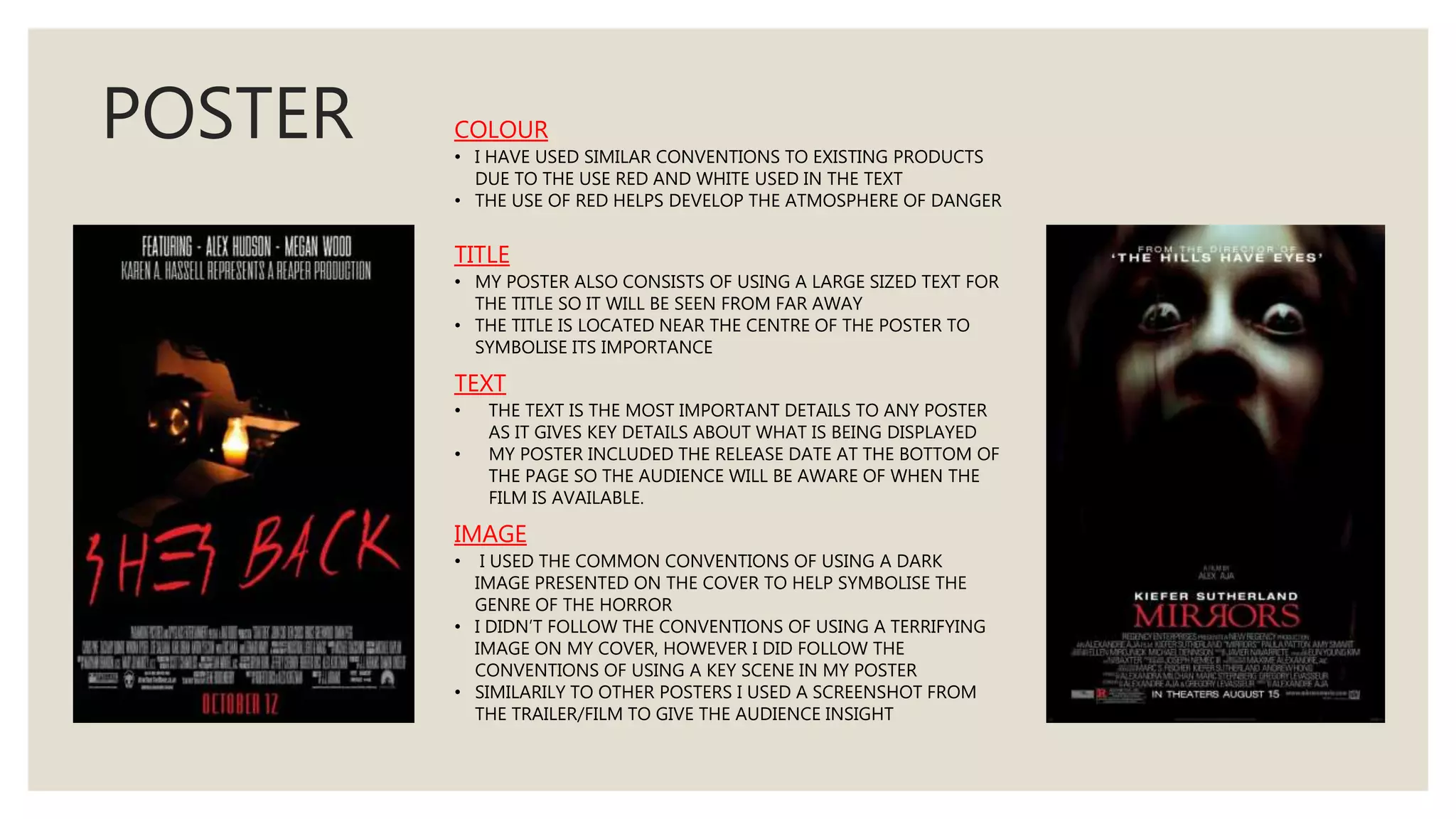
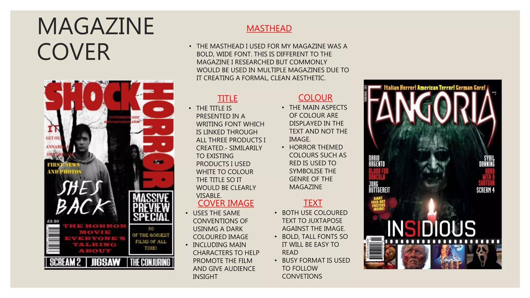
Generative AI on Enterprise Cloud with NiFi and Milvus
In what ways does your media product use, develop or challenge forms and conventions of real media products?
1. IN WHAT WAYS DOES YOUR
MEDIA PRODUCT USE, DEVELOP
OR CHALLENGE FORMS AND
CONVENTIONS OF REAL MEDIA
PRODUCTS? KAREN HASSELL
A2 MEDIA STUDIES
2. TITLE
My horror movie’s title is ‘SHES BACK’ . This title helps to hint and explain the storyline of the film. This
follows a common convention which is expressed through movies, as commonly films titles will
interoperate a connection to the context of the film. My products title also follows conventions due to
the simple title, this is progressively used throughout multiple horror films such as ‘SINISTER’ , ‘THE
EXCORSIST’ and ‘PARANORMAL ACTIVITY’. The use of a short title makes it memorable and easy to
visualise.
For my production company, my title also followed similar conventions of including a horror themed title
to symbolise it’s a horror production. I also interoperated a picture logo into my design to improve the
quality of the design and as inspiration from existing company’s designs.
3. CAMERA SHOTS
SHOTS
◦ ESTABLISHINGSHOT – CHARACTER WRITING
AT DESK; SET THE SCENE
◦ WIDE SHOT – GIRL STOOD AT TRAIN
STATION; CREATE ATMOSPHERE OF
ISOLATION AND SHOW LANDSCAPE
◦ EXTREME CLOSE UP – CHARACTERS EYES;
SHOWS DETAILS OF EMOTIONS
◦ POV – TRAIN SHOT, WRITING; SEE FROM
CHARACTERS PERSPECTIVE
MOVEMENT
◦ PAN AND TRACK – REFLECTION OF
CHARACTER IN MIRROR – BUILD SUSPENSE
AND CREATE MOVEMENT
THE REVENANT
– 2015
EXTREME CLOSE
UP SHOT
POINT OF VIEW SHOT
EDWARD SCISSORHANDS
- 1990
4. ANGLES
◦ HIGH ANGLE – CHARACTER WRITING ,CHARACER
LOOKING THROUGH MEMORY BOX; LACK OF POWER,
FEELS INSIGNIFICANT
◦ LOW ANGLE – CHARACTER RUNNING ; BUILDS
SUSPENSE, AUDIENCE SIGNIFICANT THEN CHARACTER.
COMPOSITION
◦ SHALLOW FOCUS – CHARACTER HOLDING KNIFE,
LOOKING THROUGH MEMORY BOX; HIGHLIGHTS THE
MAIN FOCUS AND SIGNIFICANCE
SHALLOW
FOCUS
SUBMARINE
- 2010
5. EDITING
JUMP SCARE
◦ JUMP SCARES ARE A COMMON CONVENTION USED IN HORROR TRAILERS AND
FILMS AS IT PART OF THE GENRE’S CONVENTIONS TO SCARE THE CHOSEN
AUDIENCE, AS WELL AS A TECHNIQUE TO GRAB THE AUDIENCES ATTENTION AND
TO MAKE THEM WANT TO LEARN MORE ABOUT THE FILM.
◦ I USED A CLOSE UP, HIGH ANGLE SHOT FOCUSING ON THE MAIN CHARACTERS
FACE ASLEEP. THE JUMP SCARE IS THEN CREATED WHEN THEY OPEN THEIR EYES; I
EDITED A LOUD SOUND WITH THIS SHOT TO EMPHASISE THE JUMP SCARE,
WITHOUT THE SOUND IT WOULDN’T BE AS EFFECTIVE DUE TO NOISE ALSO BEING
A HIGH FREQUENCY.
FAST PACED CUTS
◦ FAST PACED CUTS ARE ALSO A COMMON CONVENTION USED IN HORROR FILM
TRAILERS AS IT CREATES A SENSE OF ACTION AND SUSPENSE. I USED THIS
EDITING STYLE TO DISPLAY THE DISEQLIBRIUM SECTOR OF MY FILM TRAILER. I
THINK BY USING MULTIPLE SHOTS OF RANDOM DRAMATIC SCENES TOGETHER
MAKES THE AUDIENCE CURIOUS ABOUT THE FILM AND THERFORE MAKE THEM
WANT TO VIEW IT. I ALSO EDITED SOUND BETWEEN EACH CUT SCENE TO
EMPHASISE THE FEELING OF URGENCY.
JUMP
SCARE
INSIDIOUS
-2010
6. BLACK SCREEN
◦ THIS CONVENTION IS COMMONLY USED IN HORROR MOVIE TRAILERS TO HELP TRANISTION SCENES OR TO BUILD
TENSION AND SUSPENSE TO PARTICULAR DRAMATIC PARTS OF A TRAILER.
◦ A KEY SCENE IN MY TRAILER IS THE DEATH OF THE MAIN CHARACTERS GIRLFRIEND. AS HE WITNESSES HER DEATH
BLACK SCREEN IS EDITED TOWARDS THE END TO CREATE MSYTERY TO THE AUDIENCE AS WELL SYMBOLISE THE
CHARACTERS EMOTION.
◦ I HAD ALSO USED THIS COVENTION THROUGHOUT FAST PACED CUT SCENES IN MY TRAILER, THIS WAS TO SUIT
NON DIAGETIC SOUND AND BUILD TENSION FOR WHAT MAY BE SEEN NEXT.
◦ I CREATED THIS EFFECT ON ‘ADOBE PREMIERE PRO’ BY LEAVING GAPS INBETWEEN VIDEO CLIPS, II MADE SURE TO
MAKE THIS PROCESS PRECISE TO SUIT THE SOUND.
TEXT
◦ TEXT IS A WELL KNOWN CONVENTION TO ANY GENRE OF TRAILER. THIS
TECHNIQUE IS SOMETIMES USED TO DEVELOP AND EXPLAIN THE PLOT
OR DISPLAY KEY INFORMATION, SUCH AS THE TITLE AND THE RELEASE
DATE.
◦ I DECIDED TO INCLUDE TEXT INTO MY TRAILER AS IT WILL GIVE MY
AUDIENCE INFORMATION OF WHEN IT WILL BE AVAILABLE
◦ THE TYPOGRAPHY I USED WAS ALSO FOLLOWING CONVENTIONS OF
HORROR TRAILERS AS I INCLUDED RED COLOURS.
7. SOUND
In my trailer I follow the conventions of using a soundtrack which is eerie and gentle to use
at the beginning and end. I used this style of music at the ‘equilibrium’ of the trailer, which
is presented at the beginning as well as at the end to emphasise the cliff hanger created as
well link the whole trailer together.
During the ‘disruption’ of my trailer when the character loses his mind and goes on a
rampage, I included sound to emphasise the fast paced cuts; this helped build tension and
add to the dramatic atmosphere. The sound I used was the ticking of a clock, this links with
a key prop seen at the beginning of the trailer when the character was writing on the desk.
Multiple horror films will use sound to compliment scene cuts in a trailer to show action
and to make each transaction effective.
Another key use of sound I incorporated in my trailer was the main characters thoughts,
these were represented as non diegetic sound presented over scenes to explain the plot to
the audience as well as progress the ‘equilibrium’ to the ‘disruption’.
8. THEORY
My trailer doesn’t follow the correct
structure of this theory. This is due to my
product being in the form of a trailer and
therefore minimal information is displayed,
this is also because the trailer highlights
features of a film not in chronological order.
My trailer includes:
Equilibrium – main character writing at
desk/beginning
Disruption - death of girlfriend/ middle
Recognition - main character break
down/end
Even though I have used some aspects of
Todorovs Theory, I didn’t use all of his key
narrative processes as I wanted to keep the
audience guessing what is about to
happen.
Theorist Tzvetan Todorov states that most films
follow a narrative process. Frequently, horror films
will use this structure, however some will use only
certain formats depending on the plot of the film.
9. MISE EN SCENE
COSTUME
Costume is an important detail in trailers and films as it gives the audience an insight about the characters. I used common horror
conventions in my main characters costume by the use of a white dress. This costume is presented through several horror films as it helps
build effect to the genre. The connotations which link with the colour white are ‘pure’ and ‘peaceful’ which contrasts with the genre of my
film, therefore creating irony. I also used make up on my female character to exaggerate the context of themselves being deceased and evil.
Similarly, multiple horror films use make up as well to build impact towards the audience.
PROPS
The main props I used in my trailer was the clock, diary and knife. The clock is featured in the equilibrium when the character is writing at his
desk, as well as in the recognition which is presented through the editing of the fast paced cut scenes. This prop links the beginning of the
trailer to the end, making it exciting. Another key prop I used which is seen commonly throughout horror conventions is the knife. This knife
is presented at the end of the trailer in the downfall which creates mystery to what will happen next.
LIGHTING
Lighting has a key impact to horror genre films as it effects the suspense, tension and reaction from the audience. For my horror film trailer
lighting was a key detail in my production to help impact and reflect the genre. I mainly used dark locations due to the dramatic atmosphere
it creates, as also seen in existing horror films. I also created dark shadows and reflections from light which are represented as horror
iconography. One of my favourite shots from the trailer was due to the lighting which was featured, this was when the main character was
writing at the desk in the dark with a single candle reflecting onto him. I admired this scene the most as the diary was in light and the
characters silhouette was unidentifiable; creating the intention that the book is significant and mystery from the hidden character. I used the
common conventions of setting my scenes at night time when the lighting is darker, as it gives connotations that something negative is
about to occur.
10. LOCATION
My trailer followed the conventions of using dark, isolated settings in a trailer/film to create a tense atmosphere.
used isolated locations at night time to create a mysterious mood and setting towards the audience and to
exaggerate the horror genre. From my primary research, multiple existing horror trailers used isolated and
looking areas as they give the audience an idea that it is a dangerous location due to how victims could be
defenceless or unprotected.
CHARACTERS
I challenge the conventions of a typical horror trailer by creating a
vulnerable male as the victim. My character was a victim of
emotional distress as well as a victim of a lost loved one. This is
challenging the conventions of horror iconography as
stereotypically the female is meant to be fragile. I switched the
gender roles to challenge the conventions. However, the roles
change at the end of the trailer as the main character as they soon
become the villain. I also casted my actors to be a suitable age to
benefit the target audience.
VILLAIN
VICTIM
11. POSTER COLOUR
• I HAVE USED SIMILAR CONVENTIONS TO EXISTING PRODUCTS
DUE TO THE USE RED AND WHITE USED IN THE TEXT
• THE USE OF RED HELPS DEVELOP THE ATMOSPHERE OF DANGER
TITLE
• MY POSTER ALSO CONSISTS OF USING A LARGE SIZED TEXT FOR
THE TITLE SO IT WILL BE SEEN FROM FAR AWAY
• THE TITLE IS LOCATED NEAR THE CENTRE OF THE POSTER TO
SYMBOLISE ITS IMPORTANCE
TEXT
• THE TEXT IS THE MOST IMPORTANT DETAILS TO ANY POSTER
AS IT GIVES KEY DETAILS ABOUT WHAT IS BEING DISPLAYED
• MY POSTER INCLUDED THE RELEASE DATE AT THE BOTTOM OF
THE PAGE SO THE AUDIENCE WILL BE AWARE OF WHEN THE
FILM IS AVAILABLE.
IMAGE
• I USED THE COMMON CONVENTIONS OF USING A DARK
IMAGE PRESENTED ON THE COVER TO HELP SYMBOLISE THE
GENRE OF THE HORROR
• I DIDN’T FOLLOW THE CONVENTIONS OF USING A TERRIFYING
IMAGE ON MY COVER, HOWEVER I DID FOLLOW THE
CONVENTIONS OF USING A KEY SCENE IN MY POSTER
• SIMILARILY TO OTHER POSTERS I USED A SCREENSHOT FROM
THE TRAILER/FILM TO GIVE THE AUDIENCE INSIGHT
12. MAGAZINE
COVER
TITLE
• THE TITLE IS
PRESENTED IN A
WRITING FONT WHICH
IS LINKED THROUGH
ALL THREE PRODUCTS I
CREATED.- SIMILARILY
TO EXISTING
PRODUCTS I USED
WHITE TO COLOUR
THE TITLE SO IT
WOULD BE CLEARLY
VISABLE.
COLOUR
• THE MAIN ASPECTS
OF COLOUR ARE
DISPLAYED IN THE
TEXT AND NOT THE
IMAGE.
• HORROR THEMED
COLOURS SUCH AS
RED IS USED TO
SYMBOLISE THE
GENRE OF THE
MAGAZINE
COVER IMAGE
• USES THE SAME
CONVENTIONS OF
USINMG A DARK
COLOURED IMAGE
• INCLUDING MAIN
CHARACTERS TO HELP
PROMOTE THE FILM
AND GIVE AUDIENCE
INSIGHT
TEXT
• BOTH USE COLOURED
TEXT TO JUXTAPOSE
AGAINST THE IMAGE.
• BOLD, TALL FONTS SO
IT WILL BE EASY TO
READ
• BUSY FORMAT IS USED
TO FOLLOW
CONVETIONS
MASTHEAD
• THE MASTHEAD I USED FOR MY MAGAZINE WAS A
BOLD, WIDE FONT. THIS IS DIFFERENT TO THE
MAGAZINE I RESEARCHED BUT COMMONLY
WOULD BE USED IN MULTIPLE MAGAZINES DUE TO
IT CREATING A FORMAL, CLEAN AESTHETIC.