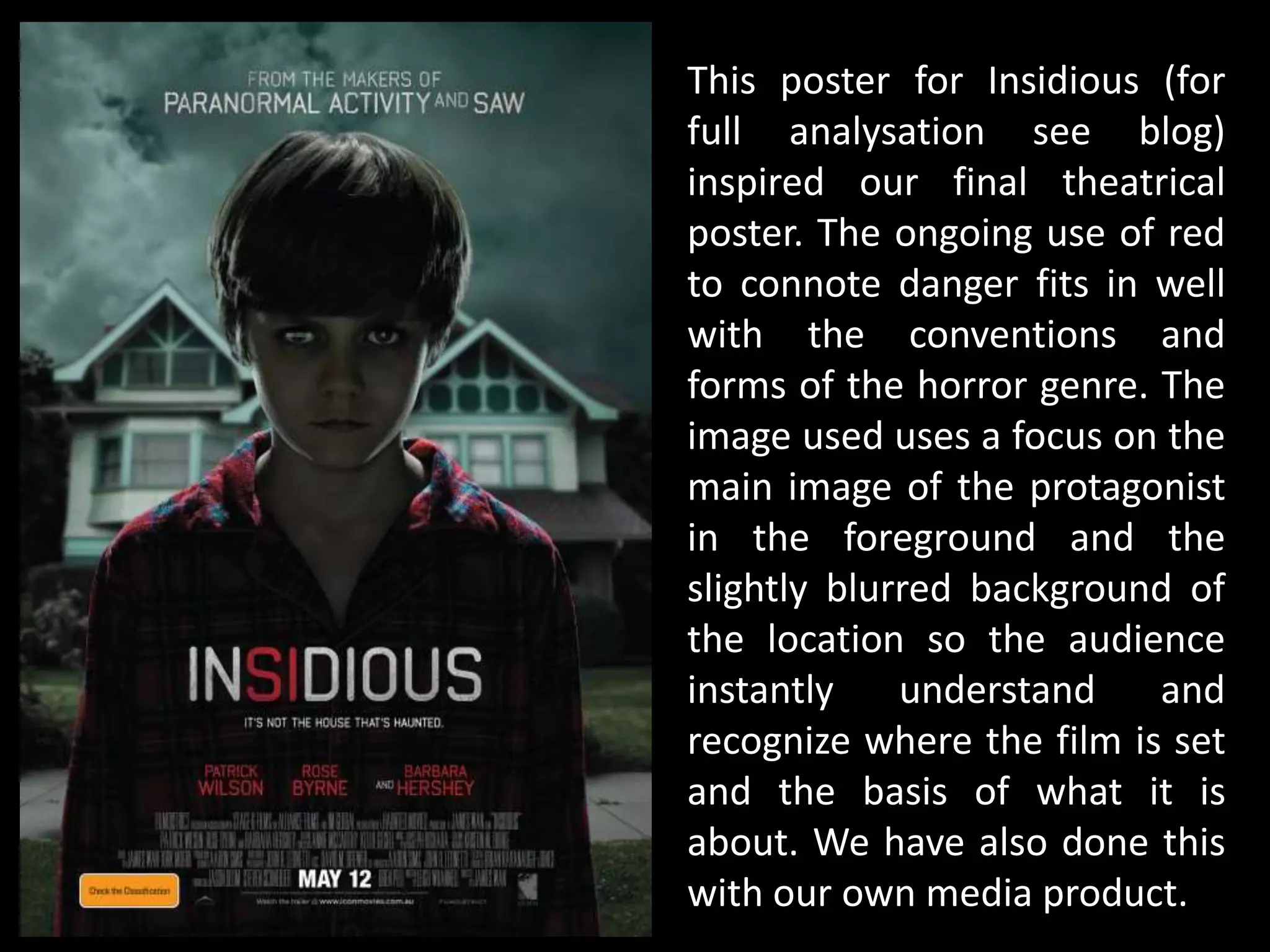
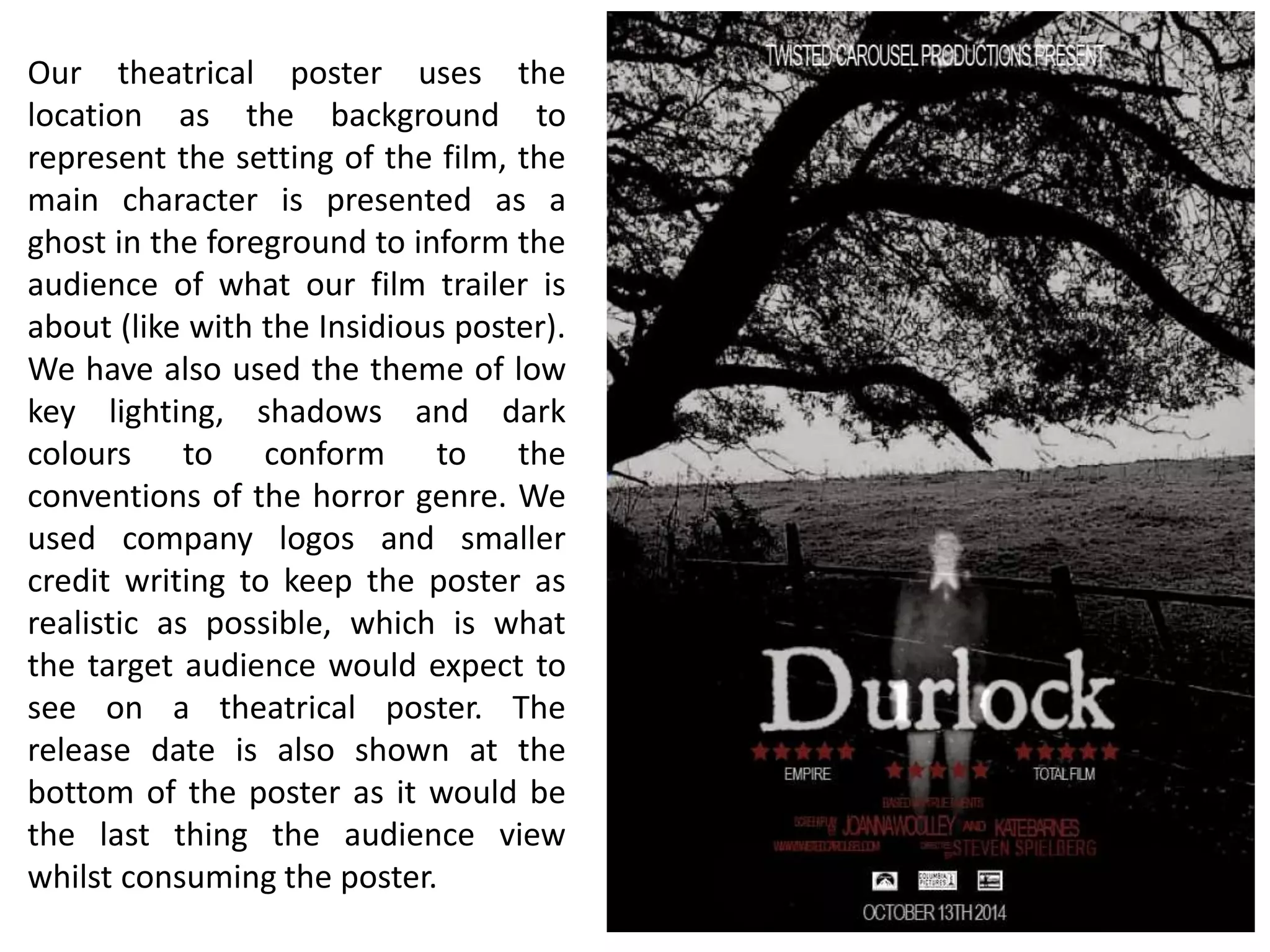
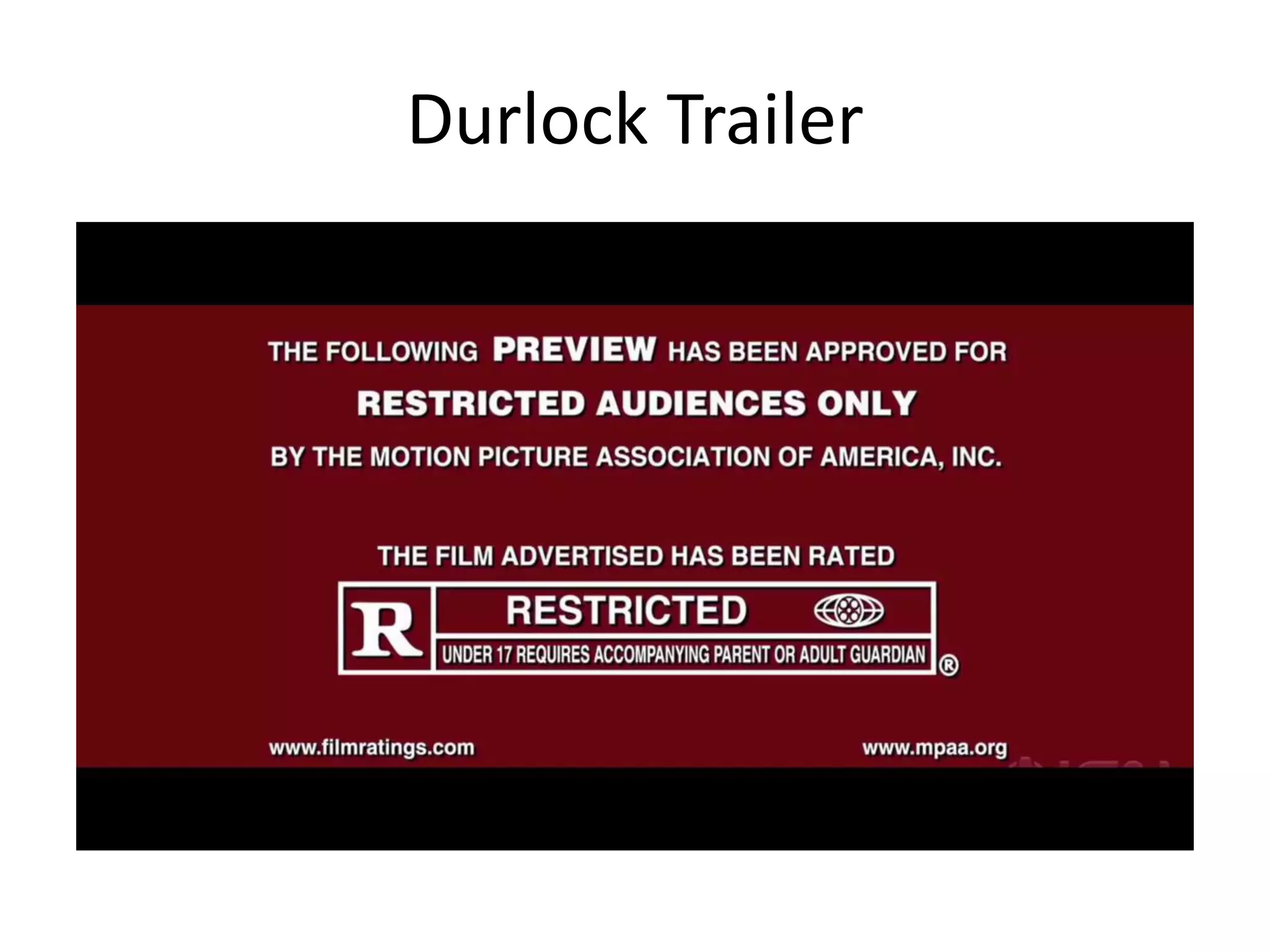
Evaluation Question 1: In what ways does your media product use, develop or challenge forms and conventions of real media products?
1. In what ways does your media
product use, develop or
challenge forms and conventions
of real media products?
2. Use and Develop
Our trailer, magazine cover and
poster used and developed
forms and conventions of real
media products.
3. This genuine cover of a Horror
genre edition of Empire
magazine uses the colour red
throughout to catch the
attention of the reader as it is
the first colour the human eye
recognises, it also connotes
horror with the ideas of blood,
danger and pain. There is a
close up of a characters face
and a relevant main headline
to inform the reader of the
content of the magazine. There
is also the use of a puff/plug,
barcode, other headlines and a
banner.
4. Our magazine cover uses the same
conventions and forms as the real
product. We incorporated the large
masthead and red colour to keep within
the theme. We used relevant headlines
that would appeal to film fanatics, a
banner, barcode and a plug/puff. The
main image of the antagonist/character is
relevant to the main headline, like the
previous magazine cover shown, the
close up image is directly addressing the
audience with the use of eye contact. The
whole layout and colour is relevant to the
themes, conventions and forms of a
genuine Horror film magazine cover. We
used Empire magazine to help create our
magazine as it is the most read and well
known within the mass target audience
our products are aimed at. The audience
would be expecting to see relevant
headlines such as the ones we have used
in our product.
5. This poster for Insidious (for
full analysation see blog)
inspired our final theatrical
poster. The ongoing use of red
to connote danger fits in well
with the conventions and
forms of the horror genre. The
image used uses a focus on the
main image of the protagonist
in the foreground and the
slightly blurred background of
the location so the audience
instantly understand and
recognize where the film is set
and the basis of what it is
about. We have also done this
with our own media product.
6. Our theatrical poster uses the
location as the background to
represent the setting of the film, the
main character is presented as a
ghost in the foreground to inform the
audience of what our film trailer is
about (like with the Insidious poster).
We have also used the theme of low
key lighting, shadows and dark
colours to conform to the
conventions of the horror genre. We
used company logos and smaller
credit writing to keep the poster as
realistic as possible, which is what
the target audience would expect to
see on a theatrical poster. The
release date is also shown at the
bottom of the poster as it would be
the last thing the audience view
whilst consuming the poster.
7. We based our trailer on The Conjuring and Insidious
due to the conventions they use. (For full trailer
analysis and other trailer see blog)
9. Our trailer used ideas, conventions and forms of real horror trailers,
for example the use of sound effects such as children laughing and
screaming, this creates a juxtaposition similar to the one created in
Insidious and The Conjuring. We used low-key lighting and a range
of shot types such as close ups, establishing shots and shots
portraying natural family/home life to slowly build up the tension.
We also used rapid jump cuts to surprise our target audience and
‘hit’ them with the unexpected, making them ‘jump’, which is what
our target audience would expect from a horror trailer (as they
stated in our questionnaire in target research section of our blog).
We also used a narrative in the form of captions to guide our
audience through the basic storyline of our trailer, similar to that
used in The Conjuring trailer.
10. Challenge
Our media product challenged the
forms and conventions of real
media products to appear unique
and original and therefore stand
out.
11. Our poster used star ratings, which is not usually
shown on real theatrical posters, we did this as a
method of drawing our target audience in, as
reviews give the audience some form of security
in the sense of how others found the film,
therefore increasing their chances of wanting to
view it and therefore helping them make a
decision in terms of watching the film.
12. Our poster and magazine also did not contain a
catchphrase describing the movie, such as in the
poster for Insidious “It’s not the house that’s
haunted”. We did consider using one to
accompany the poster which can be found on
our blog, but instead we used this in our trailer
as a form of narrative and to withdraw some
information from the audience, creating
suspense and curiosity for when they watch it
the first time.
13. Our trailer challenged conventions and forms of
actual horror trailers, we did not use a spoken
narrative and we used minimal dialogue to keep
the trailer as realistic as possible. We thought
this would be effective as we did not think using
someone’s voice would have been realistic, as
we did not have access to a suitable actor/voice
that could portray and deliver a point across to
our target audience in a professional manner
that would have suited the conventions and
forms of a horror trailer.
14. Our initial ideas did not change greatly, we used
target audience research and planning to build
on the production and ideas that we originally
came up with:
16. Our finished trailer, poster and magazine cover
reflect what our target audience wanted, we
took into account their opinions, comments,
answers and made notes on existing media
products. This allowed us to create our products
to a standard that we and our target audience
are satisfied with.