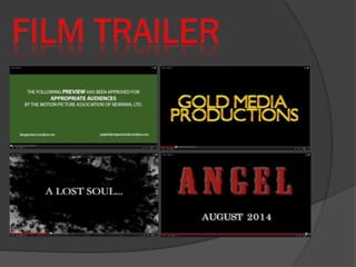
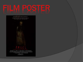
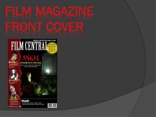
The document discusses the media products created by Kiera Garrison to promote a horror film, including a trailer, poster, and magazine front cover. The trailer aims to portray the main girl as having a dark secret or being possessed by showing her in a graveyard with an evil expression. Conventions like rating cards and production logos were included but not a clear storyline, to generate intrigue. The poster features the film title, information, a long shot of the creepy main girl, and the tagline "looks can be deceiving." Dark colors, lighting, and composition aim to frighten audiences. The magazine cover promotes the film as its main focus, uses colors and other articles to represent the genre, and aims
3. My media products mostly use conventions of real horror film trailers,
posters and magazine front covers. In my trailer I tried to make the girl
seem like she had a dark secret. I did this mainly by recording in a
graveyard, trying to show that she had killed someone with no reason but
with possibility that she is possessed by something evil. I think that this
worked through the way she used a certain expression on her face,
making her look evil even though she is a young innocent girl. I haven’t
made my trailer have much of a story line because I wanted to show off
the creepiness of the girl so that the audience would want to watch the film
to find out what she has done and what is actually going on. When
watching the trailer ‘mama’ I particularly like show the text was used near
the beginning which is why I created my own one in a similar way, creating
a mystic background which when put on my trailer put a zoom effect on it.
My audience are used to the conventions of children being involved in the
story line, however are not used to there being a lack of a story line. So I
have used a mix of using and not using the conventions because I wanted
to create something unique but still making my audience wanting to see
the film. I have tried to follow some conventions of a film trailer, the first by
having a rating card at the beginning which I created myself using the
same colour background and similar text font, then putting my production
company after the rating card to show the audience who made it which
then they will know is they have seen any other films made by this
company to make them more interested in watch the film, and finally
having the film name at the end. I have followed these conventions so that
my film trailer looks more realistic and gives it the professional touch.
4.
5. My poster follows those that have already been made
from real films. It features the film name at the bottom,
some sort of information at the top (what films link with
my own) and the image in the centre). Within my poster
I have included some conventions, the first being the
colours which the dark colours create a chilling
atmosphere and the red signifies blood and danger so
it is clear to the audience what genre it is, the second
being the lighting which I have used a very dark one so
I could capture some evil from this girl, the use of a
large image (a long shot) which shows her scary
characteristics that I have managed to capture so these
should frighten the audience and a tagline which I have
created (‘looks can be deceiving’) as this should sell
the poster to the audience a bit more but also providing
that extra anticipation in the meaning of it so it will want
the audience to see it more.
6.
7. My magazine front cover follows some conventions of a real
magazine. It features a main focal point which is the new
film ‘Angel’ and has the name of it on show with a tagline
beneath it to show that is it the main focus of this magazine.
I also have placed other cover lines on my magazine to
show that it has other interesting topic within in with other
images to show who the people are that these cover lines
are talking about. I have tried to use colours to represent
the genre, using the colour yellow is something that I took
inspiration from real magazines which I think makes my
magazine more effective as it works well with the red, using
red makes the genre more clear because red has
connotations of danger and blood, the black shows
darkness within the magazine and white has connotations
of purity and innocence but that is not the case in this
magazine as I want to show that it is not true in this case,
which this gives the audience their suspicions in why this is
changing the connotation so it should attract the audience.