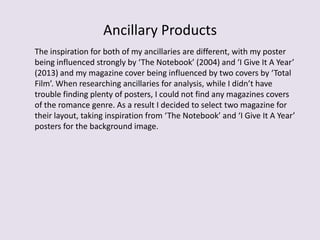
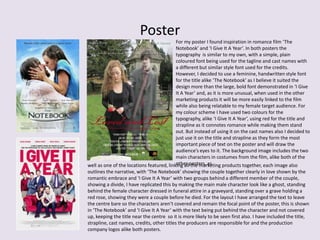
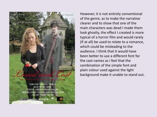
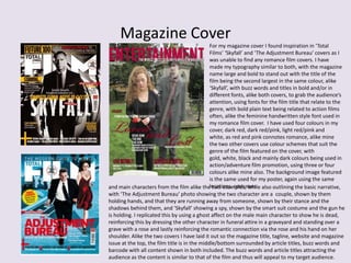
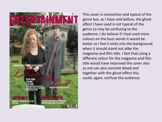
How effective is the combination of
your main product and ancillary
texts?
Promotion and Marketing
The main types of marketing are viral and heritage:
• Viral Marketing uses the internet (for example, blogs, social networking and apps) to spread
information on the internet and slowly releasing information about the film. It’s good for gaining
attention from the online target audience and generate hype that relies on word-of-mouth ,
utilising social networking sites and all at a low-cost that is ideal for indie film companies. An
example of this is ‘Paranormal Activity’ (2007), with the small budget of $15,000 they managed to
earn $3,593,762 in the box office opening weekend due to their successful marketing campaign,
getting fans to demand the film came to their town where they recorded reactions and put them
online to generate hype, getting fans to ‘tweet their scream’ on the social network Twitter to easily,
quickly and effectively spread the word.
• Heritage Marketing uses analogue methods, such as posters, newspapers/magazines, billboards,
bus spreads and interviews, to advertise the film. A conglomerate that took this offline approach
was ‘Warner Bros.’ with ‘The Hangover’ (2009), putting wanted/missing campaign posters relating
to and making the narrative seem real, this was very effective, generating $3,193,806 in it’s UK
opening weekend.
My marketing scheme involves the use of posters, magazine covers and trailers, taking inspiration from
existing materials of the same genre.
Ancillary Products
The inspiration for both of my ancillaries are different, with my poster
being influenced strongly by ‘The Notebook’ (2004) and ‘I Give It A Year’
(2013) and my magazine cover being influenced by two covers by ‘Total
Film’. When researching ancillaries for analysis, while I didn’t have
trouble finding plenty of posters, I could not find any magazines covers
of the romance genre. As a result I decided to select two magazine for
their layout, taking inspiration from ‘The Notebook’ and ‘I Give It A Year’
posters for the background image.
Poster
For my poster I found inspiration in romance film ‘The
Notebook’ and ‘I Give It A Year’. In both posters the
typography is similar to my own, with a simple, plain
coloured font being used for the tagline and cast names with
a different but similar style font used for the credits.
However, I decided to use a feminine, handwritten style font
for the title alike ‘The Notebook’ as I believe it suited the
design more than the large, bold font demonstrated in ‘I Give
It A Year’ and, as it is more unusual, when used in the other
marketing products it will be more easily linked to the film
while also being relatable to my female target audience. For
my colour scheme I have used two colours for the
typography, alike ‘I Give It A Year’, using red for the title and
strapline as it connotes romance while making them stand
out. But instead of using it on the cast names also I decided to
just use it on the title and strapline as they form the most
important piece of text on the poster and will draw the
audience’s eyes to it. The background image includes the two
main characters in costumes from the film, alike both of the
other posters, aswell as one of the locations featured, linking all the marketing products together, each image also
outlines the narrative, with ‘The Notebook’ showing the couple together clearly in love shown by the
romantic embrace and ‘I Give It A Year’ with two groups behind a different member of the couple,
showing a divide, I have replicated this by making the main male character look like a ghost, standing
behind the female character dressed in funeral attire in a graveyard, standing over a grave holding a
red rose, showing they were a couple before he died. For the layout I have arranged the text to leave
the centre bare so the characters aren’t covered and remain the focal point of the poster, this is shown
in ‘The Notebook’ and ‘I Give It A Year’ with the text being put behind the character and not covered
up, keeping the title near the centre so it is more likely to be seen first also. I have included the title,
strapline, cast names, credits, other titles the producers are responsible for and the production
company logos alike both posters.
However, it is not entirely conventional
of the genre, as to make the narrative
clearer and to show that one of the
main characters was dead I made them
look ghostly, the effect I created is more
typical of a horror film and would rarely
(if at all) be used to relate to a romance,
which could be misleading to the
audience. I think that it would have
been better to use a different font for
the cast names as I feel that the
combination of the simple font and
plain colour used against the light
background make it unable to stand out.
Magazine Cover
For my magazine cover I found inspiration in ‘Total
Films’ ‘Skyfall’ and ‘The Adjustment Bureau’ covers as I
was unable to find any romance film covers. I have
made my typography similar to both, with the magazine
name large and bold to stand out with the title of the
film being the second largest in the same colour, alike
‘Skyfall’, with buzz words and titles in bold and/or in
different fonts, alike both covers, to grab the audience’s
attention, using fonts for the film title that relate to the
genre, with bold plain text being related to action films
often, alike the feminine handwritten style font used in
my romance film cover. I have used four colours in my
cover, dark red, dark red/pink, light red/pink and
white, as red and pink connotes romance, alike mine
the two other covers use colour schemes that suit the
genre of the film featured on the cover, with
gold, white, black and mainly dark colours being used in
action/adventure film promotion, using three or four
colours alike mine also. The background image featured
is the same used for my poster, again using the same
locations, costumesand main characters from the film alike the two examples, while also outlining the basic narrative,
with ‘The Adjustment Bureau’ photo showing the two character are a couple, shown by them
holding hands, and that they are running away from someone, shown by their stance and the
shadows behind them, and ‘Skyfall’ showing a spy, shown by the smart suit costume and the gun he
is holding. I replicated this by using a ghost affect on the male main character to show he is dead,
reinforcing this by dressing the other character in funeral attire in a graveyard and standing over a
grave with a rose and lastly reinforcing the romantic connection via the rose and his hand on her
shoulder. Alike the two covers I have laid it out so the magazine title, tagline, website and magazine
issue at the top, the film title is in the middle/bottom surrounded by article titles, buzz words and
barcode with all content shown in both included. The buzz words and article titles attracting the
audience as the content is similar to that of the film and thus will appeal to my target audience.
This cover is convention and typical of the
genre but, as I have said before, the ghost
affect I have used is not typical of the
genre so may be confusing to the
audience. I do believe if I had used more
colours on the buzz words it would be
better as I feel it sinks into the background
when it should stand out alike the
magazine and film title. I feel that using a
different colour for the magazine and film
title would have improved the cover also
as red can also connote blood and
together with the ghost effect this
could, again, confuse the audience.

Evaluation Question 2: Ancillary Products

  • 1.
    How effective isthe combination of your main product and ancillary texts?
  • 2.
    Promotion and Marketing Themain types of marketing are viral and heritage: • Viral Marketing uses the internet (for example, blogs, social networking and apps) to spread information on the internet and slowly releasing information about the film. It’s good for gaining attention from the online target audience and generate hype that relies on word-of-mouth , utilising social networking sites and all at a low-cost that is ideal for indie film companies. An example of this is ‘Paranormal Activity’ (2007), with the small budget of $15,000 they managed to earn $3,593,762 in the box office opening weekend due to their successful marketing campaign, getting fans to demand the film came to their town where they recorded reactions and put them online to generate hype, getting fans to ‘tweet their scream’ on the social network Twitter to easily, quickly and effectively spread the word. • Heritage Marketing uses analogue methods, such as posters, newspapers/magazines, billboards, bus spreads and interviews, to advertise the film. A conglomerate that took this offline approach was ‘Warner Bros.’ with ‘The Hangover’ (2009), putting wanted/missing campaign posters relating to and making the narrative seem real, this was very effective, generating $3,193,806 in it’s UK opening weekend. My marketing scheme involves the use of posters, magazine covers and trailers, taking inspiration from existing materials of the same genre.
  • 3.
    Ancillary Products The inspirationfor both of my ancillaries are different, with my poster being influenced strongly by ‘The Notebook’ (2004) and ‘I Give It A Year’ (2013) and my magazine cover being influenced by two covers by ‘Total Film’. When researching ancillaries for analysis, while I didn’t have trouble finding plenty of posters, I could not find any magazines covers of the romance genre. As a result I decided to select two magazine for their layout, taking inspiration from ‘The Notebook’ and ‘I Give It A Year’ posters for the background image.
  • 4.
    Poster For my posterI found inspiration in romance film ‘The Notebook’ and ‘I Give It A Year’. In both posters the typography is similar to my own, with a simple, plain coloured font being used for the tagline and cast names with a different but similar style font used for the credits. However, I decided to use a feminine, handwritten style font for the title alike ‘The Notebook’ as I believe it suited the design more than the large, bold font demonstrated in ‘I Give It A Year’ and, as it is more unusual, when used in the other marketing products it will be more easily linked to the film while also being relatable to my female target audience. For my colour scheme I have used two colours for the typography, alike ‘I Give It A Year’, using red for the title and strapline as it connotes romance while making them stand out. But instead of using it on the cast names also I decided to just use it on the title and strapline as they form the most important piece of text on the poster and will draw the audience’s eyes to it. The background image includes the two main characters in costumes from the film, alike both of the other posters, aswell as one of the locations featured, linking all the marketing products together, each image also outlines the narrative, with ‘The Notebook’ showing the couple together clearly in love shown by the romantic embrace and ‘I Give It A Year’ with two groups behind a different member of the couple, showing a divide, I have replicated this by making the main male character look like a ghost, standing behind the female character dressed in funeral attire in a graveyard, standing over a grave holding a red rose, showing they were a couple before he died. For the layout I have arranged the text to leave the centre bare so the characters aren’t covered and remain the focal point of the poster, this is shown in ‘The Notebook’ and ‘I Give It A Year’ with the text being put behind the character and not covered up, keeping the title near the centre so it is more likely to be seen first also. I have included the title, strapline, cast names, credits, other titles the producers are responsible for and the production company logos alike both posters.
  • 5.
    However, it isnot entirely conventional of the genre, as to make the narrative clearer and to show that one of the main characters was dead I made them look ghostly, the effect I created is more typical of a horror film and would rarely (if at all) be used to relate to a romance, which could be misleading to the audience. I think that it would have been better to use a different font for the cast names as I feel that the combination of the simple font and plain colour used against the light background make it unable to stand out.
  • 6.
    Magazine Cover For mymagazine cover I found inspiration in ‘Total Films’ ‘Skyfall’ and ‘The Adjustment Bureau’ covers as I was unable to find any romance film covers. I have made my typography similar to both, with the magazine name large and bold to stand out with the title of the film being the second largest in the same colour, alike ‘Skyfall’, with buzz words and titles in bold and/or in different fonts, alike both covers, to grab the audience’s attention, using fonts for the film title that relate to the genre, with bold plain text being related to action films often, alike the feminine handwritten style font used in my romance film cover. I have used four colours in my cover, dark red, dark red/pink, light red/pink and white, as red and pink connotes romance, alike mine the two other covers use colour schemes that suit the genre of the film featured on the cover, with gold, white, black and mainly dark colours being used in action/adventure film promotion, using three or four colours alike mine also. The background image featured is the same used for my poster, again using the same locations, costumesand main characters from the film alike the two examples, while also outlining the basic narrative, with ‘The Adjustment Bureau’ photo showing the two character are a couple, shown by them holding hands, and that they are running away from someone, shown by their stance and the shadows behind them, and ‘Skyfall’ showing a spy, shown by the smart suit costume and the gun he is holding. I replicated this by using a ghost affect on the male main character to show he is dead, reinforcing this by dressing the other character in funeral attire in a graveyard and standing over a grave with a rose and lastly reinforcing the romantic connection via the rose and his hand on her shoulder. Alike the two covers I have laid it out so the magazine title, tagline, website and magazine issue at the top, the film title is in the middle/bottom surrounded by article titles, buzz words and barcode with all content shown in both included. The buzz words and article titles attracting the audience as the content is similar to that of the film and thus will appeal to my target audience.
  • 7.
    This cover isconvention and typical of the genre but, as I have said before, the ghost affect I have used is not typical of the genre so may be confusing to the audience. I do believe if I had used more colours on the buzz words it would be better as I feel it sinks into the background when it should stand out alike the magazine and film title. I feel that using a different colour for the magazine and film title would have improved the cover also as red can also connote blood and together with the ghost effect this could, again, confuse the audience.