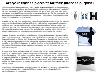
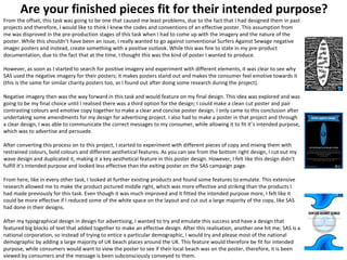
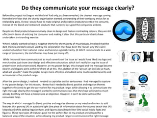
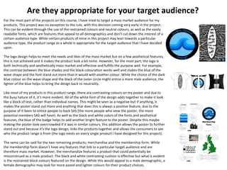
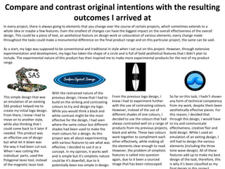
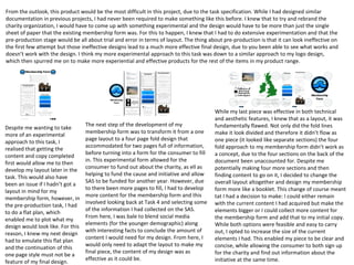
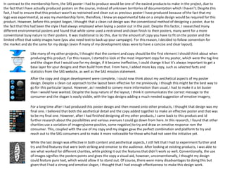
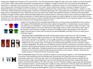
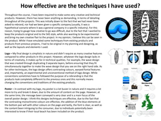
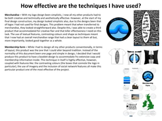
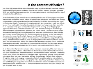
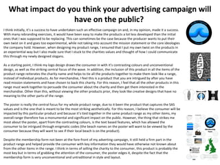
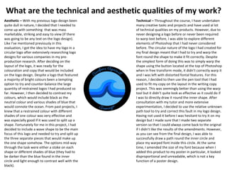
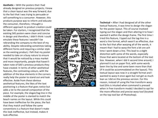
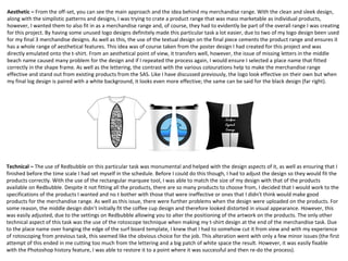
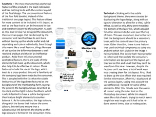
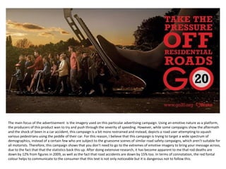
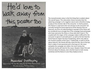
SlideShare a Scribd company logo
Social action and community
media production
Task 9 – Evaluation
Patrick Gouldsbrough
Are your finished pieces fit for their intended purpose?
For my logo design, I thought a literal approach to the Surfers Against sewage name was the correct
way of going about the design process, hence why my first deign (bottom right) features litter in the
shape of a surfer. For this design, I fulfill a purpose but I believe it doesn’t fit the purpose set on the
brief. The brief stated that Surfers Against Sewage needed a range of products rebranding and while
this design is a redevelopment and different to their existing design, I believe it doesn’t look as eye-
catching, which a rebranding exercise should ensure (the more eye-catching and aesthetically
pleasing; the more consumers will notice and the more support the initiative will receive).
On the other hand, they did fulfill the purpose of been a logo that could be used by Surfers Against
Sewage if chosen. Even if they stuck with their existing design, the bottom right image is a logo that
has employed enough technical creativity to be considered ‘original’.
As the project progressed, I knew I had to employ different techniques to try and make my logo more
enticing to a range of audiences (my products are fixed on the idea of a mass market product range
which will be elaborated on further in my intended target audience section of the evaluation). Instead
of the litter theme, a more surf orientated logo was the next idea I moved onto, due to sewage and
litter in a logo connotes negativity and I wanted to promote a positive brand image and once the
consumer is enticed with the positive imagery, negative imagery can be added into the poster to
explain the severity of the problem SAS face and the battle to keep the UK’s beaches clean.
Like it can be seen in the middle right of the page, I started with a simple surf design that allowed me
to customise the design should I add it to the merchandise, poster and membership form. A highly
customisable logo is desirable and allows you to alter it ever so slightly every time you include it,
which will lead to a more creative approach to the logo design.
While the logo I designed at this stage of the process was effective and could have been used
extensively over my product range, it was more suited to a surf type shop than a charity organisation
and for that reason, I then began looking for more existing products as well as looking back at the
ones I had collated in planning, before emulating various techniques from this design. A design that I
had found was a circular design that was simple to make, visually effective and allowed for enough
design work to make it my own work. This was the design that I produced in the logo part of the
project that I believed positively reflected the work that SAS do, while allowing for creative flair and a
brightness that made it stand out and be seen easily by the consumer and for this reason, I think for
the overall project, I fulfilled the purpose of the logo design.
Are your finished pieces fit for their intended purpose?
From the start of this project, I envisaged this task been the most time consuming of them all and is why I
scheduled it in for the final piece I would complete in the task list (it would give me the most time possible
because I had contingency time to run into if required). For this reason, I started researching membership forms
while I was working on my other products, which is why I believe I have been able to produce and develop an
unconventional type of membership form effectively.
At first, my main concern was to focus on the content of the membership and not so much the style or the
layout of it, which, on my first layout, was evident. I think that as a concept, my first draft (bottom right) fulfills
the purpose of a membership form, while bringing unconventional and untraditional forms of making a
membership form. While the traditional way of producing such a product is to have everything on one page and
all the information and boxes within close proximity of each other. However, I wanted to try and open up this
concept and give it a more leaflet and mass marketable approach to it. While a single page membership form
can be seen as a restrained approach, my leaflet design is bold and innovative but could easily become
ineffective if carried out incorrectly. This far then, the leaflet worked as a concept and fulfilled it’s purpose in
terms of content, however, it struggled in terms of layout. Due to me wanting to design it like a leaflet, I had not
thoroughly experimented with different options so when I tested it and printed it, it didn’t successfully work
because four panels can’t make a leaflet (I filled four panels with content but didn’t account for the four panels
on the back that will be blank).
While the next stage of this task should have been focused on solving this layout issue, I concentrated on various
technical and aesthetical issues, as well as the content I was going to feature on my membership form. As a
starting point, I did further research on layout options for not only membership forms but for membership
material as well. From there, I emulated some features from the designs, which included the use of a sand effect
as my background and to contrast it, an extra stroke on the boxes. This made it stand out but made it look a bit
heavy and dull for a membership form. Traditionally, with development, work is supposed to improve and fulfill
the various purposes and brief you have been set but on this occasion, I felt I was going backwards in this task.
I knew that to meet the criteria for this task and get it to fulfill the intended purpose, I had to tackle the one
thing that I had failed to do this far; the layout. Amending this issue wasn’t going to be easy because by creating
a new layout style, I would have double the layout room I had on the ineffective versions of the membership
form, therefore, I would have to somehow fill it with content I did not yet have. However, as I found when I
altered the layout, it was a matter of increasing the size of the existing content to fill the gaps and a booklet
form of leaflet was sufficient enough to make an effective membership form that I was happy with, while also
ensuring that it stuck to the intended purpose of a membership form, which was to inform and persuade the
Are your finished pieces fit for their intended purpose?
From past projects, tasks that required a lot of creative work were more difficult than others and
therefore, a lot of work and time was allocated to this task. However, I knew I wouldn’t need all of
the time I had allocated, due to the fact that from my first task of logos, I had some logos that I
knew would convert well into a merchandise format, as well as the fact that the merchandise task
was all about creating a range of designs, before adopting a ‘trial and error’ hypothesis to test the
artwork on various pieces of merchandise.
As well as the fact that I had lots of designs collated from other tasks, the pre-production planning
for the merchandise task was helpful and I believe it made my final products as effective as they
could have been. The pre-production task involved me collecting lots of existing products and
extensively analysing them to see what worked and didn’t when it came to surf merchandise. For
this reason, I believe I knew the elements that worked and the ones that didn’t, which, in turn,
allowed me to emulate the effective features, while leaving out the ineffective elements.
However, despite my best efforts to try and pick the effective and quality work, there were a few
pieces of merchandise that I produced that weren’t intend for purpose and if sold on the market,
they would struggle to shift the stock. An example of this would be the cushion at the bottom right
of the screen that I produced during the merchandise task. Even though it is a design that I have
uploaded to Red Bubble, it struggles to fit any kind of criteria for merchandise and has to be one of
the most ineffective products I have made over the course of not only this project but every
project on this course.
As for the other design (pictured middle right) I had created this as a simple experimental product,
however, all I had done to the image is post-produce it and then put the company font on the
design. Deciding that if this product was my final, it would be ineffective, due to the little amount
of creativity I had added to the design. This was the case for many of my products because after I
had adapted all of my unused logo designs, I started experimenting with stock imagery but I hadn’t
adapted the design enough to be my own work and for that reason, non of them would make it to
my final designs.
In conclusion, my final pieces are simplistic in nature but with a mix of contrasting colours and bold
and innovative designs, they are able to fulfill their purpose of interesting and effective
merchandise pieces for this project.
Are your finished pieces fit for their intended purpose?
From the offset, this task was going to be one that caused me least problems, due to the fact that I had designed them in past
projects and therefore, I would like to think I knew the codes and conventions of an effective poster. This assumption from
me was disproved in the pre-production stages of this task when I had to come up with the imagery and the nature of the
poster. While this shouldn’t have been an issue, I really wanted to go against conventional Surfers Against Sewage negative
imager posters and instead, create something with a positive outlook. While this was fine to state in my pre-product
documentation, due to the fact that at the time, I thought this was the kind of poster I wanted to produce.
However, as soon as I started to search for positive imagery and experiment with different elements, it was clear to see why
SAS used the negative imagery for their posters; it makes posters stand out and makes the consumer feel emotive towards it
(this is the same for similar charity posters too, as I found out after doing some research during the project).
Negative imagery then was the way forward in this task and would feature on my final design. This idea was explored and was
going to be my final choice until I realised there was a third option for the design; I could make a clean cut poster and pair
contrasting colours and emotive copy together to make a clear and concise poster design. I only came to this conclusion after
undertaking some amendments for my design for advertising project. I also had to make a poster in that project and through
a clear design, I was able to communicate the correct messages to my consumer, while allowing it to fit it’s intended purpose,
which was to advertise and persuade.
After converting this process on to this project, I started to experiment with different pieces of copy and mixing them with
restrained colours, bold colours and different aesthetical features. As you can see from the bottom right design, I cut out my
wave design and duplicated it, making it a key aesthetical feature in this poster design. However, I felt like this design didn’t
fulfill it’s intended purpose and looked less effective than the exiting poster on the SAS campaign page.
From here, like in every other task, I looked at further existing products and found some features to emulate. This extensive
research allowed me to make the product pictured middle right, which was more effective and striking than the products I
had made previously for this task. Even though it was much improved and it fitted the intended purpose more, I felt like it
could be more effective if I reduced some of the white space on the layout and cut out a large majority of the copy, like SAS
had done in their designs.
After my typographical design in design for advertising, I wanted to try and emulate this success and have a design that
featured big blocks of text that added together to make an effective design. After this realisation, another one hit me; SAS is a
national corporation, so instead of trying to entice a particular demographic, I would try and please most of the national
demographic by adding a large majority of UK beach places around the UK. This feature would therefore be fit for intended
purpose, while consumers would want to view the poster to see if their local beach was on the poster, therefore, it is been
viewed by consumers and the message is been subconsciously conveyed to them.
Do they communicate your message clearly?
Before the project had begun and the brief had only just been revealed, the clearest message coming
from the brief was that the charity organisation wanted a rebranding of their company and as far as
rebranding goes, I knew I would have to make original and creative products to entice the consume,
instead of the bland and restrained products that currently occupied the companies website.
Despite my final products been relatively clean in design and feature contrasting colours, they are still
effective in terms of enticing the consumer and making it clear that this particular charity have
undertaken a rebranding exercise.
While I initially wanted to have a negative theme for the majority of my products, I realised that the
dark themes and dark colours used by the corporation may have been the reason why they were
unable to build on their national status and become a global charity. (it didn’t communicate to a wide
range of consumers, the dark themes may have put many off).
While I may not have communicated as much severity on the issue as I would have liked (my logo and
merchandise just show clear design and effective colouration, which isn’t really forcing the issue of
preservation and conservation). However, on my poster design, this changed and the message became
clearer and slogans were at the forefront of all this. The addition of the ‘we can can only do so much,
what will you do?’ made the poster design more effective and added some much needed severity and
seriousness to the product range.
After the poster design, I realised I needed to capitalise on this seriousness I had managed to capture
in my poster design. For this reason, I knew that I needed to blend positive and negative themes
together effectively to get the correct feel for my product range, while allowing it to communicate the
right message clearly (the message I wanted to communicate was that they have achieved so much
already but they still have a mission and an objective. However, it can’t be done without the
consumers help).
The way in which I managed to blend positive and negative themes on my merchandise was to add
features that portray SAS in a positive light (the piece of information about Porthcurno beach that SAS
keep clean) while adding negative facts and figures about beach litter (the social media facts and
figures). These two types of features gave me the perfect feel to my product and allowed for a
balanced view of the situation, while allowing my product range to communicate the right message
Are they appropriate for your target audience?
For the most part of the projects on this course, I have tried to target a mass market audience for my
products. This project was no exception to the rule, with this decision coming very early in the project.
This can be evident through the use of the restrained colours and neutral colours, as well as the easily
readable fonts, which are features that appeal to all demographics and don’t cut down the interest of a
certain audience type. While certain products of mine in this project may lean towards a particular
audience type, the product range as a whole is appropriate for the target audience that I have decided
upon.
The logo design helps to meet the needs and likes of the mass market but on a few aesthetical features,
this is not achieved and it makes the product look a bit niche. However, for the most part, the logo is
both technically and aesthetically mass market and effective and fulfills the purpose well. For example,
the contrast between the blue shades and the black colouration works well and makes the blue of the
wave shape and the font stand out more than it would with another colour. While the choice of the dark
blue colour on the wave shape and the black of the outer circle might entice a more male audience, the
lighter of the blue helps to bring the design back to neutrality.
Like most of my products in this product range, there are contrasting colours on my poster and due to
the busy nature of it, it’s more evident. All of the white font of the design adds together to make it look
like a block of text, rather than individual names. This might be seen as a negative but if anything, it
makes the poster stand out more and anything that does this is always a positive feature, due to the
purpose of it been to entice people to back SAS (the more people who view the poster, the more
potential members SAS will have). As well as the black and white colors of the fonts and aesthetical
features, the blue of the badge helps to add another bright feature to the poster. Despite this maybe
making the poster look overcrowded if it was in similar colours, this addition allows the poster to further
stand out and because it’s the logo design, links the products together and allows the consumers to see
who the product range is from (the logo exists on every single product I have designed for this project).
The same can be said for the two remaining products; merchandise and the membership form. While
the membership form doesn’t have any features that link to a particular target audience and are
therefore mass market. However, the merchandise features a product that could potentially be
misconstrued as a male product. The black and white contrasting cushion is effective but what is evident
is the restrained block colours featured on the design. While this would appeal to a male demographic, a
female demographic may look for more pastel and lighter colours for their product choices.
Compare and contrast original intentions with the resulting
outcomes I arrived at
In every project, there is always going to elements that you change over the course of certain projects, which sometimes extends to a
whole idea or maybe a few features. Even the smallest of changes can have the biggest impact on the overall effectiveness of the overall
design. This could be a piece of text, an aesthetical feature on design work or colouration of various elements, every change made
throughout the tasks could make a monumental difference on the final product range and on this particular project, the same can be said.
As a start, my logo was supposed to be conventional and traditional in style when I set out on this project. However, through extensive
experimentation and development, my logo has taken the shape of a circle and is full of bold aesthetical features that I didn’t plan to
include. The experimental nature of this product has then inspired me to make more experimental products for the rest of my product
range.
This simple design that was
an emulation of an existing
SAS product helped me to
create my initial logo design.
From there, I knew I had to
move on to another style,
while also thinking that I
could come back to it later if
needed. This product was
an effective use of design
but what let it down was
the way it had been cut-out.
When I was cutting the
individual parts, used the
Polygonal lasso tool, instead
of the magnetic lasso tool.
With the restrained nature of the
previous design, I knew that I had to
build on the striking and contrasting
colours to try and design my logo.
While you would think a black and
white contrast might be the most
effective for the design, I had seen
where the same colour but different
shades had been used to make the
main colours for a design. As this
project was all about experimenting
with various features to see what was
effective, I decided to use it as a
concept. In my opinion, it works well
and is simple but it’s simplistic nature
could be it’s downfall, due to it
potentially been too simple in design.
From the previous logo design, I
knew I had to experiment further
with the use of contrasting colours.
However, instead of the use of
different shades of one colours, I
decided to use the colours that had
always contrasted well on a range of
products from my previous projects;
black and white. These two colours
work together to compliment each
other effectively, while making all
the elements clear enough to read.
However, the problem of simplistic
features is called into question
again, due to it been a sourced
image that has been rotoscoped.
So far on this task, I hadn’t shown
any form of technical competency
from my work, despite them been
aesthetically effective pieces. For
this reason, I decided that
through this design, I would have
to try and communicate
effectiveness, creative flair and
bold design. While I used an
emulation of an exiting design, I
still had to design the various
elements (including the three
tone wave design). All of these
features add up to make my best
design of the task, therefore, this
is why it’s been classified as my
From the outlook, this product would be the most difficult in this project, due to the task specification. While I had designed similar
documentation in previous projects, I had never been required to make something like this before. I knew that to try and rebrand the
charity organization, I would have to come up with something experimental and the design would have to be more than just the single
sheet of paper that the existing membership form was. For this to happen, I knew that I had to do extensive experimentation and that the
pre-production stage would be all about trial and error in terms of layout. The thing about pre-production is that it can look ineffective on
the first few attempt but those ineffective designs lead to a much more effective final design, due to you been able to see what works and
doesn’t work with the design. I think my more experimental approach to this task was down to a similar approach to my logo design,
which then spurred me on to make more experiential and effective products for the rest of the items in my product range.
Despite me wanting to take
more of an experimental
approach to this task, I
realised that getting the
content and copy completed
first would allow me to then
develop my layout later in the
task. This would also have
been an issue if I hadn’t got a
layout in mind for my
membership form, however, in
the pre-production task, I had
to do a flat plan, which
enabled me to plot what my
design would look like. For this
reason, I knew my next design
had to emulate this flat plan
and the continuation of this
one page style must not be a
feature of my final design.
The next step of the development of my
membership form was to transform it from a one
page layout to a four page fold design that
accommodated for two pages full of information,
before turning into a form for the consumer to fill
in. This experimental form allowed for the
consumer to fund out about the charity, as ell as
helping to fund the cause and initiative and allow
SAS to be funded for another year. However, due
to there been more pages to fill, I had to develop
more content for the membership form and this
involved looking back at Task 4 and selecting some
of the information I had collected on the SAS.
From here, I was bale to blend social media
elements (for the younger demographic) along
with interesting facts to conclude the amount of
content I would need for my design. From here, I
would only need to adapt the layout to make my
final piece, the content of my design was as
effective as it could be.
While my last piece was effective in both technical
and aesthetic features, I knew that as a layout, it was
fundamentally flawed. Not only did the fold lines
make it look divided and therefore it didn’t flow as
one piece (it looked like separate sections) the four
fold approach to my membership form didn’t work as
a concept, due to the four sections on the back of the
document been unaccounted for. Despite me
potentially making four more sections and then
finding content to go on it, I decided to change the
overall layout altogether and design my membership
form more like a booklet. This change of course meant
tat I had a decision to make: I could either remain
with the current content I had acquired but make the
elements bigger or I could collect more content for
the membership form and add that to my initial copy.
While both options were feasible and easy to carry
out, I opted to increase the size of the current
elements I had. This enabled my piece to be clear and
concise, while allowing the consumer to both sign up
for the charity and find out information about the
initiative at the same time.
In contrast to the membership form, the SAS poster I had to produce would be one of the easiest products to make in the project, due to
the fact that I have actually produced posters on the course, instead of unknown territories of documentation which I haven’t. Despite this
fact, I had to ensure that this product wasn’t as restrained and clean cut as previous poster I have produced because of the fact that my
logo was experimental, as was my membership form, therefore, I knew an experimental take on a simple design would be required for this
product. However, before this project began, I thought that a clean-cut design was the conventional method of designing a poster, due to
the fact that this had been the style I had always employed when laying a poster out in the past. Despite this factor, I researched many
different environmental posters and found that while some used a restrained and clean finish to their posters, many went for a more
conventional busy nature to their posters. It was traditional to do this, due to the amount of copy you have to fit on the poster and the
limited effect that solely images have (you also need text to back up your campaign). For this reason, I decided to follow convention for
the market and do the same for my design (even if many of my development ideas were to have a concise and clear layout).
Like many of my other projects, I thought that the content and copy should be the first element I should think about when
producing this product. For this reason, I started to look at the most important copy for my poster, which were the tag-line
and the slogan that I would use for my design, if it became ineffective, I could change it but it’s always important to get a
base layer for your designs and then build from that. From here, I added more key copy, such as selected facts and
statistics from the SAS website, as well as the SAS mission statement.
After the copy and slogan development were complete, I could now think about my aesthetical aspects of my poster
design. Despite a clean cut approach to the layout been effective for me previously, I though this might be the best way to
go for this particular layout. However, as I needed to convey more information than usual, I had to make it a lot busier
than I would have wanted. Despite the busy nature of the layout, I think it communicates the correct message to the
consumer and the slogan is easily visible, with the logo designs adding a much needed suggestion of emotive imagery.
For a long time after I had produced this poster design and then moved onto other products, I thought that design was my
final one. I believed that both the aesthetical detail and the copy added together to make an effective poster and that was
to be my final one. However, after I had finished designing all my other products, I came back to this product and id
further research about the possibilities and various avenues I could go down from here. In this research, I found that other
charities use a variation of imagery(some positive, some negative) to try and draw an emotive response rom the
consumer. This, coupled with the use of my copy and my slogan gave the perfect combination and platform to try and
reach out to the SAS consumers and to make it more noticeable for those who had not seen the initiative yet.
While the last design was effective in both content and aesthetical aspects, I still felt that I had to experiment further and
try and find features that were both striking and emotive to the audience. After looking at existing products, I was able to
see what worked for different charities, while picking it out the features that didn’t work so well. Conventionally, the use
of images signifies the posters points and gives the copy a visual aid, however, unconventionally, I thought my design
could feature pure text, which would allow it to stand out. Of course, there were many disadvantages to doing this but
given that I had a strong and emotive slogan, I thought that I had enough effectiveness to make this design work.
Having never designed merchandise on the course before, I was a bit apprehensive to begin the task, hence why I started it as my third product
in this project. While I didn’t believe this product was going to be the toughest, I thought it would be the most creatively demanding task I
would have to undertake. Not only would it require my full creative capabilities, it would also require me to self-evaluate my work, due to my
tutor letting us plan and produce this project ourselves. For this reason, I knew I would have to design a variation of designs and even if I
believed the design was complete and to it’s full potential, I needed to develop it further to get the best out of this product. However, as I got
to this task, having already done the logo design, I knew that I had failed logo designs that I could adapt into merchandise pieces for my product
range. Due to me knowing this fact it made the task easier and meant that I already had a platform to build on, therefore, the project didn’t
stall while I thought of ideas. Despite al these developed logos been transferred across, I knew that I had to come up with some original artwork
for this task and this meant having a combination of creative elements and stock imagery to combine together to make the foundations of my
artwork for this task. While some of the artwork was too simplistic and didn’t feature enough alterations to be classed as original, some showed
promising signs and was therefore moved on to the developments stage of the task.
I began on this project with the developed logo designs from a previous tasks and adapted them into various t-
shirt designs. While Redbubble would have been a good starting platform, I decided to get my own template
and make them on Photoshop so I could see what they looked like as a mini-product range. From there, I had
to then decided whether thee as any potential for these design and if so, which t-shirt would I select, due to
the fact that I could only have 3 designs as my final merchandise products. My thoughts at the end of this
stage of the task was to remain with this idea but see what Redbubble could offer in terms of creativity and
aesthetical aspects.
Uploading designs to Redbubble was simple and the process wasn’t a new one to me, due to previous
products been made through this particular site. The whole process begins when you upload an image on to
the site and it processes it and adjusts it to fit a range of products, including: clothing, bags, mugs, technology
cases and accessories. From here, you can see which products fit your design and which ones would be
ineffective for your product range. The image on the left hand side depicts 0ne of the mini-product ranges I
created on Redbubble. The phone cases are effective products and fit the specification I wanted on this task (I
wanted to find an expensive product, a mid-cost product and a high market product for the merchandise task).
However, after deliberation, I decided that phone cases use plastic and promote extensive phone use, which I
believed an environmental charity like SAS should be promoting. For this reason, I believe I should look for
another product to fit the brief for this merchandise range.
After the Redbubble stage of the task, I decided to collate all my best designs together in one Photoshop document
to see what I had achieved over the merchandise task. Discovering I had crated more than first thought as a
welcoming surprise but it still meant that I had to cut the designs down to the three that were required for this
particular product range. Despite deciding on two of my final designs (the two left ones) I realised that I had to
create a more technical product to fit in with my range. Thus far, I had been relying on logo design that had already
been developed, however, I got the feeling that I needed to make a text based t-shirt that would show off both my
creative competencies and creative flair. Once complete, I added the finished piece to the collection and was finally
happy with how all three pieces blend together to give me an effective merchandise range.
How effective are the techniques I have used?
Throughout the course, I have been required to make some very creative and technical
products. However, there has never been anything as demanding, in terms of detailing
throughout all the projects. This was initially down to the fact that we had never been
asked to rebrand, nor had we been given a specific company (usually, it was a
hypothetical scenario where it was a general company in a specific industry). For this
reason, trying to gauge how creative to go was difficult, due to the fact that I wanted to
keep the products original and to the SAS style, while also wanting to be experimental
and bring my own creative flair to the project. In my opinion, I believe this can be seen in
the product. While I have emulated some techniques from existing products and
products from previous projects, I had to be original in my planning and designing, as
well as the layouts and elements I used.
Logo – My final design is simplistic in nature and didn’t require as many creative features
compared to other products in this project. However, whatever the logo design lacks in
terms of creativity, it makes up for in technical qualities. For example, the wave design
that was created through duplicating 3 separate layers, before ensuring that they fit
simultaneously together to make the wave design that you see on the right hand side. As
for other techniques, the logo design offers contrasting colours, warped fontal features
and, importantly, an experimental and unconventional method of logo design. While
conventions sometimes have to followed the purpose of a rebranding is that the
products look completely different to the previous ones and this normally means
changing the conventions and traditions of the existing products.
Poster – In contrast with my logo, my poster is a lot busier in nature and it requires a lot
more to try and break it down, due to the amount of content on the page. However, at
the same time, the message been conveyed is very clear and is a main focus of the
overall poster design. I think this designs techniques are effective, due to the fact that
the contrasting monochrome colours are effective, the addition of the blue elements at
the bottom pair will with other colours on the page and lastly, the font is clear, as well as
the content been intriguing to the consumer, due to individuals potentially been
interested to know if their local beach has been included on the product.
How effective are the techniques I have used?
Merchandise – With my logo design been simplistic, I new all my other products had to
be both creative and technically and aesthetically effective. However, at the start of my
final design construction, my design looked simplistic also, due to the designs been that
of logos I had not used for final designs. This problem meant that when transferred to
merchandise, they looked straightforward also. Despite this, I was able to create a third
product that accommodated for creative flair and that killer effectiveness I need on this
task. The use of textual features, contrasting colours and shape as techniques meant
that I now had an overall merchandise range that had a clean layout to them all but,
more importantly, looked good together as a whole.
Membership form – While I had to design all my other products conventionally, in terms
of layout, this product was the one that I could alter beyond tradition. Instead of the
normality of this document been one page and simple in design, I decided that I would
produce this product to have a booklet design to accommodate fro extensive copy and
membership information inside. This technique in itself is highly effective, however,
coupled with features like: the contrasting colours (the boxes that connote the logo in
particular), the use of imagery and the inclusion of social network features all make this
particular product one of the most effective of the project.
Is the content effective?
Due to the logo design and the merchandise been solely focused on aesthetical features, they are
not applicable for this section. However, the other two products have lots of content to analyse.
While one relies heavily on pure copy, the other generates consumer attention through the use of
simple textual based features.
At the start of the project, I knew that I had to find an effective way of conveying my message to
the consumer through the poster. The use of symbols, signs, paragraphs and imagery was strongly
considered and experimented with many times throughout the project but dismissed due to the
ineffectiveness of each. For example, the imagery approach was emotive but it made text difficult
to read if you overlayed it. Even when it was a mix of imagery and background, there seemed to
be an expanse of white space wherever the images weren’t covering. As for the paragraph
approach; I knew that I had to be concise and find a way of communicating my clear message
without losing the consumer on the delivery of this. For this reason, I decided that a text based
poster would be good if I left no white space on the layout and ensured that the brand message
was the main focus of the product. The decision to include the names of various beaches came
after extensive research and multiple stages of tutor feedback. While this wasn’t an emulation
from an existing design, it did originate from an idea I had emulated for my design for adverting
project and had therefore decided to adopt on this project also. I feel the most effective feature
about this textual designs is the fact that the consumer will be enticed by the various names and
the enigma surrounding it, not to mention consumers looking for their local beach and without
knowing, they are subconsciously drawn by the poster, and more importantly, the charity.
As for the membership form, the only one to have main copy and content, it has many features
that can be classed as effective but could also be described as unconventional and untraditional.
Due to the purpose of this membership form (to inform and persuade the consumer) I knew I had
to fill it full of content that would both inspire and make the consumer emotive. I think the mix of
information about how many beaches the SAS have cleaned up and the facts about pollution,
through the social media imagery, I was able to effectively target the audience and make these
features noticeable to the intended demographic. In the idle of the project where the document
was in a 4 fold layout design, I had reservations about how the content would be received, due to
the fact it was small. However, now it’s been converted into the booklet layout, the clarity of the
font or content is not an issue.
What impact do you think your advertising campaign will
have on the public?
I think initially, it’s a success to have undertaken such an effective campaign on and, in my opinion, made it a success.
With many rebranding exercises, it would have been easy to make the products a lot less developed than the initial
ones that I was supposed to be replacing. This can sometimes be the case because the producer wants to put their
own twist on it and goes too experimental, while not taking into account the mission statement or the core ideologies
the company hold. However, when designing my product range, I ensured that I put my own twist on the products in
an experiential way but I also made sure that I stuck to the charities values and thought of how I could communicate
this through my newly designed slogans.
As a starting point, I think my logo design draws the consumer in with it’s contrasting colours and unconventional
design, as well as the striking central focus of the wave. In addition, the inclusion of this product in all the items of the
product range reiterates the charity name and helps to tie all the products together to make them look like a range,
instead of individual products. As for merchandise, I feel this is a product that you are intrigued by after you have
read mission statements and have chosen to back this charity. For this reason, I feel that all the other products in this
range must work together to persuade the consumer about the charity and then get them interested in the
merchandise. Other than this, without viewing the other products prior, they look like creative designs that have no
meaning to the other parts of the range.
The poster is really the central focus for my whole product range, due to it been the product that captures the SAS
values and is the one that is meant to be the most striking aesthetically. For this reason, I believe the consumer will be
impacted by this particular product and because it’s tied together in the same product range as my other items, my
overall range therefore has a monumental and significant impact on the public. However, the thing that strikes me
most about the poster, apart from the contrasting colours, is the text based features, which has allowed the
consumer to be intrigued through enigmatic codes (the beach names on the poster will want to be viewed by the
consumer because they will want to see if their local beach is on the product).
Despite the membership form not been at the fore-front of my adverting campaign, it still held a firm part in the
product range and helped provide the consumer with key information they would have otherwise not known about
from the other items in the range. I think in terms of selling the charity to the consumer, this product is probably the
most key but in terms of grabbing the attention of the consumer, the poster edges it, despite the fact that the
membership form is very unconventional and untraditional in style and layout.
What are the technical and aesthetic qualities of my work?
Technical – Throughout the course, I have undertaken
many creative tasks and projects and have used al lot
of technical qualities on my products. However, due to
never designing a logo before or never been required
to warp text before, I was able to explore different
elements of Photoshop that I had never considered
before. The circular nature of the logo I had created for
my final design meant that I had to try and warp the
font round the shape to make it fit correctly. Despite
the simplest form of doing this was to simply warp the
shape using the button located at the top of Photoshop
when in free transform mode, it didn’t correctly warp it
and I was left with distorted fontal features. For this
reason, I decided to then use the pen tool that I had
used to fit my copy on the layout in the writing copy
project. This was seemingly better than using the warp
tool but it didn’t quite look as effective as it could do if
I was to directly draw it round the inner shape. After
consultation with my tutor and more extensive
experimentation, I decided to use the relative unknown
path tool to try and correct this fault in my logo design.
Having not used it before I was hesitant to try it on my
design but I made sure that I made two separate
version so that I could always come back to the original
if I didn’t like the results of the amendments. However,
as you can see from the final design, I was able to
successfully draw a path round the inner circle and
place my warped font inside this circle. At the same
time, I amended the size of my font because when I
added this product to my poster in particular, it looked
disproportional and unreadable, which is not a key
function of a poster design.
Aesthetic – With my previous logo design been
quite dull in nature, I decided that I needed to
come up with something that was mass
marketable, striking and easy to view (if there
was going to be any text on the logo design).
Like I’ve mentioned previously in this
evaluation, I got the idea to have my logo in a
circular logo after extensively researching logo
designs for various companies in my pre-
production research. After deciding on the
layout of the logo, it was ready for the
colouration and copy that would be included
on the logo design. Despite a logo that featured
a majority of bright colours been a tempting
option to try and counter-balance the large
quantity of restrained logos I had produced so
far. However, I then decided to contrast my
colours, which would include black as the
neutral colour and various shades of blue that
would connote the ocean. From past projects, I
knew that a restrained colour with different
shades of one colour was very effective and
was especially good if it was used to split up a
shape. Fortunately for me in this project, I had
decided to include a wave shape to be the main
focus of this logo and needed to try and split up
the three separate pieces that would make up
the one shape somehow. The options mid-way
through the task were either a stoke on each
shape or different shades of blue (they had to
be darker than the blue found in the inner
circle and light enough to contrast well with the
black).
Aesthetic – With the posters that I had
already designed on previous projects, I knew
that a clean layout was the way forward, due
to the fact that I was trying to persuade or
sell something to a consumer. However, this
products purpose was to inform and educate
the consumer, therefore, I thought a
different approach to product creation could
be taken. For starters, I recognized that the
existing SAS posters were clean and concise
in design and therefore, I didn’t think I could
emulate these features I wouldn’t be
rebranding the company to the best of my
ability. Despite rebranding sometimes taking
different forms and requiring a similar style
as the existing product, I felt that my poster
needed to take on a busy nature to ensure
that it would be noticed by a mass market
and more importantly, people that haven’t
taken note of SAS’s previous products they
have created. In terms of other aesthetical
features, the contrasting colours, with the
addition of the blue elements in the corners
really help the poster to stand out and look
effective. Aside from these obvious
aesthetical features, the likes of the text
positioning is a feature that goes notice but
adds a lot to the overall composition of the
piece. For example, the slogan/tag-line in the
middle of the poster is slanted to match the
beach names on the layout. While this could
have been ineffective for the piece, the fact
that they match and follow the same
conventions is a feature that doesn’t make
this look ineffective, but instead, makes it
look effective.
Technical – After I had designed all of the other
textual features, it was time to design the slogan
for the poster layout. This of course involved
typing out the slogan and then altering it to how I
wanted it within the design frame. The first time I
tried this feature, I typed out the tag-line in a
word a line format, which wasn’t as effective, due
to the fact that after warping all of the words, it
meant that I had to warp the font a bit ore ach
time I went down a line. This lead to a slight
distortion with some of the words, especially
those that were located at the bottom of the text
box. However, when I did it second time around, I
planned it out on paper first, with some words
been line by line and some been more than that
(if it could be accommodated on the layout). This
textual layout was now in a straight format and I
wanted to warp it once again but not get as much
lean as I did on the previous version. For this
reason, instead of using the free transform warp
tool (this is intuited when command is pressed
when in free transform mode) I decided to opt for
the more effective and precise warp tool (located
on the top tool bar of Photoshop).
Aesthetic – From the off-set, you can see the main approach and the idea behind my merchandise range. With the clean and sleek design,
along with the simplistic patterns and designs, I was trying to crate a product range that was mass marketable as individual products,
however, I wanted them to also fit in as a merchandise range and, of course, they had to evidently be part of the overall range I was creating
for this project. By having some unused logo designs definitely made this particular task a lot easier, due to two of my logo design been used
for my final 3 merchandise designs. As well as this, the use of the textual design on the final piece cements the product range and ensures it
has a whole range of aesthetical features. This idea was of course taken from the poster design I had created for this project and was
directly emulated onto the t-shirt. From an aesthetical point of view, it transfers well, however, the issue of missing letters in the middle
beach name caused many problem for the design and if I repeated the process again, I would ensure I selected a place name that fitted
correctly in the shape frame. As well as the lettering, the contrast with the various colourations help to make the merchandise range
effective and stand out from existing products from the SAS. Like I have discussed previously, the logo look effective on their own but when
my final log design is paired with a white background, it looks even more effective; the same can be said for the black design (far right).
Technical – The use of Redbubble on this particular task was monumental and helped with the design aspects of it, as well as ensuring that I
finished before the time scale I had set myself in the schedule. Before I could do this though, I had to adjust the design so they would fit the
products correctly. With the use of the rectangular marquee tool, I was able to match the size of my design with that of the products
available on Redbubble. Despite it not fitting all the products, there are so many products to choose from, I decided that I would work to the
specifications of the products I wanted and no t bother with those that were ineffective or ones that I didn't think would make good
products for the merchandise range. As well as this issue, there were further problems when the design were uploaded on the products. For
some reason, the middle design didn’t initially fit the coffee cup design and therefore looked distorted in visual appearance. However, this
was easily adjusted, due to the settings on Redbubble allowing you to alter the positioning of the artwork on the products. The only other
technical aspect of this task was the use of the rotoscope technique when making my t-shirt design at the end of the merchandise task. Due
to the place name over hanging the edge of the surf board template, I knew that I had to somehow cut it from view and with my experience
of rotoscoping from previous task, this seemed like the obvious choice for the job. This alteration went with only a few minor issues (the first
attempt of this ended in me cutting too much from the lettering and a big patch of white space the result. However, it was easily fixable
with the Photoshop history feature, I was able to restore it to a point where it was successful and then re-do the process).
Aesthetic – The most monumental aesthetical
feature of this product is the least noticeable
and has nothing to do with the content aspect
of the final design. The unconventional feature
of the four fold booklet, instead of the
traditional one page layout. This feature allows
for more content to be included in it’s layout, as
well as the fact that it can be increased in size
and therefore clearer to the consumer. As well
as this, due to how I’ve designed the document,
there are two pages that can be kept by the
consumer and two that have to sent back
without tearing up the whole leaflet and risk
separating each piece individually. Even though
this seems like a small feature, things like ease
of use can be the difference between a well
received product and that of an ineffective
product. Aside from this monumental
aesthetical feature, there are loads of little
elements that make up the document, which
also help it to be effective in nature. These
features include the use of the logo, which
leads to a cross-product link and a familiarity of
the company logo been made by the consumer.
This is coupled with the fact that the subtle
little prints of the logo been featured as the
background of the membership form. During
the project, the background was described as
too dark and too light in tutor feedback, which
is why I decided to have a subtle background
then feature bright elements to counter-
balance it. As for colouration, the logo colours,
along with the boxes that feature the same
colours, link well and ensure that a
subconscious link between the charity an the
logo colours is formed in the consumers mind.
Technical – Sticking with the subtle
background theme, they were created by
duplicating the logo design, along with an
opacity alteration to allow for a tiled, subtle
effect. As well as this, they were moved to
the bottom of the layer list, which allowed
for other elements to be seen over the top
of them. This was important, due to the fact
that the background should be a secondary
layer, with the content been the primary
layer. Other than this, there is one feature
that used technical competency to carry out
and one which isn’t visible in the image I
have provided. The boxes that I have provide
to collect and then collate the consumers
information are key parts of the layout, yet
they are so thin and small that they can’t be
seen from this view. However, despite the
fact you can’t see hem, a lot of work went
into creating them for this layout. First, I had
to draw up the size of box that was required
for the information. After his, I duplicated all
the various layers, taking into account the
size difference I needed for some of the
elements. After this, I made sure they were
all correct using the ruler tool on the
Photoshop document. While this doesn’t
seem like a lot of work, trying to match every
single box was tough and it had to be re-
done several times, due to inadequacies.
The main focus of the advertisement is the imagery used on this particular advertising campaign. Using an emotive nature as a platform,
the producers of this product wan to try and push through the severity of speeding. However, while some campaigns show the aftermath
and the shock of been in a car accident, this campaign is a bit more restrained and instead, depicts a road user attempting to squash
various pedestrians using the peddle of their car. For this reason, I believe that this campaign is trying to target a wide spectrum of
demographics, instead of a certain few who are subject to the gruesome scenes of similar road safety campaigns, which aren’t suitable for
all motorists. Therefore, this campaign shows that you don’t need to go to the extremes of emotive imagery to bring your message across,
due to the fact that that the statistics back this up. After doing extensive research, it has become apparent to me that rod deaths are
down by 12% from figures in 2009, as well as the fact that road accidents are down by 15% too. In terms of connotation, the red fontal
colour helps to communicate to the consumer that this text is not only noticeable but it is dangerous not to follow this.
The monochromatic colour is the first thing that is evident about
this overall layout. This colouration choice connotes that the
adverting campaign is of a negative nature and is therefore trying
to play on the emotive side of the consumer. In charity posters,
this feature is used more than not and due to the consumer not
normally having first hand experience of the illnesses that are
featured, any form of understanding or example of the illness will
be considered more strongly than if the campaign featured people
who have overcome the illness or those who don’t have it. This
coupled with the slogan of the campaign makes it difficult for the
consumer to ignore it and walk past it, as well as the fact that the
fontal features depict the boys handwriting, which only adds to
the emotive qualities of this piece. Traditionally, as well as all the
above features, the charity will also name the boy, due to the fact
that it makes it more personal and in the long run, the more
sympathy the campaign can collect, the more money this
particular charity will raise for this cause. Despite it been first and
foremost about he disease, even charities have to male money
somehow and this feature is one they employ to do so.

More Related Content

What's hot

Evaluation for print
Evaluation for printEvaluation for print
Evaluation for print
Harry Taylor
 
Development diary
Development diaryDevelopment diary
Development diary
Harry Taylor
 
Evaluation
EvaluationEvaluation
Evaluation
Tom Batty
 
evaluation
 evaluation evaluation
evaluation
Tom Batty
 
Evaluation - Question 3
Evaluation - Question 3Evaluation - Question 3
Evaluation - Question 3
Mjames00
 
7. fmp evaluation
7. fmp evaluation7. fmp evaluation
7. fmp evaluation
kipppp
 
Evaluation client
Evaluation clientEvaluation client
Evaluation client
louis harman
 
Evaluation - Question 3
Evaluation - Question 3Evaluation - Question 3
Evaluation - Question 3
Matthew James
 
Evaluation
EvaluationEvaluation
Evaluation
Ellie Marsh
 
Evaluation
Evaluation Evaluation
Evaluation
Emily Shaw
 
Evaluation
Evaluation Evaluation
Evaluation
Emily Shaw
 
Evaluation
Evaluation  Evaluation
Evaluation
samuel nixon
 
client project Evaluation
client project Evaluation  client project Evaluation
client project Evaluation
samuel nixon
 
7. Evaluation FMP (Liberty Whitehorn)
7. Evaluation FMP (Liberty Whitehorn)7. Evaluation FMP (Liberty Whitehorn)
7. Evaluation FMP (Liberty Whitehorn)
Libby Whitehorn
 
Fmp production dev diary
Fmp production dev diary Fmp production dev diary
Fmp production dev diary
Tommy Lister
 
Fmp evaluation updated
Fmp evaluation updatedFmp evaluation updated
Fmp evaluation updated
Ben Harris
 
7. evaluation(3)
7. evaluation(3)7. evaluation(3)
7. evaluation(3)
Stephen Royle
 
Idea development- Task Two
Idea development- Task TwoIdea development- Task Two
Idea development- Task Two
Alex Walker
 
Izaak Neil Portfolio
Izaak Neil PortfolioIzaak Neil Portfolio
Izaak Neil Portfolio
Izaak Neil
 

What's hot (20)

Evaluation for print
Evaluation for printEvaluation for print
Evaluation for print
 
Development diary
Development diaryDevelopment diary
Development diary
 
Evaluation
EvaluationEvaluation
Evaluation
 
evaluation
 evaluation evaluation
evaluation
 
Evaluation - Question 3
Evaluation - Question 3Evaluation - Question 3
Evaluation - Question 3
 
7. fmp evaluation
7. fmp evaluation7. fmp evaluation
7. fmp evaluation
 
Evaluation client
Evaluation clientEvaluation client
Evaluation client
 
Evaluation - Question 3
Evaluation - Question 3Evaluation - Question 3
Evaluation - Question 3
 
Evaluation
EvaluationEvaluation
Evaluation
 
7. evaluation
7. evaluation7. evaluation
7. evaluation
 
Evaluation
Evaluation Evaluation
Evaluation
 
Evaluation
Evaluation Evaluation
Evaluation
 
Evaluation
Evaluation  Evaluation
Evaluation
 
client project Evaluation
client project Evaluation  client project Evaluation
client project Evaluation
 
7. Evaluation FMP (Liberty Whitehorn)
7. Evaluation FMP (Liberty Whitehorn)7. Evaluation FMP (Liberty Whitehorn)
7. Evaluation FMP (Liberty Whitehorn)
 
Fmp production dev diary
Fmp production dev diary Fmp production dev diary
Fmp production dev diary
 
Fmp evaluation updated
Fmp evaluation updatedFmp evaluation updated
Fmp evaluation updated
 
7. evaluation(3)
7. evaluation(3)7. evaluation(3)
7. evaluation(3)
 
Idea development- Task Two
Idea development- Task TwoIdea development- Task Two
Idea development- Task Two
 
Izaak Neil Portfolio
Izaak Neil PortfolioIzaak Neil Portfolio
Izaak Neil Portfolio
 

Viewers also liked

Research template
Research templateResearch template
Research template
PJG123
 
Pitch
Pitch Pitch
Pitch
PJG123
 
Final products
Final productsFinal products
Final products
PJG123
 
Evaluation (task 9)
Evaluation (task 9)Evaluation (task 9)
Evaluation (task 9)
PJG123
 
Mood board annotations task 4
Mood board annotations task 4Mood board annotations task 4
Mood board annotations task 4PJG123
 
Pitch
Pitch Pitch
Pitch
PJG123
 
Research template
Research templateResearch template
Research templatePJG123
 
Mood board annotations
Mood board annotationsMood board annotations
Mood board annotationsperer050308
 

Viewers also liked (8)

Research template
Research templateResearch template
Research template
 
Pitch
Pitch Pitch
Pitch
 
Final products
Final productsFinal products
Final products
 
Evaluation (task 9)
Evaluation (task 9)Evaluation (task 9)
Evaluation (task 9)
 
Mood board annotations task 4
Mood board annotations task 4Mood board annotations task 4
Mood board annotations task 4
 
Pitch
Pitch Pitch
Pitch
 
Research template
Research templateResearch template
Research template
 
Mood board annotations
Mood board annotationsMood board annotations
Mood board annotations
 

Similar to Evaluation (task 9)

Task 9!
Task 9!Task 9!
Task 9!
AlanSmith96
 
Future York evaluation
Future York evaluationFuture York evaluation
Future York evaluation
BrandonLambert4
 
7. evaluation [recovered]
7. evaluation [recovered]7. evaluation [recovered]
7. evaluation [recovered]
Alex Hiscoe
 
Task 9! Evaluation
Task 9! Evaluation Task 9! Evaluation
Task 9! Evaluation
AlanSmith96
 
Fmp evaluation v1.9
Fmp    evaluation v1.9Fmp    evaluation v1.9
Fmp evaluation v1.9
Will Cave
 
Evaluation
EvaluationEvaluation
Evaluation
Thomas Haase
 
Fmp evaluation v1.8
Fmp evaluation v1.8Fmp evaluation v1.8
Fmp evaluation v1.8
Will Cave
 
7. fmp evaluation
7. fmp evaluation7. fmp evaluation
7. fmp evaluation
joshpalmmer
 
7. evaluation
7. evaluation7. evaluation
7. evaluation
Daniel Thompson
 
7. Evaluation FMP (Liberty Whitehorn)
7. Evaluation FMP (Liberty Whitehorn)7. Evaluation FMP (Liberty Whitehorn)
7. Evaluation FMP (Liberty Whitehorn)
Libby Whitehorn
 
7. fmp evaluation
7. fmp evaluation7. fmp evaluation
7. fmp evaluation
kallum-sykes
 
Factual Evaluation
Factual EvaluationFactual Evaluation
Factual Evaluation
JodieWood4
 
Client Evaluation
Client EvaluationClient Evaluation
Client Evaluation
Daniel Thompson
 
Evaluation
Evaluation Evaluation
Evaluation
Scott Harrand
 
5. evaluation 3
5. evaluation 35. evaluation 3
5. evaluation 3
holly-clark
 
Evaluation FMP
Evaluation FMPEvaluation FMP
Evaluation FMP
Tommy Lister
 
7. Evaluation
7. Evaluation7. Evaluation
7. Evaluation
josh22bailey
 
Evaluation FMP
Evaluation FMPEvaluation FMP
Evaluation FMP
Tommy Lister
 

Similar to Evaluation (task 9) (20)

Task 9!
Task 9!Task 9!
Task 9!
 
Future York evaluation
Future York evaluationFuture York evaluation
Future York evaluation
 
7. evaluation [recovered]
7. evaluation [recovered]7. evaluation [recovered]
7. evaluation [recovered]
 
Task 9! Evaluation
Task 9! Evaluation Task 9! Evaluation
Task 9! Evaluation
 
Fmp evaluation v1.9
Fmp    evaluation v1.9Fmp    evaluation v1.9
Fmp evaluation v1.9
 
Evaluation
EvaluationEvaluation
Evaluation
 
Fmp evaluation v1.8
Fmp evaluation v1.8Fmp evaluation v1.8
Fmp evaluation v1.8
 
7. fmp evaluation
7. fmp evaluation7. fmp evaluation
7. fmp evaluation
 
7. evaluation
7. evaluation7. evaluation
7. evaluation
 
7. Evaluation FMP (Liberty Whitehorn)
7. Evaluation FMP (Liberty Whitehorn)7. Evaluation FMP (Liberty Whitehorn)
7. Evaluation FMP (Liberty Whitehorn)
 
7. fmp evaluation
7. fmp evaluation7. fmp evaluation
7. fmp evaluation
 
Factual Evaluation
Factual EvaluationFactual Evaluation
Factual Evaluation
 
Client Evaluation
Client EvaluationClient Evaluation
Client Evaluation
 
Evaluation
Evaluation Evaluation
Evaluation
 
Media eval question 7
Media eval question 7Media eval question 7
Media eval question 7
 
5. evaluation 3
5. evaluation 35. evaluation 3
5. evaluation 3
 
Evaluationfinal
EvaluationfinalEvaluationfinal
Evaluationfinal
 
Evaluation FMP
Evaluation FMPEvaluation FMP
Evaluation FMP
 
7. Evaluation
7. Evaluation7. Evaluation
7. Evaluation
 
Evaluation FMP
Evaluation FMPEvaluation FMP
Evaluation FMP
 

More from PJG123

Outline of final idea
Outline of final ideaOutline of final idea
Outline of final idea
PJG123
 
Campaign Poster Development
Campaign Poster Development Campaign Poster Development
Campaign Poster Development
PJG123
 
Mood board (surf merchandise)
Mood board (surf merchandise)Mood board (surf merchandise)
Mood board (surf merchandise)
PJG123
 
Flat plans
Flat plansFlat plans
Flat plans
PJG123
 
Presentation1
Presentation1Presentation1
Presentation1
PJG123
 
Task 5
Task 5Task 5
Task 5
PJG123
 
Task 6
Task 6Task 6
Task 6
PJG123
 
Task 5
Task 5Task 5
Task 5
PJG123
 
Task 3
Task 3Task 3
Task 3
PJG123
 
Research template
Research templateResearch template
Research template
PJG123
 
Task 6
Task 6Task 6
Task 6
PJG123
 
Task 6
Task 6Task 6
Task 6
PJG123
 
Task 5
Task 5Task 5
Task 5
PJG123
 
Task 4
Task 4Task 4
Task 4
PJG123
 
Lo2 workbook(1)
Lo2 workbook(1)Lo2 workbook(1)
Lo2 workbook(1)
PJG123
 
Task 2 (case study)
Task 2 (case study)Task 2 (case study)
Task 2 (case study)
PJG123
 
Products and evaluations pro forma 2
Products and evaluations pro forma 2Products and evaluations pro forma 2
Products and evaluations pro forma 2
PJG123
 
Task 9 - evaluation
Task 9 - evaluationTask 9 - evaluation
Task 9 - evaluation
PJG123
 
Task 10
Task 10Task 10
Task 10
PJG123
 
Task 10
Task 10Task 10
Task 10
PJG123
 

More from PJG123 (20)

Outline of final idea
Outline of final ideaOutline of final idea
Outline of final idea
 
Campaign Poster Development
Campaign Poster Development Campaign Poster Development
Campaign Poster Development
 
Mood board (surf merchandise)
Mood board (surf merchandise)Mood board (surf merchandise)
Mood board (surf merchandise)
 
Flat plans
Flat plansFlat plans
Flat plans
 
Presentation1
Presentation1Presentation1
Presentation1
 
Task 5
Task 5Task 5
Task 5
 
Task 6
Task 6Task 6
Task 6
 
Task 5
Task 5Task 5
Task 5
 
Task 3
Task 3Task 3
Task 3
 
Research template
Research templateResearch template
Research template
 
Task 6
Task 6Task 6
Task 6
 
Task 6
Task 6Task 6
Task 6
 
Task 5
Task 5Task 5
Task 5
 
Task 4
Task 4Task 4
Task 4
 
Lo2 workbook(1)
Lo2 workbook(1)Lo2 workbook(1)
Lo2 workbook(1)
 
Task 2 (case study)
Task 2 (case study)Task 2 (case study)
Task 2 (case study)
 
Products and evaluations pro forma 2
Products and evaluations pro forma 2Products and evaluations pro forma 2
Products and evaluations pro forma 2
 
Task 9 - evaluation
Task 9 - evaluationTask 9 - evaluation
Task 9 - evaluation
 
Task 10
Task 10Task 10
Task 10
 
Task 10
Task 10Task 10
Task 10
 

Recently uploaded

Francesca Gottschalk - How can education support child empowerment.pptx
Francesca Gottschalk - How can education support child empowerment.pptxFrancesca Gottschalk - How can education support child empowerment.pptx
Francesca Gottschalk - How can education support child empowerment.pptx
EduSkills OECD
 
Mule 4.6 & Java 17 Upgrade | MuleSoft Mysore Meetup #46
Mule 4.6 & Java 17 Upgrade | MuleSoft Mysore Meetup #46Mule 4.6 & Java 17 Upgrade | MuleSoft Mysore Meetup #46
Mule 4.6 & Java 17 Upgrade | MuleSoft Mysore Meetup #46
MysoreMuleSoftMeetup
 
Welcome to TechSoup New Member Orientation and Q&A (May 2024).pdf
Welcome to TechSoup   New Member Orientation and Q&A (May 2024).pdfWelcome to TechSoup   New Member Orientation and Q&A (May 2024).pdf
Welcome to TechSoup New Member Orientation and Q&A (May 2024).pdf
TechSoup
 
Guidance_and_Counselling.pdf B.Ed. 4th Semester
Guidance_and_Counselling.pdf B.Ed. 4th SemesterGuidance_and_Counselling.pdf B.Ed. 4th Semester
Guidance_and_Counselling.pdf B.Ed. 4th Semester
Atul Kumar Singh
 
The Roman Empire A Historical Colossus.pdf
The Roman Empire A Historical Colossus.pdfThe Roman Empire A Historical Colossus.pdf
The Roman Empire A Historical Colossus.pdf
kaushalkr1407
 
Embracing GenAI - A Strategic Imperative
Embracing GenAI - A Strategic ImperativeEmbracing GenAI - A Strategic Imperative
Embracing GenAI - A Strategic Imperative
Peter Windle
 
The geography of Taylor Swift - some ideas
The geography of Taylor Swift - some ideasThe geography of Taylor Swift - some ideas
The geography of Taylor Swift - some ideas
GeoBlogs
 
Language Across the Curriculm LAC B.Ed.
Language Across the  Curriculm LAC B.Ed.Language Across the  Curriculm LAC B.Ed.
Language Across the Curriculm LAC B.Ed.
Atul Kumar Singh
 
A Strategic Approach: GenAI in Education
A Strategic Approach: GenAI in EducationA Strategic Approach: GenAI in Education
A Strategic Approach: GenAI in Education
Peter Windle
 
Lapbook sobre os Regimes Totalitários.pdf
Lapbook sobre os Regimes Totalitários.pdfLapbook sobre os Regimes Totalitários.pdf
Lapbook sobre os Regimes Totalitários.pdf
Jean Carlos Nunes Paixão
 
Chapter 3 - Islamic Banking Products and Services.pptx
Chapter 3 - Islamic Banking Products and Services.pptxChapter 3 - Islamic Banking Products and Services.pptx
Chapter 3 - Islamic Banking Products and Services.pptx
Mohd Adib Abd Muin, Senior Lecturer at Universiti Utara Malaysia
 
678020731-Sumas-y-Restas-Para-Colorear.pdf
678020731-Sumas-y-Restas-Para-Colorear.pdf678020731-Sumas-y-Restas-Para-Colorear.pdf
678020731-Sumas-y-Restas-Para-Colorear.pdf
CarlosHernanMontoyab2
 
The approach at University of Liverpool.pptx
The approach at University of Liverpool.pptxThe approach at University of Liverpool.pptx
The approach at University of Liverpool.pptx
Jisc
 
Polish students' mobility in the Czech Republic
Polish students' mobility in the Czech RepublicPolish students' mobility in the Czech Republic
Polish students' mobility in the Czech Republic
Anna Sz.
 
Overview on Edible Vaccine: Pros & Cons with Mechanism
Overview on Edible Vaccine: Pros & Cons with MechanismOverview on Edible Vaccine: Pros & Cons with Mechanism
Overview on Edible Vaccine: Pros & Cons with Mechanism
DeeptiGupta154
 
Home assignment II on Spectroscopy 2024 Answers.pdf
Home assignment II on Spectroscopy 2024 Answers.pdfHome assignment II on Spectroscopy 2024 Answers.pdf
Home assignment II on Spectroscopy 2024 Answers.pdf
Tamralipta Mahavidyalaya
 
June 3, 2024 Anti-Semitism Letter Sent to MIT President Kornbluth and MIT Cor...
June 3, 2024 Anti-Semitism Letter Sent to MIT President Kornbluth and MIT Cor...June 3, 2024 Anti-Semitism Letter Sent to MIT President Kornbluth and MIT Cor...
June 3, 2024 Anti-Semitism Letter Sent to MIT President Kornbluth and MIT Cor...
Levi Shapiro
 
Digital Tools and AI for Teaching Learning and Research
Digital Tools and AI for Teaching Learning and ResearchDigital Tools and AI for Teaching Learning and Research
Digital Tools and AI for Teaching Learning and Research
Vikramjit Singh
 
Adversarial Attention Modeling for Multi-dimensional Emotion Regression.pdf
Adversarial Attention Modeling for Multi-dimensional Emotion Regression.pdfAdversarial Attention Modeling for Multi-dimensional Emotion Regression.pdf
Adversarial Attention Modeling for Multi-dimensional Emotion Regression.pdf
Po-Chuan Chen
 
Unit 8 - Information and Communication Technology (Paper I).pdf
Unit 8 - Information and Communication Technology (Paper I).pdfUnit 8 - Information and Communication Technology (Paper I).pdf
Unit 8 - Information and Communication Technology (Paper I).pdf
Thiyagu K
 

Recently uploaded (20)

Francesca Gottschalk - How can education support child empowerment.pptx
Francesca Gottschalk - How can education support child empowerment.pptxFrancesca Gottschalk - How can education support child empowerment.pptx
Francesca Gottschalk - How can education support child empowerment.pptx
 
Mule 4.6 & Java 17 Upgrade | MuleSoft Mysore Meetup #46
Mule 4.6 & Java 17 Upgrade | MuleSoft Mysore Meetup #46Mule 4.6 & Java 17 Upgrade | MuleSoft Mysore Meetup #46
Mule 4.6 & Java 17 Upgrade | MuleSoft Mysore Meetup #46
 
Welcome to TechSoup New Member Orientation and Q&A (May 2024).pdf
Welcome to TechSoup   New Member Orientation and Q&A (May 2024).pdfWelcome to TechSoup   New Member Orientation and Q&A (May 2024).pdf
Welcome to TechSoup New Member Orientation and Q&A (May 2024).pdf
 
Guidance_and_Counselling.pdf B.Ed. 4th Semester
Guidance_and_Counselling.pdf B.Ed. 4th SemesterGuidance_and_Counselling.pdf B.Ed. 4th Semester
Guidance_and_Counselling.pdf B.Ed. 4th Semester
 
The Roman Empire A Historical Colossus.pdf
The Roman Empire A Historical Colossus.pdfThe Roman Empire A Historical Colossus.pdf
The Roman Empire A Historical Colossus.pdf
 
Embracing GenAI - A Strategic Imperative
Embracing GenAI - A Strategic ImperativeEmbracing GenAI - A Strategic Imperative
Embracing GenAI - A Strategic Imperative
 
The geography of Taylor Swift - some ideas
The geography of Taylor Swift - some ideasThe geography of Taylor Swift - some ideas
The geography of Taylor Swift - some ideas
 
Language Across the Curriculm LAC B.Ed.
Language Across the  Curriculm LAC B.Ed.Language Across the  Curriculm LAC B.Ed.
Language Across the Curriculm LAC B.Ed.
 
A Strategic Approach: GenAI in Education
A Strategic Approach: GenAI in EducationA Strategic Approach: GenAI in Education
A Strategic Approach: GenAI in Education
 
Lapbook sobre os Regimes Totalitários.pdf
Lapbook sobre os Regimes Totalitários.pdfLapbook sobre os Regimes Totalitários.pdf
Lapbook sobre os Regimes Totalitários.pdf
 
Chapter 3 - Islamic Banking Products and Services.pptx
Chapter 3 - Islamic Banking Products and Services.pptxChapter 3 - Islamic Banking Products and Services.pptx
Chapter 3 - Islamic Banking Products and Services.pptx
 
678020731-Sumas-y-Restas-Para-Colorear.pdf
678020731-Sumas-y-Restas-Para-Colorear.pdf678020731-Sumas-y-Restas-Para-Colorear.pdf
678020731-Sumas-y-Restas-Para-Colorear.pdf
 
The approach at University of Liverpool.pptx
The approach at University of Liverpool.pptxThe approach at University of Liverpool.pptx
The approach at University of Liverpool.pptx
 
Polish students' mobility in the Czech Republic
Polish students' mobility in the Czech RepublicPolish students' mobility in the Czech Republic
Polish students' mobility in the Czech Republic
 
Overview on Edible Vaccine: Pros & Cons with Mechanism
Overview on Edible Vaccine: Pros & Cons with MechanismOverview on Edible Vaccine: Pros & Cons with Mechanism
Overview on Edible Vaccine: Pros & Cons with Mechanism
 
Home assignment II on Spectroscopy 2024 Answers.pdf
Home assignment II on Spectroscopy 2024 Answers.pdfHome assignment II on Spectroscopy 2024 Answers.pdf
Home assignment II on Spectroscopy 2024 Answers.pdf
 
June 3, 2024 Anti-Semitism Letter Sent to MIT President Kornbluth and MIT Cor...
June 3, 2024 Anti-Semitism Letter Sent to MIT President Kornbluth and MIT Cor...June 3, 2024 Anti-Semitism Letter Sent to MIT President Kornbluth and MIT Cor...
June 3, 2024 Anti-Semitism Letter Sent to MIT President Kornbluth and MIT Cor...
 
Digital Tools and AI for Teaching Learning and Research
Digital Tools and AI for Teaching Learning and ResearchDigital Tools and AI for Teaching Learning and Research
Digital Tools and AI for Teaching Learning and Research
 
Adversarial Attention Modeling for Multi-dimensional Emotion Regression.pdf
Adversarial Attention Modeling for Multi-dimensional Emotion Regression.pdfAdversarial Attention Modeling for Multi-dimensional Emotion Regression.pdf
Adversarial Attention Modeling for Multi-dimensional Emotion Regression.pdf
 
Unit 8 - Information and Communication Technology (Paper I).pdf
Unit 8 - Information and Communication Technology (Paper I).pdfUnit 8 - Information and Communication Technology (Paper I).pdf
Unit 8 - Information and Communication Technology (Paper I).pdf
 

Evaluation (task 9)

  • 1. Social action and community media production Task 9 – Evaluation Patrick Gouldsbrough
  • 2. Are your finished pieces fit for their intended purpose? For my logo design, I thought a literal approach to the Surfers Against sewage name was the correct way of going about the design process, hence why my first deign (bottom right) features litter in the shape of a surfer. For this design, I fulfill a purpose but I believe it doesn’t fit the purpose set on the brief. The brief stated that Surfers Against Sewage needed a range of products rebranding and while this design is a redevelopment and different to their existing design, I believe it doesn’t look as eye- catching, which a rebranding exercise should ensure (the more eye-catching and aesthetically pleasing; the more consumers will notice and the more support the initiative will receive). On the other hand, they did fulfill the purpose of been a logo that could be used by Surfers Against Sewage if chosen. Even if they stuck with their existing design, the bottom right image is a logo that has employed enough technical creativity to be considered ‘original’. As the project progressed, I knew I had to employ different techniques to try and make my logo more enticing to a range of audiences (my products are fixed on the idea of a mass market product range which will be elaborated on further in my intended target audience section of the evaluation). Instead of the litter theme, a more surf orientated logo was the next idea I moved onto, due to sewage and litter in a logo connotes negativity and I wanted to promote a positive brand image and once the consumer is enticed with the positive imagery, negative imagery can be added into the poster to explain the severity of the problem SAS face and the battle to keep the UK’s beaches clean. Like it can be seen in the middle right of the page, I started with a simple surf design that allowed me to customise the design should I add it to the merchandise, poster and membership form. A highly customisable logo is desirable and allows you to alter it ever so slightly every time you include it, which will lead to a more creative approach to the logo design. While the logo I designed at this stage of the process was effective and could have been used extensively over my product range, it was more suited to a surf type shop than a charity organisation and for that reason, I then began looking for more existing products as well as looking back at the ones I had collated in planning, before emulating various techniques from this design. A design that I had found was a circular design that was simple to make, visually effective and allowed for enough design work to make it my own work. This was the design that I produced in the logo part of the project that I believed positively reflected the work that SAS do, while allowing for creative flair and a brightness that made it stand out and be seen easily by the consumer and for this reason, I think for the overall project, I fulfilled the purpose of the logo design.
  • 3. Are your finished pieces fit for their intended purpose? From the start of this project, I envisaged this task been the most time consuming of them all and is why I scheduled it in for the final piece I would complete in the task list (it would give me the most time possible because I had contingency time to run into if required). For this reason, I started researching membership forms while I was working on my other products, which is why I believe I have been able to produce and develop an unconventional type of membership form effectively. At first, my main concern was to focus on the content of the membership and not so much the style or the layout of it, which, on my first layout, was evident. I think that as a concept, my first draft (bottom right) fulfills the purpose of a membership form, while bringing unconventional and untraditional forms of making a membership form. While the traditional way of producing such a product is to have everything on one page and all the information and boxes within close proximity of each other. However, I wanted to try and open up this concept and give it a more leaflet and mass marketable approach to it. While a single page membership form can be seen as a restrained approach, my leaflet design is bold and innovative but could easily become ineffective if carried out incorrectly. This far then, the leaflet worked as a concept and fulfilled it’s purpose in terms of content, however, it struggled in terms of layout. Due to me wanting to design it like a leaflet, I had not thoroughly experimented with different options so when I tested it and printed it, it didn’t successfully work because four panels can’t make a leaflet (I filled four panels with content but didn’t account for the four panels on the back that will be blank). While the next stage of this task should have been focused on solving this layout issue, I concentrated on various technical and aesthetical issues, as well as the content I was going to feature on my membership form. As a starting point, I did further research on layout options for not only membership forms but for membership material as well. From there, I emulated some features from the designs, which included the use of a sand effect as my background and to contrast it, an extra stroke on the boxes. This made it stand out but made it look a bit heavy and dull for a membership form. Traditionally, with development, work is supposed to improve and fulfill the various purposes and brief you have been set but on this occasion, I felt I was going backwards in this task. I knew that to meet the criteria for this task and get it to fulfill the intended purpose, I had to tackle the one thing that I had failed to do this far; the layout. Amending this issue wasn’t going to be easy because by creating a new layout style, I would have double the layout room I had on the ineffective versions of the membership form, therefore, I would have to somehow fill it with content I did not yet have. However, as I found when I altered the layout, it was a matter of increasing the size of the existing content to fill the gaps and a booklet form of leaflet was sufficient enough to make an effective membership form that I was happy with, while also ensuring that it stuck to the intended purpose of a membership form, which was to inform and persuade the
  • 4. Are your finished pieces fit for their intended purpose? From past projects, tasks that required a lot of creative work were more difficult than others and therefore, a lot of work and time was allocated to this task. However, I knew I wouldn’t need all of the time I had allocated, due to the fact that from my first task of logos, I had some logos that I knew would convert well into a merchandise format, as well as the fact that the merchandise task was all about creating a range of designs, before adopting a ‘trial and error’ hypothesis to test the artwork on various pieces of merchandise. As well as the fact that I had lots of designs collated from other tasks, the pre-production planning for the merchandise task was helpful and I believe it made my final products as effective as they could have been. The pre-production task involved me collecting lots of existing products and extensively analysing them to see what worked and didn’t when it came to surf merchandise. For this reason, I believe I knew the elements that worked and the ones that didn’t, which, in turn, allowed me to emulate the effective features, while leaving out the ineffective elements. However, despite my best efforts to try and pick the effective and quality work, there were a few pieces of merchandise that I produced that weren’t intend for purpose and if sold on the market, they would struggle to shift the stock. An example of this would be the cushion at the bottom right of the screen that I produced during the merchandise task. Even though it is a design that I have uploaded to Red Bubble, it struggles to fit any kind of criteria for merchandise and has to be one of the most ineffective products I have made over the course of not only this project but every project on this course. As for the other design (pictured middle right) I had created this as a simple experimental product, however, all I had done to the image is post-produce it and then put the company font on the design. Deciding that if this product was my final, it would be ineffective, due to the little amount of creativity I had added to the design. This was the case for many of my products because after I had adapted all of my unused logo designs, I started experimenting with stock imagery but I hadn’t adapted the design enough to be my own work and for that reason, non of them would make it to my final designs. In conclusion, my final pieces are simplistic in nature but with a mix of contrasting colours and bold and innovative designs, they are able to fulfill their purpose of interesting and effective merchandise pieces for this project.
  • 5. Are your finished pieces fit for their intended purpose? From the offset, this task was going to be one that caused me least problems, due to the fact that I had designed them in past projects and therefore, I would like to think I knew the codes and conventions of an effective poster. This assumption from me was disproved in the pre-production stages of this task when I had to come up with the imagery and the nature of the poster. While this shouldn’t have been an issue, I really wanted to go against conventional Surfers Against Sewage negative imager posters and instead, create something with a positive outlook. While this was fine to state in my pre-product documentation, due to the fact that at the time, I thought this was the kind of poster I wanted to produce. However, as soon as I started to search for positive imagery and experiment with different elements, it was clear to see why SAS used the negative imagery for their posters; it makes posters stand out and makes the consumer feel emotive towards it (this is the same for similar charity posters too, as I found out after doing some research during the project). Negative imagery then was the way forward in this task and would feature on my final design. This idea was explored and was going to be my final choice until I realised there was a third option for the design; I could make a clean cut poster and pair contrasting colours and emotive copy together to make a clear and concise poster design. I only came to this conclusion after undertaking some amendments for my design for advertising project. I also had to make a poster in that project and through a clear design, I was able to communicate the correct messages to my consumer, while allowing it to fit it’s intended purpose, which was to advertise and persuade. After converting this process on to this project, I started to experiment with different pieces of copy and mixing them with restrained colours, bold colours and different aesthetical features. As you can see from the bottom right design, I cut out my wave design and duplicated it, making it a key aesthetical feature in this poster design. However, I felt like this design didn’t fulfill it’s intended purpose and looked less effective than the exiting poster on the SAS campaign page. From here, like in every other task, I looked at further existing products and found some features to emulate. This extensive research allowed me to make the product pictured middle right, which was more effective and striking than the products I had made previously for this task. Even though it was much improved and it fitted the intended purpose more, I felt like it could be more effective if I reduced some of the white space on the layout and cut out a large majority of the copy, like SAS had done in their designs. After my typographical design in design for advertising, I wanted to try and emulate this success and have a design that featured big blocks of text that added together to make an effective design. After this realisation, another one hit me; SAS is a national corporation, so instead of trying to entice a particular demographic, I would try and please most of the national demographic by adding a large majority of UK beach places around the UK. This feature would therefore be fit for intended purpose, while consumers would want to view the poster to see if their local beach was on the poster, therefore, it is been viewed by consumers and the message is been subconsciously conveyed to them.
  • 6. Do they communicate your message clearly? Before the project had begun and the brief had only just been revealed, the clearest message coming from the brief was that the charity organisation wanted a rebranding of their company and as far as rebranding goes, I knew I would have to make original and creative products to entice the consume, instead of the bland and restrained products that currently occupied the companies website. Despite my final products been relatively clean in design and feature contrasting colours, they are still effective in terms of enticing the consumer and making it clear that this particular charity have undertaken a rebranding exercise. While I initially wanted to have a negative theme for the majority of my products, I realised that the dark themes and dark colours used by the corporation may have been the reason why they were unable to build on their national status and become a global charity. (it didn’t communicate to a wide range of consumers, the dark themes may have put many off). While I may not have communicated as much severity on the issue as I would have liked (my logo and merchandise just show clear design and effective colouration, which isn’t really forcing the issue of preservation and conservation). However, on my poster design, this changed and the message became clearer and slogans were at the forefront of all this. The addition of the ‘we can can only do so much, what will you do?’ made the poster design more effective and added some much needed severity and seriousness to the product range. After the poster design, I realised I needed to capitalise on this seriousness I had managed to capture in my poster design. For this reason, I knew that I needed to blend positive and negative themes together effectively to get the correct feel for my product range, while allowing it to communicate the right message clearly (the message I wanted to communicate was that they have achieved so much already but they still have a mission and an objective. However, it can’t be done without the consumers help). The way in which I managed to blend positive and negative themes on my merchandise was to add features that portray SAS in a positive light (the piece of information about Porthcurno beach that SAS keep clean) while adding negative facts and figures about beach litter (the social media facts and figures). These two types of features gave me the perfect feel to my product and allowed for a balanced view of the situation, while allowing my product range to communicate the right message
  • 7. Are they appropriate for your target audience? For the most part of the projects on this course, I have tried to target a mass market audience for my products. This project was no exception to the rule, with this decision coming very early in the project. This can be evident through the use of the restrained colours and neutral colours, as well as the easily readable fonts, which are features that appeal to all demographics and don’t cut down the interest of a certain audience type. While certain products of mine in this project may lean towards a particular audience type, the product range as a whole is appropriate for the target audience that I have decided upon. The logo design helps to meet the needs and likes of the mass market but on a few aesthetical features, this is not achieved and it makes the product look a bit niche. However, for the most part, the logo is both technically and aesthetically mass market and effective and fulfills the purpose well. For example, the contrast between the blue shades and the black colouration works well and makes the blue of the wave shape and the font stand out more than it would with another colour. While the choice of the dark blue colour on the wave shape and the black of the outer circle might entice a more male audience, the lighter of the blue helps to bring the design back to neutrality. Like most of my products in this product range, there are contrasting colours on my poster and due to the busy nature of it, it’s more evident. All of the white font of the design adds together to make it look like a block of text, rather than individual names. This might be seen as a negative but if anything, it makes the poster stand out more and anything that does this is always a positive feature, due to the purpose of it been to entice people to back SAS (the more people who view the poster, the more potential members SAS will have). As well as the black and white colors of the fonts and aesthetical features, the blue of the badge helps to add another bright feature to the poster. Despite this maybe making the poster look overcrowded if it was in similar colours, this addition allows the poster to further stand out and because it’s the logo design, links the products together and allows the consumers to see who the product range is from (the logo exists on every single product I have designed for this project). The same can be said for the two remaining products; merchandise and the membership form. While the membership form doesn’t have any features that link to a particular target audience and are therefore mass market. However, the merchandise features a product that could potentially be misconstrued as a male product. The black and white contrasting cushion is effective but what is evident is the restrained block colours featured on the design. While this would appeal to a male demographic, a female demographic may look for more pastel and lighter colours for their product choices.
  • 8. Compare and contrast original intentions with the resulting outcomes I arrived at In every project, there is always going to elements that you change over the course of certain projects, which sometimes extends to a whole idea or maybe a few features. Even the smallest of changes can have the biggest impact on the overall effectiveness of the overall design. This could be a piece of text, an aesthetical feature on design work or colouration of various elements, every change made throughout the tasks could make a monumental difference on the final product range and on this particular project, the same can be said. As a start, my logo was supposed to be conventional and traditional in style when I set out on this project. However, through extensive experimentation and development, my logo has taken the shape of a circle and is full of bold aesthetical features that I didn’t plan to include. The experimental nature of this product has then inspired me to make more experimental products for the rest of my product range. This simple design that was an emulation of an existing SAS product helped me to create my initial logo design. From there, I knew I had to move on to another style, while also thinking that I could come back to it later if needed. This product was an effective use of design but what let it down was the way it had been cut-out. When I was cutting the individual parts, used the Polygonal lasso tool, instead of the magnetic lasso tool. With the restrained nature of the previous design, I knew that I had to build on the striking and contrasting colours to try and design my logo. While you would think a black and white contrast might be the most effective for the design, I had seen where the same colour but different shades had been used to make the main colours for a design. As this project was all about experimenting with various features to see what was effective, I decided to use it as a concept. In my opinion, it works well and is simple but it’s simplistic nature could be it’s downfall, due to it potentially been too simple in design. From the previous logo design, I knew I had to experiment further with the use of contrasting colours. However, instead of the use of different shades of one colours, I decided to use the colours that had always contrasted well on a range of products from my previous projects; black and white. These two colours work together to compliment each other effectively, while making all the elements clear enough to read. However, the problem of simplistic features is called into question again, due to it been a sourced image that has been rotoscoped. So far on this task, I hadn’t shown any form of technical competency from my work, despite them been aesthetically effective pieces. For this reason, I decided that through this design, I would have to try and communicate effectiveness, creative flair and bold design. While I used an emulation of an exiting design, I still had to design the various elements (including the three tone wave design). All of these features add up to make my best design of the task, therefore, this is why it’s been classified as my
  • 9. From the outlook, this product would be the most difficult in this project, due to the task specification. While I had designed similar documentation in previous projects, I had never been required to make something like this before. I knew that to try and rebrand the charity organization, I would have to come up with something experimental and the design would have to be more than just the single sheet of paper that the existing membership form was. For this to happen, I knew that I had to do extensive experimentation and that the pre-production stage would be all about trial and error in terms of layout. The thing about pre-production is that it can look ineffective on the first few attempt but those ineffective designs lead to a much more effective final design, due to you been able to see what works and doesn’t work with the design. I think my more experimental approach to this task was down to a similar approach to my logo design, which then spurred me on to make more experiential and effective products for the rest of the items in my product range. Despite me wanting to take more of an experimental approach to this task, I realised that getting the content and copy completed first would allow me to then develop my layout later in the task. This would also have been an issue if I hadn’t got a layout in mind for my membership form, however, in the pre-production task, I had to do a flat plan, which enabled me to plot what my design would look like. For this reason, I knew my next design had to emulate this flat plan and the continuation of this one page style must not be a feature of my final design. The next step of the development of my membership form was to transform it from a one page layout to a four page fold design that accommodated for two pages full of information, before turning into a form for the consumer to fill in. This experimental form allowed for the consumer to fund out about the charity, as ell as helping to fund the cause and initiative and allow SAS to be funded for another year. However, due to there been more pages to fill, I had to develop more content for the membership form and this involved looking back at Task 4 and selecting some of the information I had collected on the SAS. From here, I was bale to blend social media elements (for the younger demographic) along with interesting facts to conclude the amount of content I would need for my design. From here, I would only need to adapt the layout to make my final piece, the content of my design was as effective as it could be. While my last piece was effective in both technical and aesthetic features, I knew that as a layout, it was fundamentally flawed. Not only did the fold lines make it look divided and therefore it didn’t flow as one piece (it looked like separate sections) the four fold approach to my membership form didn’t work as a concept, due to the four sections on the back of the document been unaccounted for. Despite me potentially making four more sections and then finding content to go on it, I decided to change the overall layout altogether and design my membership form more like a booklet. This change of course meant tat I had a decision to make: I could either remain with the current content I had acquired but make the elements bigger or I could collect more content for the membership form and add that to my initial copy. While both options were feasible and easy to carry out, I opted to increase the size of the current elements I had. This enabled my piece to be clear and concise, while allowing the consumer to both sign up for the charity and find out information about the initiative at the same time.
  • 10. In contrast to the membership form, the SAS poster I had to produce would be one of the easiest products to make in the project, due to the fact that I have actually produced posters on the course, instead of unknown territories of documentation which I haven’t. Despite this fact, I had to ensure that this product wasn’t as restrained and clean cut as previous poster I have produced because of the fact that my logo was experimental, as was my membership form, therefore, I knew an experimental take on a simple design would be required for this product. However, before this project began, I thought that a clean-cut design was the conventional method of designing a poster, due to the fact that this had been the style I had always employed when laying a poster out in the past. Despite this factor, I researched many different environmental posters and found that while some used a restrained and clean finish to their posters, many went for a more conventional busy nature to their posters. It was traditional to do this, due to the amount of copy you have to fit on the poster and the limited effect that solely images have (you also need text to back up your campaign). For this reason, I decided to follow convention for the market and do the same for my design (even if many of my development ideas were to have a concise and clear layout). Like many of my other projects, I thought that the content and copy should be the first element I should think about when producing this product. For this reason, I started to look at the most important copy for my poster, which were the tag-line and the slogan that I would use for my design, if it became ineffective, I could change it but it’s always important to get a base layer for your designs and then build from that. From here, I added more key copy, such as selected facts and statistics from the SAS website, as well as the SAS mission statement. After the copy and slogan development were complete, I could now think about my aesthetical aspects of my poster design. Despite a clean cut approach to the layout been effective for me previously, I though this might be the best way to go for this particular layout. However, as I needed to convey more information than usual, I had to make it a lot busier than I would have wanted. Despite the busy nature of the layout, I think it communicates the correct message to the consumer and the slogan is easily visible, with the logo designs adding a much needed suggestion of emotive imagery. For a long time after I had produced this poster design and then moved onto other products, I thought that design was my final one. I believed that both the aesthetical detail and the copy added together to make an effective poster and that was to be my final one. However, after I had finished designing all my other products, I came back to this product and id further research about the possibilities and various avenues I could go down from here. In this research, I found that other charities use a variation of imagery(some positive, some negative) to try and draw an emotive response rom the consumer. This, coupled with the use of my copy and my slogan gave the perfect combination and platform to try and reach out to the SAS consumers and to make it more noticeable for those who had not seen the initiative yet. While the last design was effective in both content and aesthetical aspects, I still felt that I had to experiment further and try and find features that were both striking and emotive to the audience. After looking at existing products, I was able to see what worked for different charities, while picking it out the features that didn’t work so well. Conventionally, the use of images signifies the posters points and gives the copy a visual aid, however, unconventionally, I thought my design could feature pure text, which would allow it to stand out. Of course, there were many disadvantages to doing this but given that I had a strong and emotive slogan, I thought that I had enough effectiveness to make this design work.
  • 11. Having never designed merchandise on the course before, I was a bit apprehensive to begin the task, hence why I started it as my third product in this project. While I didn’t believe this product was going to be the toughest, I thought it would be the most creatively demanding task I would have to undertake. Not only would it require my full creative capabilities, it would also require me to self-evaluate my work, due to my tutor letting us plan and produce this project ourselves. For this reason, I knew I would have to design a variation of designs and even if I believed the design was complete and to it’s full potential, I needed to develop it further to get the best out of this product. However, as I got to this task, having already done the logo design, I knew that I had failed logo designs that I could adapt into merchandise pieces for my product range. Due to me knowing this fact it made the task easier and meant that I already had a platform to build on, therefore, the project didn’t stall while I thought of ideas. Despite al these developed logos been transferred across, I knew that I had to come up with some original artwork for this task and this meant having a combination of creative elements and stock imagery to combine together to make the foundations of my artwork for this task. While some of the artwork was too simplistic and didn’t feature enough alterations to be classed as original, some showed promising signs and was therefore moved on to the developments stage of the task. I began on this project with the developed logo designs from a previous tasks and adapted them into various t- shirt designs. While Redbubble would have been a good starting platform, I decided to get my own template and make them on Photoshop so I could see what they looked like as a mini-product range. From there, I had to then decided whether thee as any potential for these design and if so, which t-shirt would I select, due to the fact that I could only have 3 designs as my final merchandise products. My thoughts at the end of this stage of the task was to remain with this idea but see what Redbubble could offer in terms of creativity and aesthetical aspects. Uploading designs to Redbubble was simple and the process wasn’t a new one to me, due to previous products been made through this particular site. The whole process begins when you upload an image on to the site and it processes it and adjusts it to fit a range of products, including: clothing, bags, mugs, technology cases and accessories. From here, you can see which products fit your design and which ones would be ineffective for your product range. The image on the left hand side depicts 0ne of the mini-product ranges I created on Redbubble. The phone cases are effective products and fit the specification I wanted on this task (I wanted to find an expensive product, a mid-cost product and a high market product for the merchandise task). However, after deliberation, I decided that phone cases use plastic and promote extensive phone use, which I believed an environmental charity like SAS should be promoting. For this reason, I believe I should look for another product to fit the brief for this merchandise range. After the Redbubble stage of the task, I decided to collate all my best designs together in one Photoshop document to see what I had achieved over the merchandise task. Discovering I had crated more than first thought as a welcoming surprise but it still meant that I had to cut the designs down to the three that were required for this particular product range. Despite deciding on two of my final designs (the two left ones) I realised that I had to create a more technical product to fit in with my range. Thus far, I had been relying on logo design that had already been developed, however, I got the feeling that I needed to make a text based t-shirt that would show off both my creative competencies and creative flair. Once complete, I added the finished piece to the collection and was finally happy with how all three pieces blend together to give me an effective merchandise range.
  • 12. How effective are the techniques I have used? Throughout the course, I have been required to make some very creative and technical products. However, there has never been anything as demanding, in terms of detailing throughout all the projects. This was initially down to the fact that we had never been asked to rebrand, nor had we been given a specific company (usually, it was a hypothetical scenario where it was a general company in a specific industry). For this reason, trying to gauge how creative to go was difficult, due to the fact that I wanted to keep the products original and to the SAS style, while also wanting to be experimental and bring my own creative flair to the project. In my opinion, I believe this can be seen in the product. While I have emulated some techniques from existing products and products from previous projects, I had to be original in my planning and designing, as well as the layouts and elements I used. Logo – My final design is simplistic in nature and didn’t require as many creative features compared to other products in this project. However, whatever the logo design lacks in terms of creativity, it makes up for in technical qualities. For example, the wave design that was created through duplicating 3 separate layers, before ensuring that they fit simultaneously together to make the wave design that you see on the right hand side. As for other techniques, the logo design offers contrasting colours, warped fontal features and, importantly, an experimental and unconventional method of logo design. While conventions sometimes have to followed the purpose of a rebranding is that the products look completely different to the previous ones and this normally means changing the conventions and traditions of the existing products. Poster – In contrast with my logo, my poster is a lot busier in nature and it requires a lot more to try and break it down, due to the amount of content on the page. However, at the same time, the message been conveyed is very clear and is a main focus of the overall poster design. I think this designs techniques are effective, due to the fact that the contrasting monochrome colours are effective, the addition of the blue elements at the bottom pair will with other colours on the page and lastly, the font is clear, as well as the content been intriguing to the consumer, due to individuals potentially been interested to know if their local beach has been included on the product.
  • 13. How effective are the techniques I have used? Merchandise – With my logo design been simplistic, I new all my other products had to be both creative and technically and aesthetically effective. However, at the start of my final design construction, my design looked simplistic also, due to the designs been that of logos I had not used for final designs. This problem meant that when transferred to merchandise, they looked straightforward also. Despite this, I was able to create a third product that accommodated for creative flair and that killer effectiveness I need on this task. The use of textual features, contrasting colours and shape as techniques meant that I now had an overall merchandise range that had a clean layout to them all but, more importantly, looked good together as a whole. Membership form – While I had to design all my other products conventionally, in terms of layout, this product was the one that I could alter beyond tradition. Instead of the normality of this document been one page and simple in design, I decided that I would produce this product to have a booklet design to accommodate fro extensive copy and membership information inside. This technique in itself is highly effective, however, coupled with features like: the contrasting colours (the boxes that connote the logo in particular), the use of imagery and the inclusion of social network features all make this particular product one of the most effective of the project.
  • 14. Is the content effective? Due to the logo design and the merchandise been solely focused on aesthetical features, they are not applicable for this section. However, the other two products have lots of content to analyse. While one relies heavily on pure copy, the other generates consumer attention through the use of simple textual based features. At the start of the project, I knew that I had to find an effective way of conveying my message to the consumer through the poster. The use of symbols, signs, paragraphs and imagery was strongly considered and experimented with many times throughout the project but dismissed due to the ineffectiveness of each. For example, the imagery approach was emotive but it made text difficult to read if you overlayed it. Even when it was a mix of imagery and background, there seemed to be an expanse of white space wherever the images weren’t covering. As for the paragraph approach; I knew that I had to be concise and find a way of communicating my clear message without losing the consumer on the delivery of this. For this reason, I decided that a text based poster would be good if I left no white space on the layout and ensured that the brand message was the main focus of the product. The decision to include the names of various beaches came after extensive research and multiple stages of tutor feedback. While this wasn’t an emulation from an existing design, it did originate from an idea I had emulated for my design for adverting project and had therefore decided to adopt on this project also. I feel the most effective feature about this textual designs is the fact that the consumer will be enticed by the various names and the enigma surrounding it, not to mention consumers looking for their local beach and without knowing, they are subconsciously drawn by the poster, and more importantly, the charity. As for the membership form, the only one to have main copy and content, it has many features that can be classed as effective but could also be described as unconventional and untraditional. Due to the purpose of this membership form (to inform and persuade the consumer) I knew I had to fill it full of content that would both inspire and make the consumer emotive. I think the mix of information about how many beaches the SAS have cleaned up and the facts about pollution, through the social media imagery, I was able to effectively target the audience and make these features noticeable to the intended demographic. In the idle of the project where the document was in a 4 fold layout design, I had reservations about how the content would be received, due to the fact it was small. However, now it’s been converted into the booklet layout, the clarity of the font or content is not an issue.
  • 15. What impact do you think your advertising campaign will have on the public? I think initially, it’s a success to have undertaken such an effective campaign on and, in my opinion, made it a success. With many rebranding exercises, it would have been easy to make the products a lot less developed than the initial ones that I was supposed to be replacing. This can sometimes be the case because the producer wants to put their own twist on it and goes too experimental, while not taking into account the mission statement or the core ideologies the company hold. However, when designing my product range, I ensured that I put my own twist on the products in an experiential way but I also made sure that I stuck to the charities values and thought of how I could communicate this through my newly designed slogans. As a starting point, I think my logo design draws the consumer in with it’s contrasting colours and unconventional design, as well as the striking central focus of the wave. In addition, the inclusion of this product in all the items of the product range reiterates the charity name and helps to tie all the products together to make them look like a range, instead of individual products. As for merchandise, I feel this is a product that you are intrigued by after you have read mission statements and have chosen to back this charity. For this reason, I feel that all the other products in this range must work together to persuade the consumer about the charity and then get them interested in the merchandise. Other than this, without viewing the other products prior, they look like creative designs that have no meaning to the other parts of the range. The poster is really the central focus for my whole product range, due to it been the product that captures the SAS values and is the one that is meant to be the most striking aesthetically. For this reason, I believe the consumer will be impacted by this particular product and because it’s tied together in the same product range as my other items, my overall range therefore has a monumental and significant impact on the public. However, the thing that strikes me most about the poster, apart from the contrasting colours, is the text based features, which has allowed the consumer to be intrigued through enigmatic codes (the beach names on the poster will want to be viewed by the consumer because they will want to see if their local beach is on the product). Despite the membership form not been at the fore-front of my adverting campaign, it still held a firm part in the product range and helped provide the consumer with key information they would have otherwise not known about from the other items in the range. I think in terms of selling the charity to the consumer, this product is probably the most key but in terms of grabbing the attention of the consumer, the poster edges it, despite the fact that the membership form is very unconventional and untraditional in style and layout.
  • 16. What are the technical and aesthetic qualities of my work? Technical – Throughout the course, I have undertaken many creative tasks and projects and have used al lot of technical qualities on my products. However, due to never designing a logo before or never been required to warp text before, I was able to explore different elements of Photoshop that I had never considered before. The circular nature of the logo I had created for my final design meant that I had to try and warp the font round the shape to make it fit correctly. Despite the simplest form of doing this was to simply warp the shape using the button located at the top of Photoshop when in free transform mode, it didn’t correctly warp it and I was left with distorted fontal features. For this reason, I decided to then use the pen tool that I had used to fit my copy on the layout in the writing copy project. This was seemingly better than using the warp tool but it didn’t quite look as effective as it could do if I was to directly draw it round the inner shape. After consultation with my tutor and more extensive experimentation, I decided to use the relative unknown path tool to try and correct this fault in my logo design. Having not used it before I was hesitant to try it on my design but I made sure that I made two separate version so that I could always come back to the original if I didn’t like the results of the amendments. However, as you can see from the final design, I was able to successfully draw a path round the inner circle and place my warped font inside this circle. At the same time, I amended the size of my font because when I added this product to my poster in particular, it looked disproportional and unreadable, which is not a key function of a poster design. Aesthetic – With my previous logo design been quite dull in nature, I decided that I needed to come up with something that was mass marketable, striking and easy to view (if there was going to be any text on the logo design). Like I’ve mentioned previously in this evaluation, I got the idea to have my logo in a circular logo after extensively researching logo designs for various companies in my pre- production research. After deciding on the layout of the logo, it was ready for the colouration and copy that would be included on the logo design. Despite a logo that featured a majority of bright colours been a tempting option to try and counter-balance the large quantity of restrained logos I had produced so far. However, I then decided to contrast my colours, which would include black as the neutral colour and various shades of blue that would connote the ocean. From past projects, I knew that a restrained colour with different shades of one colour was very effective and was especially good if it was used to split up a shape. Fortunately for me in this project, I had decided to include a wave shape to be the main focus of this logo and needed to try and split up the three separate pieces that would make up the one shape somehow. The options mid-way through the task were either a stoke on each shape or different shades of blue (they had to be darker than the blue found in the inner circle and light enough to contrast well with the black).
  • 17. Aesthetic – With the posters that I had already designed on previous projects, I knew that a clean layout was the way forward, due to the fact that I was trying to persuade or sell something to a consumer. However, this products purpose was to inform and educate the consumer, therefore, I thought a different approach to product creation could be taken. For starters, I recognized that the existing SAS posters were clean and concise in design and therefore, I didn’t think I could emulate these features I wouldn’t be rebranding the company to the best of my ability. Despite rebranding sometimes taking different forms and requiring a similar style as the existing product, I felt that my poster needed to take on a busy nature to ensure that it would be noticed by a mass market and more importantly, people that haven’t taken note of SAS’s previous products they have created. In terms of other aesthetical features, the contrasting colours, with the addition of the blue elements in the corners really help the poster to stand out and look effective. Aside from these obvious aesthetical features, the likes of the text positioning is a feature that goes notice but adds a lot to the overall composition of the piece. For example, the slogan/tag-line in the middle of the poster is slanted to match the beach names on the layout. While this could have been ineffective for the piece, the fact that they match and follow the same conventions is a feature that doesn’t make this look ineffective, but instead, makes it look effective. Technical – After I had designed all of the other textual features, it was time to design the slogan for the poster layout. This of course involved typing out the slogan and then altering it to how I wanted it within the design frame. The first time I tried this feature, I typed out the tag-line in a word a line format, which wasn’t as effective, due to the fact that after warping all of the words, it meant that I had to warp the font a bit ore ach time I went down a line. This lead to a slight distortion with some of the words, especially those that were located at the bottom of the text box. However, when I did it second time around, I planned it out on paper first, with some words been line by line and some been more than that (if it could be accommodated on the layout). This textual layout was now in a straight format and I wanted to warp it once again but not get as much lean as I did on the previous version. For this reason, instead of using the free transform warp tool (this is intuited when command is pressed when in free transform mode) I decided to opt for the more effective and precise warp tool (located on the top tool bar of Photoshop).
  • 18. Aesthetic – From the off-set, you can see the main approach and the idea behind my merchandise range. With the clean and sleek design, along with the simplistic patterns and designs, I was trying to crate a product range that was mass marketable as individual products, however, I wanted them to also fit in as a merchandise range and, of course, they had to evidently be part of the overall range I was creating for this project. By having some unused logo designs definitely made this particular task a lot easier, due to two of my logo design been used for my final 3 merchandise designs. As well as this, the use of the textual design on the final piece cements the product range and ensures it has a whole range of aesthetical features. This idea was of course taken from the poster design I had created for this project and was directly emulated onto the t-shirt. From an aesthetical point of view, it transfers well, however, the issue of missing letters in the middle beach name caused many problem for the design and if I repeated the process again, I would ensure I selected a place name that fitted correctly in the shape frame. As well as the lettering, the contrast with the various colourations help to make the merchandise range effective and stand out from existing products from the SAS. Like I have discussed previously, the logo look effective on their own but when my final log design is paired with a white background, it looks even more effective; the same can be said for the black design (far right). Technical – The use of Redbubble on this particular task was monumental and helped with the design aspects of it, as well as ensuring that I finished before the time scale I had set myself in the schedule. Before I could do this though, I had to adjust the design so they would fit the products correctly. With the use of the rectangular marquee tool, I was able to match the size of my design with that of the products available on Redbubble. Despite it not fitting all the products, there are so many products to choose from, I decided that I would work to the specifications of the products I wanted and no t bother with those that were ineffective or ones that I didn't think would make good products for the merchandise range. As well as this issue, there were further problems when the design were uploaded on the products. For some reason, the middle design didn’t initially fit the coffee cup design and therefore looked distorted in visual appearance. However, this was easily adjusted, due to the settings on Redbubble allowing you to alter the positioning of the artwork on the products. The only other technical aspect of this task was the use of the rotoscope technique when making my t-shirt design at the end of the merchandise task. Due to the place name over hanging the edge of the surf board template, I knew that I had to somehow cut it from view and with my experience of rotoscoping from previous task, this seemed like the obvious choice for the job. This alteration went with only a few minor issues (the first attempt of this ended in me cutting too much from the lettering and a big patch of white space the result. However, it was easily fixable with the Photoshop history feature, I was able to restore it to a point where it was successful and then re-do the process).
  • 19. Aesthetic – The most monumental aesthetical feature of this product is the least noticeable and has nothing to do with the content aspect of the final design. The unconventional feature of the four fold booklet, instead of the traditional one page layout. This feature allows for more content to be included in it’s layout, as well as the fact that it can be increased in size and therefore clearer to the consumer. As well as this, due to how I’ve designed the document, there are two pages that can be kept by the consumer and two that have to sent back without tearing up the whole leaflet and risk separating each piece individually. Even though this seems like a small feature, things like ease of use can be the difference between a well received product and that of an ineffective product. Aside from this monumental aesthetical feature, there are loads of little elements that make up the document, which also help it to be effective in nature. These features include the use of the logo, which leads to a cross-product link and a familiarity of the company logo been made by the consumer. This is coupled with the fact that the subtle little prints of the logo been featured as the background of the membership form. During the project, the background was described as too dark and too light in tutor feedback, which is why I decided to have a subtle background then feature bright elements to counter- balance it. As for colouration, the logo colours, along with the boxes that feature the same colours, link well and ensure that a subconscious link between the charity an the logo colours is formed in the consumers mind. Technical – Sticking with the subtle background theme, they were created by duplicating the logo design, along with an opacity alteration to allow for a tiled, subtle effect. As well as this, they were moved to the bottom of the layer list, which allowed for other elements to be seen over the top of them. This was important, due to the fact that the background should be a secondary layer, with the content been the primary layer. Other than this, there is one feature that used technical competency to carry out and one which isn’t visible in the image I have provided. The boxes that I have provide to collect and then collate the consumers information are key parts of the layout, yet they are so thin and small that they can’t be seen from this view. However, despite the fact you can’t see hem, a lot of work went into creating them for this layout. First, I had to draw up the size of box that was required for the information. After his, I duplicated all the various layers, taking into account the size difference I needed for some of the elements. After this, I made sure they were all correct using the ruler tool on the Photoshop document. While this doesn’t seem like a lot of work, trying to match every single box was tough and it had to be re- done several times, due to inadequacies.
  • 20. The main focus of the advertisement is the imagery used on this particular advertising campaign. Using an emotive nature as a platform, the producers of this product wan to try and push through the severity of speeding. However, while some campaigns show the aftermath and the shock of been in a car accident, this campaign is a bit more restrained and instead, depicts a road user attempting to squash various pedestrians using the peddle of their car. For this reason, I believe that this campaign is trying to target a wide spectrum of demographics, instead of a certain few who are subject to the gruesome scenes of similar road safety campaigns, which aren’t suitable for all motorists. Therefore, this campaign shows that you don’t need to go to the extremes of emotive imagery to bring your message across, due to the fact that that the statistics back this up. After doing extensive research, it has become apparent to me that rod deaths are down by 12% from figures in 2009, as well as the fact that road accidents are down by 15% too. In terms of connotation, the red fontal colour helps to communicate to the consumer that this text is not only noticeable but it is dangerous not to follow this.
  • 21. The monochromatic colour is the first thing that is evident about this overall layout. This colouration choice connotes that the adverting campaign is of a negative nature and is therefore trying to play on the emotive side of the consumer. In charity posters, this feature is used more than not and due to the consumer not normally having first hand experience of the illnesses that are featured, any form of understanding or example of the illness will be considered more strongly than if the campaign featured people who have overcome the illness or those who don’t have it. This coupled with the slogan of the campaign makes it difficult for the consumer to ignore it and walk past it, as well as the fact that the fontal features depict the boys handwriting, which only adds to the emotive qualities of this piece. Traditionally, as well as all the above features, the charity will also name the boy, due to the fact that it makes it more personal and in the long run, the more sympathy the campaign can collect, the more money this particular charity will raise for this cause. Despite it been first and foremost about he disease, even charities have to male money somehow and this feature is one they employ to do so.