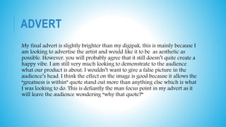
EVALUATION TASK 2
1. How effective is the
combination of your
main product and
ancillary texts?
DIGI PACK CD
COVER/VIDEO
The images I chose to use for this Cd cover were mostly from our final
video. The pictures I used were generally meant to give the potential
buyers a rough outline of some of the events that happen in our video.
First of all, the front and back cover show him on his feet looking
athletic in sports clothing. On the other hand, the picture I placed in the
top left shows Hanif in a wheelchair which shows difference to the front
and back cover. This makes it clear that something must of happened
during the video for this to happen. Lastly, we can see him doing tricep
dips in the gym with a motivational quote on his T shirt, this displays his
recovery. Lastly, as you can tell both the video and the digipak’s colours
are reasonably dull, this instantly lets the audience know that there may
be a gloomy story line behind this. Overall, I think my digipak links to
my video in a number of ways and I really enjoyed creating these.
ADVERT
My final advert is slightly brighter than my digipak, this is mainly because I
am looking to advertise the artist and would like it to be as aesthetic as
possible. However, you will probably agree that it still doesn’t quite create a
happy vibe. I am still very much looking to demonstrate to the audience
what our product is about, I wouldn’t want to give a false picture in the
audience’s head. I think the effect on the image is good because it allows the
“greatness is within” quote stand out more than anything else which is what
I was looking to do. This is defiantly the man focus point in my advert as it
will leave the audience wondering “why that quote?”

Evaluation task 2

  • 1.
    EVALUATION TASK 2 1.How effective is the combination of your main product and ancillary texts?
  • 2.
    DIGI PACK CD COVER/VIDEO Theimages I chose to use for this Cd cover were mostly from our final video. The pictures I used were generally meant to give the potential buyers a rough outline of some of the events that happen in our video. First of all, the front and back cover show him on his feet looking athletic in sports clothing. On the other hand, the picture I placed in the top left shows Hanif in a wheelchair which shows difference to the front and back cover. This makes it clear that something must of happened during the video for this to happen. Lastly, we can see him doing tricep dips in the gym with a motivational quote on his T shirt, this displays his recovery. Lastly, as you can tell both the video and the digipak’s colours are reasonably dull, this instantly lets the audience know that there may be a gloomy story line behind this. Overall, I think my digipak links to my video in a number of ways and I really enjoyed creating these.
  • 3.
    ADVERT My final advertis slightly brighter than my digipak, this is mainly because I am looking to advertise the artist and would like it to be as aesthetic as possible. However, you will probably agree that it still doesn’t quite create a happy vibe. I am still very much looking to demonstrate to the audience what our product is about, I wouldn’t want to give a false picture in the audience’s head. I think the effect on the image is good because it allows the “greatness is within” quote stand out more than anything else which is what I was looking to do. This is defiantly the man focus point in my advert as it will leave the audience wondering “why that quote?”