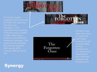
The document discusses how synergy, or connecting different marketing products for a film, makes for a more effective campaign. It describes how the poster, magazine cover, and trailer for a horror film called "The Forgotten Ones" use the same font for the title, color scheme of red, black and grey, and in one case share the same tagline, in order to associate the products and advertise the film through multiple touchpoints that viewers may encounter. Images from the trailer are also used on the poster and magazine cover to further tie the products together through visual similarities recognized by audiences.