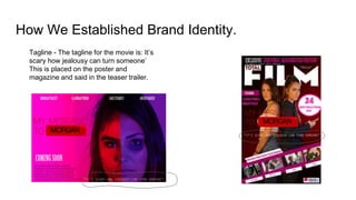
The document discusses how brand identity was established across a film and its ancillary marketing materials. A consistent red color theme and curved box logo were used around text in the teaser trailer, poster, and magazine. Character representations, settings, and props like phones were kept consistent to suggest the teen drama genre. The target audience of 12-24 year old females was addressed through colors, camera angles, and relevant information used in all three marketing products.
2137ad - Characters that live in Merindol and are at the center of main storiesluforfor
Kurgan is a russian expatriate that is secretly in love with Sonia Contado. Henry is a british soldier that took refuge in Merindol Colony in 2137ad. He is the lover of Sonia Contado.
2137ad Merindol Colony Interiors where refugee try to build a seemengly norm...luforfor
This are the interiors of the Merindol Colony in 2137ad after the Climate Change Collapse and the Apocalipse Wars. Merindol is a small Colony in the Italian Alps where there are around 4000 humans. The Colony values mainly around meritocracy and selection by effort.
thGAP - BAbyss in Moderno!! Transgenic Human Germline Alternatives ProjectMarc Dusseiller Dusjagr
thGAP - Transgenic Human Germline Alternatives Project, presents an evening of input lectures, discussions and a performative workshop on artistic interventions for future scenarios of human genetic and inheritable modifications.
To begin our lecturers, Marc Dusseiller aka "dusjagr" and Rodrigo Martin Iglesias, will give an overview of their transdisciplinary practices, including the history of hackteria, a global network for sharing knowledge to involve artists in hands-on and Do-It-With-Others (DIWO) working with the lifesciences, and reflections on future scenarios from the 8-bit computer games of the 80ies to current real-world endeavous of genetically modifiying the human species.
We will then follow up with discussions and hands-on experiments on working with embryos, ovums, gametes, genetic materials from code to slime, in a creative and playful workshop setup, where all paticipant can collaborate on artistic interventions into the germline of a post-human future.
The perfect Sundabet Slot mudah menang Promo new member Animated PDF for your conversation. Discover and Share the best GIFs on Tenor
Admin Ramah Cantik Aktif 24 Jam Nonstop siap melayani pemain member Sundabet login via apk sundabet rtp daftar slot gacor daftar
The Legacy of Breton In A New Age by Master Terrance LindallBBaez1
Brave Destiny 2003 for the Future for Technocratic Surrealmageddon Destiny for Andre Breton Legacy in Agenda 21 Technocratic Great Reset for Prison Planet Earth Galactica! The Prophecy of the Surreal Blasphemous Desires from the Paradise Lost Governments!
Explore the multifaceted world of Muntadher Saleh, an Iraqi polymath renowned for his expertise in visual art, writing, design, and pharmacy. This SlideShare delves into his innovative contributions across various disciplines, showcasing his unique ability to blend traditional themes with modern aesthetics. Learn about his impactful artworks, thought-provoking literary pieces, and his vision as a Neo-Pop artist dedicated to raising awareness about Iraq's cultural heritage. Discover why Muntadher Saleh is celebrated as "The Last Polymath" and how his multidisciplinary talents continue to inspire and influence.
1. How effective is the
combination of your main
product and ancillary texts?
2. Brand Identity
Brand identity is a very large part of creating a recognisable image for the film. This is because it establishes common elements between all
products surrounding the movie. This is good for marketing as their recognisable brand image would appear in more places making more people
want to watch the film.
The red box around the text can be found
in the teaser trailer and the poster. The
colour red is also used a lot throughout
their products.
We used this red box in our
branding, however, we
based ours more around
the youtube logo to fit the
online competition theme.
3. Our Brand identity
The brand identity throughout our film
and ancillary products.
- Red color theme throughout
- Pink / bright colour throughout
- Curved box logo around text.
- Main characters
4. Suggesting the same genre
Characters - The characters in a
movie conveys a lot about the
genre. In our case, the teen
drama genre conventionally has
high school aged teens, often
with more female characters. For
example in the movie ‘A girl like
her’ has a mostly teenage
female cast. We followed this
convection and showed the
same teenage female characters
on all three products. 1 IMAGES
Iconography - One very
iconic prop associated
with teen dramas are
mobile phones. We
used a mobile phone in
the magazine cover and
in the teaser trailer, both
suggesting the teen
drama genre and linking
together.
5. Suggesting the same genre
Setting - Locations
such as High schools
and colleges are
conventional settings
for a teen drama. We
set our film in a college
which is conventional.
However there is little
suggestion of any
locations or setting in
our magazine and
poster.
The colours used in our three
products all suggest that our
genre is a teen drama from the
bright, bold colours used. Also, all
three of our products use the
same character (female teen)
suggesting the teen drama genre.
6. Narrative Themes
The narrative of our film is surrounding a female teenager and her struggle through college
with another student and their online popularities.
Confliction suggested by the two
characters positioning, emotion
and edit with the frame
Suggestion of the online
aspect to the film
Suggestion of teenage
narrative
7. Characters Representation
Character: Morgan
Character: Mia
In all three products, Mia is
represented as more the
victim. This can be seen from
the acting in the magazine
cover, the makeup in the
poster and the high camera
angle use in this show from
the teaser trailer. This high
camera angle helps convey
the narrative of mia being
vulnerable.
Morgan is represented as
the ‘bad’ character in all
three products. This is
conveyed through acting
and direction in all three
products. In this shot
from the teaser trailer,
the low camera angle
supports the power she
has with being mean.
8. Target Audience
From our research, we found that our target audience is 12-24 skewed
towards females.
All three of our products speak to this target audience. This is done through the
use of colours, tagline, camera angles and other relevant information
9. How We Established Brand Identity.
Graphics - Throughout all our products, we used a box graphic around
text, we did this in order to establish a common graphic theme throughout
our products. We also did this to make a connection to the youtube logo
as this is a large theme in our narrative.
10. How We Established Brand Identity.
Colours - The main colour that we branded our film with is red. We did this
as it is very conventional to use red for a teen drama. We also used pink
and other bright colours in order to reinforce the teen drama genre.
Red
Pink
11. How We Established Brand Identity.
Tagline - The tagline for the movie is: It’s
scary how jealousy can turn someone’
This is placed on the poster and
magazine and said in the teaser trailer.
Editor's Notes
graphics, colours, fonts, character images, taglines, etc. (Show your products side by side to help illustrate this.)