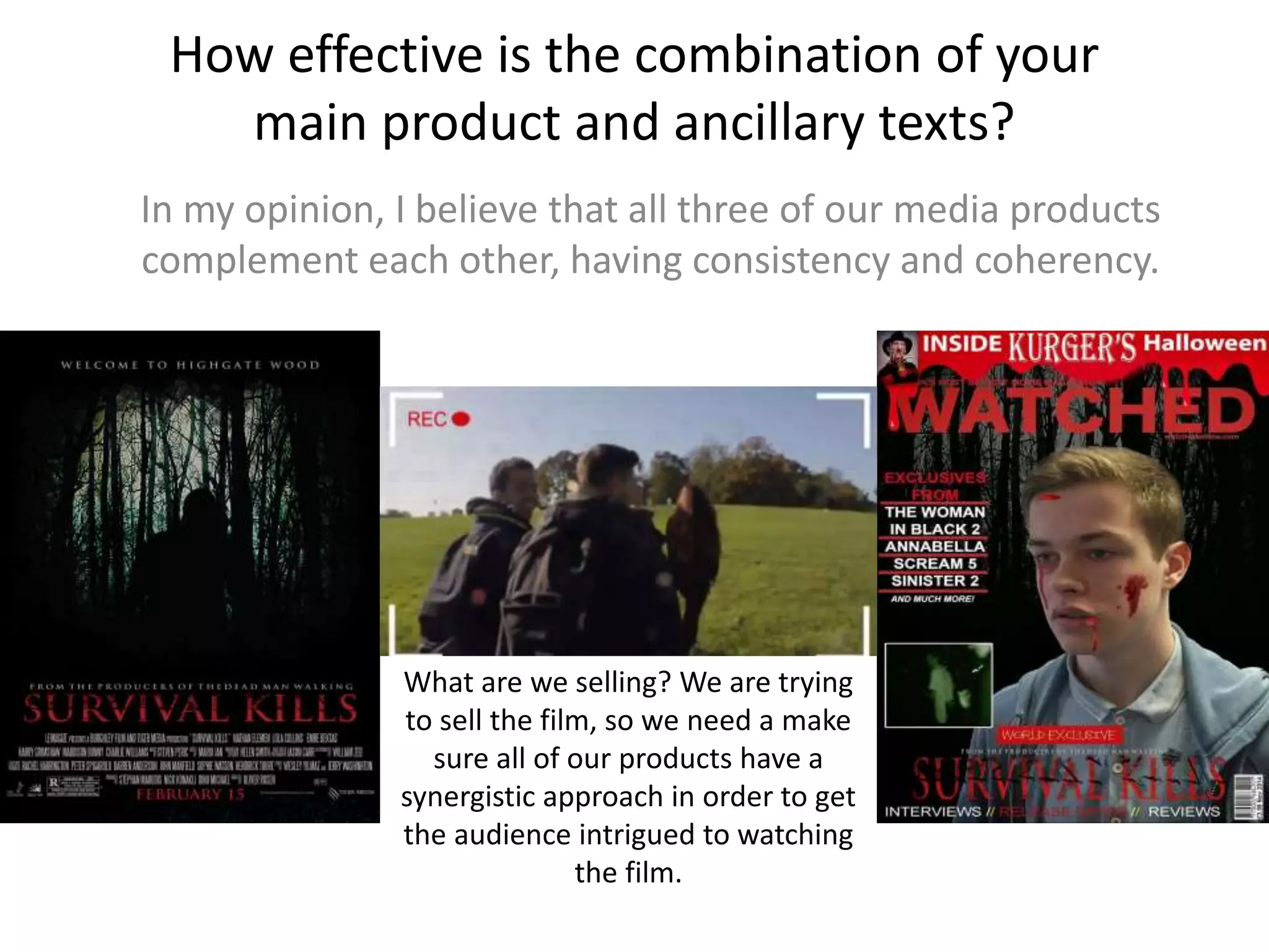
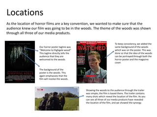
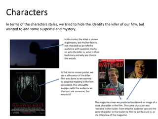
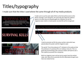
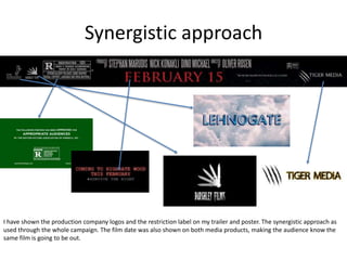
This document discusses a marketing campaign created for a horror film that focused on consistency across three media products: a movie poster, magazine cover, and trailer. Key elements like location, characters, and typography were emphasized synergistically. The woods location was prominently featured in all products using similar backgrounds. While the killer's identity was kept mysterious, the same character appeared in the magazine cover and trailer. Identical font styles and taglines linked the products. Taken together, the campaign was intended to intrigue audiences and promote the film in a coherent way across different media.
