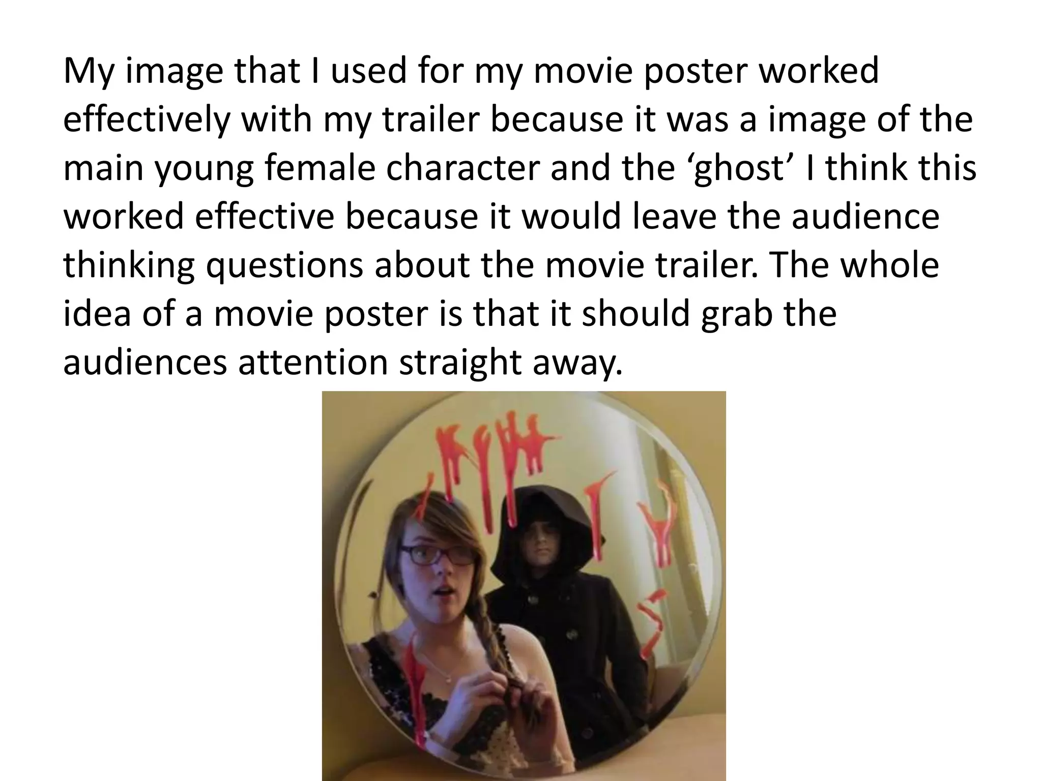
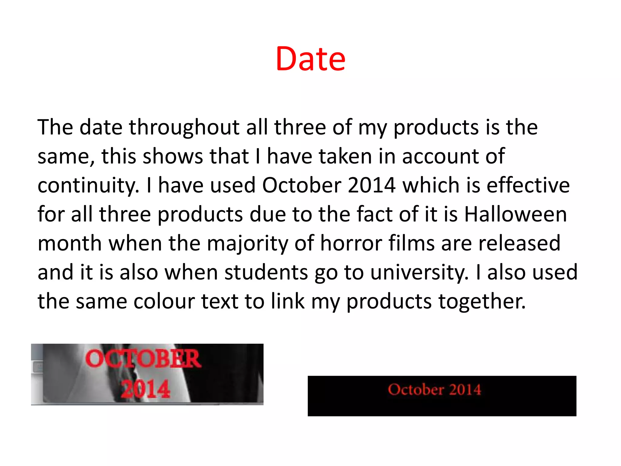
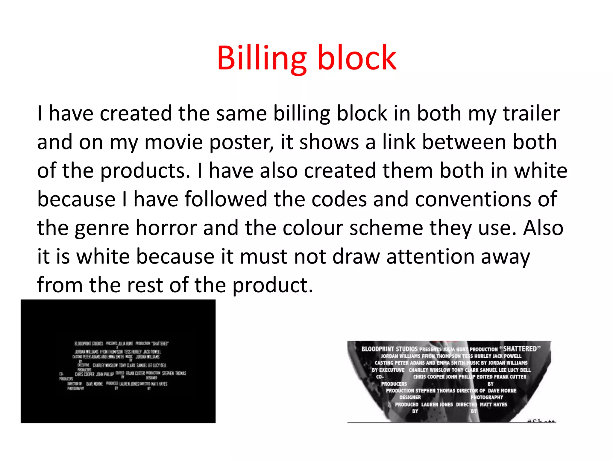
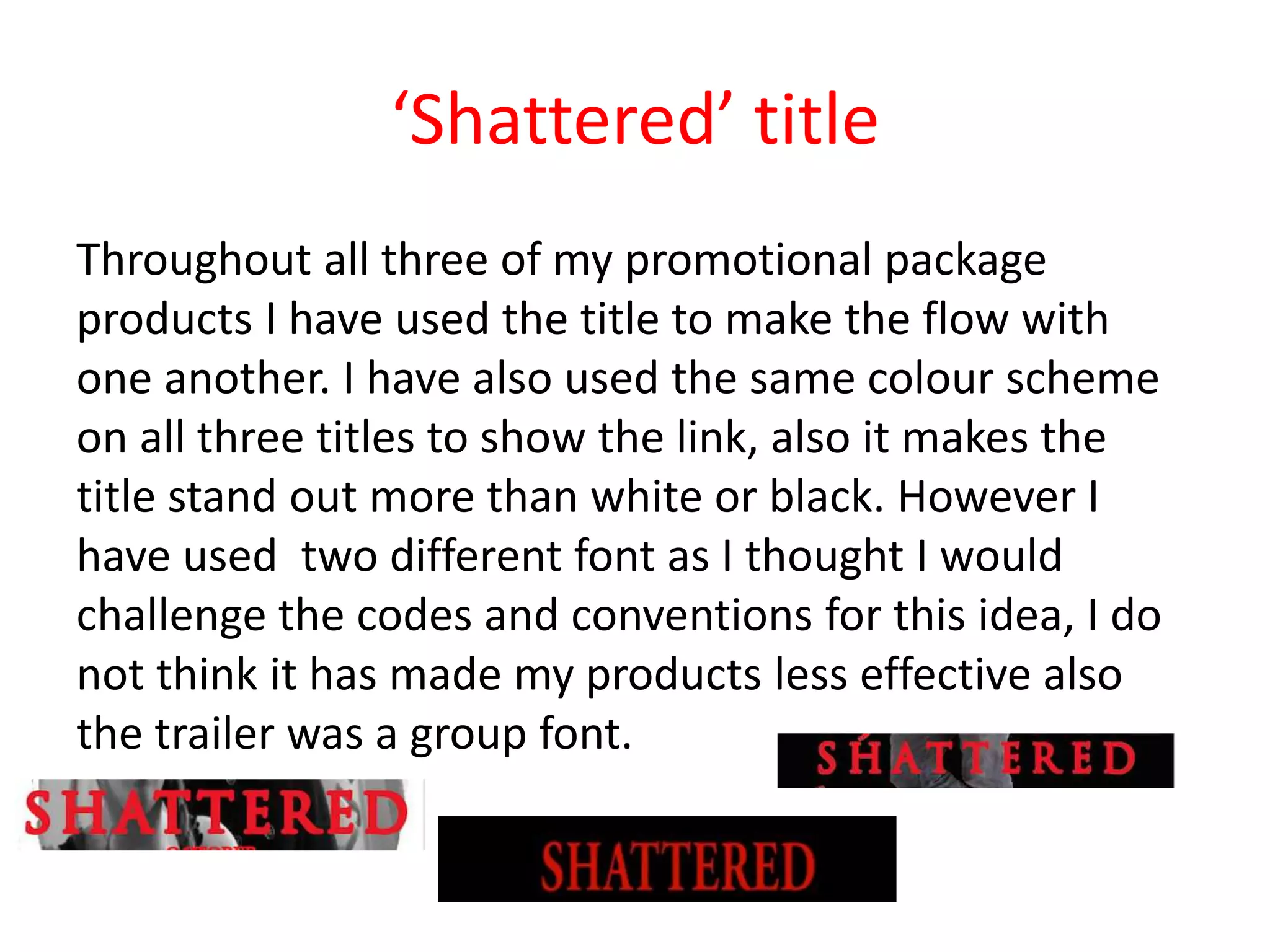
Evaluation 2
How effective is the combination of
your main task/ product and
ancillary tasks?
Promotional package
In order to make a promotional package for a movie
film trailer you must produce a trailer, poster and
magazine cover that all flow into one another. However
the trailer is what entices the audience due to the fact
it is a moving image with dialogue and music whereas a
movie poster is a still image but should also display part
of the plot in the image. I think all three of my products
work effectively with one another, in this question I will
show how I have been able to do this.
3 products
I think my three products work effective together using
the same colour scheme, billing block and titles. It is
important for all three products in a promotional
package to have continuity for them to look appealing
towards an audience.
My magazine cover and movie poster have a link with
the trailer as the characters shown are in the trailer and
are quite important characters in the movie trailer.
The audience must be able to create a link between the
three promotional products.
My image that I used for my movie poster worked
effectively with my trailer because it was a image of the
main young female character and the ‘ghost’ I think this
worked effective because it would leave the audience
thinking questions about the movie trailer. The whole
idea of a movie poster is that it should grab the
audiences attention straight away.
Date
The date throughout all three of my products is the
same, this shows that I have taken in account of
continuity. I have used October 2014 which is effective
for all three products due to the fact of it is Halloween
month when the majority of horror films are released
and it is also when students go to university. I also used
the same colour text to link my products together.
Billing block
I have created the same billing block in both my trailer
and on my movie poster, it shows a link between both
of the products. I have also created them both in white
because I have followed the codes and conventions of
the genre horror and the colour scheme they use. Also
it is white because it must not draw attention away
from the rest of the product.
‘Shattered’ title
Throughout all three of my promotional package
products I have used the title to make the flow with
one another. I have also used the same colour scheme
on all three titles to show the link, also it makes the
title stand out more than white or black. However I
have used two different font as I thought I would
challenge the codes and conventions for this idea, I do
not think it has made my products less effective also
the trailer was a group font.
Colour
I have kept the colour scheme the same on all three
products because I think they work effective together
and it also shows the link between the three of my
products.
The colour red is quite deep and intense for a horror
film because of ‘blood’ which is apparent in our movie
trailer. The colour white and black are conventional on
a horror genre promotional package
Is it effective?
I think the three of my products work effectively for my
promotional package, they each display one another
clearly and effectively.
I am happy with the combination of my three products
even though the trailer was a group product it works
well with my poster and magazine cover.

Evaluation 2

  • 1.
    Evaluation 2 How effectiveis the combination of your main task/ product and ancillary tasks?
  • 2.
    Promotional package In orderto make a promotional package for a movie film trailer you must produce a trailer, poster and magazine cover that all flow into one another. However the trailer is what entices the audience due to the fact it is a moving image with dialogue and music whereas a movie poster is a still image but should also display part of the plot in the image. I think all three of my products work effectively with one another, in this question I will show how I have been able to do this.
  • 3.
    3 products I thinkmy three products work effective together using the same colour scheme, billing block and titles. It is important for all three products in a promotional package to have continuity for them to look appealing towards an audience. My magazine cover and movie poster have a link with the trailer as the characters shown are in the trailer and are quite important characters in the movie trailer. The audience must be able to create a link between the three promotional products.
  • 4.
    My image thatI used for my movie poster worked effectively with my trailer because it was a image of the main young female character and the ‘ghost’ I think this worked effective because it would leave the audience thinking questions about the movie trailer. The whole idea of a movie poster is that it should grab the audiences attention straight away.
  • 5.
    Date The date throughoutall three of my products is the same, this shows that I have taken in account of continuity. I have used October 2014 which is effective for all three products due to the fact of it is Halloween month when the majority of horror films are released and it is also when students go to university. I also used the same colour text to link my products together.
  • 6.
    Billing block I havecreated the same billing block in both my trailer and on my movie poster, it shows a link between both of the products. I have also created them both in white because I have followed the codes and conventions of the genre horror and the colour scheme they use. Also it is white because it must not draw attention away from the rest of the product.
  • 7.
    ‘Shattered’ title Throughout allthree of my promotional package products I have used the title to make the flow with one another. I have also used the same colour scheme on all three titles to show the link, also it makes the title stand out more than white or black. However I have used two different font as I thought I would challenge the codes and conventions for this idea, I do not think it has made my products less effective also the trailer was a group font.
  • 8.
    Colour I have keptthe colour scheme the same on all three products because I think they work effective together and it also shows the link between the three of my products. The colour red is quite deep and intense for a horror film because of ‘blood’ which is apparent in our movie trailer. The colour white and black are conventional on a horror genre promotional package
  • 9.
    Is it effective? Ithink the three of my products work effectively for my promotional package, they each display one another clearly and effectively. I am happy with the combination of my three products even though the trailer was a group product it works well with my poster and magazine cover.