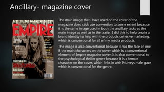
1. Evaluation Q1
IN WHAT WAYS DOES YOUR MEDIA PRODUCT USE, DEVELOP OR
CHALLENGE CONVENTIONS OF REAL MEDIA PRODUCTS
2. My aim
Throughout my piece my aim was to stick to as many conventions of the
psychological thriller genre with both the trailer and two ancillary tasks, which
were a magazine and a poster.
I aimed to make it look conventional by using elements id seen in other trailer
I looked at in my research and planning stages in my chosen genre.
3. Main Task
The title of my main product ‘Snatched’ is conventional because it is a
descriptive word that draws the audience in but doesn’t give away too
much of the films plot therefore still makes the audience look further
at the film. These are conventional elements because most film titles
have short descriptive names such as Inception, Psycho and Heat.
Although film titles also commonly have titles relating to a certain
element or place in the plot for example Shutter island.
The genre that I chose for my media product was psychological
thriller. Within all my media product I decided to use conventional
elements of both thriller and the sub-genre of psychological thriller to
be able to make it look as professional as possible. This also enabled
me to add more elements without straying too much from
conventions.
4. Main task
The settings that I have used for my main task are conventional
because they are everyday settings. The reason why this is
conventional is because by it being in a realistic setting it makes it
more relatable to a potential audience therefore linking to the
audience pleasure of identity because the see the setting as similar
to their life they become more engaged to the characters and the
medias narrative.
In terms of narrative I decided to stick to conventions. The reason
why I did this because it is a trailer it would be difficult to subvert
conventions and still make my final product look conventional
which was my aim.
5. Main task
The editing techniques that I used for my final product were cuts
and fades between shots. The reason why I used these techniques
is because they are a conventional to film trailer therefore are an
effective way to be able to easily show what type of media
product I am creating. Which also helps make my product look
more professional.
6. Ancillary- magazine cover
By having to magazine cover I have challenged conventions
because the films that normally appear in the cover of
magazines such as Empire are mostly action films rather than
psychological thrillers. The reason why I used Empire as the
magazine brand that I was going to use for my cover is because
after looking at their front covers they have done some have
thriller film on the cover of there magazine, therefore making it
the most conventional choice.
The main colours of red, white, grey and black that I used for
my magazine cover is conventional because of the connotations
associated with these colours and the thriller genre. For
example the colour red connoting blood and violence as well as
the colours black and white connoting the binary opposite of
innocent and evil.
7. Ancillary- magazine cover
The main image that I have used on the cover of the
magazine does stick use convention to some extent because
it is the same image used in both the ancillary tasks as the
main image as well as in the trailer. I did this to help create a
brand identity to help with the products cohesive marketing,
which is conventional for all of my media products.
The image is also conventional because it has the face of one
if the main characters on the cover which is a conventional
element of Empire magazine cover. It is also conventional to
the psychological thriller genre because it is a female
character on the cover, which links in with Mulveys male gaze
which is conventional for the genre.
8. Ancillary- poster
The colour scheme I used within my which includes red, white,
grey and black that I used for my poster is conventional because
of the connotations associated with these colours and the thriller
genre. For example the colour red connoting blood and violence
as well as the colours black and white connoting the binary
opposite of innocent and evil.
9. Conclusion
Overall in all my media products mostly stuck to conventions mainly because
it was the best way to ensure that my product looked realistic and
professional. The only times that I subverted conventions within my
production was the brand of magazine I chose for my magazine ancillary and
the reason for that was to because I wanted to used an established magazine
brand for my ancillary and empire is one of the most iconic film magazine
brands, therefore helped my product look professional.