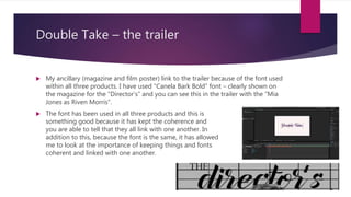
The combination of the main product (trailer) and ancillary tasks (magazine and film poster) is effective because they use consistent elements. Specifically, all three products use the same "Canela Bark Bold" font to maintain coherence. Additionally, the target audience of teenage girls and fans of chick flicks is the same across all products. Elements of the dialogue and characters from the poster also appear in the trailer, linking the two. Costuming from the trailer also matches what is depicted on the magazine cover. An overall black and white color scheme ties the magazine and poster together.